Nara Sans, a Dynamic Sans with Two Italics

More utilitarian than the original Nara, Nara Sans aims for better usability and a more contemporary feel in an economical visual style. It is closely based on Nara’s rational structure of strokes and its humanist calligraphy models, and although it is somewhat softer and gentler, it is still cut quite sharply for a humanist sans.

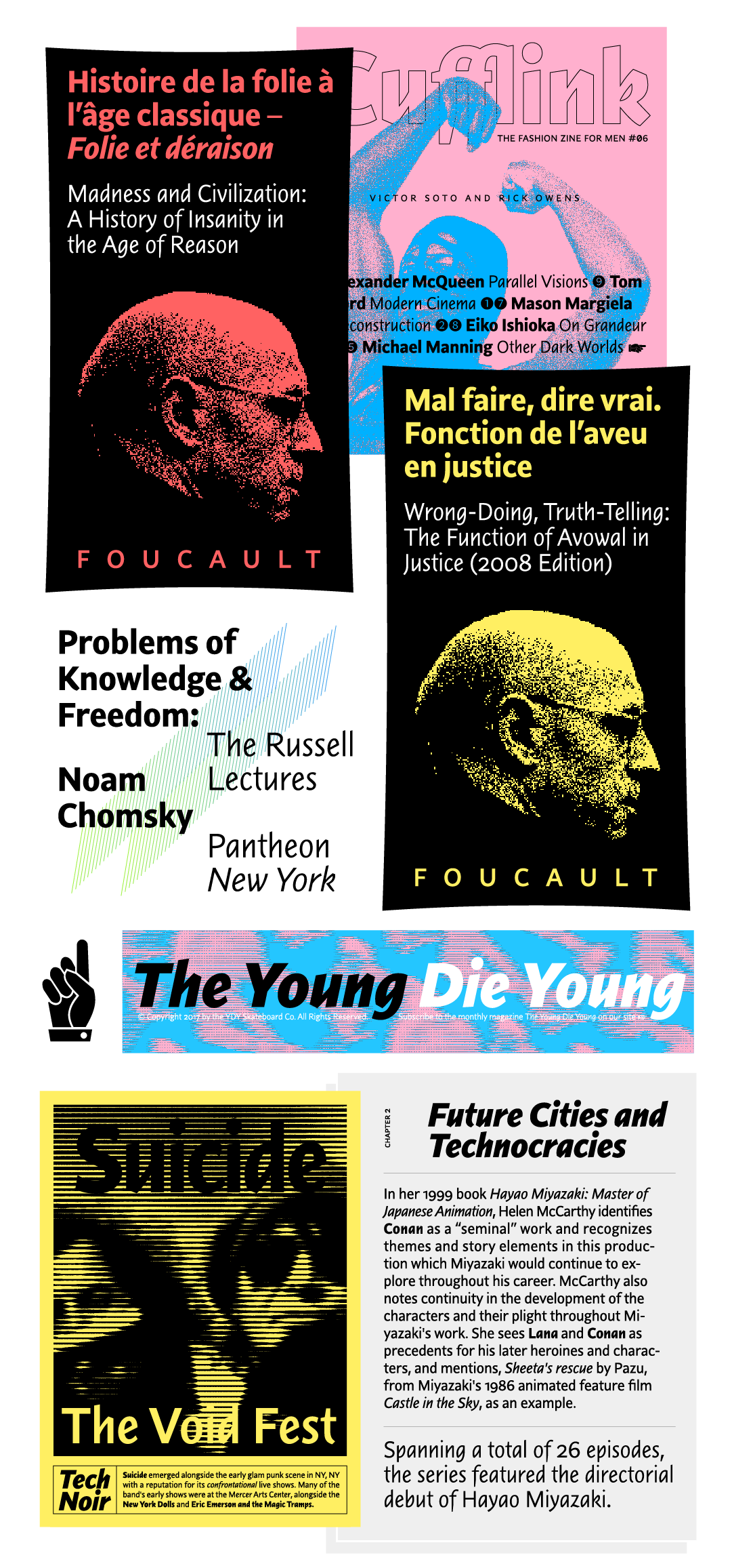
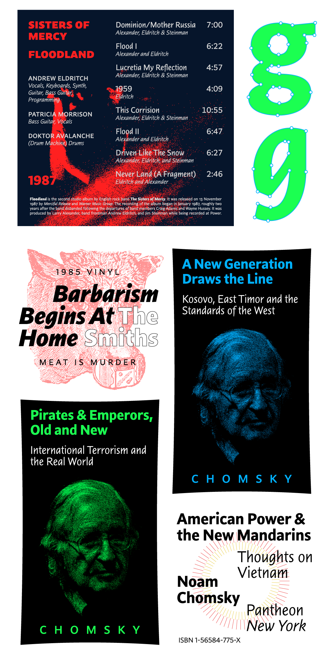
While the upright versions would readily suit any long text setting as well as the occasional headline, the cursive and italic styles are much more distinct and provide plenty of character, especially in the heavier weights. There, the calligraphic details and terminals edge closer to disruption, providing some lively opportunities to explore typographic details or a distinct text structure. The two secondary styles enable the setting of even the most complex text hierarchies, giving this spirited family sufficient versatility for any job.
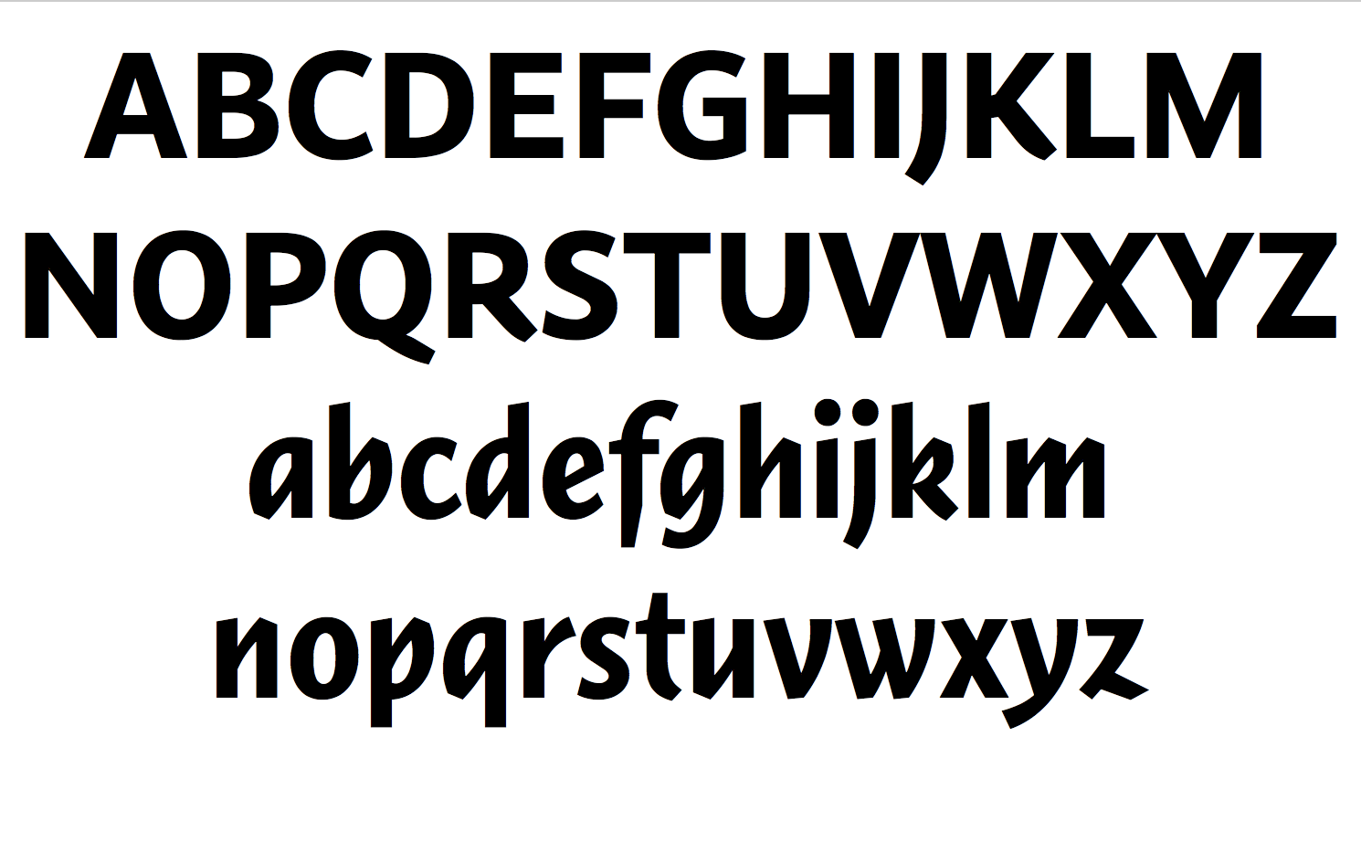
As with the original Nara, Nara Sans Cursive uses the exact same set of uppercase letters as the upright Nara Sans to accompany a much narrower lowercase. The aesthetic inspiration for this concept lies in the early Aldine italics, which began with lowercase letters only, with the uppercase letters consisting of roman capitals at the beginning of the sentences. This however proved to be challenging during the design process, requiring extensive testing to find a weight compromise that suited both text and display applications. The resulting text feel of both cursive and italic styles is not overly uniform but accentuates the underlying ‘handwritten’ character of these styles.


Nara Sans was designed by Andrej Krátky, with the assistance of Slávka Pauliková, Nikola Djurek, and Marko Hrastovec. Specimen illustrations by Shiva Nallaperumal.