
November Slab, a robust slab serif typeface

November Slab shares the same structure as the rest of the November family, but also draws inspiration from the early Egyptian models of the 19th century such as Beton, Memphis, Rockwell and most importantly Frutiger’s Serifa (1967). Unlike them, however, it is narrower, less geometric and more fluid, so it can also handle continuous text.
Since the robust serifs give blocks of text a denser, darker appearance, many characters had to be adapted to the new stroke structure. This is most visible in the design of the double storey ‘g’ that reflects the complexity of a slab serif. Other letterforms were designed without serifs in order to maintain suitable letter widths.

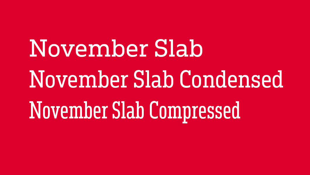
Like the original November, November Slab is also available in three widths and nine weights. The forms of the condensed and compressed styles had to be rethought in the darkest cuts, where there is no room for heavy serifs. The symmetrical serifs used in the light and medium weights were exchanged for unexpected asymmetric forms, making it possible to maintain the serifs’ weight and size.

In its narrow versions November Slab is suitable for headlines and short texts that require character and radiate confidence. The normal-width version of November Slab can also be used for longer texts, its substantial serifs leading the reader forward.


Illustrations by Shiva Nallaperumal