Plotter, a typeface family inspired by architectural lettering and drafting

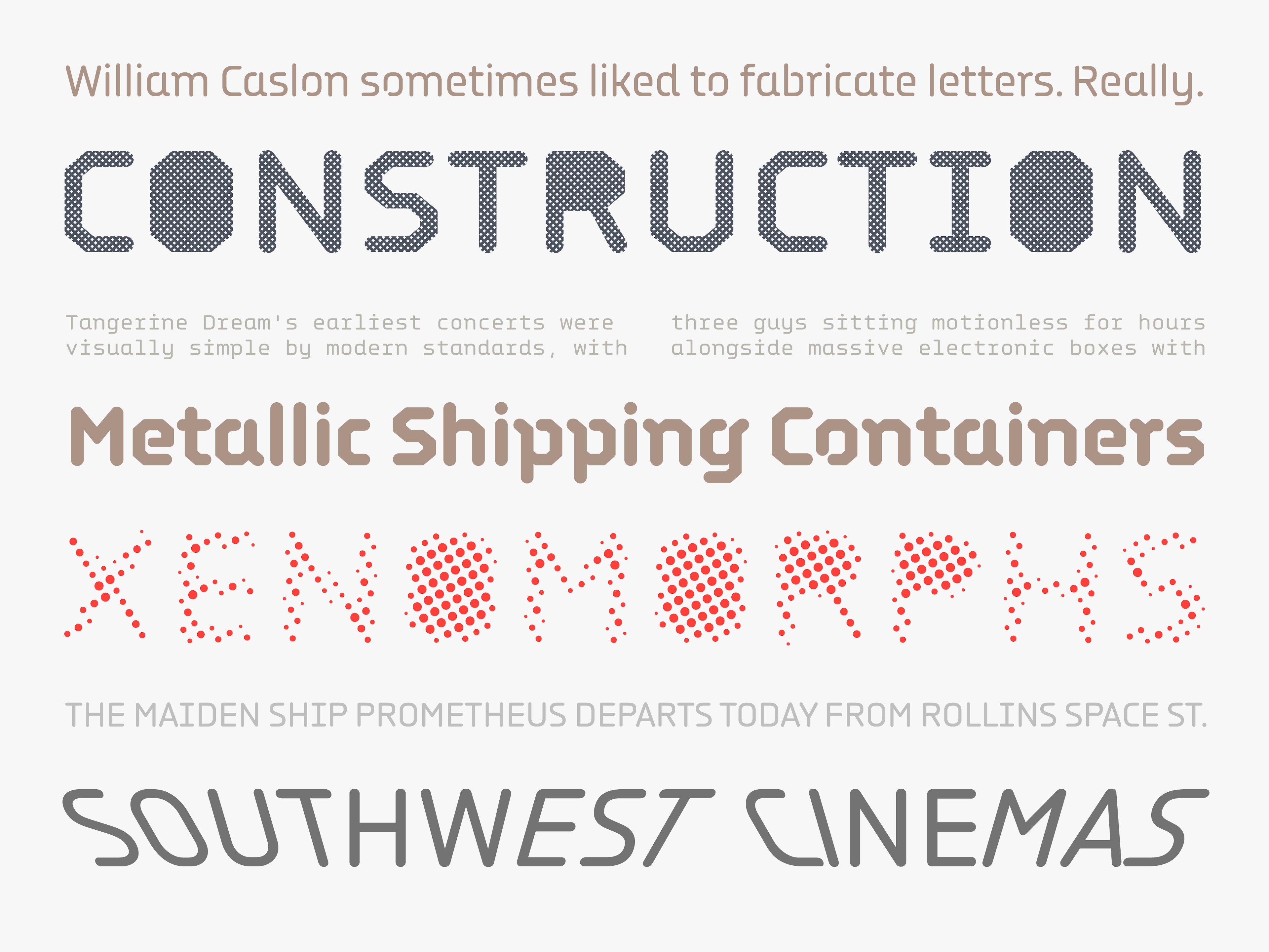
Each subfamily of Plotter reflects the characteristics of the various tools that inspired the project, tools from an age when technical diagrams were drawn and lettered by hand, and draftsmen needed a simple, efficient way to produce legible text that met established norms. Plotter has the simplified monolinear strokes with round terminals produced by technical pens, its letters reduced to their most basic stencilform elements: stems, arms, curves and diagonals.


Family Structure
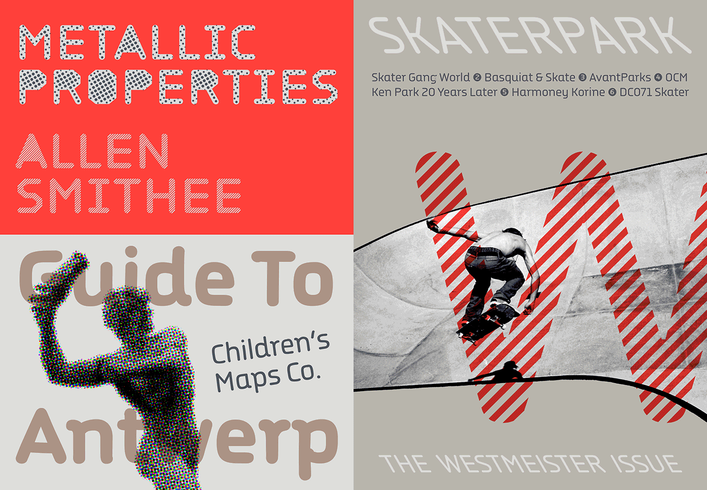
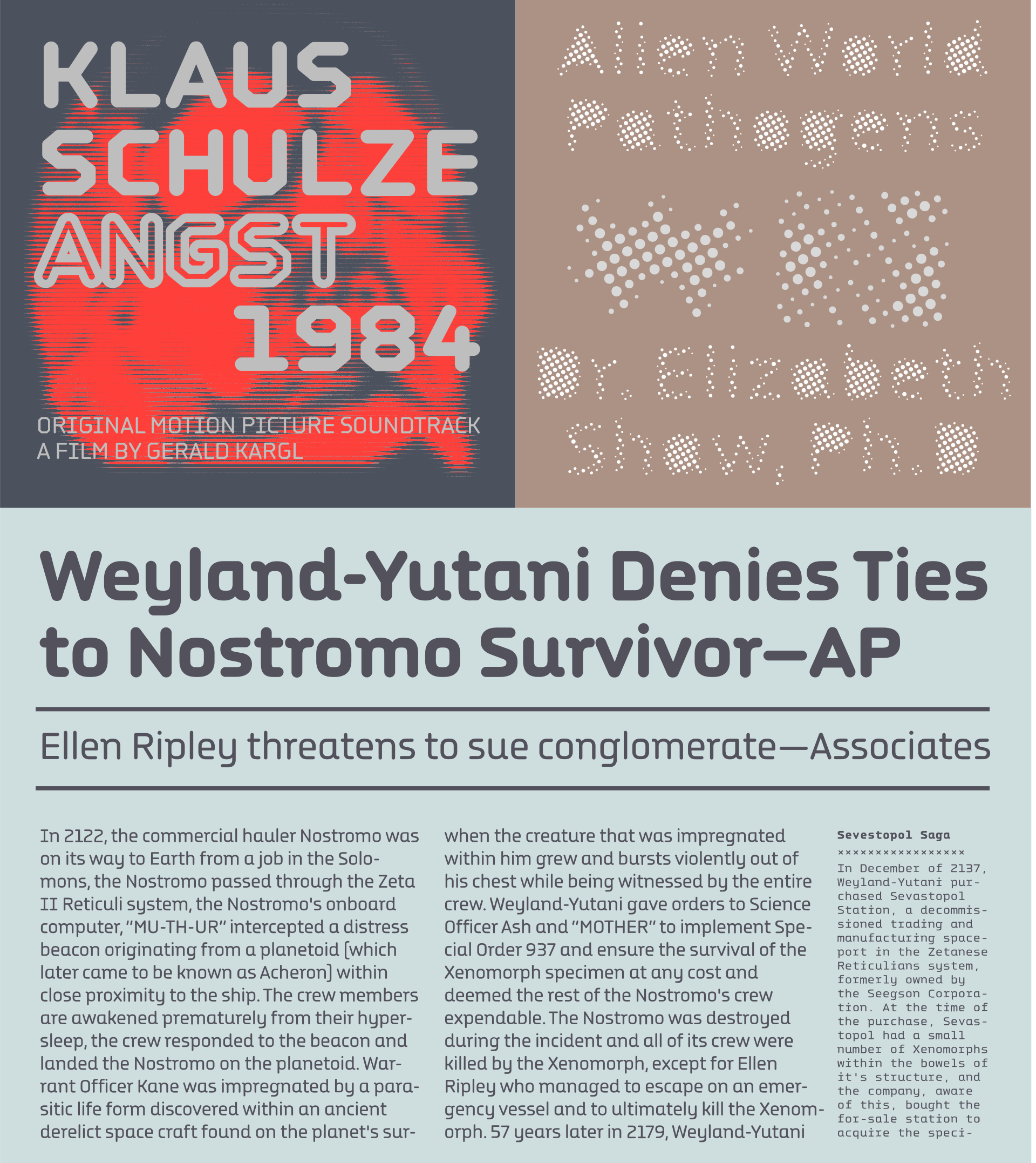
The family consists of two main versions: Plotter, which features true curves, and Plotter Liner, which contains only straight segments. Both sub families contain Basic, Monospaced, Stencil, Monospaced Stencil, and Display versions with five filling layers. There is also a separate Plotter Hand version with irregular, hand-drawn shapes created using actual architectural stencils, and Plotter Wave, a smart letter-substitution version which selects sloping letter variants contextually according to their position in the word. All in all, there are 47 fonts available either as 12 separate packages or all together as Plotter Suite.
For more information see the article: Making Letters for Drafting, by Florian Hardwig and Thomas Maier.

Sloped Styles
While many scribing devices produced letters that are inclined in fixed angle, Plotter’s upright forms can be inclined mathematically to any angle, including backslants. The playful Plotter Wave, the latest of Djurek’s explorations of smart OpenType substitution, shows this off to great effect, creating words with an unusual rhythm and structure as the letters progress from extreme backslant to extreme right slant.


Illustrations by Shiva Nallaperumal.