Print, Online and App
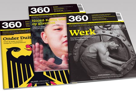
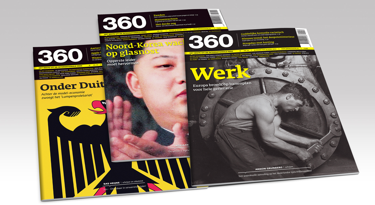
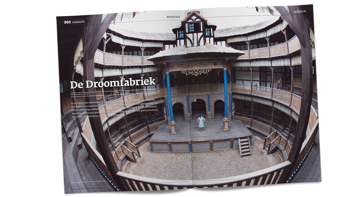
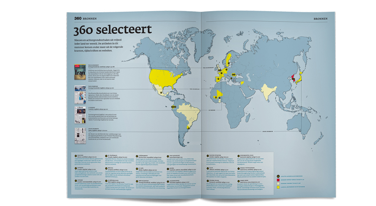
360 is a new Dutch magazine that gathers a wide selection of articles from over 800 reputable foreign periodicals and translates them into Dutch. Every two weeks its readers get a fresh compilation of material not only from such well-known newspapers as The New York Times, Le Monde and The Economist, but also from mainstream magazines in Brazil, China, Iran, or Sudan.
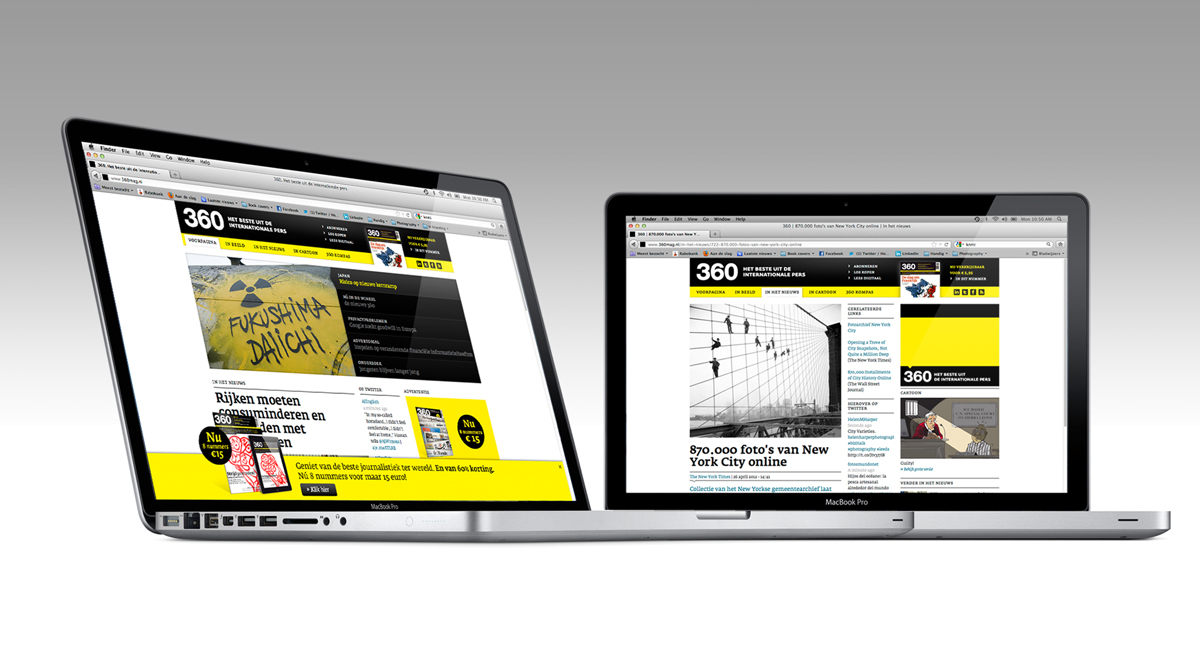
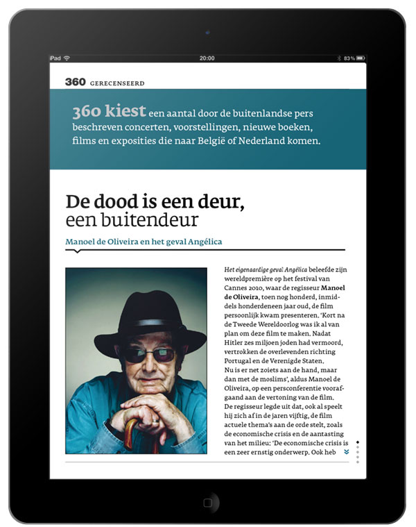
As is the trend these days, 360 is available both in a paper edition and through a paid iPad app, and most of the content is also available on the magazine’s website. Publisher Katrien Gottlieb worked with Amsterdam graphic design studio Dog and Pony to create a visual identity that would be consistent across the magazine’s print and digital environments.
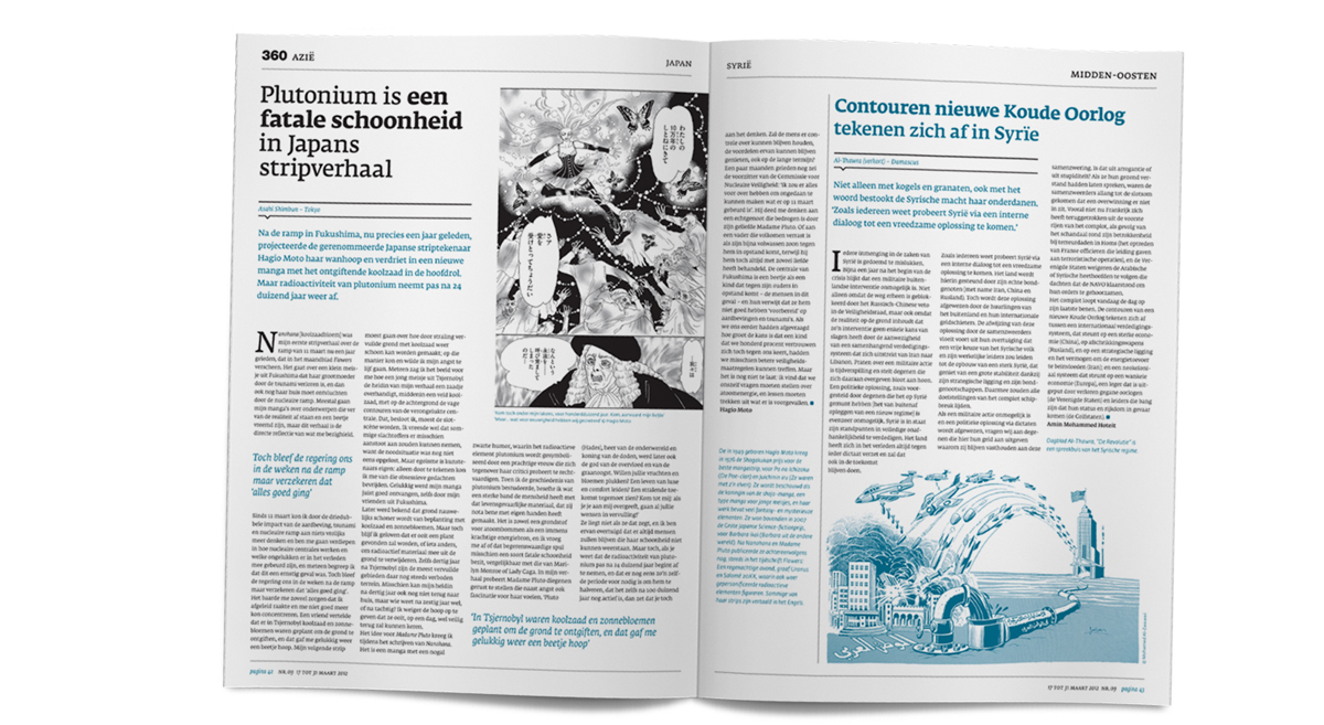
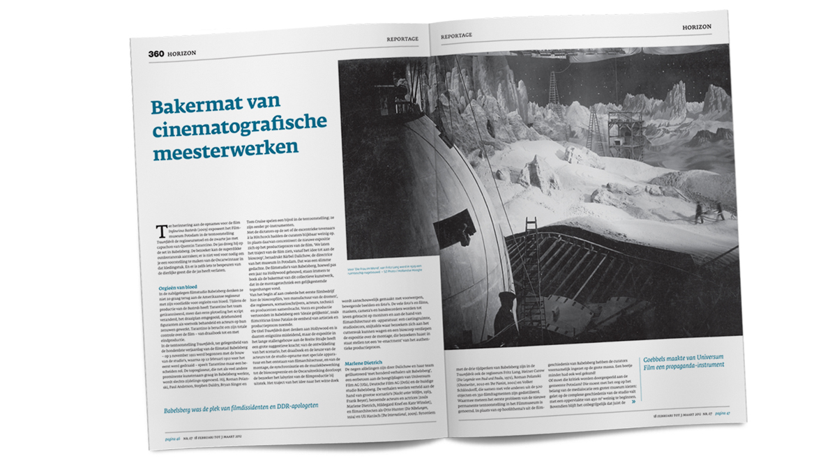
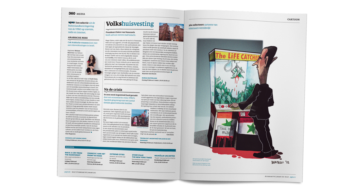
Art Director Bart Heldeman explained why he chose Fedra Serif and Fedra Sans for the project: ‘The magazine publishes long, complex stories, so we needed a typeface with excellent readability at small sizes. We were looking for a font with a large x-height and short ascenders and descenders, and we needed both serif and sans serif versions. We wanted a typeface that had not just a wide range of characters, but also a personality. Something serious, modern and sophisticated. These criteria narrowed down our choice by about 90%. In the end there was only one typeface family that distinguished itself from the rest: Typotheque’s Fedra. It's a beautiful typeface with a wide range of characters and possibilities. The large range of weights (in Serif as well as Sans), the distinctive yet harmonious difference between roman and italic, it all fit seamlessly into our idea of what 360’s identity should be.’