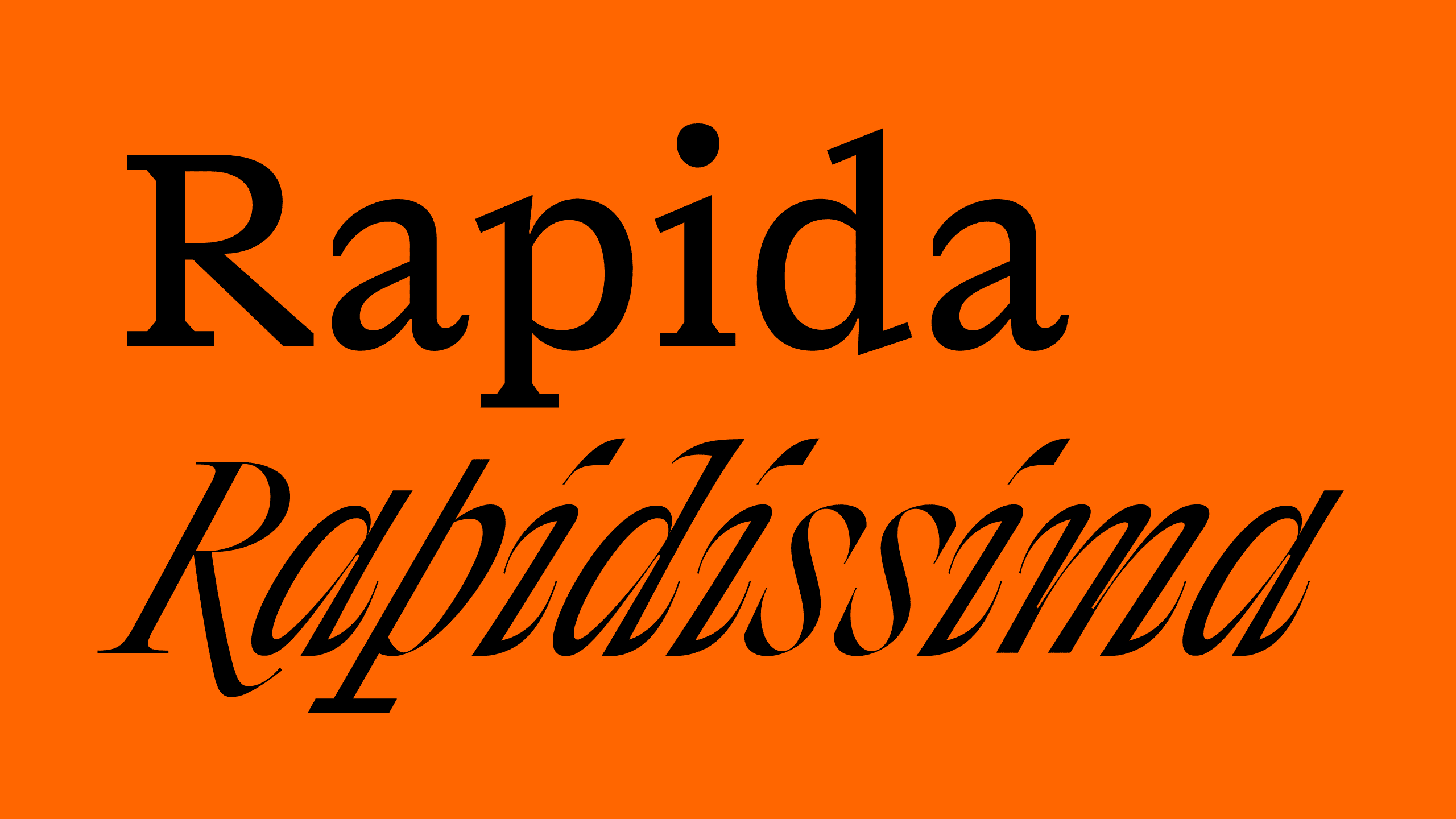
Rapida and Rapidissima, a duo of text and display high-energy typefaces


Rapida is a serif typeface family for continuous text setting, distinguished by the way in which it both follows historical conventions and introduces unusual, abrupt detailing. This brings a liveliness to text, on screen as well as in print. In addition to the body text version, there is an italic-only, display group of fonts called Rapidissima, which presents an extreme visual rendering of the idea of speed.

Rapida and Rapidissima started as part of Michelangelo Nigra’s thesis project at the Type & Media master's course at the Royal Academy of Art (KABK), The Hague.

The roots of this family lay in an investigation into how italic, a system of cursive styles, became not just the counterpart to the Roman, but a separate entity, with its own tone of voice, claiming its own space.
While carrying out research for Rapida, Nigra came across a study by Gerard P. van Galen: Handwriting: Issues for a psychomotor theory. In his article, the author describes various aspects of handwriting, defining parameters that can be interpreted as visual and non-visual. Following this lead, Nigra identified parameters that informed his type design: linear and angular velocity, acceleration and speed, temporal and force amplitude, pressure and feelings, and finally purpose. These parameters helped to move abstract ideas into the visual realm, defining the shapes of letters, and leading to the notion that Rapidissima could be treated as a standalone typeface.
This is, however, not just a project about italic, but a personal exploration of design, where the cursive styles are an integral part of the typeface family. The italic plays an important role as a language feature, typographic element and design object. It is a language feature because it carries semantic meaning. It is used for a specific type of content, or as an ornamental style that has potential to work on its own. Italic is not merely subservient to the Roman counterpart; it influences how a message is perceived and, therefore, we could also argue that italic can itself be a form of language.


