Screen fonts for optimal legibility on the computer monitor

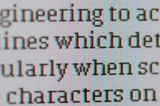
After launching our own webfont system, Typotheque now offers fonts specially engineered and optimised for exceptional readability on the computer monitor. These fonts use TrueType outlines, and were manually hinted to achieve crystal-clear results on computer screens.
More about hinting

Grey-scale rendering of an unhinted and hinted version of Fedra Sans, at 10 ppem, magnified to 200%
Screen fonts
These three font families are ideal for reading on a computer screen, offering superior legibility at small sizes especially when using Microsoft® Windows operating systems. The fonts are of course perfectly cross-platform compatible, so they work equally well on Mac OS, though the hinting instructions are ignored by the OS rasteriser.


Typotheque Screen fonts are style-linked, so the font styles (Regular, Bold, Italic, Bold Italic) are grouped under a single item in the font menu. Use the key commands or click on B for Bold and I for Italic.
Typotheque Screen fonts feature tabular numerals, so figures line up vertically when set in tables. (Tabular numerals are designed with uniform character widths.)

Fedra Sans Screen and Fedra Serif Screen are available immediately, while Fedra Mono Screen will be available later this summer.