Bara Grande

About

Bara Grande is rooted in the metal types of the Dutch Golden Age. It is not a historical revival, but an elegant type family in three optical sizes, where the Grande version is meant for the largest sizes.

PDF Specimen
Available in
  • Latin
More
Rent
LightBuy
Amsterdam
Light ItalicBuy
Bengaluru
RegularBuy
Copenhagen
Regular ItalicBuy
Damascus
MediumBuy
Edinburgh
Medium ItalicBuy
Fortaleza
BoldBuy
Guangzhou
Bold ItalicBuy
Hong Kong
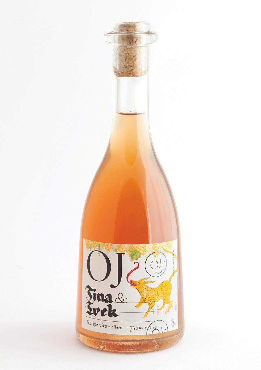
Bara Grande In Use

Design concept

Bara Grande is inspired by the carved, incised metal types of the Dutch Golden Age. It is not a historical revival, but a loose interpretation of a typeface found in The steadfast tin soldier by Joh. Enschedé en Zonen, Haarlem, hand-set in 1992 by Bram de Does in so-called Schefferletter, also known as Enschedé English-bodied Roman No.6. The origins of this historical typeface are unclear, probably dating to the early 16th century. Narrow and elegant, it defines a new all-purpose text family while preserving some particularities of the original metal type. At text sizes, Bara gives text a pleasant, slightly darker texture; at larger sizes, it draws attention to its warm, unorthodox details, such as the abruptly ended strokes of ‘e’ or the ‘c’.

Schefferletter, a typeface from Joh. Enschedé en Zonen, Haarlem

Optical sizes

Unlike the typeface that inspired it, Bara comes in multiple weights and four optical sizes (Bara Caption, Bara Text, Bara Display, Bara Grande), making it a solid choice for practical text typography. These styles differ mainly in the thick to thin stroke variation, and in spacing.

Bara Grande font, optical sizes

Numeral styles

Each weight of Bara Grande includes nine different kinds of numerals. Proportional old-style figures come as default figures in Bara. It also, however, includes lining figures, tabular numerals (both lining and old-style), small caps numerals, superior, inferior, circled and circled inverted numerals. For the running text, old-style figures work best; for use in capital setting, use lining figures, and for small caps, choose the specially designed Small Caps numerals applicable via OpenType layout features. When you take a licence for this font, you can choose the default numeral variants inside the fonts.

Bara Grande font, numeral styles

  • Released2016

Latin

  • English
  • Comorian
  • Luba-Kasai
  • Marquesan
  • Danish
  • Dutch
  • Italian
  • Haitian
  • Estonian
  • German
  • Friulian
  • Galician
  • French
  • Finnish
  • Fijian
  • Frisian
  • Luxemburgish
  • Spanish
  • Swahili
  • Breton
  • Bislama
  • Basque
  • Afar
  • Afrikaans
  • Zulu
  • Tetum
  • Portuguese
  • Norwegian
  • Swedish
  • Catalan
  • Polish
  • Slovak
  • Czech
  • Maltese
  • Albanian
  • Indonesian
  • Irish Gaelic
  • Latvian
  • Lithuanian
  • Slovene
  • Rhaeto-Romanic
  • Hungarian
  • Sorbian
  • Kurdish
  • Hawaiian
  • Esperanto
  • Welsh
  • Sámi (Northern)
  • Faroese
  • Greenlandic
  • Icelandic
  • Croatian
  • Romanian
  • Romani
  • Turkish
  • Bosnian
  • Phonetics
  • Sámi (Inari)
  • Sámi (Lule)
  • Sámi (Southern)
  • Vietnamese
  • Azeri (Latin)
  • Interlingua
  • Sanskrit transliteration
  • Malay
  • Māori
  • Turkmen
  • Uzbek
  • Tagalog (Filipino)
  • Malagasy
  • Crimean Tatar
  • Guaraní
  • Kashubian
  • Xhosa
  • Silesian
  • Cornish
  • Manx
  • Oromo
  • Somali (Latin)
  • Aymara
  • Ganda
  • Ido
  • Javanese
  • Gikuyu
  • Kinyarwanda
  • Kirundi
  • Kongo
  • Kwanyama
  • Nauruan
  • Navajo
  • Ndebele (Northern)
  • Ndebele (Southern)
  • Quechua
  • Samoan
  • Shona
  • Sotho
  • Sundanese
  • Tahitian
  • Tongan
  • Tsonga
  • Tswana
  • Twi
  • Wolof
  • Yoruba
  • Cheyenne
  • Chichewa
  • Kiribati
  • Swati
  • Pinyin
  • Arabic transliteration
  • Ladin
  • Igbo
  • Karelian
  • Veps
  • Chamorro
  • Marshallese
  • Montenegrin
  • Náhuatl
  • Norfuk
  • Occitan
  • Papiamento
  • Pedi
  • Sardinian
  • Seychelles Creole
  • Tok Pisin
  • Tuvalu
  • Aromanian
  • Ga
  • Gagauz
  • Ulithian
  • Venda
  • Chokwe
  • Chuukese
  • Kituba
  • Lingala
  • Maninka
  • Nyanja
  • Otomi
  • Palauan
  • Rarotongan
  • Sango
  • Temne
  • Umbundu
  • Bemba
  • Gwich’in
  • Scottish Gaelic
  • Tokelauan
  • Aranese
  • Cofán
  • Pictograms
  • Norn
  • Romaji
  • Old Norse
  • Chiquitano
  • Araona
  • Cavineña
  • Ayoreo

  • Ha
    Ha

    Small Caps

    smcp

    Most Typotheque fonts implement the Small Caps feature. In Adobe applications you can replace lower case letters with small caps using the keyboard shortcut (⌘ + ⇧ + H), or the OpenType menu.
  • Ha
    Ha

    All Small Capitals

    smcp, c2sc

    There are two methods of applying small capitals. The first one replaces only lower case letters with small caps. The second method, All Small Caps, also replaces capital letters with small caps. It also replaces regular quotation marks, exclamation points, question marks, slashes and usually also numerals with small caps variants.
  • (H:
    (H:

    Case Sensitive Forms

    case

    When the ‘change to caps’ function is applied from within an application (not when text is typed in caps) appropriate case-sensitive forms are automatically applied. Regular brackets, parenthesis, dashes and hyphens are replaced with their capital forms.
  • (1)
    (1)

    Circled numerals and arrows

    dlig

    The discretionary ligature feature creates real arrows when you type the combination -> (right arrow), <- (left arrow), -^ (up arrow) or ^- (down arrow). It also creates enclosed numerals when you type numerals inside parenthesis, and inverse enclosed numerals when you type numerals inside brackets. Discretionary ligatures are off by default in Adobe applications.
  • fi
    fi

    Standard Ligatures

    liga

    Standard ligatures are those which are designed to improve the readability of certain letter pairs. For example, when this feature is activated, typing ‘f’ and ‘i’ will automatically produce the ‘fi’ ligature. Using ligatures does not affect the spelling and hyphenation of your text in any way.
  • 19
    19

    Proportional Lining Figures

    lnum, pnum

    Typotheque fonts contain various styles of numerals within one font. Old-style Figures, also known as ranging figures, come standard in our text fonts. They are specifically designed to work well in running text, as they have the same proportions as lower case letters with their ascenders and descenders. The proportional Lining Figures feature changes standard figures to Lining figures which work better with all-capital text.
  • 19
    19

    Tabular Lining Figures

    lnum, tnum

    Tabular figures are for use in tables where numerals need to be aligned vertically. Tabular figures are available as a OpenType feature and have a fixed width in all weights. Typotheque fonts include both Lining and Old-style Tabular figures.
  • 19
    19

    Tabular Old-style Figures

    onum, tnum

    Tabular figures are for use in tables where numerals need to be aligned vertically. Tabular figures are available as a OpenType feature and have a fixed width in all weights. Typotheque fonts include both Lining and Old-style Tabular figures.
  • 2/9
    2/9

    Arbitrary Fractions

    frac

    Typotheque OpenType fonts already include a number of pre-designed diagonal fractions. The fraction feature allows you to create other fractions quickly and easily.
  • H1
    H1

    Superiors

    sups

    Replaces all styles of figures (old style, tabular, lining) and letters with their superior alternates, which can be used for footnotes, formulas, etc. Superior characters are more legible than mathematically scaled characters, have a similar stroke weight, are spaced more generously, and better complement the rest of the text.
  • H1
    H1

    Inferiors

    sinf

    Replaces all styles of figures (old style, tabular, lining) and letters with their inferior alternates, used primarily for mathematical or chemical notation. Inferior characters are more legible than mathematically scaled characters, have a similar stroke weight, are spaced more generously, and better complement the rest of the text