November
About
November is a highly accessible and legible typeface family for effective signage and information systems, handling even long texts with ease. Extremely functional at smaller sizes, with distinctive orthogonal end strokes that support the rhythm of the words.
PDF SpecimenAvailable in
November System Overview
November
- HairlineItalic
- ThinItalic
- ExtraLightItalic
- LightItalic
- RegularItalic
- MediumItalic
- BoldItalic
- HeavyItalic
- BlackItalic
November Condensed
- HairlineItalic
- ThinItalic
- ExtraLightItalic
- LightItalic
- RegularItalic
- MediumItalic
- BoldItalic
- HeavyItalic
- BlackItalic
November Compressed
- HairlineItalic
- ThinItalic
- ExtraLightItalic
- LightItalic
- RegularItalic
- MediumItalic
- BoldItalic
- HeavyItalic
- BlackItalic
November Variable
Aa
HairlineBuy
ᐋᒻᓱᕐᑖᒻ
Hairline ItalicBuy
ᐹᓐᒐᓗᐊᕐ
ThinBuy
ᑰᐸᓐᓵᒐᓐ
Thin ItalicBuy
ᑕᒫᔅᑲᔅ
ExtraLightBuy
ᐃᑕᓐᐳᕋ
ExtraLight ItalicBuy
ᕗᐊᑕᓕᓴ
LightBuy
ᒍᐊᖕᑦᓴᐅ
Light ItalicBuy
ᓵᖕ ᑳᖕ
RegularBuy
ᐃᔅᑕᓐᐳᓪ
Regular ItalicBuy
ᔨᕈᓴᓚᒻ
MediumBuy
ᑳᑦᒫᓐᑑ
Medium ItalicBuy
ᓚᒃᓴᓐᐴᕈ
BoldBuy
ᒫᓐᑕᕖᑎᐅ
Bold ItalicBuy
ᓂᐅ ᑎᓕ
HeavyBuy
ᐅᐊᒐᑑᒍ
Heavy ItalicBuy
ᐳᕋᕕᑕᓐᔅ
BlackBuy
ᑯᐸᐃᒃ ᓯᑎ
Black ItalicBuy
ᕋᐃᑭᕕᒃ
BlackBuy
ᓄᑖᑦ ᓄᓇᕗᒻᒥ ᐅᖃᐅᓯᓕᕆᓂᕐᒧᑦ ᐱᖁᔭᕐᔪᐊᖅ ᐃᓕᓴᖅᓯᓯᒪᕗᖅ ᐃᓄᐃᑦ ᐅᖃᐅᓯᖓᓂᒃ (ᐃᓄᒃᑎᑐᑦ ᐊᒻᒪᓗ ᐃᓄᐃᓐᓇᖅᑐᓐ), ᖃᓪᓗᓈᑦ ᐅᐃᕖᓪᓗ ᐅᖃᐅᓯᖏᓐᓂᒃ, ᓄᓇᕗᑦ ᐃᓗᐊᓂ ᐃᓕᓴᕆᔭᐅᓯᒪᓪᓗᑎᒃ ᐅᖃᐅᓯᕆᔭᐅᓪᓗᑎᒃ. ᐃᓄᐃᑦ ᐅᖃᐅᓯᖓᑦ ᐃᓄᐃᑦ ᐅᖃᐅᓯᖓᑦ ᑕᒪᒃᑮᖑᕗᑦ ᐃᓄᐃᓐᓇᖅᑐᑦ ᐊᒻᒪᓗ ᐃᓄᒃᑎᑐᑦ. ᓄᓇᕗᒻᒥ ᐃᓄᐃᑦ ᒪᕐᕈᐃᖕᓂᒃ ᐃᓄᒃᑎᑐᑦ ᑎᑎᕋᐅᓰᖕᓂᑦ ᐊᑐᖅᐳᑦ: ᖃᓕᐅᔮᖅᐸᐃᑦ (ᖃᓪᓗᓈᑦ ᑎᑎᕋᐅᓯᖏᓐᓂᒃ ᐊᑐᖅᑐᑦ) ᐊᒻᒪᓗ ᖃᓂᐅᔮᖅᐸᐃᑦ (ᐃᓄᐃᑦ ᑎᑎᕋᐅᓯᖏᓐᓂᒃ ᐊᑐᖅᑐᑦ). ᐊᒥᓱᑦ ᓄᓇᕗᒻᒥ ᐃᓄᒃᑎᑐᑦ ᐅᖃᓪᓚᓲᑦ ᓇᖕᒥᓂᖅ ᐅᖃᐅᓯᕐᒥᓂᒃ ᑎᑎᕋᓕᕌᖓᒥᒃ ᖃᓂᐅᔮᖅᐸᐃᑦ ᑎᑎᕋᐅᓯᖏᓐᓂᒃ ᐊᑐᖃᑦᑕᖅᑐᑦ. ᐃᓄᐃᑦ ᑎᑎᕋᐅᓯᖏᑦᑕ ᑎᑎᕋᑯᓗᖏᑦ 60-ᖏᓐᓃᑉᐳᑦ, ᐅᓄᖅᑐᓪᓗ ᐊᑕᐅᓯᐅᓐᖏᑦᑐᓂᒃ ᖃᓂᐅᑉ ᐅᖃᖅᐸᓪᓕᐊᔭᖏᓐᓂᒃ ᐊᑕᐅᓯᕐᒥᒃ ᓇᓗᓇᐃᒃᑯᑕᕐᒥᒃ ᐊᑐᖅᖢᑎᒃ. ᑕᐃᒪᐃᓐᓂᖓᓄᑦ “NU” ᖃᓕᐅᔮᖅᐸᐃᑦ ᑎᑎᕋᐅᓯᖏᑦ ᐊᑐᕐᓗᒋᑦ ᑕᐃᒪᓐᓇ ᑎᑎᕋᖅᓯᒪᓇᔭᖅᐳᖅ, ᐃᓄᒃᑎᑐᑦ ᖑᑐᐃᓐᓇᖅᑎᓪᓗᒍ. ᖃᓂᐅᔮᖅᐸᐃᑦ ᑎᑎᕋᐅᓯᖏᑦ ᐊᑐᖅᐳᑦ ᖃᓪᓗᓈᑦ ᐅᕝᕙᓘᓐᓃᑦ ᑎᑎᖅᑲᖏᓐᓂᒃ. ᐊᒥᓱᑦ ᖃᓂᐅᔮᖅᐸᐃᓂᒃ ᐊᑐᓲᑦ ᑎᑎᕋᕈᓐᓇᕆᕗᑦ ᖃᓕᐅᔮᖅᐸᐃᑎᑐᑦ, ᐱᓗᐊᕐᓗᒋᑦ ᑎᑎᕋᓕᕌᖓᒥᒃ ᖃᕆᓴᐅᔭᒃᑯᑦ ᐅᕝᕙᓘᓐᓃᑦ ᐊᓯᖏᓐᓂᒃ ᐱᓕᕆᐊᖃᓕᕌᖓᒥᒃ ᖃᕆᓴᐅᔭᒃᑰᖅᑐᓂᒃ. ᓄᓇᕗᑦ ᒐᕙᒪᒃᑯᑦ ᖃᕆᓴᐅᔭᖁᑎᖏᑦ ᐋᖅᑭᒃᑕᐅᓯᒪᕗᑦ ᖃᓂᐅᔮᖅᐸᐃᑎᑐᑦ ᑎᑎᕋᕈᑕᐅᔪᓐᓇᕐᓂᐊᕐᒪᑕ. ᐃᓄᐃᓐᓇᖅᑐᑦ ᐅᖃᐅᓯᓖᑦ ᑎᑎᕋᐅᓯᖃᖅᐳᑦ ᖃᓪᓗᓈᑦ ᑎᑎᕋᕈᓯᖏᓐᓂᒃ ᒪᓕᒃᖢᑎᒃ. 2006-ᒥ ᑐᑭᓯᓇᓱᖕᓂᖃᖅᖢᑎᒃ ᐊᐱᖅᓱᑲᑕᖕᓂᖃᖅᑎᓪᓗᒋᑦ, 64 ᐳᓴᓐᑎᖏᓐᓃᑦᑐᑦ ᑭᐅᔪᑦ ᐅᖃᓚᐅᖅᓯᒪᔪᑦ ᐃᓄᐃᑦ ᐅᖃᐅᓯᖏᓐᓂᒃ ᐊᑐᖃᑦᑕᕐᓂᕋᖅᖢᑎᒃ ᐊᖏᕐᕋᒥ, ᐅᖃᐅᓯᕐᖓᐅᑎᖃᖅᑐᑦ ᓄᓇᕗᓕᒫᒥ 83 ᐳᓴᓐᑎᖏᓐᓃᒃᑲᓗᐊᖅᑎᓪᓗᒋᑦ. ᑕᐃᒪᐃᓕᖓᑎᓪᓗᒍ ᐊᕐᕌᒍᑦ ᖁᓕᑦ ᐃᓗᐊᓂ 12 ᐳᓴᓐᑎᒦᑦᑐᑦ ᐅᖃᐅᓯᕐᖓᐅᑎᒥᖕᓂᒃ ᐊᑐᖃᑦᑕᕈᓐᓃᖅᑐᑦ. ᑕᐃᒪᐃᓕᖓᔾᔪᑎᖃᖅᐳᑦ ᒪᒃᑯᒃᑐᑦ ᐅᕝᕙᓘᓐᓃᑦ ᐅᑭᐅᑭᑦᑐᑦ ᐅᓄᕐᓂᖅᐹᖑᖕᒪᑕ, 2006-ᒥ ᐊᕐᕌᒎᖃᖅᑐᑦ 23.1-ᓂᒃ ᐅᓄᕐᓂᖅᐹᖑᓚᐅᖅᖢᑎᒃ, ᑲᓇᑕᒥᓗ ᐅᓄᕐᓂᖅᐹᑦ 39.5-ᓄᑦ ᐊᕐᕌᒍᖏᑦ ᐋᖅᑭᒃᑕᐅᓯᒪᓪᓗᑎᒃ. 2006-ᒥ ᑐᑭᓯᓇᓱᖕᓂᖃᖅᖢᑎᒃ ᐊᐱᖅᓱᑲᑕᖕᓂᖃᖅᑎᓪᓗᒋᑦ, 420-ᐅᓚᐅᖅᐳᑦ ᐅᐃᕖᑦ ᐅᖃᐅᓯᖓᓐᓂᒃ ᐅᖃᐅᓯᕐᖓᐅᑎᓖᑦ, ᐊᒻᒪᓗ 1,200-ᖑᓂᕋᖅᑕᐅᓪᓗᑎᒃ ᐅᐃᕖᑦ ᐅᖃᐅᓯᖓᓐᓂᒃ ᐊᑐᖃᑦᑕᖅᑐᑦ. ᓄᓇᕗᒻᒥ ᒐᕙᒪᒃᑯᑦ ᑐᑦᑕᕐᕕᖓᓐᓂ ᐃᖃᓗᖕᓂ, ᐅᐃᕖᑦ ᐅᓄᖅᑐᕐᔪᐊᒻᒪᕆᐊᓗᐃᑦ ᐅᖃᐅᓯᕐᒥᖕᓂᒃ ᐊᑐᖅᑐᑦ. ᐃᖃᓗᖕᓂ, ᑕᒫᓂ 800-ᖏᓐᓃᑦᑐᑦ ᐅᐃᕖᑎᑐᑦ ᐅᖃᕈᓐᓇᕐᓂᖃᓚᐅᖅᑐᑦ, ᐊᒻᒪᓗ ᐊᒥᓲᓪᓗᑎᒃ ᐅᐃᕖᑦ ᐃᓄᖕᓂᒃ ᓄᓕᐊᖅᑖᖅᓯᒪᔪᑦ ᐅᐃᑖᖅᓯᒪᔪᓪᓘᓐᓃᑦ. ᐅᐃᕖᑎᑐᑦ ᐅᖃᐅᓯᕐᒥᒃ ᐊᑐᖅᑐᑦ ᓇᖕᒥᓂᖅ ᐃᓕᓐᓂᐊᕐᕕᓖᑦ, ᐸᐃᕆᕕᓖᑦ, ᓈᓚᐅᑎᖃᕐᕕᓖᑦ, ᐊᒻᒪᓗ ᐃᓕᖅᑯᓯᓕᕆᕕᖃᖅᖢᑎᒃ ᖃᐅᑕᒫᖅ ᒪᑐᐃᖏᓐᓇᖃᑦᑕᖅᑐᒥᒃ ᐊᒻᒪᓗ ᖃᓄᐃᓕᐅᖅᑎᑦᑎᕈᓅᔭᖃᑦᑕᖅᖢᑎᒃ ᐊᕐᕌᒎ ᐃᓗᐊᓂ. ᖃᓪᓗᓈᑦ ᐅᖃᐅᓯᖓᑦ ᐊᒃᓱᐊᓗᒃ ᐊᑐᖅᑕᐅᔪᖅ ᐊᕕᒃᑐᖅᓯᒪᔪᓂ ᑐᑦᑕᕐᕕᒋᔭᐅᔪᓂ ᐊᒻᒪᓗ ᓄᓇᓕᖕᓂ ᐊᖏᓂᖅᓴᓂ ᐊᒻᒪᓗ ᒪᓕᒐᖅᑎᒍᑦ ᐅᖃᖅᓯᒪᔪᖅᑕᖃᓐᖏᒃᑲᓗᐊᖅᖢᓂ ᐊᑐᖅᑕᐅᓂᖅᐹᖑᓪᓗᓂ ᒐᕙᒪᐃᑦ ᐊᒻᒪᓗ ᓴᓇᕖᑦ ᐃᓗᐊᓂ.
RegularBuy
ᓄᑖᑦ ᓄᓇᕗᒻᒥ ᐅᖃᐅᓯᓕᕆᓂᕐᒧᑦ ᐱᖁᔭᕐᔪᐊᖅ ᐃᓕᓴᖅᓯᓯᒪᕗᖅ ᐃᓄᐃᑦ ᐅᖃᐅᓯᖓᓂᒃ (ᐃᓄᒃᑎᑐᑦ ᐊᒻᒪᓗ ᐃᓄᐃᓐᓇᖅᑐᓐ), ᖃᓪᓗᓈᑦ ᐅᐃᕖᓪᓗ ᐅᖃᐅᓯᖏᓐᓂᒃ, ᓄᓇᕗᑦ ᐃᓗᐊᓂ ᐃᓕᓴᕆᔭᐅᓯᒪᓪᓗᑎᒃ ᐅᖃᐅᓯᕆᔭᐅᓪᓗᑎᒃ. ᐃᓄᐃᑦ ᐅᖃᐅᓯᖓᑦ ᐃᓄᐃᑦ ᐅᖃᐅᓯᖓᑦ ᑕᒪᒃᑮᖑᕗᑦ ᐃᓄᐃᓐᓇᖅᑐᑦ ᐊᒻᒪᓗ ᐃᓄᒃᑎᑐᑦ. ᓄᓇᕗᒻᒥ ᐃᓄᐃᑦ ᒪᕐᕈᐃᖕᓂᒃ ᐃᓄᒃᑎᑐᑦ ᑎᑎᕋᐅᓰᖕᓂᑦ ᐊᑐᖅᐳᑦ: ᖃᓕᐅᔮᖅᐸᐃᑦ (ᖃᓪᓗᓈᑦ ᑎᑎᕋᐅᓯᖏᓐᓂᒃ ᐊᑐᖅᑐᑦ) ᐊᒻᒪᓗ ᖃᓂᐅᔮᖅᐸᐃᑦ (ᐃᓄᐃᑦ ᑎᑎᕋᐅᓯᖏᓐᓂᒃ ᐊᑐᖅᑐᑦ). ᐊᒥᓱᑦ ᓄᓇᕗᒻᒥ ᐃᓄᒃᑎᑐᑦ ᐅᖃᓪᓚᓲᑦ ᓇᖕᒥᓂᖅ ᐅᖃᐅᓯᕐᒥᓂᒃ ᑎᑎᕋᓕᕌᖓᒥᒃ ᖃᓂᐅᔮᖅᐸᐃᑦ ᑎᑎᕋᐅᓯᖏᓐᓂᒃ ᐊᑐᖃᑦᑕᖅᑐᑦ. ᐃᓄᐃᑦ ᑎᑎᕋᐅᓯᖏᑦᑕ ᑎᑎᕋᑯᓗᖏᑦ 60-ᖏᓐᓃᑉᐳᑦ, ᐅᓄᖅᑐᓪᓗ ᐊᑕᐅᓯᐅᓐᖏᑦᑐᓂᒃ ᖃᓂᐅᑉ ᐅᖃᖅᐸᓪᓕᐊᔭᖏᓐᓂᒃ ᐊᑕᐅᓯᕐᒥᒃ ᓇᓗᓇᐃᒃᑯᑕᕐᒥᒃ ᐊᑐᖅᖢᑎᒃ. ᑕᐃᒪᐃᓐᓂᖓᓄᑦ “NU” ᖃᓕᐅᔮᖅᐸᐃᑦ ᑎᑎᕋᐅᓯᖏᑦ ᐊᑐᕐᓗᒋᑦ ᑕᐃᒪᓐᓇ ᑎᑎᕋᖅᓯᒪᓇᔭᖅᐳᖅ, ᐃᓄᒃᑎᑐᑦ ᖑᑐᐃᓐᓇᖅᑎᓪᓗᒍ. ᖃᓂᐅᔮᖅᐸᐃᑦ ᑎᑎᕋᐅᓯᖏᑦ ᐊᑐᖅᐳᑦ ᖃᓪᓗᓈᑦ ᐅᕝᕙᓘᓐᓃᑦ ᑎᑎᖅᑲᖏᓐᓂᒃ. ᐊᒥᓱᑦ ᖃᓂᐅᔮᖅᐸᐃᓂᒃ ᐊᑐᓲᑦ ᑎᑎᕋᕈᓐᓇᕆᕗᑦ ᖃᓕᐅᔮᖅᐸᐃᑎᑐᑦ, ᐱᓗᐊᕐᓗᒋᑦ ᑎᑎᕋᓕᕌᖓᒥᒃ ᖃᕆᓴᐅᔭᒃᑯᑦ ᐅᕝᕙᓘᓐᓃᑦ ᐊᓯᖏᓐᓂᒃ ᐱᓕᕆᐊᖃᓕᕌᖓᒥᒃ ᖃᕆᓴᐅᔭᒃᑰᖅᑐᓂᒃ. ᓄᓇᕗᑦ ᒐᕙᒪᒃᑯᑦ ᖃᕆᓴᐅᔭᖁᑎᖏᑦ ᐋᖅᑭᒃᑕᐅᓯᒪᕗᑦ ᖃᓂᐅᔮᖅᐸᐃᑎᑐᑦ ᑎᑎᕋᕈᑕᐅᔪᓐᓇᕐᓂᐊᕐᒪᑕ. ᐃᓄᐃᓐᓇᖅᑐᑦ ᐅᖃᐅᓯᓖᑦ ᑎᑎᕋᐅᓯᖃᖅᐳᑦ ᖃᓪᓗᓈᑦ ᑎᑎᕋᕈᓯᖏᓐᓂᒃ ᒪᓕᒃᖢᑎᒃ. 2006-ᒥ ᑐᑭᓯᓇᓱᖕᓂᖃᖅᖢᑎᒃ ᐊᐱᖅᓱᑲᑕᖕᓂᖃᖅᑎᓪᓗᒋᑦ, 64 ᐳᓴᓐᑎᖏᓐᓃᑦᑐᑦ ᑭᐅᔪᑦ ᐅᖃᓚᐅᖅᓯᒪᔪᑦ ᐃᓄᐃᑦ ᐅᖃᐅᓯᖏᓐᓂᒃ ᐊᑐᖃᑦᑕᕐᓂᕋᖅᖢᑎᒃ ᐊᖏᕐᕋᒥ, ᐅᖃᐅᓯᕐᖓᐅᑎᖃᖅᑐᑦ ᓄᓇᕗᓕᒫᒥ 83 ᐳᓴᓐᑎᖏᓐᓃᒃᑲᓗᐊᖅᑎᓪᓗᒋᑦ. ᑕᐃᒪᐃᓕᖓᑎᓪᓗᒍ ᐊᕐᕌᒍᑦ ᖁᓕᑦ ᐃᓗᐊᓂ 12 ᐳᓴᓐᑎᒦᑦᑐᑦ ᐅᖃᐅᓯᕐᖓᐅᑎᒥᖕᓂᒃ ᐊᑐᖃᑦᑕᕈᓐᓃᖅᑐᑦ. ᑕᐃᒪᐃᓕᖓᔾᔪᑎᖃᖅᐳᑦ ᒪᒃᑯᒃᑐᑦ ᐅᕝᕙᓘᓐᓃᑦ ᐅᑭᐅᑭᑦᑐᑦ ᐅᓄᕐᓂᖅᐹᖑᖕᒪᑕ, 2006-ᒥ ᐊᕐᕌᒎᖃᖅᑐᑦ 23.1-ᓂᒃ ᐅᓄᕐᓂᖅᐹᖑᓚᐅᖅᖢᑎᒃ, ᑲᓇᑕᒥᓗ ᐅᓄᕐᓂᖅᐹᑦ 39.5-ᓄᑦ ᐊᕐᕌᒍᖏᑦ ᐋᖅᑭᒃᑕᐅᓯᒪᓪᓗᑎᒃ. 2006-ᒥ ᑐᑭᓯᓇᓱᖕᓂᖃᖅᖢᑎᒃ ᐊᐱᖅᓱᑲᑕᖕᓂᖃᖅᑎᓪᓗᒋᑦ, 420-ᐅᓚᐅᖅᐳᑦ ᐅᐃᕖᑦ ᐅᖃᐅᓯᖓᓐᓂᒃ ᐅᖃᐅᓯᕐᖓᐅᑎᓖᑦ, ᐊᒻᒪᓗ 1,200-ᖑᓂᕋᖅᑕᐅᓪᓗᑎᒃ ᐅᐃᕖᑦ ᐅᖃᐅᓯᖓᓐᓂᒃ ᐊᑐᖃᑦᑕᖅᑐᑦ. ᓄᓇᕗᒻᒥ ᒐᕙᒪᒃᑯᑦ ᑐᑦᑕᕐᕕᖓᓐᓂ ᐃᖃᓗᖕᓂ, ᐅᐃᕖᑦ ᐅᓄᖅᑐᕐᔪᐊᒻᒪᕆᐊᓗᐃᑦ ᐅᖃᐅᓯᕐᒥᖕᓂᒃ ᐊᑐᖅᑐᑦ. ᐃᖃᓗᖕᓂ, ᑕᒫᓂ 800-ᖏᓐᓃᑦᑐᑦ ᐅᐃᕖᑎᑐᑦ ᐅᖃᕈᓐᓇᕐᓂᖃᓚᐅᖅᑐᑦ, ᐊᒻᒪᓗ ᐊᒥᓲᓪᓗᑎᒃ ᐅᐃᕖᑦ ᐃᓄᖕᓂᒃ ᓄᓕᐊᖅᑖᖅᓯᒪᔪᑦ ᐅᐃᑖᖅᓯᒪᔪᓪᓘᓐᓃᑦ. ᐅᐃᕖᑎᑐᑦ ᐅᖃᐅᓯᕐᒥᒃ ᐊᑐᖅᑐᑦ ᓇᖕᒥᓂᖅ ᐃᓕᓐᓂᐊᕐᕕᓖᑦ, ᐸᐃᕆᕕᓖᑦ, ᓈᓚᐅᑎᖃᕐᕕᓖᑦ, ᐊᒻᒪᓗ ᐃᓕᖅᑯᓯᓕᕆᕕᖃᖅᖢᑎᒃ ᖃᐅᑕᒫᖅ ᒪᑐᐃᖏᓐᓇᖃᑦᑕᖅᑐᒥᒃ ᐊᒻᒪᓗ ᖃᓄᐃᓕᐅᖅᑎᑦᑎᕈᓅᔭᖃᑦᑕᖅᖢᑎᒃ ᐊᕐᕌᒎ ᐃᓗᐊᓂ. ᖃᓪᓗᓈᑦ ᐅᖃᐅᓯᖓᑦ ᐊᒃᓱᐊᓗᒃ ᐊᑐᖅᑕᐅᔪᖅ ᐊᕕᒃᑐᖅᓯᒪᔪᓂ ᑐᑦᑕᕐᕕᒋᔭᐅᔪᓂ ᐊᒻᒪᓗ ᓄᓇᓕᖕᓂ ᐊᖏᓂᖅᓴᓂ ᐊᒻᒪᓗ ᒪᓕᒐᖅᑎᒍᑦ ᐅᖃᖅᓯᒪᔪᖅᑕᖃᓐᖏᒃᑲᓗᐊᖅᖢᓂ ᐊᑐᖅᑕᐅᓂᖅᐹᖑᓪᓗᓂ ᒐᕙᒪᐃᑦ ᐊᒻᒪᓗ ᓴᓇᕖᑦ ᐃᓗᐊᓂ.
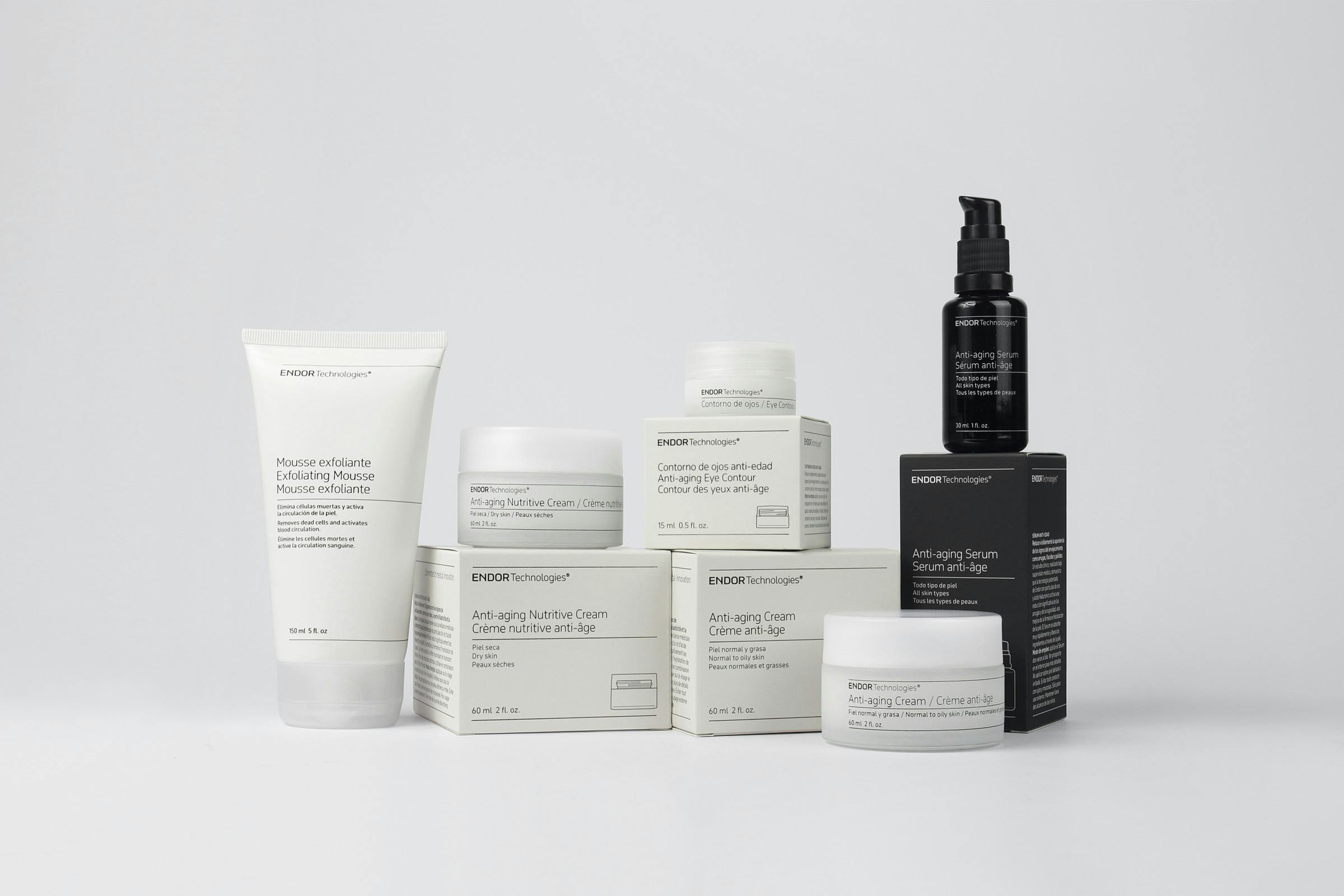
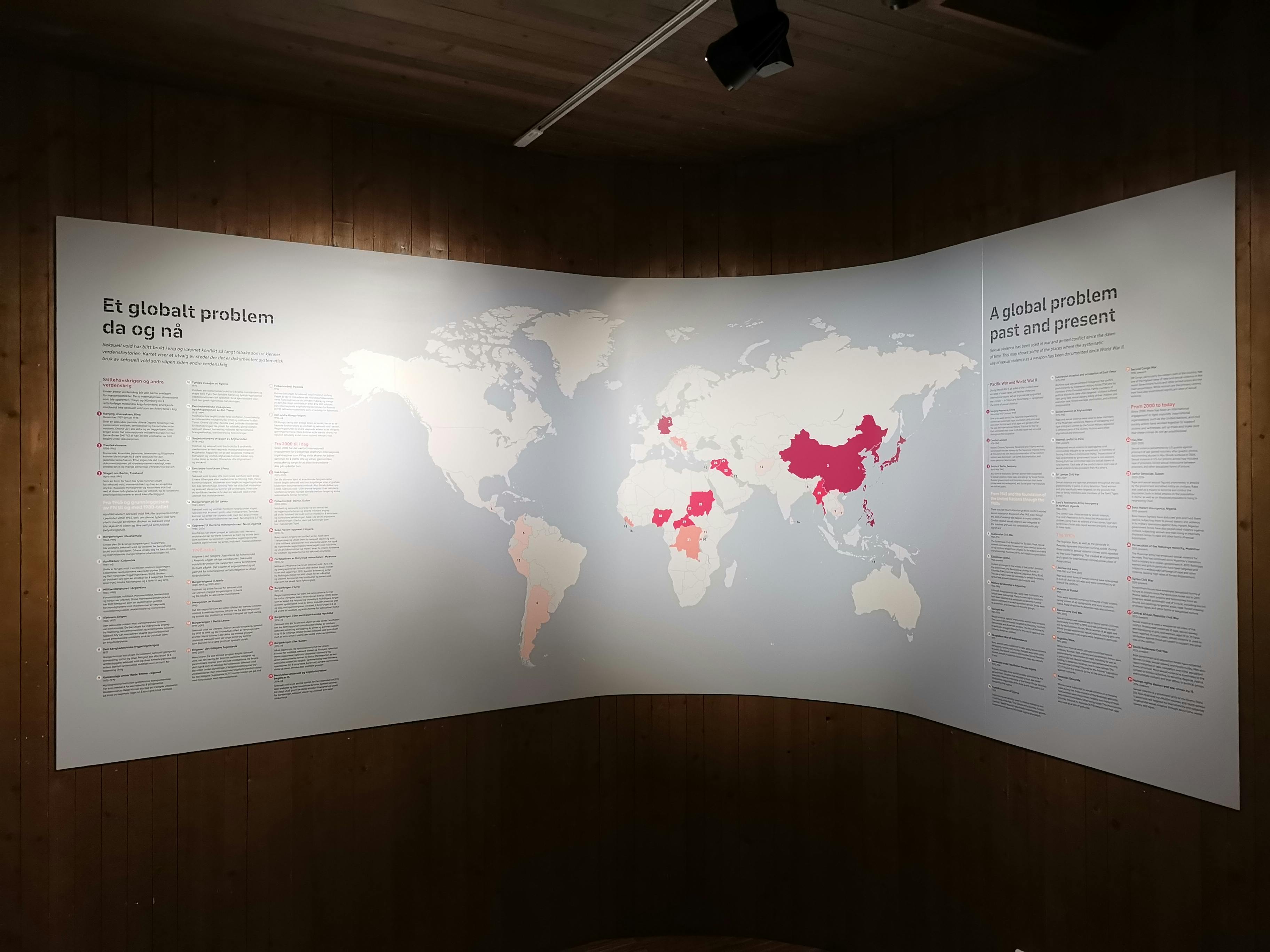
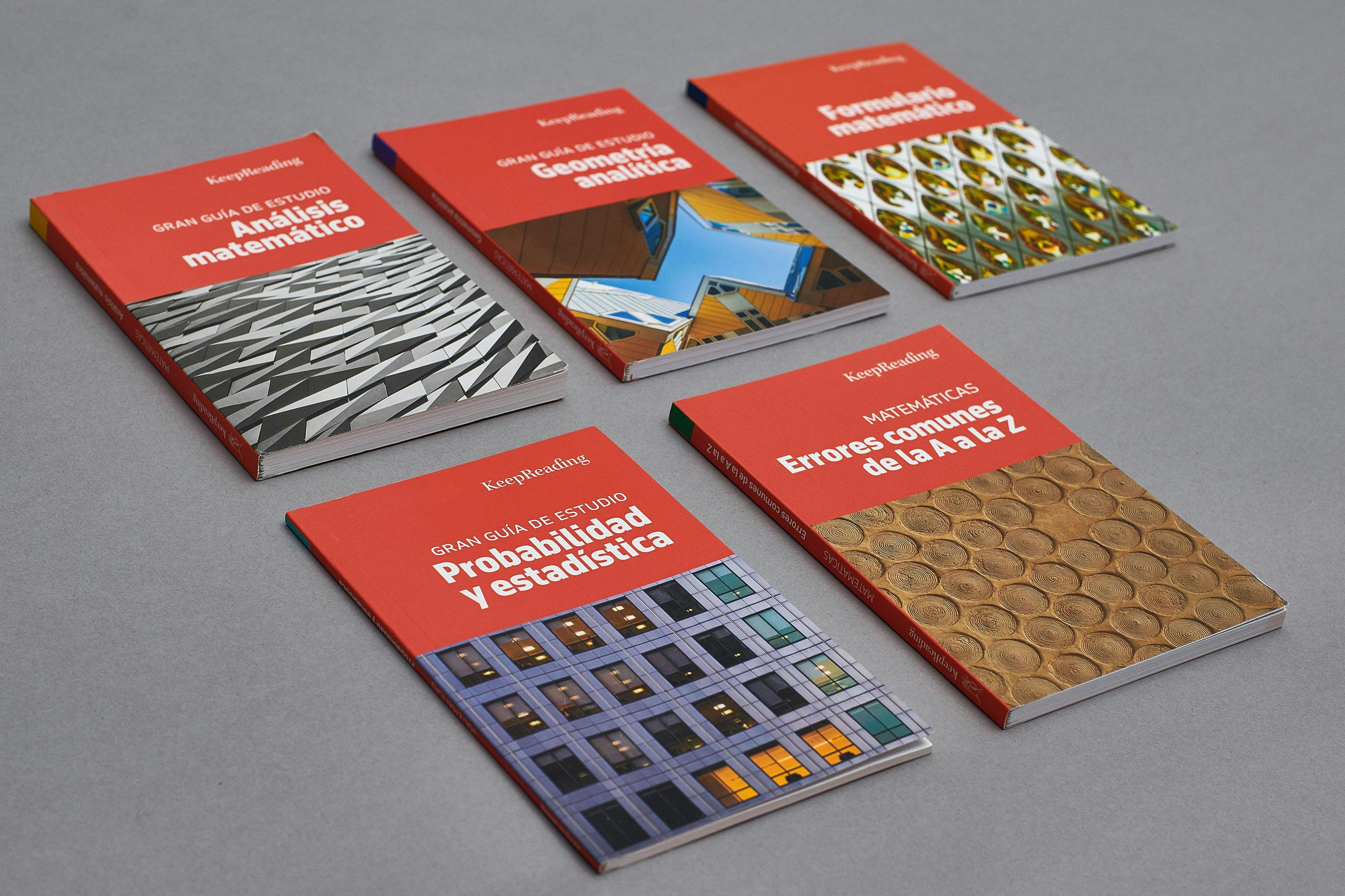
November In Use