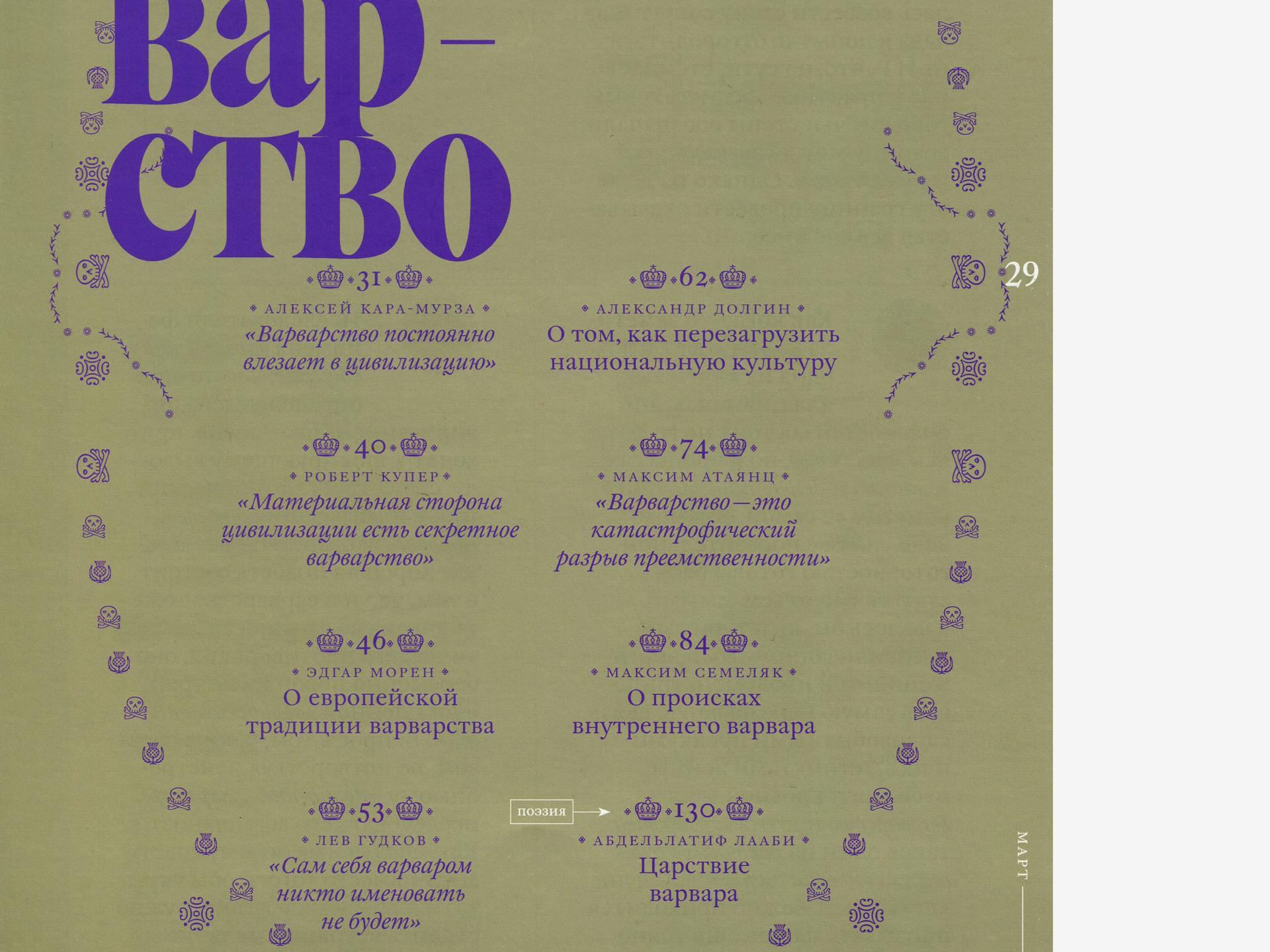
William Subhead
William Subhead is a middle size text of the contemporary Caslon revival, available in three optical sizes. It has a Text version with a large x-height for smaller text from 7 to 12pt, a Subhead version for use at 14 to 30pt, and Display version for text larger than 36pt.
PDF SpecimenDesign Concept
William Caslon (1692–1766) established the cornerstone of British type founding, ending reliance on the Dutch types which had been commonly used in England up to that point (and which inspired his designs). Caslon achieved success both at home and abroad, and the American Declaration of Independence was printed in 1776 using Caslon type. Caslon typefaces set the aesthetic standard for book design, and by the 20th century, the name Caslon referred not only to a specific set of typefaces, but an entire brand.
Caslon’s work has a permanent place in the history of typography. William builds on his foundation and makes his type relevant for a new generation of designers. Read more about the development of William in this article.
Optical Sizes
William is available in three optical sizes, a Text version with a large x-height for smaller text from 7 to 12 points, a Subhead version for use at 14 to 30 points, and Display version for text larger than 36 points. The optical sizes differ not only in the contrast between the thick and thin strokes; the vertical and horizontal proportions of letters have also been adjusted to better fit the specific size ranges, and the spacing of the text has been optimised as well.
Ornaments
The original Caslon Foundry produced over 2,600 ornaments and decorative elements, important for the book publishing of the time. Maria Doreuli reviewed them, giving William more than 200 tasteful ornaments that can be recombined to create borders, patterns and typographic decorations.
Numeral Styles
All styles of William include nine different kinds of numerals. Default numerals are proportional old-style (ranging) numerals, for use in running text. William also includes lining figures for use with capitals letters, because their proportions match the height of the capitals. Use small caps figures in all small caps setting, tabular (both lining and old-style figures), superior and inferior figures, and finally circled and circled inverted figures. When you take a licence for this font, you can choose your own default numeral variant.
- DesignMaria Doreuli (Cyrillic, Greek, Latin)
- ContributorsIrene Vlachou (Greek)
- AwardsATypI Letter2 Best Typefaces of the Decade 2011
- Released2016
Cyrillic
- Rusyn
- Kazakh
- Russian
- Abaza
- Buryat
- Dargin
- Kabardian
- Komi
- Bulgarian
- Chechen
- Kirghyz
- Macedonian
- Ossetic
- Serbian
- Tajik (Cyrillic)
- Ukrainian
- Belarusian
- Yakut
- Abkhaz
- Dolgan
- Kalmyk
- Adyghe
- Avar
- Dungan
- Balkar
- Karakalpak
- Mordvin (Moksha)
- Nivkh
- Enets
- Ingush
- Itelmen
- Kumyk
- Azeri (Cyrillic)
- Bashkir
- Selkup
- Nanai
- Nenets
- Lak
- Lezgian
- Mordvin (Erzya)
- Tabasaran
- Altai
- Chukcha
- Chuvash
- Yupik
- Even
- Khanty
- Koryak
- Manci
- Nogai
- Tuva
- Tatar
- Uighur
- Rutul
- Tuvan
- Moldovan
- Mari
- Aghul
- Evenki
- Khakas
- Mansi
- Nganasan
- Tsakhur
- Udmurt
- Kildin Sami
Greek
- Greek (modern)
- Greek (classical)
Latin
- English
- Comorian
- Luba-Kasai
- Marquesan
- Danish
- Dutch
- Italian
- Haitian
- Estonian
- German
- Friulian
- Galician
- French
- Finnish
- Fijian
- Frisian
- Luxemburgish
- Spanish
- Swahili
- Breton
- Bislama
- Basque
- Afar
- Afrikaans
- Zulu
- Tetum
- Portuguese
- Norwegian
- Swedish
- Catalan
- Polish
- Slovak
- Czech
- Maltese
- Albanian
- Indonesian
- Irish Gaelic
- Latvian
- Lithuanian
- Slovene
- Rhaeto-Romanic
- Hungarian
- Sorbian
- Kurdish
- Hawaiian
- Esperanto
- Welsh
- Sámi (Northern)
- Faroese
- Greenlandic
- Icelandic
- Croatian
- Romanian
- Romani
- Turkish
- Bosnian
- Phonetics
- Sámi (Inari)
- Sámi (Lule)
- Sámi (Southern)
- Vietnamese
- Azeri (Latin)
- Interlingua
- Sanskrit transliteration
- Malay
- Māori
- Turkmen
- Uzbek
- Tagalog (Filipino)
- Malagasy
- Crimean Tatar
- Guaraní
- Kashubian
- Xhosa
- Silesian
- Cornish
- Manx
- Oromo
- Somali (Latin)
- Aymara
- Ganda
- Ido
- Javanese
- Gikuyu
- Kinyarwanda
- Kirundi
- Kongo
- Kwanyama
- Nauruan
- Navajo
- Ndebele (Northern)
- Ndebele (Southern)
- Quechua
- Samoan
- Shona
- Sotho
- Sundanese
- Tahitian
- Tongan
- Tsonga
- Tswana
- Twi
- Wolof
- Yoruba
- Cheyenne
- Chichewa
- Kiribati
- Swati
- Pinyin
- Arabic transliteration
- Ladin
- Igbo
- Karelian
- Veps
- Chamorro
- Marshallese
- Montenegrin
- Náhuatl
- Norfuk
- Occitan
- Papiamento
- Pedi
- Sardinian
- Seychelles Creole
- Tok Pisin
- Tuvalu
- Aromanian
- Ga
- Gagauz
- Ulithian
- Venda
- Chokwe
- Chuukese
- Kituba
- Lingala
- Maninka
- Nyanja
- Otomi
- Palauan
- Rarotongan
- Sango
- Temne
- Umbundu
- Bemba
- Gwich’in
- Scottish Gaelic
- Tokelauan
- Aranese
- Cofán
- Pictograms
- Norn
- Romaji
- Old Norse
- Chiquitano
- Araona
- Cavineña
- Ayoreo
- AA
Swash capitals
swsh
A set of capital swash characters, typographical flourishes for the Italics. They can be used at larger sizes as initials, or to give text extra decorative touch. - CC
Serifless capital `C`
ss02
Alternative version of the capital ‘C’ without lower serif, including its accented variants. - JJ
Short capital `J`
ss03
This stylistic Set will replace the standard descending capital ‘J’ (and the small caps version) by the shorter version of the letter. - HaHa
Small Caps
smcp
Most Typotheque fonts implement the Small Caps feature. In Adobe applications you can replace lower case letters with small caps using the keyboard shortcut (⌘ + ⇧ + H), or the OpenType menu. - HaHa
All Small Capitals
smcp, c2sc
There are two methods of applying small capitals. The first one replaces only lower case letters with small caps. The second method, All Small Caps, also replaces capital letters with small caps. It also replaces regular quotation marks, exclamation points, question marks, slashes and usually also numerals with small caps variants. - (H:(H:
Case Sensitive Forms
case
When the ‘change to caps’ function is applied from within an application (not when text is typed in caps) appropriate case-sensitive forms are automatically applied. Regular brackets, parenthesis, dashes and hyphens are replaced with their capital forms. - (1)(1)
Circled numerals and arrows
dlig
The discretionary ligature feature creates real arrows when you type the combination -> (right arrow), <- (left arrow), -^ (up arrow) or ^- (down arrow). It also creates enclosed numerals when you type numerals inside parenthesis, and inverse enclosed numerals when you type numerals inside brackets. Discretionary ligatures are off by default in Adobe applications. - fifi
Standard Ligatures
liga
Standard ligatures are those which are designed to improve the readability of certain letter pairs. For example, when this feature is activated, typing ‘f’ and ‘i’ will automatically produce the ‘fi’ ligature. Using ligatures does not affect the spelling and hyphenation of your text in any way. - 1919
Proportional Lining Figures
lnum, pnum
Typotheque fonts contain various styles of numerals within one font. Old-style Figures, also known as ranging figures, come standard in our text fonts. They are specifically designed to work well in running text, as they have the same proportions as lower case letters with their ascenders and descenders. The proportional Lining Figures feature changes standard figures to Lining figures which work better with all-capital text. - 1919
Tabular Lining Figures
lnum, tnum
Tabular figures are for use in tables where numerals need to be aligned vertically. Tabular figures are available as a OpenType feature and have a fixed width in all weights. Typotheque fonts include both Lining and Old-style Tabular figures. - 1919
Tabular Old-style Figures
onum, tnum
Tabular figures are for use in tables where numerals need to be aligned vertically. Tabular figures are available as a OpenType feature and have a fixed width in all weights. Typotheque fonts include both Lining and Old-style Tabular figures. - 2/92/9
Arbitrary Fractions
frac
Typotheque OpenType fonts already include a number of pre-designed diagonal fractions. The fraction feature allows you to create other fractions quickly and easily. - H1H1
Superiors
sups
Replaces all styles of figures (old style, tabular, lining) and letters with their superior alternates, which can be used for footnotes, formulas, etc. Superior characters are more legible than mathematically scaled characters, have a similar stroke weight, are spaced more generously, and better complement the rest of the text. - H1H1
Inferiors
sinf
Replaces all styles of figures (old style, tabular, lining) and letters with their inferior alternates, used primarily for mathematical or chemical notation. Inferior characters are more legible than mathematically scaled characters, have a similar stroke weight, are spaced more generously, and better complement the rest of the text - жж
Bulgarian Cyrillic
Bulgarian readers prefer to set text in a variation of Cyrillic that differs from the standard Cyrillic by using shapes of letters based on cursive handwriting, where letters are easier to tell apart. Typotheque fonts use standard Cyrillic forms as default, and Bulgarian Cyrillic is applied when the text is tagged as Bulgarian. When the Localised forms feature is not available, you can also apply the same forms by using a Stylistic Set. - пп
Serbian & Macedonian Cyrillic
Serbian and Macedonian Cyrillic has different preferred shapes for some italic letters, which differ from the standard Cyrillic. Typotheque fonts use standard Cyrillic forms as default, and Serbian Cyrillic italic is applied when the text is tagged as Serbian Or Macedonian. When the Localised forms feature is not available, you can also apply the same forms by using a Stylistic Set.