Notes on the development of Charlie typeface family
Three Simple Words
The phrase ‘make it bigger’ has long been a cliché in the sphere of graphic design. The mere mention of these three words is enough to make most designers cringe. In typography, the request to make type larger is also misleading as it implies that an increase in the size of the text is the sole objective. It omits another inevitable change that is equally important to the structure of information.
Joined at the hip, type size and weight share a unique relationship. When graphic designers make type larger to signify a change in the hierarchy of information, they are in effect employing two devices to create this shift: size and weight. While it is possible to adjust the weight of a text without affecting its size, any change in the size of the text will naturally alter the weight of the forms. In typography, to make it bigger is also to make it heavier.
Separating the inseparable
It is sometimes necessary to break the bond between the size and weight of text in order to provide detailed control over the hierarchy of information. I came across such a need while working on the design of an exhibition. Frustrated by the inability to create a consistent weight across varying type sizes at a large scale, I began searching for a typeface with a series of weights to be combined at specific size intervals. The result - I hoped - would be a consistent texture across numerous sizes and weights of text.
Luc(as) de Groot’s Thesis typefamily is - to my knowledge - the first typeface to undertake such an idea. Released as a series of 7 hairline weights, the Sans Hair offers the ability to mix and match weights and sizes to allow for an increase in type size while maintaining consistent stroke width.
This concept works exceptionally well in the hairline ranges due to the large negative space within and between the letters, the skeletal nature of the strokes and the lack of contrast. I began to wonder how this concept would work if applied to a broader series of weights. Would it be possible to construct an entire type family based on these constraints? At what point would servicing these constraints come at a detriment to the usefulness of the typeface?
Historical precedent
Around the same time, I developed an affinity for slab-serif letterforms and the nineteenth century vernacular of wood-type posters. Attempts to one-up the competition by grabbing the attention of the viewer led to an unprecedented array of type styles. One of the chief inventions of this time came in the form of the Egyptian, which was characterized by an apparently equal weight of all the strokes and the thick, unbracketed square-cut serifs.
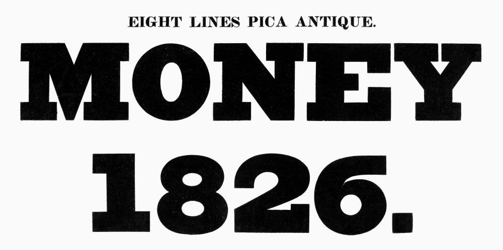
Walter Tracy suggests in his book Letters of Credit that advertising brought these faces into being in the early years of the nineteenth century, ‘when the promoters of lotteries, entertainments and coaching services wanted their placards to shout to the passer-by with a louder voice than had been delivered by the display sizes of the Caslon and Baskerville style types previously in use1. As each poster emphatically vied for the viewers’ coveted gaze, the posters quickly became a smorgasbord of information.
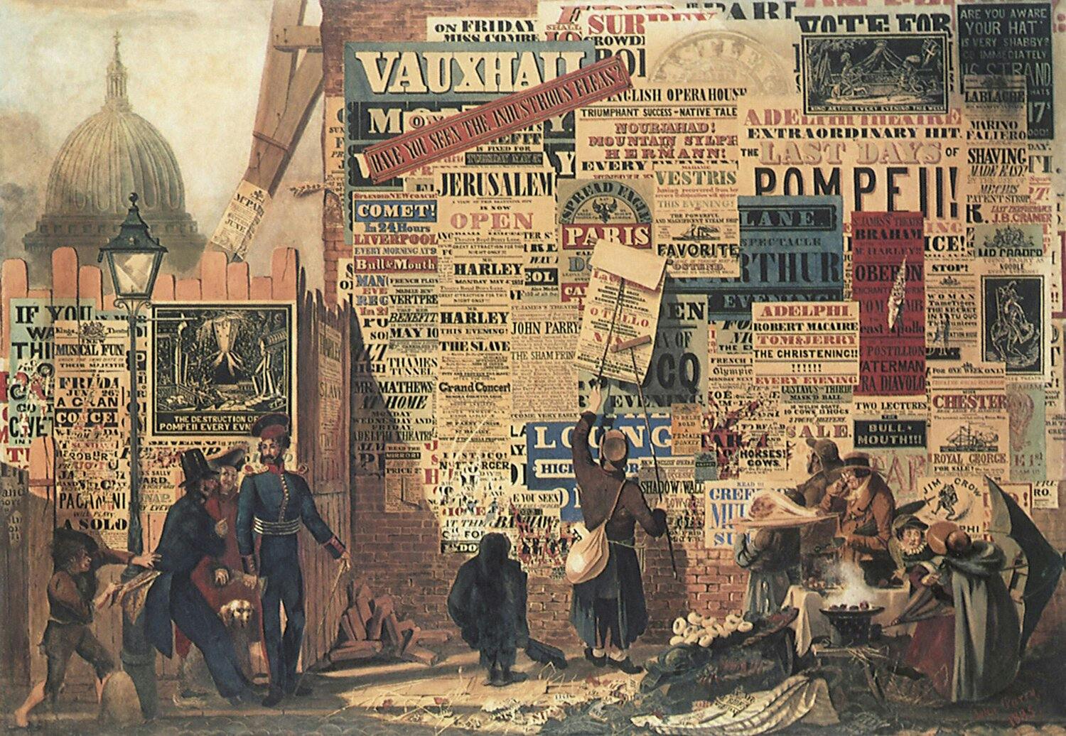
The ability to shape text in a way that emphasizes (or de-emphasizes) information is a fundamental skill of the graphic designer. These posters showcase many of the now common conventions used to create hierarchy in a body of text. Type style, size, weight, color, proximity and various stylistic effects are just some of the ways designers create hierarchy. Individually these conventions serve a useful purpose: without visual clues, the reader finds it hard to navigate a text and becomes disinterested. A similar problem occurs at the opposite extreme when the use of too many devices at one time clutters the page and inhibits communication. The posters above show that a working hierarchy is as much a product of holding back information as it is about pushing information forward. These principles provided the historical and theoretical framework that would guide the development of Charlie.
The use of the word ‘historical’ above needs some clarification. Charlie can be seen - much like the slab-serifs of the 1930s - as a revival ‘not of the actual nineteenth-century Egyptians but of the idea of slab-serif’2. Charlie is not intended to be a revival and its formal relation to humanist models diverges from the tradition of slab-serif genres that emerged during the nineteenth century. Charlie’s formal principles are governed by the intended function of the typeface; to equip the designer with a precise tool to control hierarchy. As a tool for graphic designers, Charlie proposes that the identity of a typeface (what makes it unique) is not simply a product of its formal considerations, but also of the way it functions in use.
Optical Weights
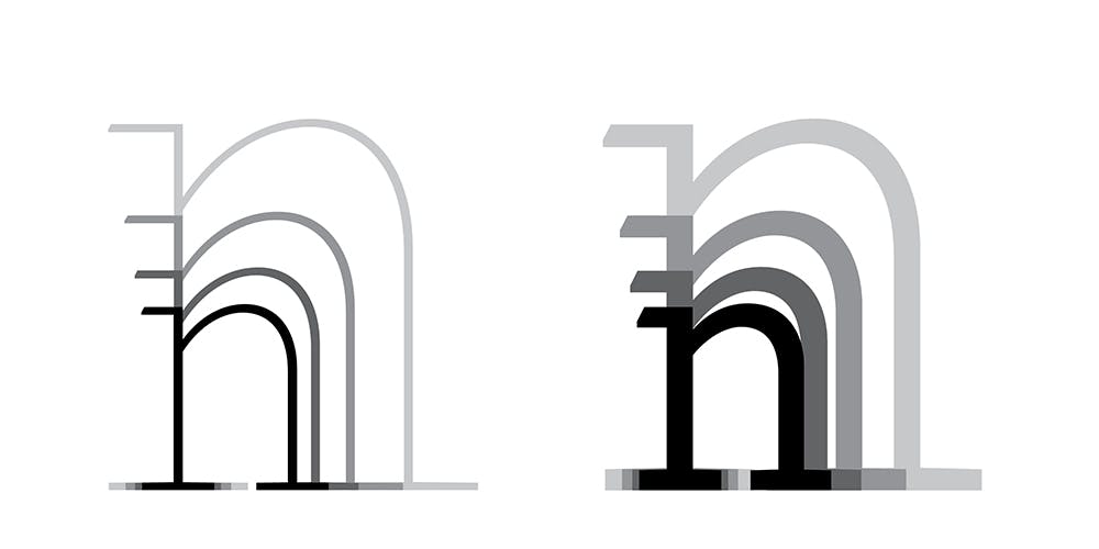
Each of Charlie’s lighter weights (Hairline, Thin, Light, Regular) are available in two optical sizes, one lighter than the other. Unlike other typefaces with optical sizes, Charlie’s exist to match together at specific intervals of display sizes. As an example of this system, the Regular weight is twice the stroke width of the Light (-). A consistent texture can be achieved by using the Light (-) weight at double the size of the regular weight. This and similar combinations produce equally heavy letterforms at varying sizes.
Weight Calculator
To easily understand and use Charlie’s weight system, an online weight calculator has been developed. The weight calculator allows the user to input a type size at a specific weight and return a series of sizes for the corresponding optical weights. This creates a straightforward process, allowing the user to switch back and forth between design applications and the web-based tool.
Notes on the development
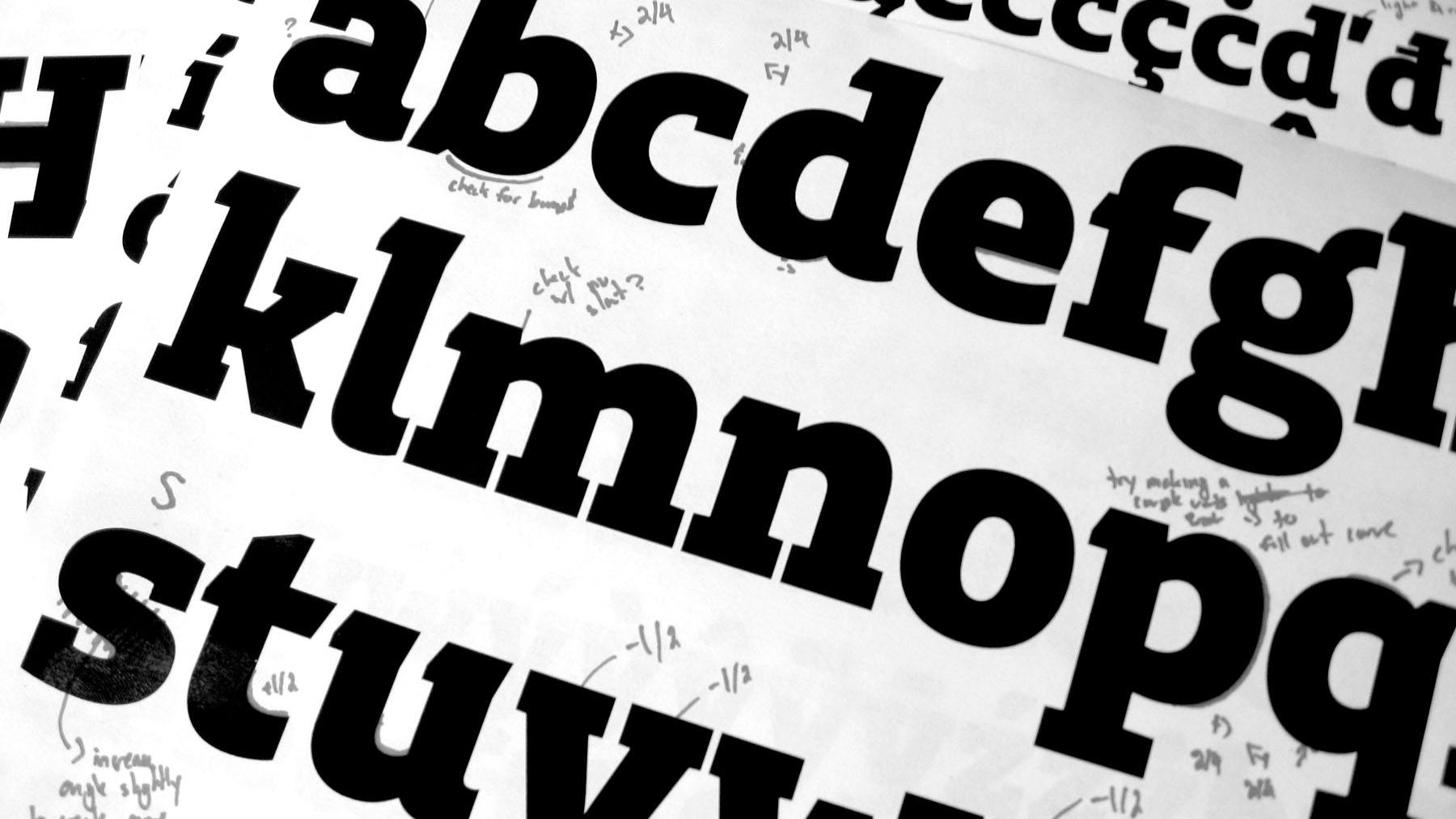
While Charlie’s roots can be traced to my work as a graphic designer the typeface itself began in 2008 as my thesis project in the Type & Media course at the Royal Academy of Art (KABK) in the Hague. The classroom offered the ideal opportunity to test an idea without worrying about the practical viability of the typeface in the design market. The culmination of my work in the Type & Media course was Foxtrot, a typeface that can be regarded as the beta version of Charlie.
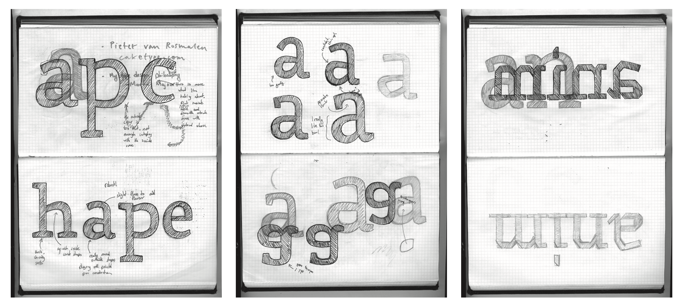
Initially conceived for running text at display sizes, the proportional weight system is ideal for large display settings like those found in exhibition environments. To my delight this idea has become highly applicable in other contexts, often with surprising results. Magazine covers, known for their expressive call-outs and multiple typographic treatments are in many ways the contemporary equivalent of the nineteenth century wood type poster. Other editorial examples, such as headlines and the interior call-outs within magazines are also ideal settings for Charlie’s weight system.
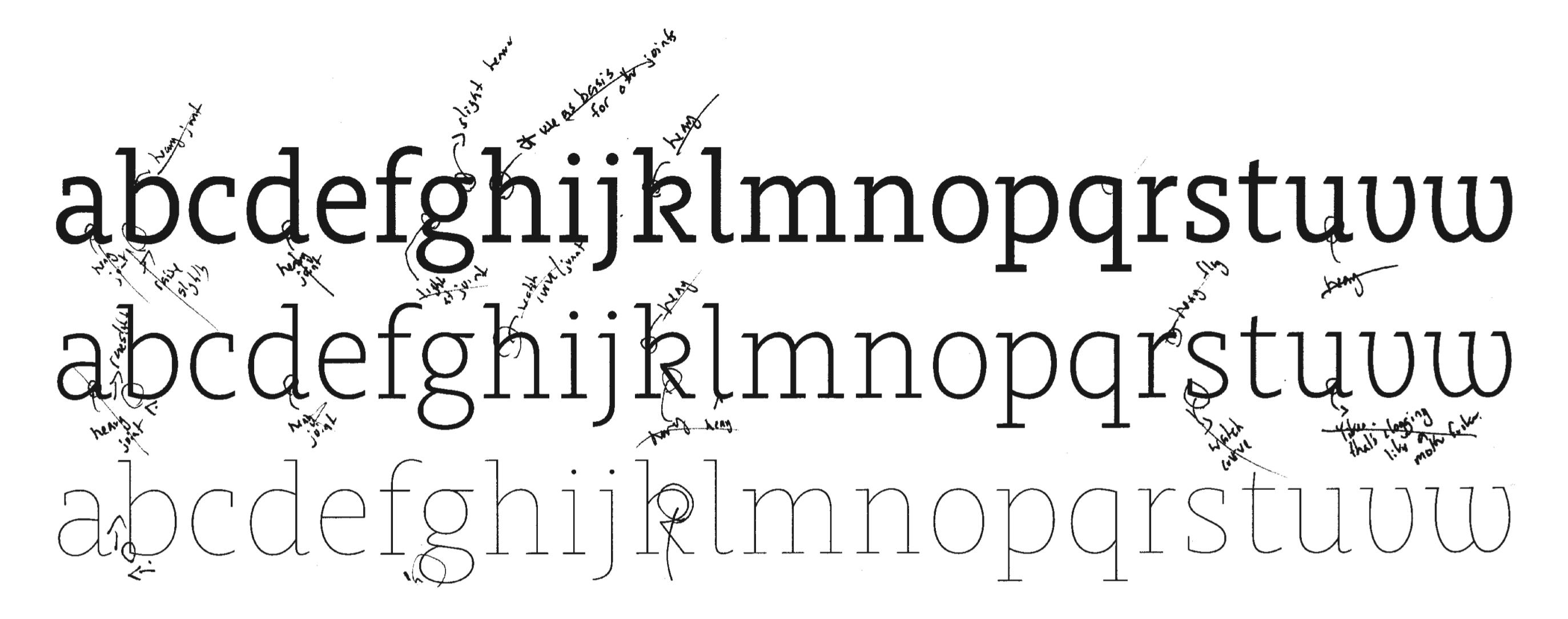
Throughout its development, additional care has been taken to ensure Charlie’s suitability for text settings at book and editorial sizes. The character set has been expanded to include support for Central and Eastern European languages, and a series of bullet figures, arrow sets and icons have been created to support Charlie’s use in museum and gallery settings.
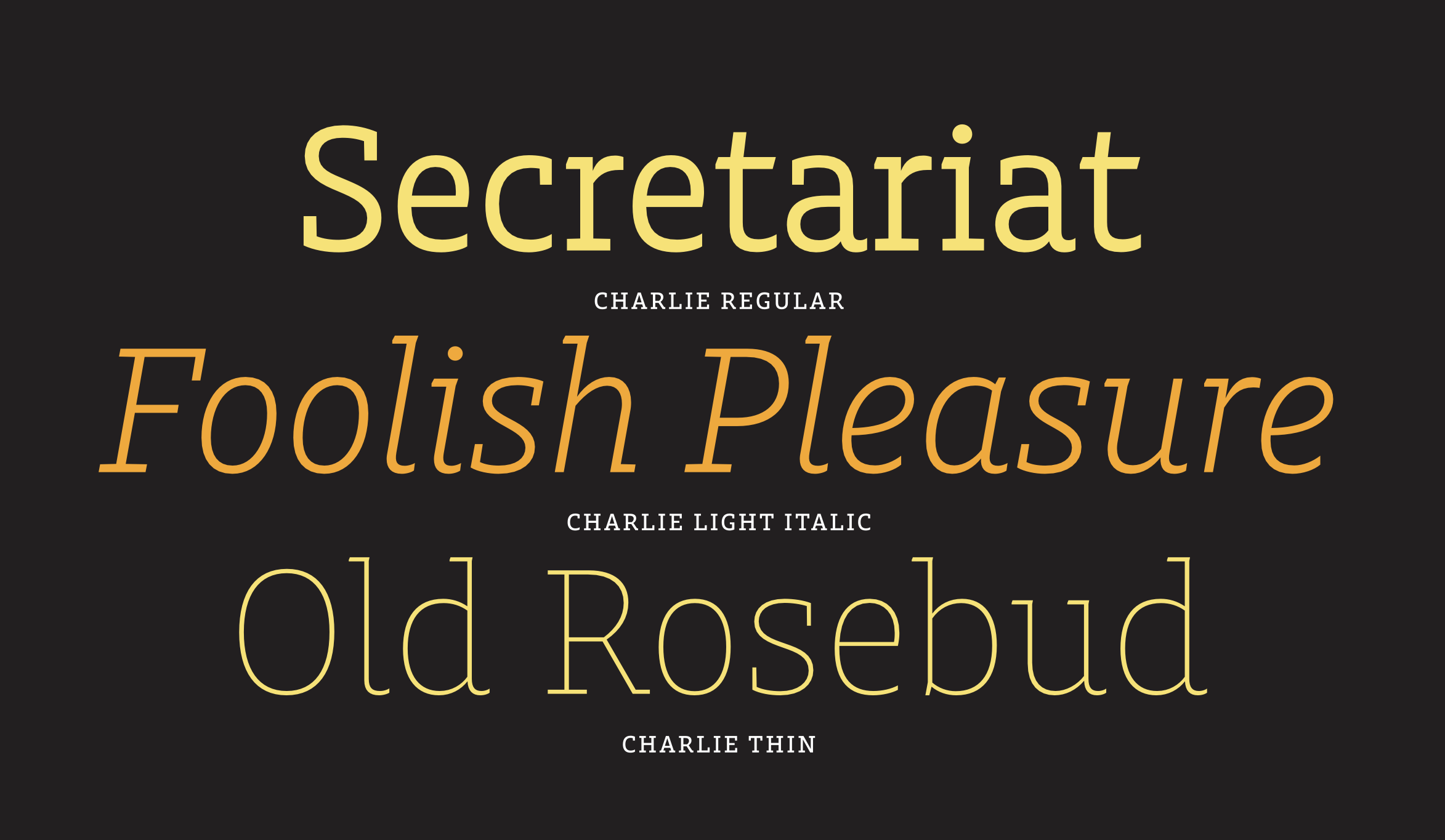
From its inception, a partial aim of this project was to explore how hierarchy can be shaped by the tools we use. By breaking the bond between the size and weight of text, Charlie places more control in the hands of the designer. Twelve weights and 24 styles later, Charlie is a versatile typeface suited for settings well beyond its foundations in display typography.