Czechoslovak Typography Connections
Until the end of 18th century, black letter had a strong influence on Czech printing. With the exception of a 15th century Czech version of black letter known as the ‘Czech Bastarda’, Czech printing has not significantly contributed to the formal development of Latin type. This is mainly caused due to a religious reformation led by Jan Hus which prevented Renaissance and humanistic movements from Italy from spreading through Czech territories. Additionally, there were financial and technical obstacles which made printers to turn to existing German or Austrian printing types. In the 19th century, the Latin Roman type become a symbol of Czech national revivalism and subsequent development allowed for a gradual transition from blackletter to Roman type.
The beginnings of the modern phase of Czech type can be said to start in 1918. This is when Czech and Slovak nations united into one country. Increasing nationalism of the 1920s paved the way to a search for ‘national character’ in all creative disciplines; and it is interesting to observe that searching for a national identity was as relevant as it is today.
Changing conditions and the building of a national awareness resulted in a real demand for new type. The International Exhibition of Decorative Art in Paris in 1925 represented a challenge for Czech typographic circles who commissioned Vojtěch Preissig (1873-1944), graphic and book artist, to produce an original Czech printing typeface. His Preissig Roman was exceptional in a way that it integrated Czech accents into the Latin character set.
Slavoboj Tusar (1883-1950) was another Czech typographer to create a special printing type for a book destined for the Paris exhibition. His Tusar’s Roman was the first Czech typeface produced by Monotype for their typesetting machines. In 1936, Tusar added a few Roman alternatives to the cursive lowercase letters in order to improve legibility.
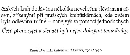
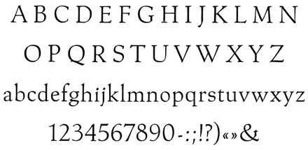
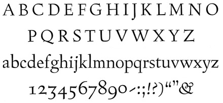
When the State Printing House in Prague bought a modern engraving machine in 1925, the technical aspect of type production improved. Karel Dyrynk (1876-1949), the director of the printing house and a great promoter of Czech typographic work, took the advantage of the improved technology and designed five new typefaces, all rather decorative, keeping strong links with several well-known historical models, while at the same time retaining a particular charm as can be seen in: Malostranská Antikva (1927), Dyrynk’s Roman (1928), or Gregr’s Roman (1930).
Unlike previously mentioned predecessors, Oldřich Menhart (1897-1962) dedicated all of his time and energy to type design and theory, working at an international level. Paradoxically, in spite of his efforts to enrich modern Czech type, his debut typeface Menhart’s Antikva (1932) was produced abroad, by the Bauer type foundry (Bauerische Giesserei) in Frankfurt. Its international success raises a question about its appearance: did a distinctly Czech spirit, or widely appreciated calligraphic principles make this text typeface so attractive?
His second typeface, also skillfully based on writing principles, is Menhart Roman (1933-1934), published by Monotype in 1934-1936. In his booklet about the new typeface, Menhart defined his views and requirements of a modern text typeface: “A new era needs a new form of type; it is useless to add decoration to historical models; there is an abundance of copies of historical typefaces, destined for book printing, which have already fulfilled their mission to stand against the fashionable type of the late 19th century”. Menhart’s great contribution was to promote a realistic way forward: to continue reasonably with the tradition, taking from it what is not subject to change and to build on a solid foundation while following a new modern spirit.
Menhart Roman was meant to be a distinctly Czech typeface in its expressiveness: according to Menhart, the alphabet was a visual manifestation of the spoken word, with a direct relationship to the content and form of language. Menhart, like Preissig, realized that type for the Czech and Slovak languages would require attention to be paid to the design of diacritics. He was searching for appropriate forms of the lettershapes, which were not to be imposed by Renaissance or Neoclassicist models, but neither by mathematical/rational construction. Retourning to the pre-Roman sources he had found inspiration in the simple strokes of the Greek alphabet, Menhart designed his Latin characters using his profound calligraphy experience.
Menhart’s long experience in observing type and lettering would lead him in sharpening his perception of the emotional effects letterforms have on the reader. In his book Tvorba typografického písma (1957) (A Guideline of Designing typefaces), he wrote: “... typefaces, as well as people, have a face, that their voices can be friendly or rough, cold, angry or demanding”. He went on to say that the visual form of a typeface is able to provoke in the reader a whole range of associations before he actually knows the content of the text.
[signup]Only his third typeface Manuscript (1946) was released by the local type foundry Slévarna písem in Prague and was inspired by the author’s handwriting adjusted for the typesetting technology. Figural (1940-1948) is widely regarded as his most mature typeface design and appears more severe and angular, less based on calligraphy as Menhart’s earlier typefaces. Oldřich Menhart, as a designer and an author, was ahead of his time. His legacy is vital to contemporary designers and serves as a unique source of inspiration. One can see a link connecting him with other Czech type designers. With his type production he freed himself from the overbearing historical associations that was evidenced on most of typefaces produced in Czechoslovakia.
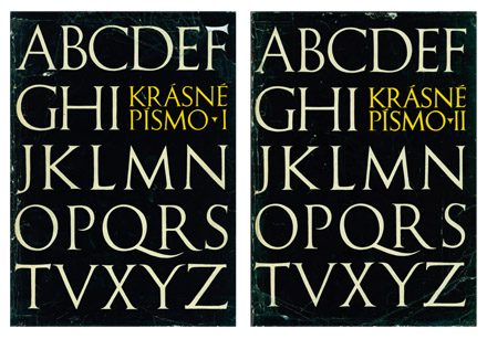
An important figure for Czech type history is František Muzika (1900-1974), multidisciplinary artist working as painter, graphic artist, stage designer and teacher. In 1921 he became a member of the avant-garde movement Devětsil (Nine Forces), where he created life lasting friendship with other members of Devětsil, poet Jaroslav Seifert, who in 1984 received Nobel prize for literature, and Karel Teige, modernist designer, editor and art critic. After the World War II he became a professor at the Academy of Arts and Design (AAAD) in Prague (1945-1970). Muzika reflected his long-term interest in type in a monumental 2-volume book Krásne písmo ve vývoji latinky I, II (Beautiful Typefaces I, II) 1958, 1963, an unprecedented account of the development of Latin type, which can be compared to D.B. Updike’s Printing Types. Krásne písmo serves still as an important and unique reference for those studying type history from the invention of Latin alphabet until the 1960s. This valuable and richly illustrated book has been published also in German in 1965 (Die schöne Schrift in der Entwicklung des lateinischen Alphabets. Hanau am Main: Verlag Werner Dausien).
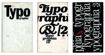
From the profession of a typesetter, Oldřich Hlavsa (1909-1995) developed his artistic sensitivity through a long practice in printing industry, studying type history and avant-garde trends. He admired Teige’s constructivist ideas on one side, but also respected how Sutnar, Menhart and Muzika transfered tradition into modern design. In Hlavsa’s work, typography was conceived as a visual interpretation of the content. Hlavsa was a self-tought designer, and got a first major opportunity to experiment with illustrative typographic compositions as an artistic editor of the Plamen (Flame) magazine. Although Hlavsa has never been officially teaching, encouraged throughout his career by friend Ladislav Sutnar, he spread his knowledge in the typography manual Typografická písma latinková (1957), which was also published in English by New York’s Tudor Publishing as A book of Type and Design (1960). During the Czechoslovakia’s normalization period of the 1970s and 1980s, Hlavsa put his views and polygraphic experiences in a three volume book Typographia 1 (1976), Typographia 2 (1981), Typographia 3 (1986) that became an important reference for the Czech typographic and book culture.
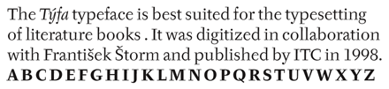
Josef Týfa (1913-) was a good friend of Oldřich Hlavsa. Similarly as Hlavsa, he has always believed in earnest, fine typography, and that a typeface should have a direct relationship to the content of a book. Starting in the field of advertising, in the 1950s he focused solely on book typography. He was hired by several publishing houses in Czechoslovakia and directed the visual identities of large book editions such as Situace, Ypsilon, Most, or Archiv. As a stern believer of supremacy of content, before designing it was important to him to read the content of the book thoroughly. Týfa’s striving for integral design of a book led him to undertake several typeface design competitions. He debuted in 1952 with transitional typeface Kolektiv produced for the type machines, but the most outstanding type he produced was the Týfa Roman/Italic (1960) typeface designed for literature books, which was published also by Berthold for photo composition. This typeface has been later digitized in collaboration with František Štorm and published by ITC as ITC Týfa (1998). More completed version of the same typeface is sold by Štorm Type Foundry.
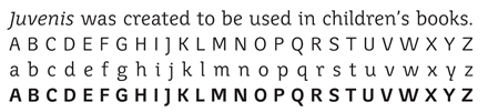
Quite recently, Týfa revisited for the second time an older typeface from the 1960s called Juvenis, designed for children’s books. This low-contrast typeface features asymmetric serifs creating rhythm to the text where no letter resemble each other, thus improving legibility for the novice in reading. In 2002, in collaboration with Štorm they created new italics and published the family by the Štorm type foundry. To round up his typeface creation, it is necessary to mention Academia (1968), and Amos (1982).
A generation younger, Jan Solpera (1939-) was a student of František Muzika. Besides his work in graphic design field, he has been also active as a writer and design critic, contributing to various periodicals focused on graphic design. Solpera’s studies of formal Latin typeface development resulted in his proposal of new type classification system. He divided Latin typefaces into eleven groups, 8 groups of typographic text typefaces, 2 groups of calligraphic and handwritten typefaces and a separate group of black letter. This solid knowledge was further spread to his students, while he was heading the typography department at the AAAD in Prague (1973-2003). Legacy of Muzika’s teachings with respect to the tradition are also reflected in Solpera’s historically reminiscent typeface designs. In the end of the 1970s, he began working on a set of inscriptional capitals to be used for the signage of the AAAD. The originally-proposed name Insignia suggests the form and purpose of the typeface. In 1983, this ‘lineal-serif’ was introduced to the public when the typographer Bohuslav Blažej published it in the magazine Typografia. Ten years later, Oldřich Kulhánek chose the typeface for the current edition of Czech bank notes. Following the project, Solpera was commissioned to adapt the font for the new Czech National Bank identity, but it ended up only in the bank’s logotype, as the institution considered the adaptation too ornate. In 1999 Solpera added the lowercase characters and reworked some details in the capitals. He then asked František Štorm to digitize his font, and in 2000 the extended family of 16 variants was published by the Štorm Type foundry under name Solpera.
Although retired from teaching, Solpera is still active as type designer. In 2005, he released in collaboration with Štorm his typeface from the 1960s, Areplos. In this design, he questioned the basic morphology of the alphabet, and created a type ‘at the top with, at the bottom without’ serifs. Areplos addresses the research in Latin type that one reads mainly the upper half of the letters and legibility is aided by serifs in those parts. The challenge for the designer was in colour balancing of the individual characters, as it was necessary to achieve that the upper half of each letter should have a visual counterbalance in its lower, simpler half. Specifically, this meant to find the correct shape and degree of thickening of the lower parts of the letters.
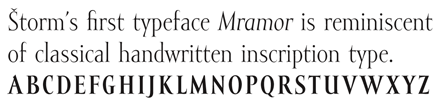
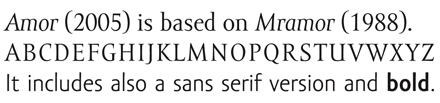
In a small Czech type design scene everyone seems to be interconnected. František Štorm (1966-) graduated from the AAAD in 1991 where he studied book and type design under Jan Solpera, and worked as his assistant at the same department between 1991-1995. In 1993 he founded the Štorm Type Foundry and began to revive the work of the great Czech typographers such as Slavoboj Tusar, Vojtěch Preissig, Jan Solpera and Josef Týfa. Today he is the head of typography at AAAD and is influencing the next generation of designers. For Štorm ‘history is a key to the present and the basis for the future’. He is well informed about the materials at the Department of Rare Books at the National Library in Prague, as well as at Prague Castle and he regularly visits the libraries attached to monasteries around the country. His first typeface drawn under Solpera’s tutorship is Mramor (1988-1994), reminiscent of the handwritten classical inscription typeface. In 2005 improved and published under name Amor.
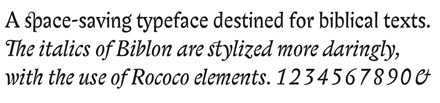
Carefully studied Baroque models, Štorm’s favourites, are evident in typefaces such Regent (1994), Serapion (1996) and Biblon (2000). Biblon with simplified version of italic is sold by the International Typeface Corporation as Biblon ITC. Serapion served as a starting point for Sebastian (2003), a typeface which simultaneously reveals a reflexive parody of type design traditions, while referring to both formal sources: the modern grotesques and post-renaissance serifed typefaces.
In response to the absence of local fonts, Štorm’s type foundry has released more than 55 large type families in 13 years existence. This unprecedented collection of styles is reflecting peculiarities of the Czech language as well as Štorm’s personal love affair with vernacular and official typographic development.
Although Slovak-born Zuzana Ličko (1961-) hasn’t been directly in touch with the Czechoslovak scene, she influenced a generation of type designers in the 1990s who used her work as an exemplar of contemporary digital type design. In 1985, at the age of 24, she designed her first typefaces for the Macintosh computer and the dot matrix printer. Her approach was driven by technological limitations and has changed the traditional view of type-making. She started with highly geometric typefaces based on the pixel grid of the computer screen. Although Emperor (1985), Universal (1985), Oakland (1985), and Emigre (1985) are coarse bitmap shapes guided by a specific functional intent, they became immediately recognizable and proved the potential of bitmap type.
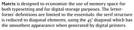
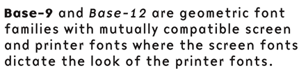
[social]Matrix (1986), Modula (1985), Citizen (1986) and Base (1995), amongst others, comprise a subsequent series of fonts by Ličko which followed the early bitmap type, profiting from the increased technological advances and the introduction of PostScript. Matrix is designed to economize the use of memory space for both typesetting and for digital storage purposes. The letterforms’ definitions are limited to the essentials: the serif structure is reduced to diagonal elements, using the 45° diagonal which has the smoothest appearance when generated by digital printers. Modula is a geometric headline font derived from the Emperor bitmap typeface. The intention to adapt it for smooth laser printing resulted in simplified diagonal and circular segments. Citizen is an experiment with the bitmap ‘smooth’ printing option. The features of smooth printing are approximated with the use of straight line segments, creating the illusion of round shapes. Base-9 and Base-12 are geometric font families with mutually compatible screen and printer fonts where the screen fonts dictate the look of the printer fonts. A decade later, Zuzana Ličko made use of the many lessons that she had learned from her early bitmap experiments.
More recently, Emigre’s move towards more traditional text faces was motivated by Emigre magazine’s (discontinued in 2005) shift to text-heavy issues. Mrs Eaves (1996) is a Baskerville revival. The font’s soft appearance tends to approach the letterpress feeling. Thanks to the many ligatures, it offers the possibility of enriching text with sophisticated decoration. Filosofia (1996) is a revisited Bodoni. Softened by round serif terminals and reduced contrast, this design is also reminiscent of the letter-press technique. Solex (2000) is a sans serif exploring the morphology of the industrial sans serifs. It aspires to belong to the grotesques family while distinguishing itself from popular faces like Meta Sans or Officina Sans.
The Czech Republic and Slovakia peacefully seceded from a single state in 1993. Traditionally, many Slovaks have often studied in Prague, the Czechoslovak cultural capital, in order to obtain a more specialized education in the graphic arts and typography, among other fields.
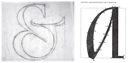
From 1986 to 1992, a Slovak designer Andrej Krátky (1966-) was one of the students under Jan Solpera at AAAD in Prague but his early type experiments were influenced also by his father, typographer Ľubomír Krátky. In 1988, he conceived Nara (formally called Adriq), probably the first digital outline font family in Czechoslovakia, just before PostScript technology became available. Nara was digitized in METAFONT, the programming language devised by Donald Knuth as part of his TeX typesetting system. The laborious production process was probably the reason why this typeface remained unfinished. Through Krátky’s analytical approach, Nara aimed to connect two contradictory principles: a dynamic serif design that would adopt several construction elements from a static serif morphology. This attempt resulted in a legible calligraphic typeface with constructed serifs, making it more modern and stylish – distinct from traditional renaissance models. The author recognized that it is not the angle of the slope that makes cursive letters unique, but their informal, handwritten construction. Krátky’s innovation was to include two complementary typefaces in the Roman family: cursive and italic. In collaboration with Peter Biľak, Nara is currently being completed and expanding into a larger typeface family to be published by Typotheque in 2009.
At the start of the 1990s Krátky moved back to Bratislava and inspired several graphic design students at the Academy of Fine Arts & Design (AFAD) to design their own typefaces.
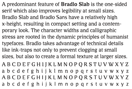
His second font family Bradlo (1994) was designed exclusively for one of the largest Slovak bank, with the goals of legibility, originality, contemporary appearance, and compatibility with current technology. A predominant feature of Bradlo Slab is the one-sided serif which also improves legibility at small sizes. Bradlo Slab and Bradlo Sans have a relatively high x-height, resulting in compact setting and a contemporary look. The character widths and calligraphic stress are rooted in the dynamic principles of humanist typefaces. Bradlo takes advantage of technical details like ink-traps not only to prevent clogging at small sizes, but also to create a formal texture at larger sizes. Although Bradlo was fine-tuned to address the bank’s financial purposes, including the design of tabular figures, the font family has never been used by the intended institution. Instead, it was published by FontShop in 1995.
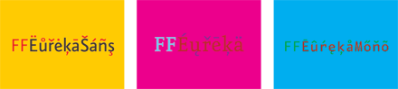
Peter Biľak (1973-) first learned about type design from Menhart’s books. In his teenage years he read his type design manual Tvorba typografického písma (A Guideline of Designing typefaces), which he found deeply inspiring, encountering for the first time practical information about type design. At that time, Menhart’s books were all that could be found in Czechoslovakia, and these books served as inspiration for many students. Krátky has set up the first Apple computer lab at the Academy introducing the new possibilities to the students. Here, Biľak started drawing his first typeface Affiatus (1991), which was never released. Quoting Biľak: ‘Luckily, all the files have been lost’. The experience was not lost however, and there is a visible influence of Menhart in Biľak’s first published text typeface Eureka (1995). It is largely in the sturdiness of the construction, and the way the designer adjusts the proportions of Eureka to accommodate the accents. Similarly to Menhart, Biľak observed that languages which make extensive use of diacritics such as Czech and Slovak require modified proportions, for the most part a lowered x-height to create room for the diacritics. Eureka was created for the bilingual (Slovak/English) setting of his M.A theses Transparency (1997), and is particularly suitable for Central-European languages. Eureka was also one of the first published FontShop typefaces to cover CE languages. From 1995, Biľak has worked and lived mainly outside of Slovakia. Because of his continuous interest in design criticism and publishing, he kept in contact with trends in Slovakia and Czech Republic by contributing to local magazines such as Deleatur, Designum, Typo and also magazines abroad such as Emigre or Print. In 2000, Biľak together with Stuart Bailey founded Dot Dot Dot magazine, a bi-annual journal concerned with design, art, music, film, and language.
Also in the second of Biľak’s text typeface, Fedra Sans (2001), one can observe Menhart’s influence, mainly in the way how author reconciles historical examples with contemporary requirements. Fedra Sans is not based on any historical models, rather it is a synthesis of various drawing principles. It combines gestures of fast hand-writing with a geometric approach aimed towards effective printing on low resolution devices. As for many designers in the former Czechoslovakia, it is not just the past but also the present which serves as inspiration for Biľak’s work. Fedra Sans was released in 2001, followed by Fedra Serif in 2003, both published by Typotheque, type foundry that Biľak started in 1999.
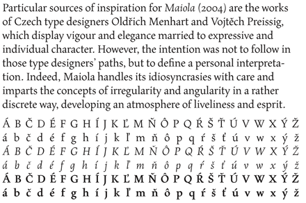
Born in Prague, Veronika Burian (1973-) lived most of her life abroad. She began her first type design project as part MA Typeface Design course at the University of Reading in 2003. Particular sources of inspiration for her text typeface family Maiola (2004) are the works of Czech type designers Oldřich Menhart and Vojtěch Preissig. Although it keeps strong links with historical models by implementing old-style features and calligraphic influences, the intention was not to follow in those type designers’ paths, but to define a personal interpretation. Maiola handles its idiosyncrasies with care and imparts the concepts of irregularity and angularity in a rather discrete way, developing an atmosphere of liveliness and esprit. The Italic clearly has an expressive and independent personality, communicating more frankly the movements of the pen through its sharp and cutting appearance. In addition to the regular character set; Maiola also includes Central European, Cyrillic and Greek versions and is since 2005 available at FontShop. In 2006, Veronika Burian co-founded with José Scaglione the font label Type-together.
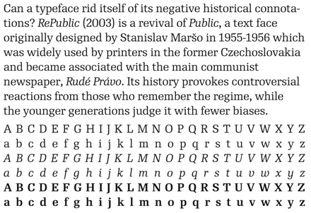
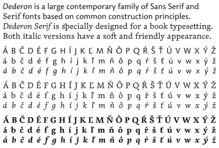
Tomáš Brousil (1975-), a student of František Štorm at AAAD, was born in Slovakia and lived most of his life in Prague. He has been developing digital fonts for his Suitcase type-foundry based since 2003. So far, he has been learning fast with assistance of Menhart’s typography books, from example of František Štorm and most of all from the autonomy of his own practice. Unlike his teacher, he prefers reviving younger Czech typefaces from the 1950s-1990s, or searching for his own formal solutions to make typefaces appealing for the fellow graphic design audience. In 2005, he was awarded the first Linotype Scholarship to study at MA Typeface Design program at the University of Reading. A selection of his recent typefaces includes RePublic (2003) and Dederon (2003).
RePublic is a revival of Public, a text face originally from the 1950s which was widely used by printers in the former Czechoslovakia and became associated with the main communist newspaper, Rudé Právo. Its history provokes controversial reactions from those who remember the regime, while the younger generations judge it with fewer biases. Public was designed by Stanislav Maršo, and in 1955 won a competition which resulted in the publishing of the typeface by Grafotechna. The original face had regular, italic, bold and bold condensed variants, and was appreciated for its legibility when the quality of paper and printing was relatively low. The new family has since grown to sixteen variants and four weights. The new design offers a more systematic look and is versatile in its use. RePublic approaches the original typeface with its prejudices in check and reveals the face’s qualities in a contemporary context.