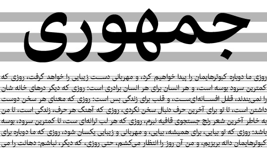
Harir - Reducing Noise in Arabic Script
When I was in elementary school I really didn’t like conventional Persian typefaces. They seemed very noisy with their inelegant spacing and lack of even minimal kerning. Mechanical typesetting systems had proved to be ill-suited to reproducing the graceful, historic shapes created by calligraphers, who had far more flexibility in drawing and combining letters. And these awkwardly adapted letters were directly transferred to digital typesetting systems as well, with the result that a whole nation had to adapt to a new type of writing system that was aesthetically inferior to and less readable than traditional handwriting.
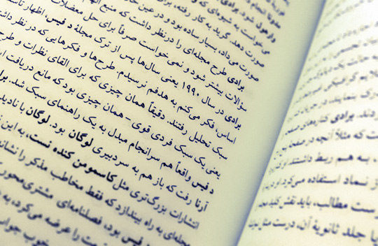
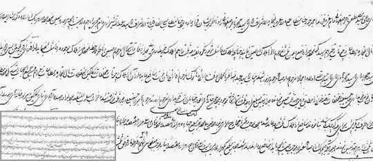
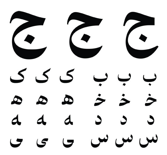
Typical layout of a Farsi book set with an early Arabic typeface from the 1970s. The word shapes are noisy, the negative spaces between and within letters are unbalanced, and the text has an inconsistent pattern. This example perfectly demonstrates the gap between traditional Persian handwriting and conventional Persian text typefaces.
Negative Space in Persian Calligraphy
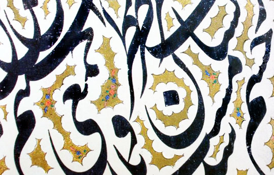
The beauty of Persian calligraphy lies in a complex system that developed over centuries, finally culminating in the Nasta’liq style. It includes principles that govern not only how letters and words combine, but how negative space is managed to produce consistent text lines and consistent text colour throughout those lines. For example, the principle of Khalvat va Jalvat (Persian for “expansion and contraction”) governs the position of individual letter combinations to distribute the negative space throughout the lines so every word has the same grey. This is similar to letter spacing and kerning in roman scripts, but much more complex because the heights of individual connections change dynamically to harmonise the negative space around the letter fusions. Another important principle, Savad va Bayaz (“white and black”), governs how letters and letter combinations should be shaped to produce an even pattern throughout the text; it deals with the proportions of letters and the relationship between the black space of the letters and the white space of the counters. Thus far, digital emulation of all these parameters has proven impossible or impractical, and although some digital Nasta’liq systems are available today, none even comes close to fully emulating the complex balance of handwritten script.
Another important feature of Persian calligraphy related to the management of negative space is the use of diacritics. Naskh, the calligraphic style from which most Arabic/Persian typefaces are derived, was created for writing long passages of the holy Qur’an, and its design incorporates diacritics, which not only avoid ambiguity when reciting the text, but also shape the negative space around the words. When Naskh letters were adapted for mechanical typesetting they were stripped of their diacritics, but the design of the letters remained unchanged, violating the principle of Savad va Bayaz and unbalancing the negative space. On the other hand, using diacritics is no panacea, as demonstrated by the countless inscriptions with awkward diacritic placement. Furthermore, Nasta’liq is largely written without diacritics, managing negative space either by defining it with an abrak (Persian for “tiny cloud”) or by slanting the baseline to allow letter combinations to stack and better fill the space.
Some calligraphers say that abrak is only ornamentation of the layout and has nothing to do with the negative space. But so often when we remove the abrak we can notice that the calligrapher wasn’t able to perfectly manage the negative space and used abrak to hide the lack of good letter spacing and adherence to the basic principles of Persian calligraphy.
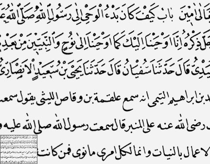
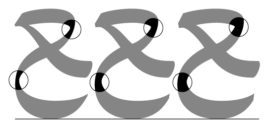
Part of an inscription from the holy Qur’an and Hadith. Notice that removing diacritics causes inconsistency in word shapes compared to a text with diacritics (especially noticeable at small sizes). When reading the bottom text the eyes move in a zig-zag pattern, but in the upper text the reading path is more horizontal.
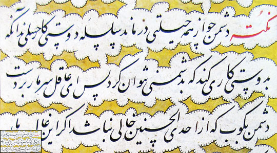
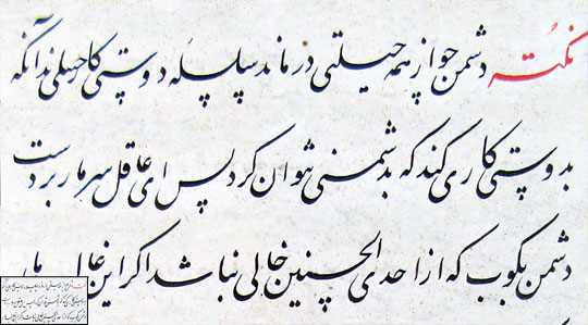
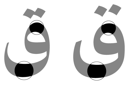
Part of a Persian Inscription written in Nasta’liq style; the abrak completes the negative space between the lines; without the abrak the layout is unattractive (especially noticeable at small sizes). The result is a zig-zag reading path.
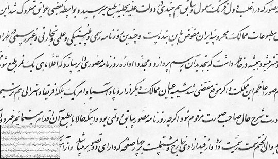
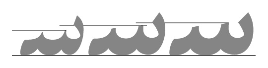
Part of a Persian official letter written in Shikaste Nasta’liq style. Letter connections and the baseline are slanted to facilitate writing, and the letter combinations stack on each other, conserving space. Negative space is balanced throughout the lines of text, and the text colour is uniform.
[signup]Redesigning the White Space
Computer typesetting and the limitations of the OpenType system impose multiple compromises on Arabic typefaces. In fact, using OpenType to create a conventional Arabic text typeface with balanced white space is nearly impossible due to the fact that the correct positioning of the dots is determined by the word shapes, not the letter shapes. Furthermore, elements of the letter shapes (such as the horizontal position of the baseline and the structures of the connections between letters) are also dynamic, tied to the shape of each word and the surrounding words as well. Thus redesigning the letters to make the white space beautiful presents a significant challenge.
Harir is designed to take advantage of the horizontal lines created by the stroke contrasts. Counters are larger, bringing their upper parts into alignment with these black zones, and dots are also placed in these zones wherever possible. This emphasizes the black zones and creates two parallel white zones, leading the eye smoothly across the text. Noise around word shapes is reduced, letter combinations are more consistent, and the essential structure of the conventional letterforms is preserved.
Horizontal black zones in Harir typeface.
Sketches and the Design Process
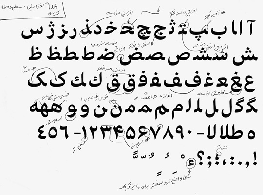
Generally, the structure of Harir is based on Arabic/Persian typefaces like Nazanin and Mitra. (I can’t overemphasize how much the works of Tim Holloway have been an inspiration for me.) I based the calligraphic elements on the Nasta’liq and Naskh styles, drawing occasionally on Thuluth calligraphy as well. The stroke cuts are angled, and the beginnings and ends have the same angle. After I finished the design I noticed that the letterforms had also been influenced by contemporary automobile designs.
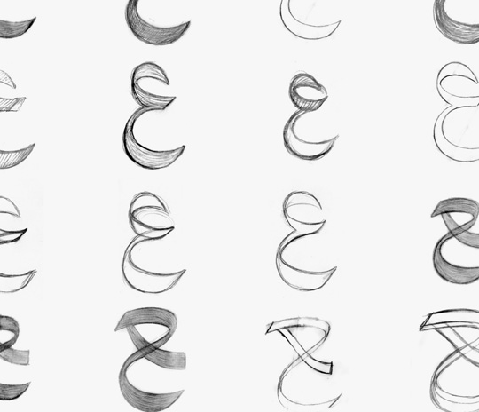
Sketches of the letter “ع”.
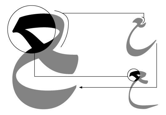
Inspirations from Nasta’liq and Thuluth calligraphy in Harir in the final form of the letter “ع”. The top right letter is in Nasta’liq style, and below it is the same letter in Thuluth style. The terminals of “ح” and “ع” are inclined upward, an element inspired by the same forms in Nasta’liq calligraphy.
Early versions of Harir used a straight baseline, but I eventually switched to a curved baseline, which is more elegant and more typical for handwritten text (especially in Persian culture). I didn’t create discretionary ligatures; they would have created irregularities in the text pattern like “speed bumps” that would slow the reader down. I started with the bold font, generating seven versions during the design process and making minor changes to the typeface at every stage. Afterwards I proceeded to the regular and finally the optical sizes.
The development of letter designs in Harir bold. The letters at left are the final design.
A proof of Harir Caption Bold.
Optical Sizes
When I saw Robert Slimbach’s elegant, modern Warnock Pro I realized that we didn’t have anything like it for Arabic script. In Harir, I worked not only to create more solid, attractive word shapes, but also something delicate, like the calligraphy pieces of Mirza Gholam Reza Isfahani, the master of Siah Mashq or “black exercise” pieces. These works are not created primarily to be readable, but to display combinations of letters in perfect balance and elegance. There are other calligraphers who have created very graceful calligraphies for text purposes, and their works have also influenced me profoundly.
Part of a Siah Mashq piece by Mirza Gholam Reza Isfahani written in the Nasta’liq style. The proportions and details of the letters are perfect in the works of this master of Persian calligraphy.
[social]I wanted Harir to be legible both at text and footnote sizes. I redesigned it to work at smaller sizes, and made some adjustments to improve legibility, following the example of Mirza Mohammad Reza Kalhor, the Persian calligrapher who adapted Nasta’liq style for newspaper lithography in the 18th century.
Part of an inscription by Mirza Mohammad Reza Kalhor. Letters and connections are placed in a way that facilitates the reading of the text.
In Harir Caption, the white space of counters is virtually untouched, while the stroke contrast is reduced, the spacing of dots and diacritics is increased, the teeth are raised to make them more visible at small sizes, and letter spacing is increased to prevent letters from merging into each other. Eventually I ended up with two weights, adjusting them to three different sizes: Display, Text and Caption.
Harir Display in comparison with Harir Caption. In the caption font, contrast is reduced, dots are separated and are also spaced farther from the base character. Horizontal stems, ascenders and descenders in all optical sizes are the same, and the white space of counters is virtually intact.
The height of the teeth has been increased in the Regular and Caption fonts to enhance legibility at small sizes.
A world of global communications demands fonts that support multiple languages and scripts. After Bahman Eslami completed Harir, Peter Biľak developed a special version of Lavato serve as Harir’s Latin character set, perfectly matching its weight, rhythm and contrast. Designers of non-Latin typefaces are often forced to adapt Latin design principles when they want their fonts to work well in multilingual settings. This can result in distorted lettershapes that deviate from the script’s tradition and heritage, impairing readability. Harir and Lava provide a unique combination that enables professional-quality multilingual (Arabic, Latin, Greek and Cyrillic) typesetting with no compromises.
A special version of Lava has been made to match all three optical sizes of Harir.
Erik van Blokland developed tools that made kerning and mark positioning in Robofont a piece of cake. Adding and modifying right-to-left kerning on large character sets is very fast, as is adding marks for Arabic vocalisation.
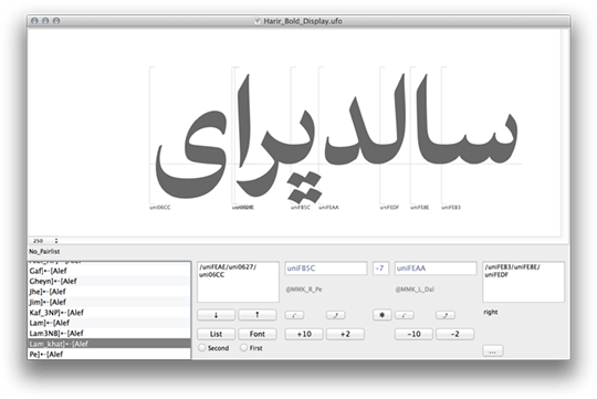
Just like previous Typotheque typefaces, Harir has been mastered and generated with custom Robofont extensions for right-to-left scripts.
Harir is not merely a technological solution, Harir is designed to make text reading a smoother and more pleasant experience on screen and in print.
