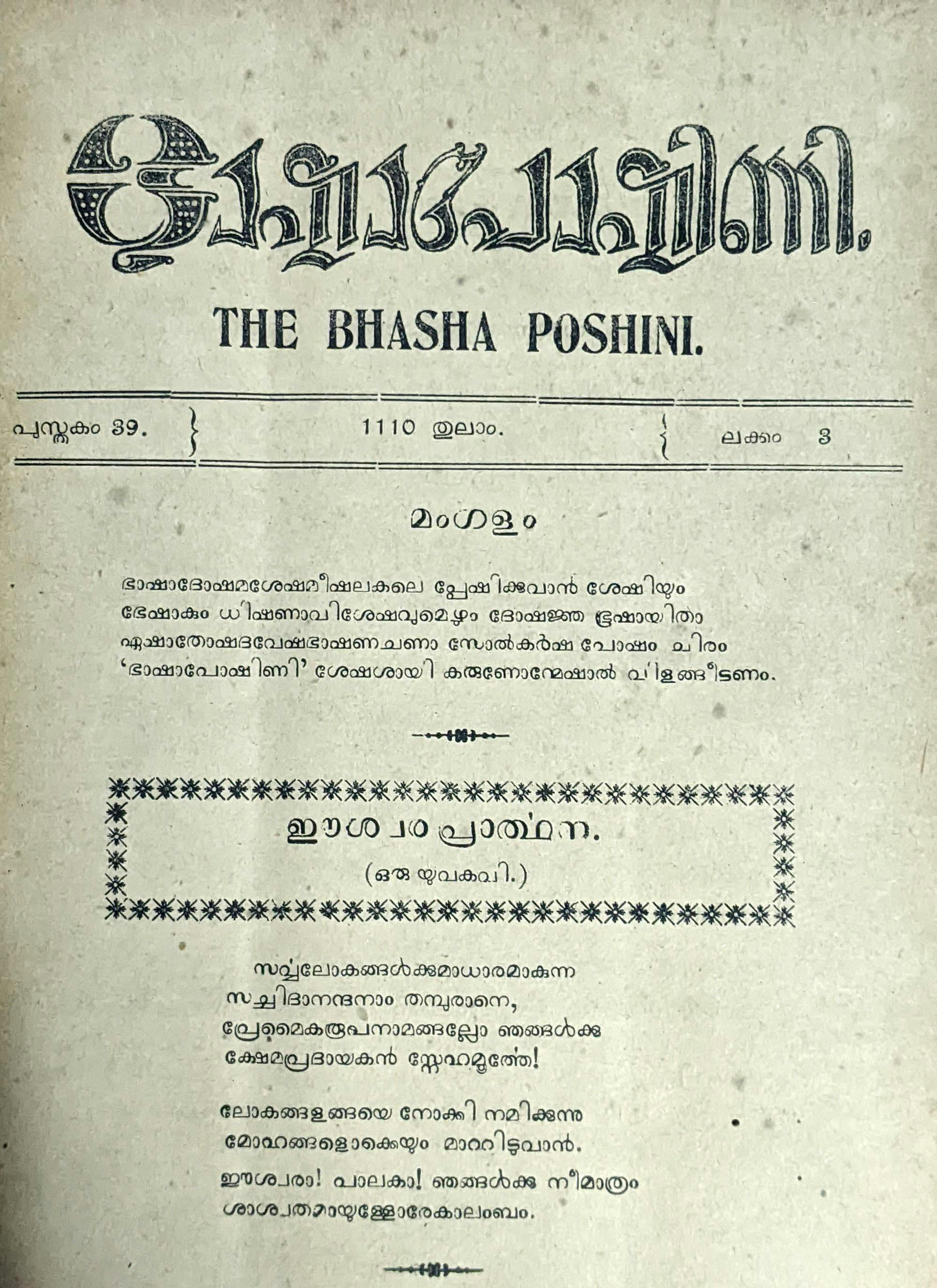
Malayalam: Scripting Tradition and Modernity
The article explores the rich tradition of Malayalam script and its evolution in the face of modern technologies. It delves into the challenges and innovations in adapting the script to digital platforms while preserving its cultural heritage.
Malayalam literary culture is marked by a number of contradictions.
Malayalam, primarily spoken in the Indian state of Kerala, has relatively few speakers (~33 million) compared to other major Indian languages, but it boasts a robust written culture; Kerala has the highest literacy rate in India, and has done since before Independence.
Malayalam-language newspapers have disproportionately large readerships. Malayala Manorama, for example, is India’s fifth most read newspaper with an estimated 8.3 million readers, behind four Hindi-language newspapers. For comparison, Hindi has more than 500 million speakers, over 15 times as many as Malayalam (according to the 2011 Census).
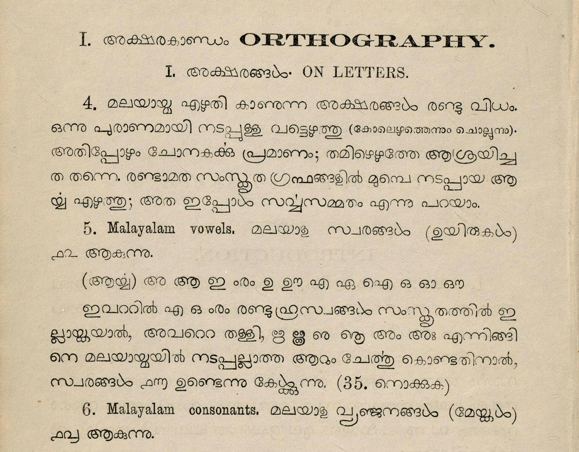
All of this is despite literary Malayalam’s relatively young existence as a medium of literature, compared to India’s other literary languages.
Linguistically, Malayalam can be traced back to Old Tamil, used for literature as early as the 4th century CE. However, from the 14th century CE onwards, a Malayalam literary form, distinct from Classical Tamil and reflecting local linguistic evolution and social conditions, began to take shape.
In the centuries that followed, Malayalam literature continued to grow, but was yet to find a firm footing as a literary medium. In fact, early 19th-century print culture played an important role in this process, allowing not only for standardisation of literary forms, but also an unprecedented level of text circulation and production.
Print and modern literary movements were important in securing Malayalam’s place in the modern world, helping establish its distinct character and keeping it from being overwhelmed by neighbouring languages with longer and more widespread traditions.
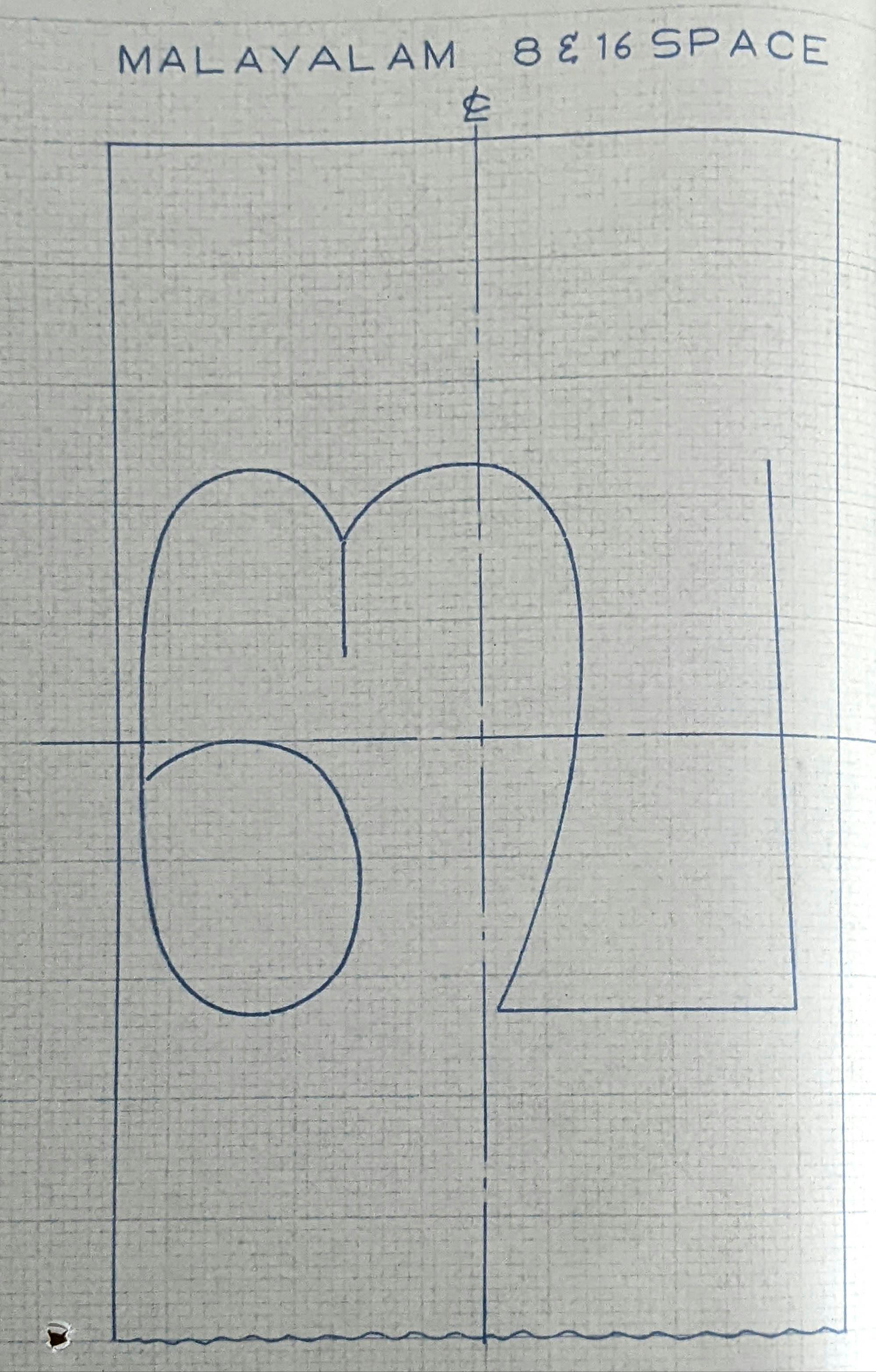
On the graphical level, the Malayalam script is also infamous for having many complex combining forms, arguably more than any other major Indian script. This complexity posed challenges to printers working with metal fonts, challenges that so-called Traditional Malayalam still poses to modern font designers.
How was one of India’s most complex scripts shaped by these same modernising tendencies that Malayalam literature so wholeheartedly embraced? In this essay, we look at the Malayalam Script Reform of 1971, its intellectual and technological lineage, and its consequences.
Pre-modern writing in Kerala
The modern Malayalam script descends from the mediaeval Grantha script, used in the Tamil, Tulu and Malayalam regions to write Sanskrit.
The local variant of Grantha, referred to as ārya eḻuttu (‘noble writing’) in Malayalam, was unsuited to the local vernacular, which featured a number of Dravidian phonemes absent in Sanskrit.
In fact, Malayalam itself was primarily written in the cursive vaṭṭeḻuttu (‘round writing’) script in this period, a script originally from the Tamil region. In pre-modern times, the language variety of Kerala was often still identified as Tamil, and a distinct local linguistic identity had yet to take shape.
The oldest extant written examples of the Malayalam language are also in the Round script, including the famous Vāḻapaḷḷi plates of 882–3 CE. Before printing, the Round script was more popular than the Malayalam script in terms of daily usage.
Around the 1500s, literary Malayalam increasingly began to be written in the Arya script, with letters taken from the Round script to represent Dravidian phonemes. Some orthographic conventions were borrowed from the Round script as well, most notably special letterforms used at the end of syllables, called cillu.
This development was a compromise of sorts, an effort to better accommodate the renewed infusion of Sanskrit loanwords into literary Malayalam, while ensuring that its underlying Dravidian morphology and phonology would still be represented faithfully.
This shared, two-tiered inheritance forms the basis of the modern Malayalam script, and accounts for its ability to write intact (in theory) both Indo Aryan loanwords and its core inherited Dravidian lexicon.
Like much else that characterises modern Malayalam, this parallel system is credited to the legendary Malayalam poet Tuñcattŭ Eluttaccan (albeit without any real evidence).
Early printing outside Kerala
The first book to be printed in Malayalam, Samkṣēpvēdārttham, was printed at Rome’s Polyglot Press in 1772. Alphabetum Grandonico Malabaricum and Centum Adagia Malabaricum followed shortly afterwards. The former is particularly interesting, as a treatise on the Grantha script used in the Malayalam region.
Clement Pianius, a Malayali Christian, cast the font used in these books. The font was reported as tedious to produce, featuring 1,138 individual type punches.
Over the next few decades, more Malayalam books were printed, but outside of Kerala. The first Malayalam font cast in India was at Bombay’s Courier Press, used in the popular Ramban Bible (1811, the first Bible translation into Malayalam), and Drummond’s Grammar of the Malabar Language (1799).
As elsewhere in South Asia, the introduction of printing put pressure on existing multiscriptal traditions. When European missionaries began to print in Malayalam, they preferred Arya script-based writing to the exclusion of the Round script, helping cement the status of the former as Malayalam’s primary script. In fact, the Round script would never even make it into print, although it continued to be used in handwriting1.
Pre-print Arya script writing featured a number of complex combining forms: -i, -ī, -u, -ū, -r̥ mātra forms, as well as stacked consonant clusters. These forms carried over into early printing as well, albeit with great inconsistency.
For example, the -ā mātra was the same across consonants, but in the early fonts it would be cast differently with different consonants, reflecting the carelessness of the typographer. In other words, such fonts were not very typographically sound, and were more functional than aesthetic or internally consistent.
These fonts cast outside Kerala all use blockier inscriptional-style letterforms, reminiscent of Grantha inscriptions, different from the Malayalam script in use today.
Benjamin Bailey and early printing in Kerala
Malayalam typographical development took off in earnest with the efforts of Benjamin Bailey, an English missionary associated with the Church Missionary Society (CMS). Bailey was deputed to the town of Kottayam in 1816 to set up a CMS mission station there, at the invitation of the Raja of Travancore.
A press was set up in 1821, to print materials to aid the society’s efforts in preaching and education. But Bailey was keen on printing texts in Malayalam as well.
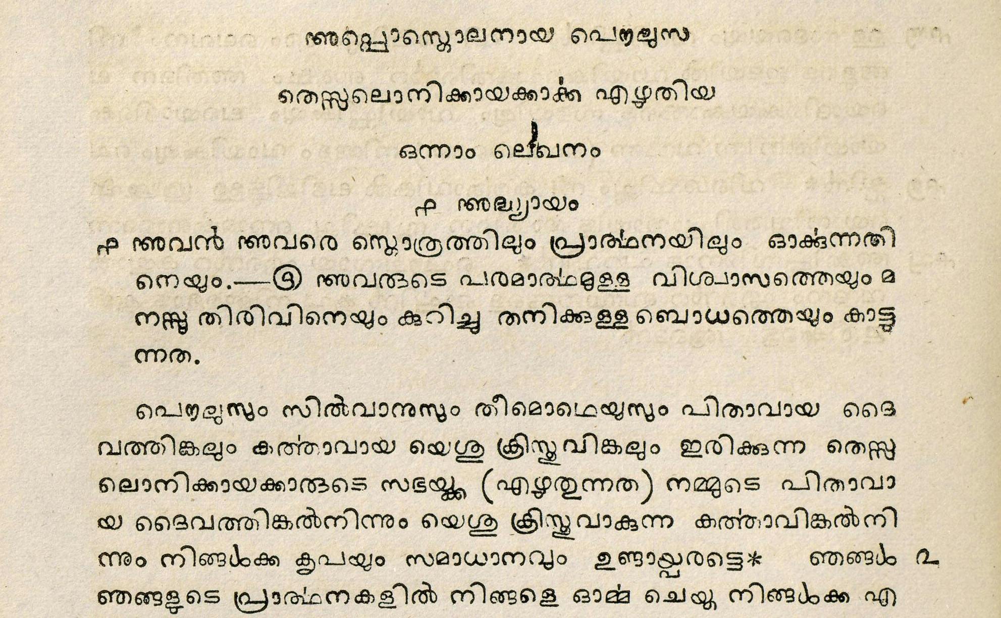
To that end, Bailey’s CMS superiors sent him a Malayalam font cast at their headquarters at Fort St George in Madras, modelled after the Courier Press font used in the Ramban Bible. Two Malayalam books were printed at the CMS press in 1825, using this font. These books – the Gospel of St Matthew and Ceṟuppaitaṅṅaḷkku Upakārārtham – were the first Malayalam books to be printed in Kerala.
Bailey was unhappy with the results, however. The Madras font was, in Bailey’s own words, ‘very defective’, and even ‘nearly useless’. In letters to Madras, he spoke of its inconsistencies in letter shapes and dimensions, and incorrectly shaped letterforms.
Working with local metalsmiths, Bailey designed a new metal Malayalam font (originally cast in silver), making efforts to adhere to the principles of typography. A complete metal font was ready by 1829, and was used to print a Malayalam translation of the New Testament, supervised by Bailey. His new font was quickly recognised for its superior quality and legibility.
Bailey’s insistence on a high-quality font was mirrored by his painstaking effort in ensuring the entire range of complex combined forms was represented by metal types. In fact, another one of his primary criticisms of the Madras font was its deficiency in type sorts for complex forms.
The only attempt he made at the simplification of the system was to detach -i and -ī mātra forms from consonants altogether. This innovation caught on and has been part of printed Malayalam ever since.
Very significantly, Bailey’s seminal 1829 font introduced rounded letterforms, in contrast to the earlier inscriptional-style fonts. They show strong continuity with those found in paper and palm leaf records from the northern Malayalam region, closer to the Kannada region. They also had the benefit of being more compressed, making it easier to reduce type size. Bailey’s font also halved printing costs, since letters took up less space and could be typeset more easily.
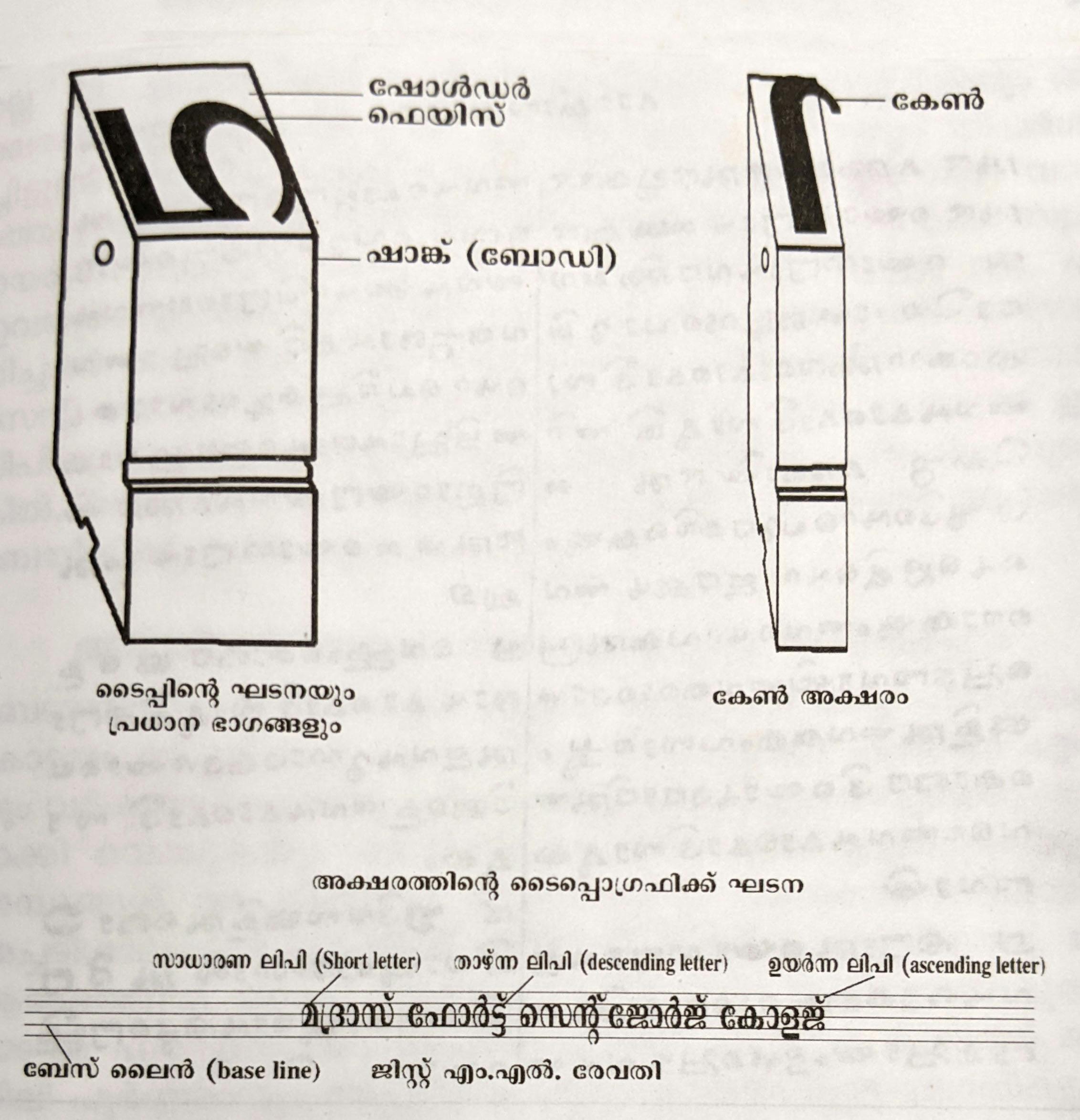
All in all, the visual differences between Bailey’s 1829 font and earlier Malayalam fonts are striking. His rectification of letter dimensions and alignment, as well as letterform variation, gave his font a certain elegance that Malayalam printing had never seen before. According to linguist Rama Warrier, letters in Bailey’s 1829 font mainly started from the baseline and some from the cap line, but in earlier fonts the starting point was often a lot more haphazard.
Bailey continued to design Malayalam fonts. In 1835, he helped the Raja of Travancore set up the Government of Travancore Press, and shared his fonts with the press for their use. He also cast two fonts in 1840, while back in his native England.
Further north, in the northern Malayalam region (ruled by the British from Madras), parallel developments were taking place. The German missionary Hermann Gundert, attached to the Basel Mission (headquartered in Mangalore), arrived in Tellicherry (now Thalassery) in 1839. Initially tasked with imparting religious education, Gundert soon became fascinated by Malayalam and local history. He learned Malayalam and began to work on documenting local culture, language and literature.
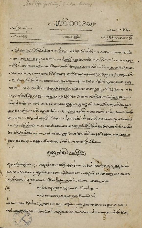
Gundert’s contributions to Malayalam were primarily linguistic and philological2, but he also oversaw lithographic printing efforts in Malayalam from Tellicherry, including the first Malayalam periodicals, Paścimōdayam (1846) and Rājyasamācāram (1847).
Among Gundert’s contributions is the introduction of the candrakkala symbol ് into printed Malayalam, a half-moon symbol used to mark the word-final schwa /ə/, as in kaḷḷǔ ‘toddy’. This symbol would later evolve to incorporate other functions, and came to play an important role in script reform efforts.
Later, Gundert helped set up the Basel Mission Press in Mangalore, where Malayalam texts were printed using metal fonts (which featured the candrakkala), alongside texts in the Kannada script (in Kannada, Tulu and Konkani).
Journalism and periodicals
By the mid-1800s, the Malayalam print sphere had begun to expand beyond the religious and educational. Commercial interests and literary figures began to be involved in printing, and modern periodicals were started in Malayalam, setting the stage for a host of new themes, styles and ideas to enter the realm of print.
These literary endeavours sought to reshape and redefine literary Malayalam, to give it a modern identity outside the shadow of Sanskrit and literary Tamil. This was largely an effort to address anxieties around Malayalam’s relatively younger literary identity.
As this modern literary Malayalam took shape, so did a new socio-linguistic identity centred on the language and its speakers. Commercial printing played a key role in this process, just as it did in other literary South Asian languages.
The first privately Malayalam owned press was the Kēraḷavilāsam Press, founded in Trivandrum, the capital of Travancore, in 1852. More would come up in the following years, many even casting their own fonts, fonts modelled after Bailey’s own.
Out of all the players involved, Kandathil Varghese Mappila, the founder of Malayala Manorama (printed at the eponymous Malayala Manorama Press in Kottayam, also founded by him), was a particularly important force in broadening the scope of discourse in Malayalam. Crucially, Mappila’s work, as historian of literature Ashokan Nambiar writes, featured an ‘integration of the coordinates of the printing world: printing, publishing, editing and writing’.
In addition to his many contributions to journalism and publishing, Mappila wrote numerous essays and editorials on Malayalam printing, a subject that had yet to be dealt with in writing. These writings represent his own experiences working with the printing process, but also reveal his vision of adapting print technology to modernising Malayalam.
In an interesting essay, Mappila writes (correctly) how Malayalam’s 56 individual letters were in practice merely base forms, and that the true number of letters in the script would be in the hundreds, making Malayalam a hassle to print. He also observed that the steadily increasing number of English loans were written linearly, since conjuncts were written according to Sanskrit and Malayalam grammatical rules (which did not apply to English). He then argued that since linear conjunct writing was being used anyway, why not extend it to non-English consonant clusters as well, saving printers hours of effort and many rupees?
Mappila went even further and attempted to apply this idea in Malayala Manorama and other periodicals and books published at his press. He used a dot-like diacritic to represent half consonants, allowing for consonant clusters to be written linearly instead of as conjuncts. This attracted criticism from literary figures and was perceived as breaking continuity with older writing, and he soon had to go back to the traditional pattern of complex conjuncts.
Despite its eventual failure, this innovation foreshadowed the convention of using the candrakkala for splitting up consonant clusters.
Mappila also observed that the Koonamavu Mission Press, run by the Roman Catholic Church, had briefly used detached -u, -ū, -r̥ mātra forms in their publications from 1872 to 1873, the first recorded attempt to simplify these vowel mātra forms. To Mappila, this made perfect sense, since it could ‘greatly reduce the stress printers face in printing’.
Unfortunately, with Mappila’s death in 1904, printing as a topic of discourse and intellectual inquiry largely receded to the footnotes of the Malayalam literary sphere for the rest of the pre-Independence era.
20th-century printing and Malayalam font complexities
After Kandathil Varghese Mappilla’s abortive script reform attempt in the late 1800s, no major suggestion emerged for many decades.
Script reform does not seem to have been an active concern for local intellectuals either, who were more focused on debating social issues and working with literary themes. Kerala also lacked major industrial hubs, and local intellectuals didn’t have ready access to advances in print technology, seeming instead to have adhered to existing written standards.
This is in stark contrast to Bombay-based Marathi- and Gujarati-speaking nationalist and literary figures who sought to reshape the very image and structure of the Devanagari script through experimentation with print technology, which we explore at great length in our essay, The Makings of a National Character.
That being said, the Malayalam script continued to evolve, albeit at a subdued pace of its own.
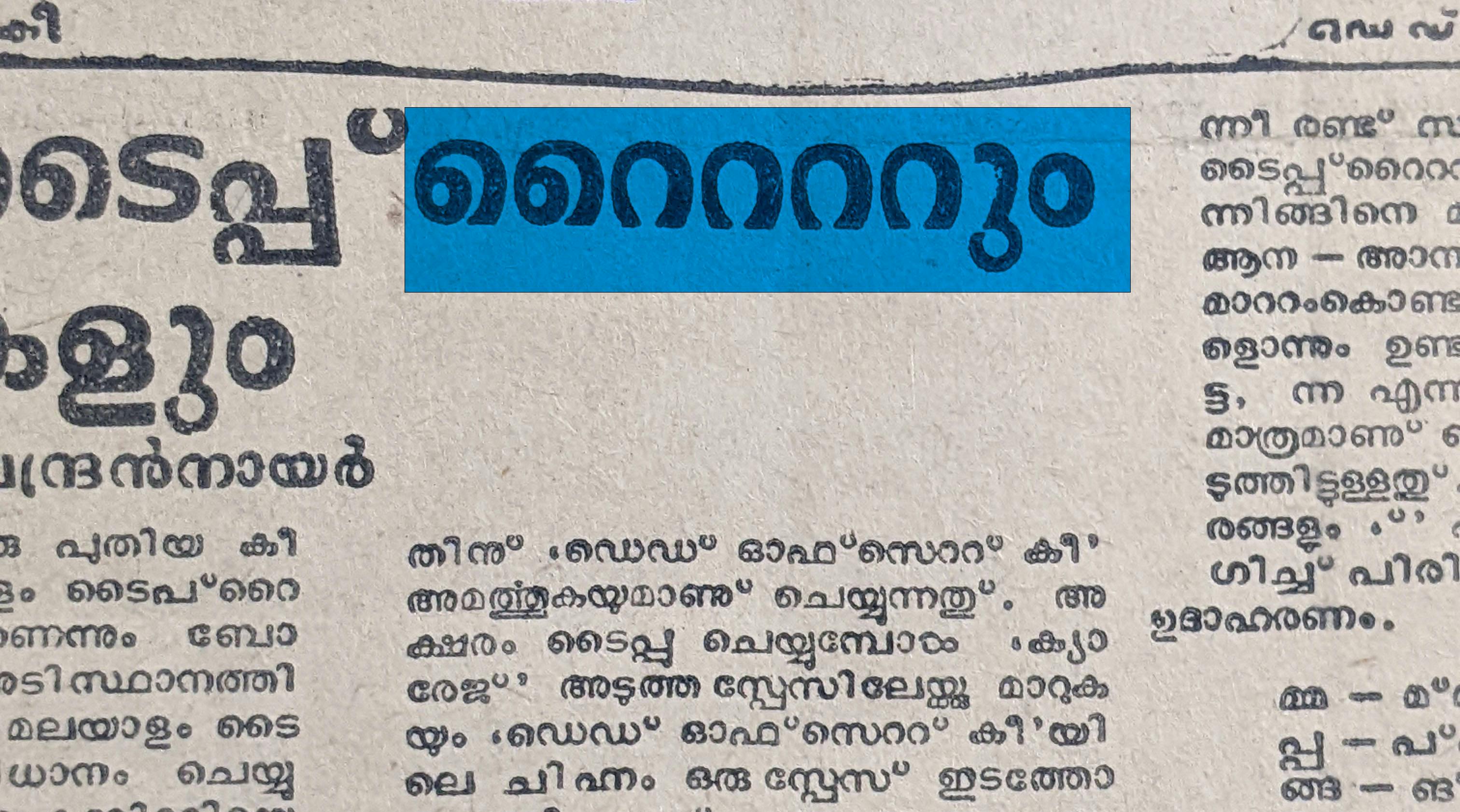
As Malayalam print researcher Shiju Alex writes in an essay, the candrakkala became increasingly used to mark half consonants by the early 1900s, primarily for English loanwords. He also notes that the repham became less common around the same period, since English loanwords represented clusters with ൪, as in പാ൪ക്ക് ‹pārkk› instead of ധൎമ്മം ‹dharmmam›.
The alveolar stop /t/ in English words was borrowed intact into Malayalam3, represented by ററ ‹ṟṟ› used for native words. However, in native words, the sound can only appear between vowels and usually only once, whereas English loans disrupted this pattern by introducing it in new positions and even multiple times in the same word. This led to confusing (and somewhat ridiculous) scenarios where a word could feature chained sequences of റ, with multiple theoretically correct readings based on how these sequences were parsed.
On top of these English-induced changes, Malayalam writing came up against forces more technical than linguistic or literary: the increased commercialisation of newspaper text space, and the tedious labour involved in printing Malayalam at scale. Unlike books, newspapers placed a premium on the compactness of text, aiming to fit in as much editorial content and coverage as possible, with extra space able to be sold for advertisements.
In fact, the journalism sphere in Kerala was the most robust in all of India at the time of Indian Independence – in 1951, Malayalam dailies sold almost as many copies as Hindi ones, a language with over ten times as many speakers at the time.
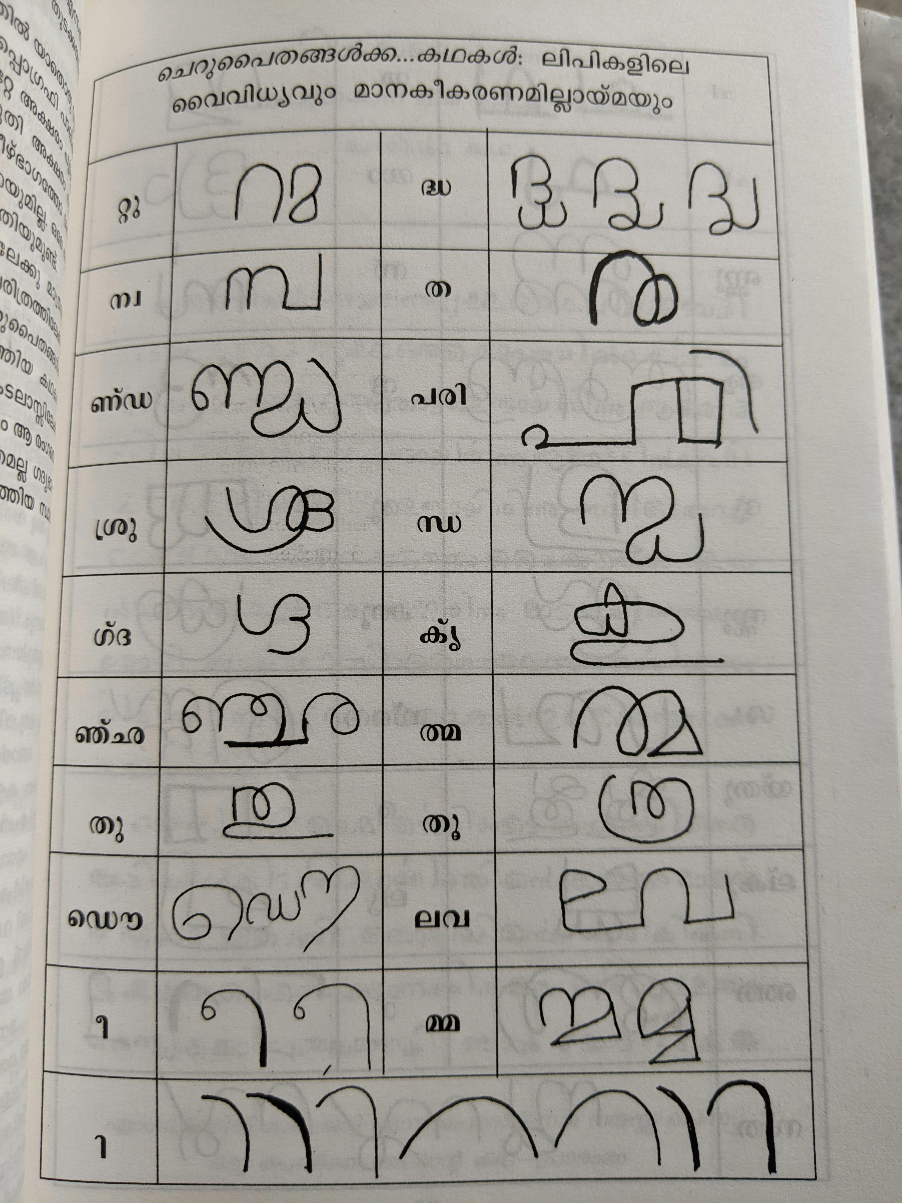
On one hand, the number of unique type punches needed to represent the range of Malayalam letters was roughly a thousand, involving intensive labour in designing and setting these types. On the other hand, typesetting was challenging because graphical elements could break alignment and crowd up precious whitespace.
The ‹r›/‹y›/‹v› combining forms included both descending and ascending elements and looped back around the base consonant, taking up much whitespace and leaving the letter with multiple tiny apertures.
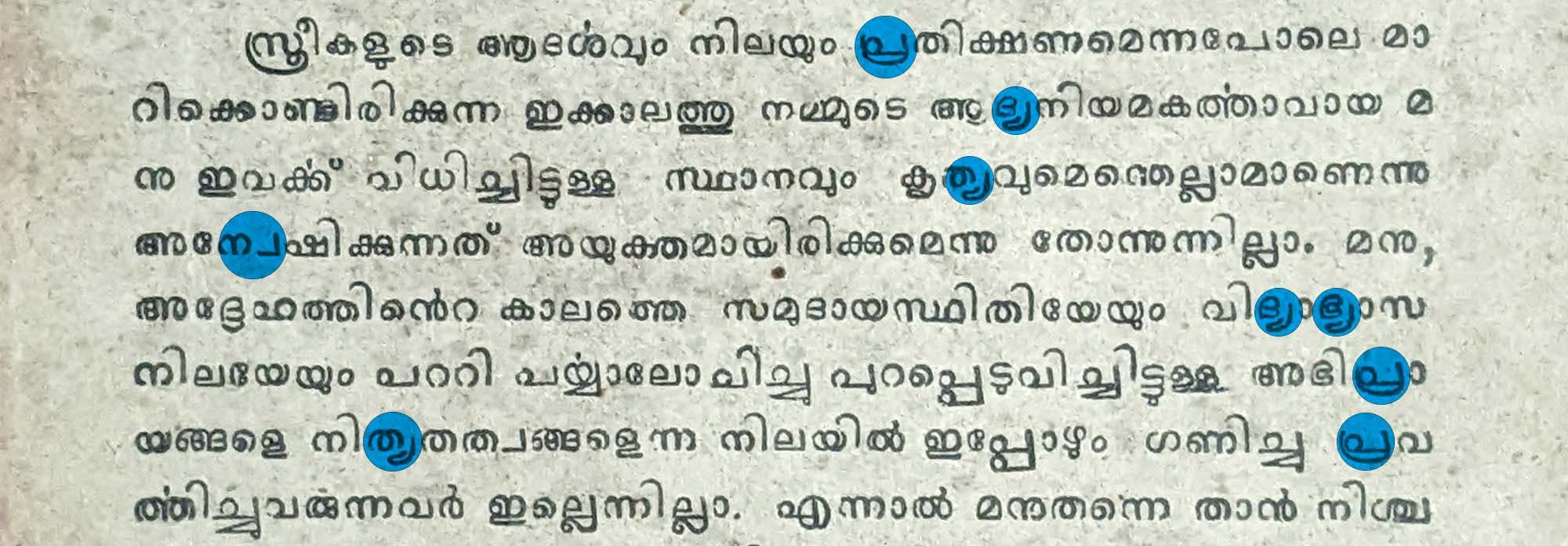
In short, working with metal Malayalam types was challenging.
Frustratingly enough, these challenges arose from the very script grammar of the language – fonts that were faithful to the Malayalam script’s structure would necessarily be difficult to use, and fonts that used simpler forms would by definition produce unfaithful representations of Malayalam.
It’s an open question as to whether or not these issues significantly hindered the development of a wider range of fonts, but it seems highly likely.
Nor were Malayalis unaware of these issues.
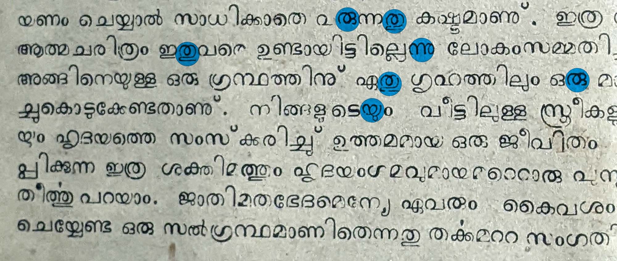
A 1953 article in Malayala Manorama pointed out that Malayalam had the most number of individual characters in the world after the complex Chinese character system, making script simplification a very real concern for ‘language patriots’.
Other articles also stressed the need for Malayalam printing at scale in journalism, to keep up with the requirements of the modern world. The contemporary printing process was described as ‘creating an irredeemable expense of time’ with the script making ‘modern typesetting impossible in it’.
One typesetter even half-joked how the total distance involved in walking across the printing room to fetch the necessary punches over the course of a day’s work could amount to many kilometres.
Newspapers occasionally used linearisation to overcome limitations in space, and detached -u, -,ū mātra signs to avoid breaking alignment. But these workarounds functioned on an ad hoc basis, subject to the space available and the forms used.
Responses on an institutional level only emerged after Indian Independence in 1947, with the formation of the Malayalam-speaking state of Travancore-Cochin (from the merger of the erstwhile kingdoms of Travancore and Cochin).
Early script reform and debates: preludes to 1971
After Independence, Malayalam speakers led India in literacy, and Malayalam boasted a robust public literary sphere – yet print technology was seen as lagging behind.
We looked at archival sources in Malayalam to get a sense of the circumstances and ideas that animated these discussions. In fact, most of the materials referenced in this report are being studied and written about for the first time here.
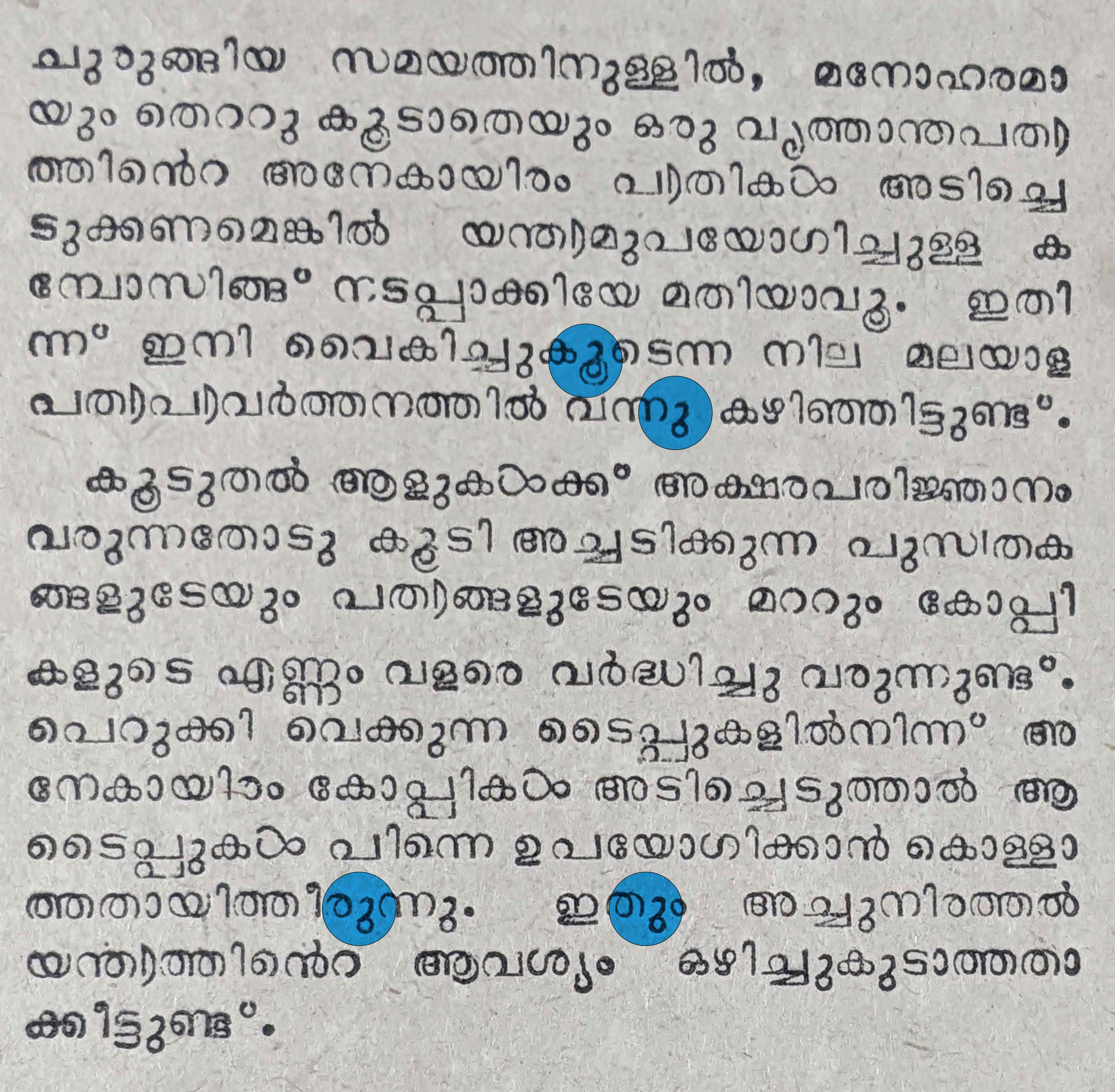
The dissemination of hot-metal typesetting equipment, particularly Linotype and Monotype machines, and typewriters raised the question of how to modernise the Malayalam script4. ‘Composing with machines must be implemented if thousands of copies of a newspaper are required to be printed elegantly without mistakes, in a short span of time’, as an editorial summed it up. A 1953 article in Malayala Rajyam went so far as to claim that Malayalam could only call itself a modern language if it could be composed on Monotype and Linotype machines.
In 1951, the University of Travancore at Trivandrum (now the University of Kerala) set up a committee to develop an ‘abbreviated’ Malayalam script.
Key members of the committee included K. Bhaskaran Nair5, a zoology professor and Malayalam writer with a keen interest in typewriter design, G. F. Amalanathan, the Linotype-trained superintendent of the Travancore-Cochin Government Press, and K. Godavarma, a literary figure and linguist.
In addition, representatives from Monotype and Linotype attended as technical advisors.
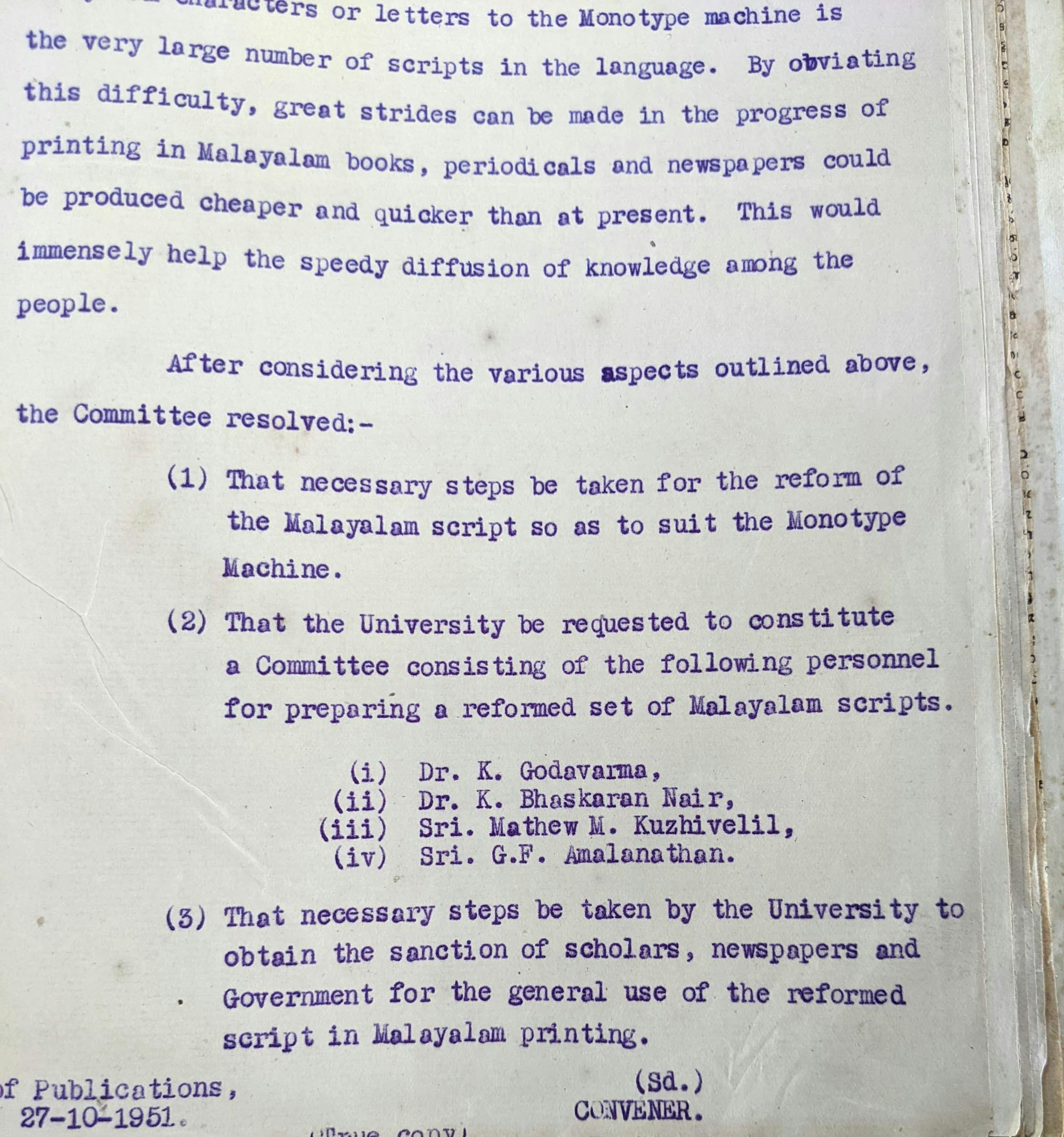
Intriguingly enough, official records of the committee note that the ultimate objective of the abbreviated script was usage on Monotype composition machines, going so far as to call it ‘the reform of the Malayalam script so as to suit the Monotype Machine’.
Nair maintained correspondence with Monotype representatives, revealing his persistence in ensuring that Malayalam would be supported by the company’s machines. He even personally reviewed and suggested edits to prototypes from the company, and devised a core letterset based on a frequency analysis done by Amalanathan. Monotype’s advisor made changes to Nair’s letterset as well. Amalanathan cast a new font based on these discussions, which Monotype tested and then confirmed that it worked on their machines.
The Committee submitted its recommendations in 1953:
The -u, -ū mātra forms would be regularised, represented only as ു, either descending from letters or written to their right. Low-frequency consonant clusters would be represented linearly, using the candrakkala. Certain characters – with less upper whitespace – would use a vertical mark (|) instead of the candrakkala.
Despite these encouraging developments, however, the committee’s efforts appear to have lost steam somewhere along the way. The committee was clear that its suggestions would have to secure public approval first, and in 1953, it seems to have been presented to managing directors of newspapers. As it would turn out, the newspapers were sceptical of the proposed reform, from its recommendations to the collaboration with foreign corporations.
A 1953 article in Deepam cautioned against allowing ‘vested interests from owning Malayalam’. Manorama scoffed at the efforts, pointing out that their early editors-in-chief (including Kandathil Verghese Mappila) had attempted serious script reform before anyone else. It also questioned the expertise of the committee members.
These newspapers also criticised the reform for not going far enough. The unified ു forms were welcomed, but detached forms were suggested instead, with references to the Koonamavu Press’ publications in the 1870s. The selective linearisation of clusters was described as incomplete and insufficient, with Manorama suggesting more far-reaching linearisation. The vertical marker | was ridiculed for being redundant.
In the meantime, the correspondence between Nair and Monotype turned sour over commercial rights and implementation, with both parties reaching an impasse.
Despite public disapproval and the commercial failure of the project, the 1951–53 reform attempt made room for public discourse and debate on the subject of script reform.
The 1971 Script Reform
India’s 1956 linguistic reorganisation of states led to the formation of Kerala state, intended as a political unit representing Malayalam and its speaker community. Broadening the scope of the Malayalam language in administration became a top priority for the state.
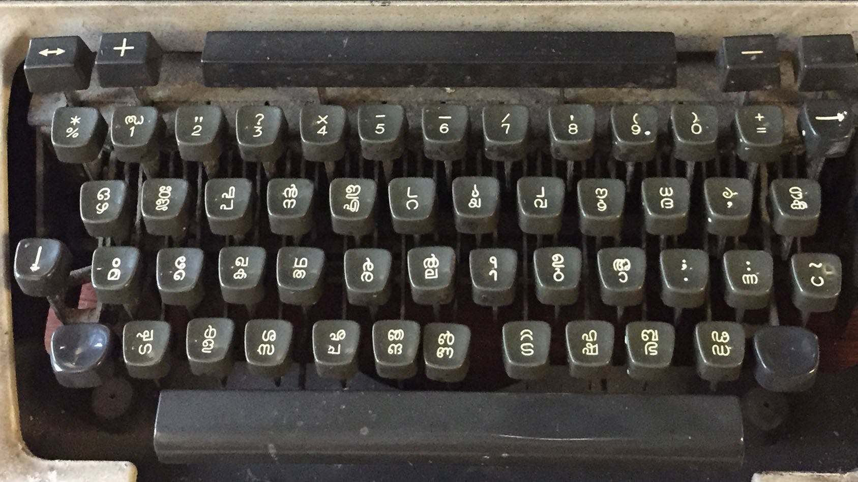
Across India, the typewriter had come to represent modernity in the written language, a device that could fuel aspirations of true linguistic and literary maturity. The writing on the wall was clear: if Malayalam was to be the state’s primary language, it would have to be typed, and necessarily be typed with ease and great speed without excessive cost to boot.
Or as one newspaper article put it, ‘the main obstacle pointed out by all departments and employees in making Malayalam the official language is the lack of a good Malayalam typewriter.’
Several themes emerge across writings on script reform, print technology, printing and linguistics in the years between 1951 and 1971, all of them tying back to navigating the complexity of the Malayalam script. An underlying anxiety was the modernisation of the Malayalam language by updating the script to the modern era, since, as one observer wrote, it ‘was designed for the stylus on palm leaves, not for machines’.
Records clearly show how script reform had become a concern that involved a range of interest groups – literary figures, typewriter manufacturers, printers, government officials and managing directors of major newspapers.
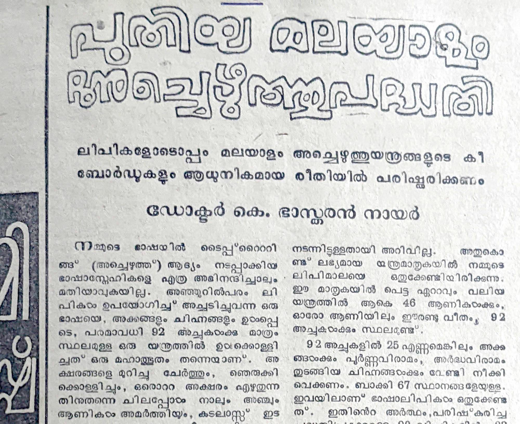
Malayalam literary culture had continued to mature, but the script itself with its numerous complex combining forms and contextual variations was poorly suited to the typewriter. A 1971 Mathrubhumi article noted how four or five keys needed to be pressed to write just one letter, and that 500 letters had to be represented with 92 keys.
Clearly, this was a critical juncture for the language.
The Government of Kerala took heed of these concerns, taking the initiative to set up another script reform committee in 1968, with lexicographer and writer Sooranad Kunjan Pillai at its helm. K. Bhaskaran Nair was a member of this committee as well, and a Madras-based representative from Monotype also participated. The director of the Kerala Bhasha Institute (set up in 1968) and the secretary of the state’s Ministry of Education (who convened the committee) represented the government’s involvement.
Crucially, this time the committee included the managing directors of Malayala Manorama, Kerala Kaumudi and Mathrubhumi (Manorama and Mathrubhumi were, and still are, Kerala’s two most widely read dailies).
The committee submitted its recommendations in 1969, made official by the Government of Kerala in 1971.
The -u, -ū mātra forms would be reduced to one set of forms, detached from the combining consonant. The -r̥ mātra would be detached from the combining consonant. The dot repham would be phased out. Apart from a set of consonant clusters – mostly consisting of 18 clusters occurring in native Malayalam vocabulary – all other consonant clusters would be represented linearly, with the candrakkala. The special combining forms for ‹y›, ‹r›, ‹v› would be unified and detached from the combining consonant, to allow for more whitespace and legibility. Cillu forms would be retained, for their uniqueness and grammatical function.
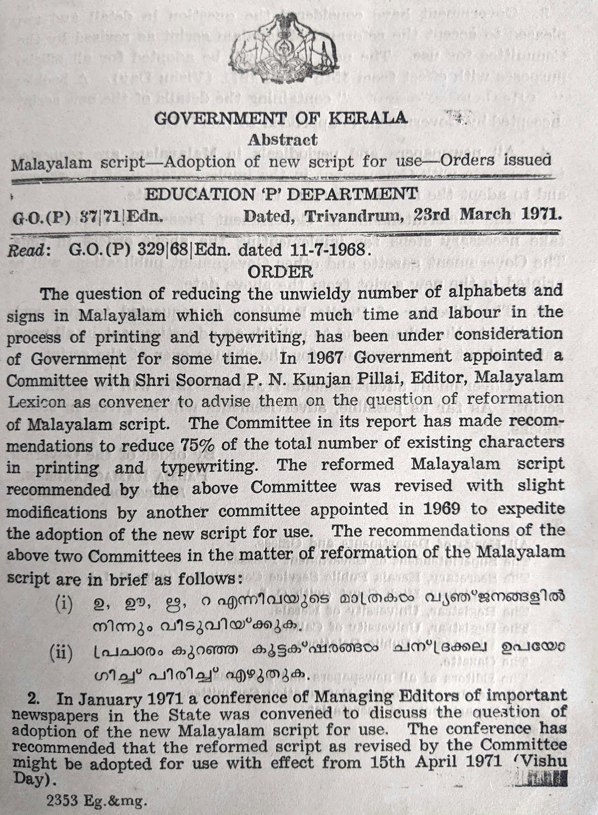
A couple of years later, certain additional recommendations came up, based on linguistic concerns.
The high-frequency Sanskrit clusters ന്ദ ‹nd› and ക്ഷ ‹kṣ› would be added to the official character set. The modern combining forms റ്റ ‹ṯṯ› ന്റ ‹nḏ› would be added to the character set, to reduce ambiguity.
This 1971 Script Reform marks the formal birth of so-called Simplified Malayalam, distinguished from older ‘Traditional’ Malayalam. From this point on, Malayalam had two parallel orthographic systems: Simplified Malayalam, intended for printing, and Traditional Malayalam, retained for handwriting.
Script reform principles
The writings of the script reform committees and commentators offer an insight into the scientific and linguistic underpinning of their efforts. Letter frequency analyses for example formed an important component, leading to the later additions of ന്ദ ‹nd› and ക്ഷ ‹kṣ› to the official character set.
Significantly, the suggestions didn’t follow any overarching logical principle of linearisation or simplification, but are instead a set of compromises between print technology capability, text legibility, linguistic and literary considerations, and user convention. It would be inaccurate to see the move as primarily ‘rational’, since it incorporated these numerous socio-linguistic variables.
For example, the 1968 Script Reform Committee wanted to retain distinct combining forms for native (i.e., occurring in inherited Dravidian words) consonant clusters given their elegance and importance for the language. This was done despite the fact that some of them, like ഞ്ഞ ‹ññ›, were distinctly longer than other characters.
Combining forms for Sanskrit clusters on the other hand were marked for linearisation. Many only appeared in obscure words anyway, as frequency analyses showed.
In fact, none of the suggestions were radically novel or without precedent – all of them drew from conventions and symbols already current, ones attempted by earlier printers (including in Kandathil Varghese Mappila’s writings almost a century earlier), and suggested and proposed anew in the years following 1951.
The 1971 Script Reform’s novelty came from its institutionalisation and formal standardisation, not its design or even its suggestions.
Script reform in practice
The scope of the 1971 Script Reform was initially a lot less ambitious, restricting itself to education and government communications. Records show that the traditional orthography was intended to be taught to students after the 2nd grade, but this seems to have been ignored.
Very importantly, newspapers adopted the new orthography in their own ad hoc fashion. For example, Mathrubhumi kept the complex -r̥ form because it featured in their masthead (Mātr̥ubhūmi).
A 1985 analysis by linguist S. Sreekumari shows that Malayala Manorama used linearised clusters more frequently, and Kerala Kaumudi preserved older forms more, with Mathrubhumi somewhere in the middle. To make things more confusing, she also notes that these were tendencies involving a high degree of free variation, with no consistent patterns.
In general, the detached -u, -ū forms have persisted more than linear clusters or simplified ‹r›, -‹r̥› forms and can be seen as the main innovation of the 1971 Script Reform.
Students at schools began to be taught Simplified Malayalam in textbooks, while their parents and visual media around them – including hand-painted signage and movie posters – continued to use Traditional Malayalam. Simplified Malayalam made its way into the mainstream through younger speakers, but it did not displace Traditional Malayalam.
Ultimately, a range of typewriters and metal fonts were in use even well into the 1980s, hindering any envisioned unification of the Malayalam script.
Digital printing and contextual variation
The 1990s ushered in a new radical shift in technology: digital publishing.
The earliest digital Malayalam fonts were ISCII encoded, with each font having a hard 256 character limit. Naturally, this ruled out the inclusion of Malayalam’s vast range of individual combined forms.
In 1997, the Government of Kerala proposed a new set of reforms, which would completely linearise consonant conjunct forms. This suggestion sparked local groups and individuals into action.
Rachana Akshara Vedi, a community group of computer scientists, made efforts to bring the traditional orthography onto digital devices. They came up with an ingenious workaround – using six different fonts in parallel to represent complex combined forms, using a custom-designed text editor.
Rachana’s Traditional-style Malayalam printing workaround caught the attention of important literary figures, and was used to publish books. According to researcher and type designer Santhosh Thottingal, M. T. Vasudevan Nair and M. Krishna Nair were two major writers who were in favour of Rachana’s Traditional Malayalam font, and Krishna Nair even insisted that his weekly newspaper column be printed in Traditional-style letters.
Local newspapers included debates on the ‘return’ to Traditional Malayalam that Rachana had made possible, with Mathrubhumi preferring it and Manorama questioning its feasibility (reflecting earlier debates).
The spark that Rachana lit soon found expression thanks to advances in text encoding. Malayalam was added to Unicode in 1991, and in 2005 the Malayalam character set was expanded, following a report containing a set of recommendations from the Government of Kerala.
A Unicode font called Rachana, featuring Traditional Malayalam combining forms, was designed in 2005 by the Swathanthra Malayalam Computing group in collaboration with Rachana Akshara Vedi and Unicode. The font was added to Linux operating systems.
The Windows XP Service Pack 3 in 2004 added Unicode support for Indic scripts including Malayalam. However, the default Microsoft Malayalam font (following the Reformed orthography) and its rendering engine were of low quality.
Around 2010, the Government of Kerala decided that all computers at government offices and public schools would use free software and Linux operating systems. This move meant that the Rachana font, with its Traditional-style letter forms, entered common usage across the state, even reaching children in their homes via their personal devices.
Options in fonts have only kept growing since then, as have their font rendering engines. At the same time, however, the orthography displayed on an app or a webpage is then completely dependent on the font used by that platform, and on the functionality of the rendering engine. For example, the stock Malayalam font on Android devices uses Simplified orthography, while the default Malayalam font on Linux OSes is Traditional-style.
Today, the limitations of metal font design that once plagued printers working with Malayalam are no longer insurmountable, and the choice between complex Traditional Malayalam and Simplified reformed Malayalam is a question of user preference.
In other words, the Traditional vs Simplified divide has moved from the hard contours of metal type to the abstractions of socio-linguistic variables. Understanding what goes into these choices, contextual preferences and the considerations of design can help font designers break away from this idea of a hard binary.
Traditional vs Simplified: a false binary?
Script debates notwithstanding, popular usage today draws from across the spectrum.
Some elements of the 1971 Script Reform have been adopted so wholeheartedly that not even Traditional Malayalam purists have opposed them. The dot repham (ൎ) and linear ‹nṟ› ‹ṟṟ› forms (ൻറ, ററ) have been fully phased out of Malayalam writing and only appear in older texts.
Today, the debate centres on -u, -ū, -r̥ mātra usage, and complex conjuncts. But even within this, there seems to be a hierarchy, with detached mātra forms being more common than linear conjuncts.
To better visualise and conceptualise variations in preferences, we propose a visual model of the spectrum, from more traditional to more linear – the orthography proposed in the 1971 Standard is on the more linear side of the spectrum.

Digital typography has removed the physical limitations of designing complex forms, bringing variations in user preference and legibility to the fore instead.
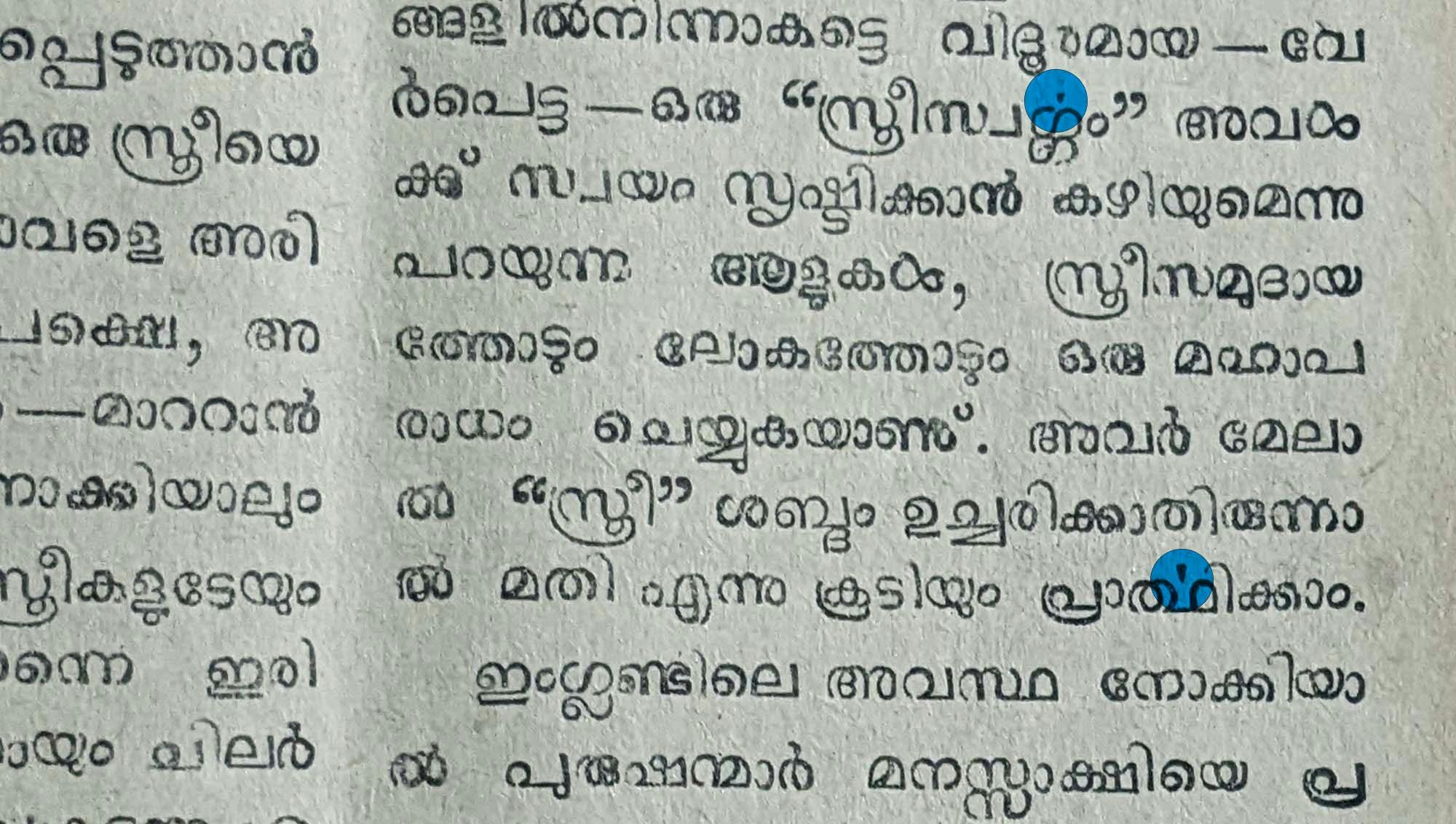
At the same time, technology also allows for dynamic combining patterns, where legibility and alignment take precedence over a strict adherence to Traditional-style stacked clusters. For example, a complex combining form like ‹strū› would feature a number of stacked and looped elements, making it awkward to represent faithfully in one letter, without any linearisation to help spread it out and preserve alignment.

There is a tendency for Traditional Malayalam to be written off as outmoded, impractical or even difficult, but that ignores the fact that strong emotional ties to the elegance of Traditional Malayalam persist, especially among the culturally inclined.
Traditional Malayalam is commonly seen as more aesthetic and representative of Malayalam’s uniqueness and literary character, a cultural attitude also reflected in how the 1971 Script Reform sought to retain consonant clusters used in native Malayalam words.
For example, it’s common for school students to attempt to approximate Traditional Malayalam when writing by hand in more cultural or literary oriented contexts, a mark of how closely Traditional Malayalam is linked to these identities.
A 2018 article authored by Malayalam researchers Kavya Manohar and Santhosh Thottingal explores the impact of script reform on visual representations of Malayalam. They show how Traditional Malayalam has enjoyed increasing visibility in recent years, from meme pages to movie titles. The article goes on to document how major newspapers have also announced that they will be reverting to Traditional Malayalam, while publishers increasingly use Traditional-style fonts.
Manohar and Thottingal conclude that the main driver behind this trend back towards Traditional Malayalam seems to be the growing availability of digital fonts that support Traditional Malayalam, but they stress that this trend is underpinned by existing preferences, both cultural and aesthetic.
In other words, when the option to use Traditional Malayalam is available, many users actively prefer it. It cannot be taken for granted that all audiences will prefer Simplified Malayalam by default.
Publishers in particular play an important role in navigating the spectrum of Malayalam script usage, given the importance of literary culture – writing, reading and printing – in Kerala. We spoke to different figures placed in the industry to understand the rationale behind the orthographic choices in their publications, and their perception of reader response. Manuel George, chief visual editor at Malayala Manorama, the most widely read Malayalam newspaper, told us that Manorama uses fonts produced in-house for both their print and digital editions, and these fonts follow the Simplified orthography.
George explained that Manorama believed younger readers would be more familiar with Simplified Malayalam, and likely unfamiliar with certain unique letter combinations in Traditional Malayalam. He told us that Simplified Malayalam had a wider potential reach, since it is also comprehensible to people who prefer Traditional Malayalam.
At the same time, he spoke to us about his team’s plans to design Traditional orthography variants of their fonts, especially for headings and titles. Despite their editorial position, which is to use Simplified orthography, Traditional forms cannot be ignored, and the option to represent them needs to be available, he added.
It is tempting to trace Manorama’s contemporary position back to the newspaper’s response to script reform efforts, and even further to Kandathil Verghese Mappila’s own thoughts on script.
Govind Deecee of DC Books, Kerala’s largest publishing house, told us that their books were mostly printed in Simplified Malayalam (using two in-house designed fonts) for similar reasons of inclusion. Interestingly, however, he added that they were beginning to use Traditional Malayalam for book chapter titles, similar to Manorama. Lettering used for book covers also often incorporates Traditional Malayalam, albeit not necessarily for every letter.
The 2022 Script Reform: 1971 revisited
In mid-2022, the Government of Kerala approved and issued a new script reform order, just over half a century since the 1971 Reform.
The new script reform seeks to update the Simplified orthography by establishing a new standard, one that acknowledges advances in technology. For clarity’s sake, we’ll call this the updated 2022 orthography.
• It accepts the usage of complex stacked consonant conjuncts. • It allows complex ‹r›‹y›‹v› combining forms. • It continues the usage of unified, detached -u, -ū mātra forms. • It continues the usage of linear consonant clusters for certain combinations.
The provisions of the new orthography are illustrated in a document titled ‘Rules for Writing Malayalam’, available online. Pages 1–6 cover the changes it introduces and offer examples of letterforms and comparisons with Simplified Malayalam.
We managed to speak to VP Joy, the Chief Secretary of Kerala, who instituted and chaired the 2022 script reform committee himself. The 15-member script committee comprised, among others, literary figures, including Madhusudhan Nair. The committee’s work has been projected as a pro-Malayalam move aimed at bringing unity to the written language.
When asked why he initiated the recent reform, Joy began by returning to the 1971 Script Reform, and how the large number of unique Malayalam conjunct forms made it a necessity at the time. However, he continued, since computers lack the limitations of metal type, digital fonts allow for a return to the full range of Malayalam’s graphic variation. At the same time, he justified the continued usage of detached vowel markers as ‘more logical’ than bringing back the complex contextual variation of -u and -ū markers.
Joy admitted that adoption will most likely be slow, but he was pleased that there hadn’t been any major opposition or objection to the move, including from literary figures. He was also expecting wider implementation to take time, over the course of a few years.
Joy pointed out that unlike the 1971 reform that required new metal fonts, modern changes to the script are much easier to make thanks to digital technology reducing the level of effort involved.
The main challenges, in Joy’s opinion, will arise from ensuring more and more people use the new orthography, including children learning and becoming comfortable with it, and newspapers and publishers introducing it to older readers.
Interestingly, Joy asserted that a script reform should have been enacted when Unicode fonts were introduced, in collaboration with Unicode itself. This would have ensured greater uniformity and standards compliance at what was a crucial moment in Malayalam’s wider transition to the digital medium.
Speaking of his vision for the reform, Joy shared that the Government of Kerala was working on putting out another 15–20 digital fonts in the new orthography, and that a 140,000-word Malayalam dictionary adhering to the 2022 orthography would be published on the Government site. He also told us that textbooks for the next academic year (2024) would feature reformed spellings.
In his roadmap for the future, Joy plans to introduce the 2022 orthography into the Bureau of Indian Standards and have the standard codified, bringing it into official national policy. If carried out, digital devices would likely have to adhere to the orthography to ensure compliance.
It’s significant that this order is a move to bring the official standard closer to Traditional Malayalam, attributable to a perception of Traditional-style forms as more elegant and ‘authentic’. It reverses some of the changes proposed in 1971 but retains the most radical one.
Once again, we see that detached -u, -ū forms are the primary source of difficulty, reflecting popular variation in usage. In 2022, however, this is because of a perceived difficulty in children learning these forms, rather than any technical issues in representing them.
The order calls for uniformity in written Malayalam, in a time when font usage itself has become so decentralised, with font support dependent on platforms and devices. Additionally, it states that printed text facilitated by digital technology following any other written conventions, including Traditional Malayalam, should be discouraged in the interest of uniformity and standardisation. This stands uncomfortably with the fact that Traditional-style digital fonts are in wide usage and in many cases even actively preferred.
At the same time, the poorly documented variation in practice today results in a lack of reference points for web and software developers and font designers.
The Government of Kerala has set up a web page with a set of fonts, free to download and use. These fonts all follow the 2022 orthography, but were created by forking existing Traditional-style fonts and editing them, which has consequences for their visual consistency and rendering.
Both George and Thottingal also pointed out that the 2022 reformation has yet to make its way into Malayalam textbooks, meaning that it will not be reaching new students – and by extension, new readers of Malayalam – yet.
We spoke to publishers in order to understand their perspective on the proposed script reform update.
Manuel George was ambivalent on the 2022 orthography, telling us that Manorama had no plans to adopt it in the near future, but may decide to assess its feasibility in a few years’ time. Govind Deecee told us that DC Books was similarly not considering any changes to their text-setting, saying that it would require too much effort.
He stressed how even a seemingly minor orthography change will require significant change and re-assessment to existing processes across the board, to various aspects of editorial, design and printing workflows. New fonts would have to be designed, and proofreaders, printers and editors trained in the new system.
Publishers would have to invest significant time, energy and money in their technical and human resources to adapt to what is essentially a minor update. There is also a sense that the 2022 orthography was finalised without sufficient consultation from technical experts on how to ensure font support and rendering, similar to criticism of the 1951–53 reform.
The lack of production-ready fonts supporting the 2022 orthography, as well as the muted response to it from publishers and government agencies, will likely set back any proposed adoption.
Given the uncertainty surrounding the 2022 orthography, we recommend that font designers focus on the two established orthographies, Traditional and Simplified, for now, until the effects of the 2022 reform are clearer. Fonts should be able to balance the two by including features from the other style when needed. Traditional Malayalam persists, and cannot be dismissed as old-fashioned or too complex, even with young audiences.
Malayalam continues to set its sights decidedly on the future, and this vision calls for continued, deeper engagement with reader preferences, letterforms and technology.
Special thanks to Shiju Alex for his painstaking efforts in digitizing old Malayalam texts and making them available online, to Dr. Babu Cherian for sharing his expertise on Benjamin Bailey and early Malayalam printing, and to Santhosh Thottingal for his insights on digital Malayalam typography and computing.
November Malayalam and October Malayalam font families support both simplified orthography as well as the 2022 Script Reform. They are part of the larger November South Asia project.