
Notes on Designing and Producing the Typeface Wind
Hansje van Halem is a graphic designer who works with type. She blurs the boundaries between type and image, between foreground and background, often creating seductive patterns that only reveal their texts only when viewed from the distance, making the reader work hard to decode their message. I’ve been following her work for a long time, and about a year ago I went to a lecture in Amsterdam where she presented her latest projects.
A short documentary film about the work of Hansje van Halem
After the lecture I asked Hansje if she’d ever consider publishing some of her type work as retail fonts. She replied that she finds the typefaces that she makes to be very personal tools, that she wouldn’t be able to give them to others since they are what makes the work hers. I didn’t want to push too hard, but I suggested that we could take some of the principles of her work and make creative tools for both her and the general public to use.
The timing was right. Hansje had just worked with type designer and programmer Just van Rossum, who had ‘industrialised’ her work for the identity of Lowlands, the Netherlands’ largest music festival, turning it into scripts that generate posters and animations. This streamlined what would have otherwise been the extremely tedious process of applying such complex typography to a commercial project.
Hansje liked the idea that other designers could use her work to create something new. She emailed me the original Illustrator files, and we studied how to turn them into digital fonts. Although her work may seem highly intuitive, it is a result of systematic exploration and design research, crafting rules and formulas that make shapes. ‘It is like playing games,’ she explains. ‘What happens if I draw a line around a line, and another one around it? What happens if I make a grid around the letter?’ It’s a playful approach that often leads to unintended results.
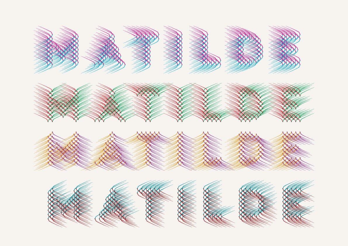
Work on her first typeaface started by analysing the drawings. Hansje had already made the basic set of letters A–Z and the numerals 0-9, but the question was how to create the necessary extra glyphs, currency signs, punctuation marks and accented letters. One possibility was to cut and paste the existing letters, and another was to recreate them using the same methods that she had originally used. Nikola Djurek began by trying to complete the set based on the existing drawings, but since the original Illustrator files contained too many points, the resulting glyphs were quite messy. We decided on a different approach: trying to reverse engineer Hansje’s creative process.

Brochure for the exhibition at the Museum Flehite, and the first use of lettering that inspired the typeface Wind, 2016
At the heart of Wind are letters are mapped onto a diagonal 8×8 pixel grid, with successive lines of pixels shifted by 50% of the pixel distance. I recreated the grid and the basic letters to see if my results would match Van Halem’s originals. In some cases they were exactly the same, but in others there were differences. I concluded that there the differences were due to human imperfections in the creative process and decided to respect them, although new characters were made more systematically and without those imperfections. After the pixel drawings were made, the final effect was achieved by replacing the pixel shape with an element similar to what van Halem used, and rotating it to produce NE and SW, which were then mirrored to produce NW and SE.

Deconstructing the lettering work of Van Halem revealed the grid behind what appears to be freely drawn letter shapes.
The typeface didn’t have a name when we started work on it. We considered calling it ‘Matilde’ after the name in the project that featured it, and we also considered ‘Milano’, but both names turned out to be taken by other fonts already. Naming the four styles was easier since they are based on the four cardinal directions, and we decided to call them northeast (NE), southeast (SE), southwest (SW) and northwest (NW). From there, the name Wind came naturally.

My promise to Hansje was not just to replicate her work, but to push it in directions that she might not have considered. I had two ideas about where this project could go next. First of all, the recent introduction of variable fonts, technology based on Apple’s TrueType GX and Adobe’s Multiple Master system, enables users to interpolate between various masters along a continuous range of design axes, generating new variations of fonts as required. Typically these axes are weight or width or optical size, but theoretically there can be as many as 64,000 axes operating in concert. I became interested to see if they could be used to control the direction of Wind’s lines.

I asked Thom Janssen, a recent graduate of the Type & Media program at the Royal Academy of Arts in The Hague, to investigate if it was possible to make a full circle rotation of elements, using the smallest number of interpolation masters. Thom’s graduation project was designing typefaces for variable font technology, so he was the right person to try this. It didn’t take too long to create a variable font version of Wind that allows the user to set the rotation from 0 to 360 degrees. I shared this version with Hansje who was pleasantly surprised by the new possibilities of her work.

My second idea was to expand Wind to other writing scripts. Having understood how the shapes were constructed, I was confident we could make Greek, Cyrillic or even Arabic versions, and we will publish those versions shortly, giving designers worldwide a chance to explore visual elements based on the personal research of Hansje van Halem, and the possibility of using them to create unexpected new works.