Peter Biľak works in the field of editorial, graphic, and type design. In 1999 he started Typotheque type foundry, in 2000, together with Stuart Bailey he co-founded art & design journal Dot Dot Dot, in 2012 he started Works That Work, a magazine of unexpected creativity, in 2015 together with Andrej Krátky he co-founded Fontstand.com, a font rental platform. He collaborates with the choreographer Lukas Timulak on creation of modern dance performances, and together they started Make-Move-Think.org, a foundation for interdisciplinary artistic collaborations. Peter is teaching at the Type & Media, postgraduate course at the Royal Academy of Arts, The Hague. Member of AGI (Alliance Graphique Internationale).
Fonts
- Zed Text Semi-WideZed Text Semi-Wide18 styles
- Zed Round WideZed Round Wide27 styles
- Zed Round Semi-WideZed Round Semi-Wide27 styles
- Zed Round Semi-CondensedZed Round Semi-Condensed27 styles
- Zed Round Extra-WideZed Round Extra-Wide27 styles
- Zed Round Extra-CompressedZed Round Extra-Compressed27 styles
Products
 €10
€10Zed type specimen
By Peter Biľak
A type specimen for Zed type system documenting the laboratory acuity tests, design process and presenting the typeface in detail.- €20
New Georgian Type
By Sophia Kintsurashvili and Peter Biľak
This book presents Typotheque Georgian type collection, showcasing over 30 font families, as well as documenting the history of the Georgian writing script. 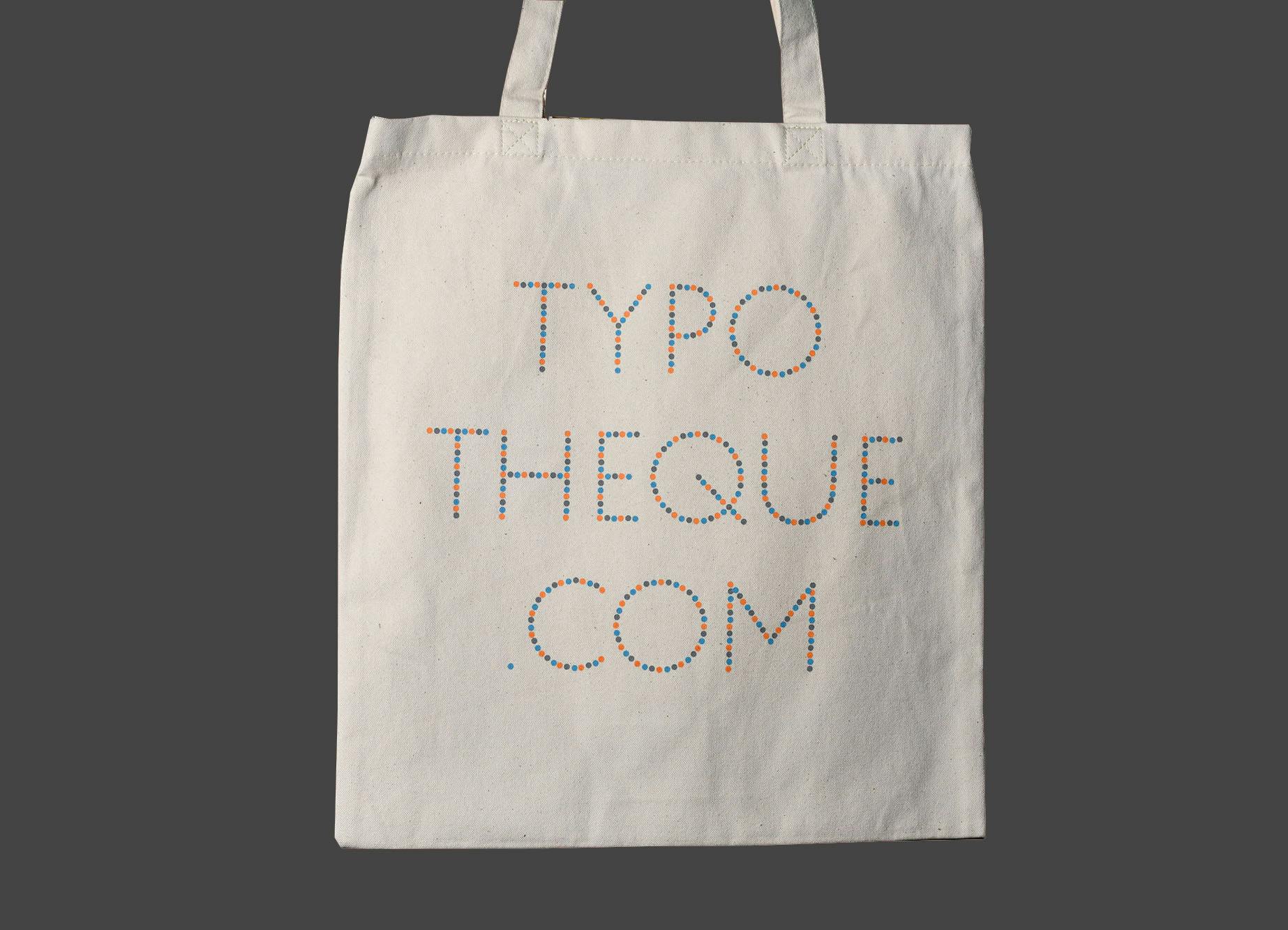 €15
€15Confetti tote bag
By Peter Biľak
Heavy-weight Typotheque tote bag for your book, made of 100% organic cotton canvas, sustainably sourced and locally silk-screened.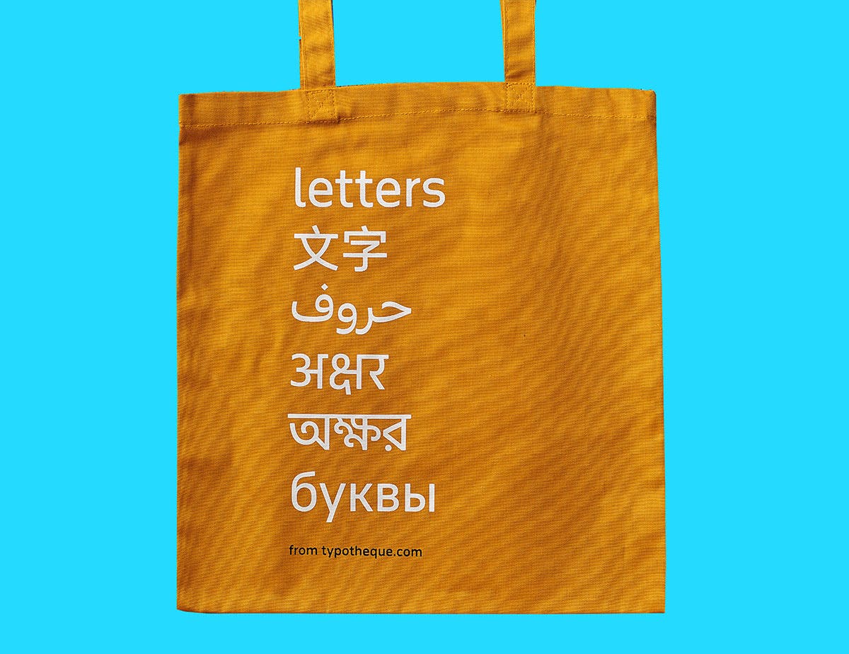 €15
€15Typotheque tote bag
By Peter Biľak
Heavy-weight Typotheque tote bag for your book, made of 100% organic cotton canvas, sustainably sourced and locally silk-screened.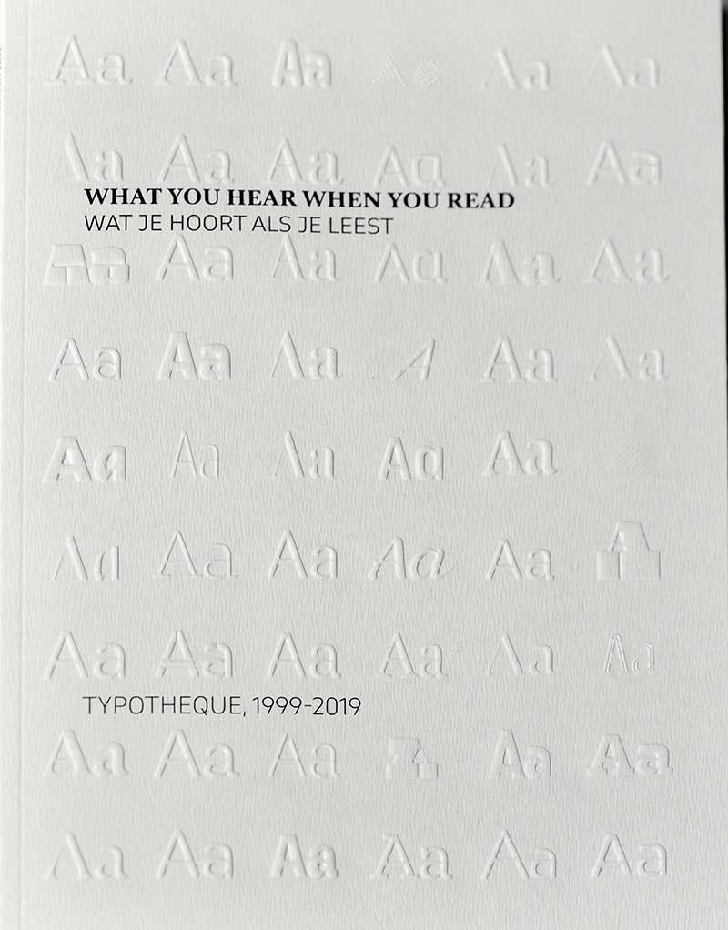
€15€10,50What You Hear When you Read
By Peter Biľak and Jan Middendorp
This book was published on the occasion of the opening of Typotheque’s solo exhibition at the Kunstmuseum Den Haag.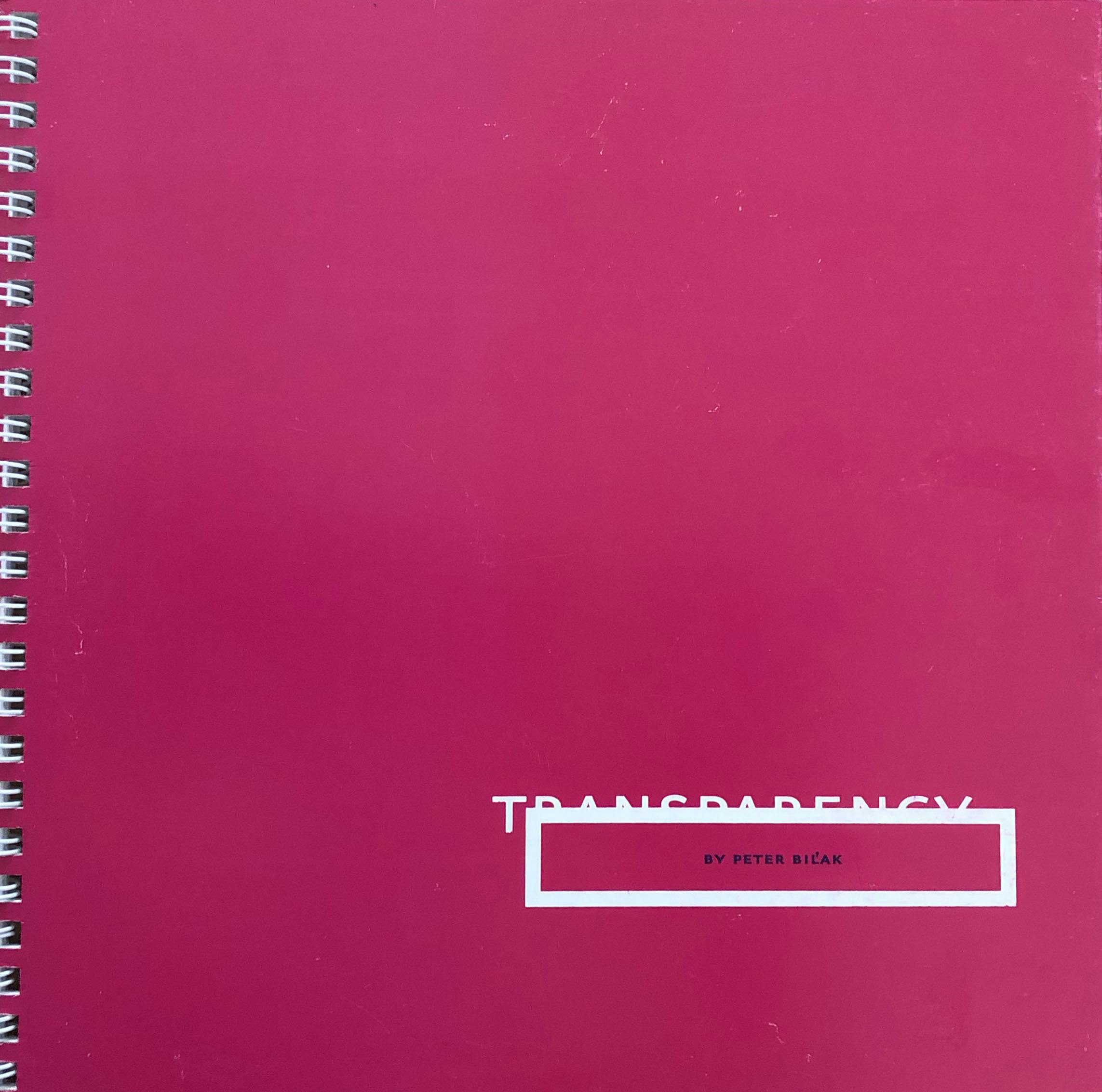 Sold Out
Transparency
By Peter Biľak
Transparency is a study on design and language, Peter Bilak’s MA thesis at the Academy of Fine Arts & Design in Bratislava (1997), designed, written and edited by the author.
Stories

A sans for small text. And another for large.
by Peter BiľakSans-serif vs. serif fonts for legibility: a contentious debate without much evidence. Recent research challenges conventional wisdom.
Optimising Braille Character Spacing for Enhanced Tactile Reading
by Peter Biľak, Héctor Mangas AfonsoExploring the complexities of tactile legibility and optimal spacing for enhanced reading experiences. Through research and collaboration with international organisations, Zed Braille emerges as a finely tuned typeface, bridging diverse user needs and international standards.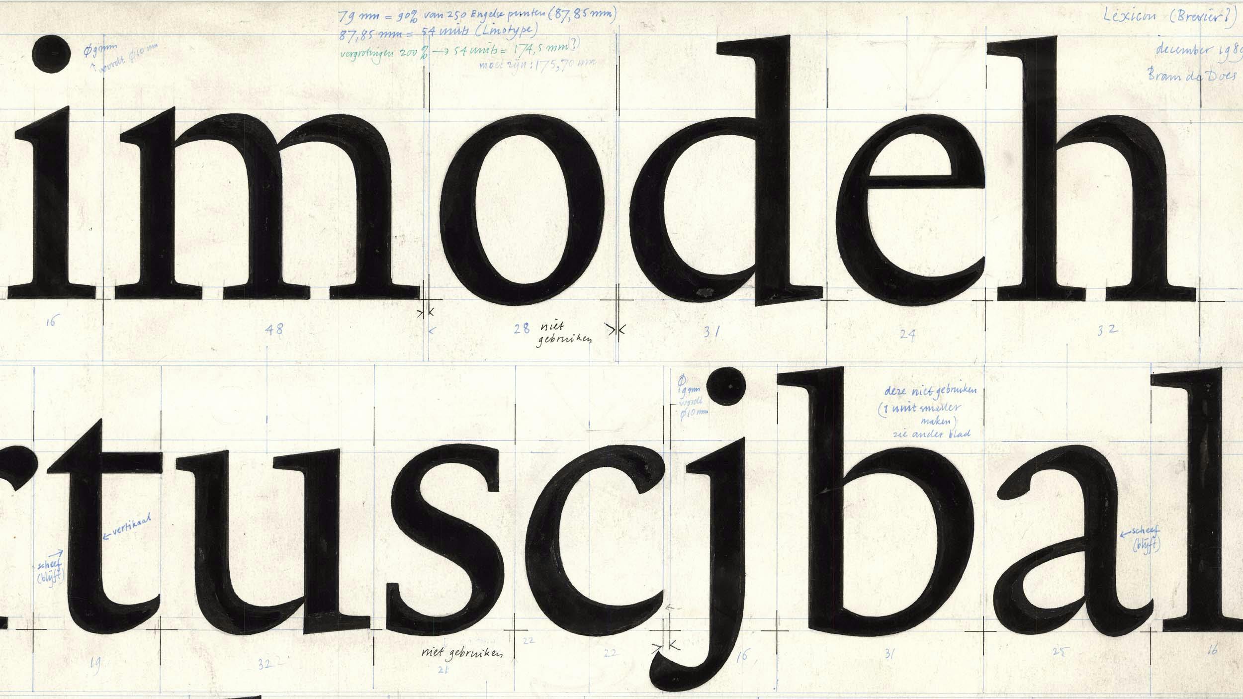
Originality in Type Design
by Peter BiľakThe article was triggered by the discussions with the late Gerard Unger about the nature of originality in the type design industry, highlighting the importance of historical continuity in creating new works while examining the notions of originality and the boundaries between interpretation and plagiarism.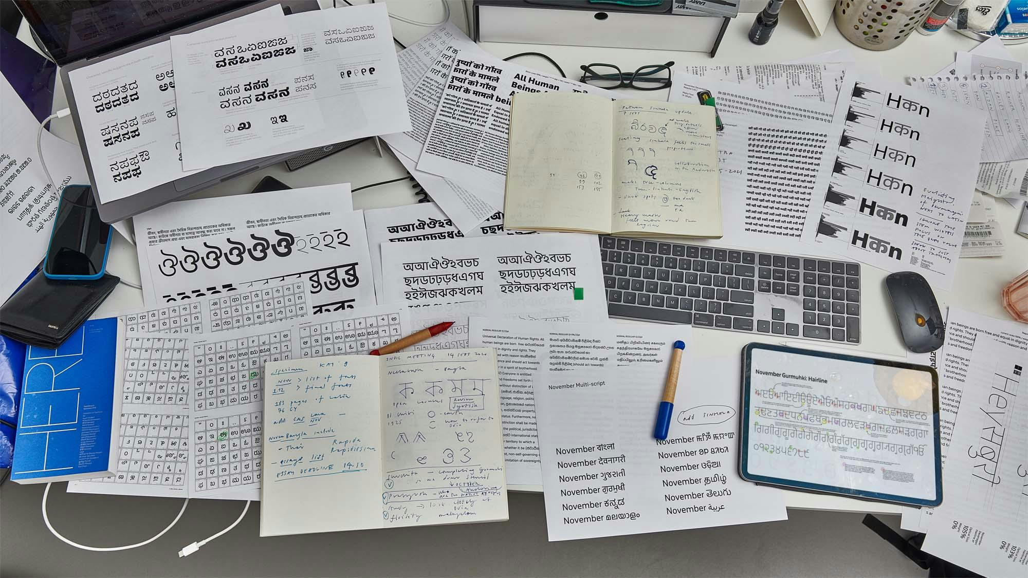
Designing Fonts for Two Billion people
by Peter BiľakTypotheque tackled the unprecedented task of designing a comprehensive set of fonts for South Asia.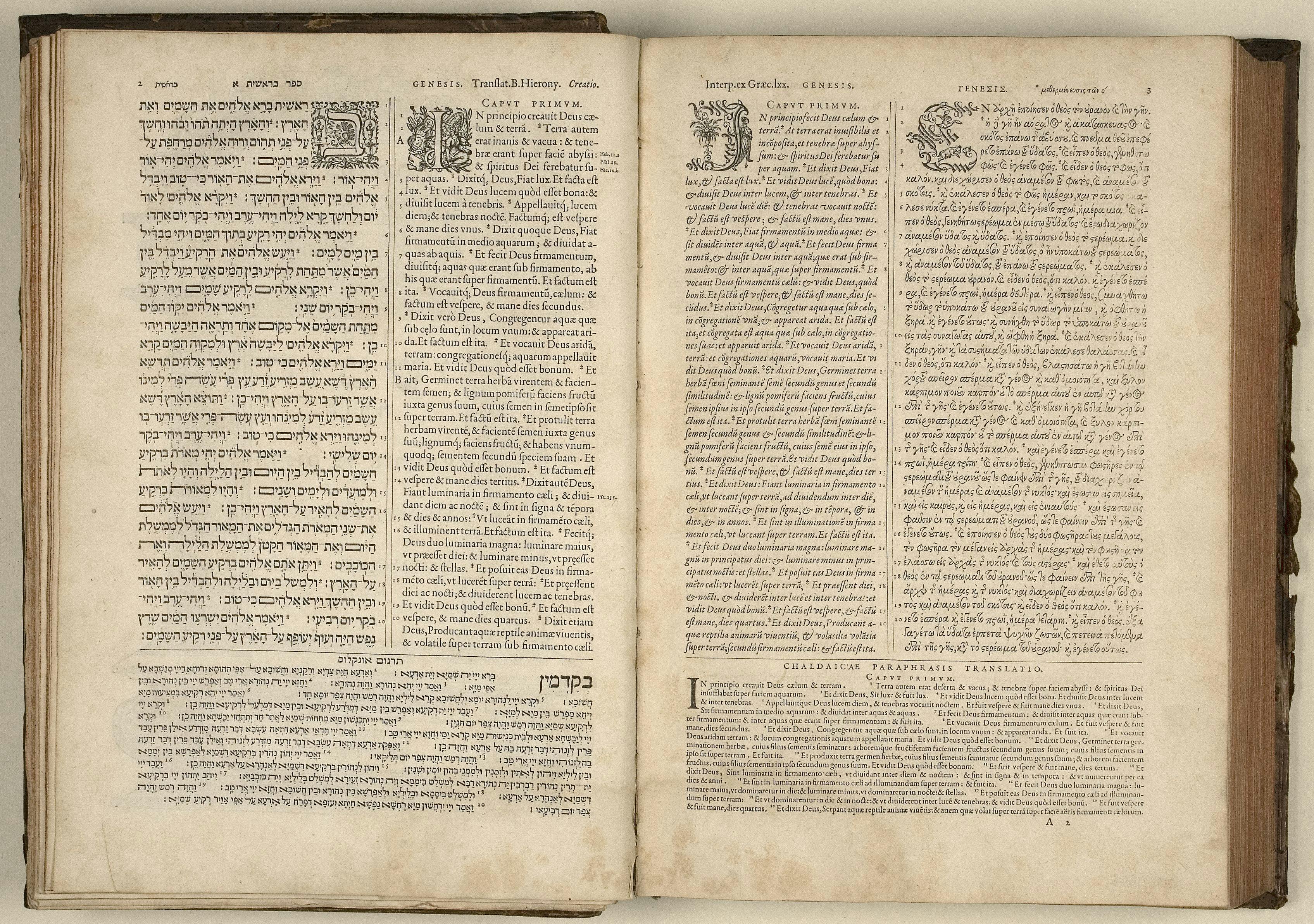
Typeface design beyond a single script
Essays by Peter BiľakCreating a new language version of a typeface is akin to a translation, whereby purpose, intention and respect are as important as proportion and design.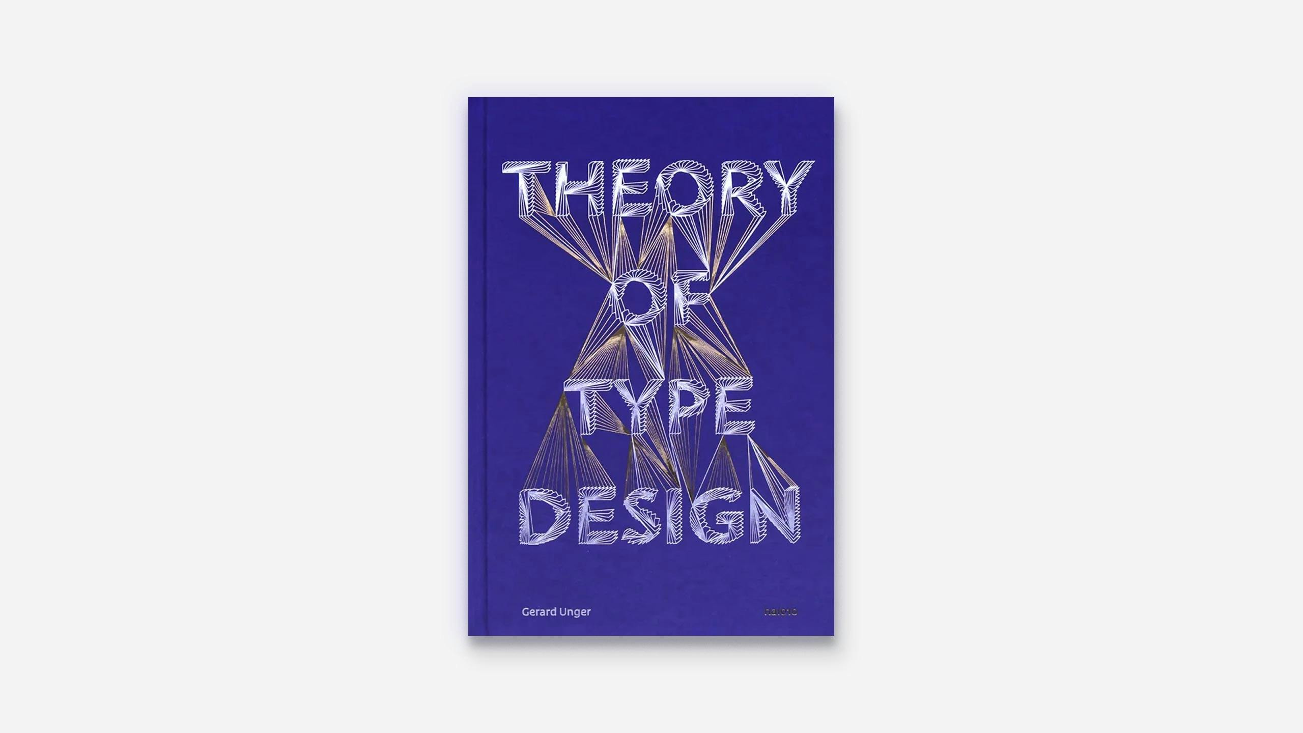
Theory of Type Design, a book review
Reviews by Peter BiľakA book review of Theory of Type Design by internationally renowned type designer Gerard Unger, where he is delving into cultural, historical and social roots of type design and typography.