November Tamil: Designing with purpose
Feedback
In the summer of 2020, I was invited by Peter Biľak to critique the first release of November Tamil – a typeface intended for ‘highly legible and effective street wayfinding and information systems’. At the time, both the Tamil and Devanagari variants were up for review, being the first steps in what would soon be a mammoth project encompassing the dominant scripts from the Indian subcontinent.

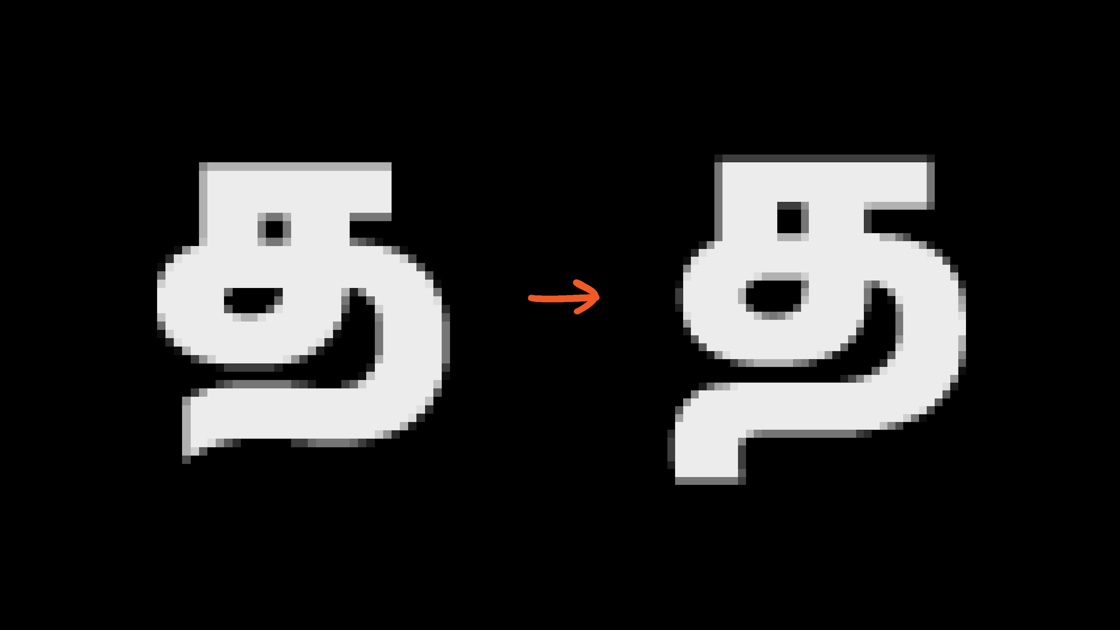
The Latin was intended as a no-fuss-no-frills utilitarian design, ‘one that simply gets the job done’. In stark contrast, the first draft of the Tamil was littered with odd quirks of the human hand. This was exemplified by the limp tails on the த(ta), ந(na), ற(rra) and ஹ(ha), the lacrymal eyes on the vowels அ(a), ஆ(aa), இ(i), உ(u) and ஊ(uu) and the cursive structure of the bowls and matras. More importantly, the construction of forms lacked distinction, making the script more difficult to read in sub-optimal conditions – a significant disadvantage when designing information systems. Issues of weight distribution and drawing quality exacerbated underlying problems.
Notes on the brief ‘neutral’
After discussions with Peter and Hai Liang, we decided that my role in the project would extend beyond excoriating the previous design. I was to redesign November Tamil from the ground up.
The brief was articulated with key words from the official release notes for the Latin: no-fuss, no-frills, no-nonsense attitude, not too friendly, rational, standardised, more practical than personal, utilitarian...
I’ll say it: in short, the aim was to design a ‘neutral’ Tamil typeface.
We’ve come to develop a euphemistic relationship with the term ‘neutral’. Descriptors such as ‘no-frills’, ‘unobtrusive’ and ‘transparent’ help us flirt in secret with a dated concept. A ‘neutral’ Latin typeface refers to a specific and situated Western design movement: the International Typographic Style – a style that ‘sought an absolute and universal form of graphic expression through objective and impersonal presentation’, aided in no small part by the use of grids and sans serif typography. However, now, we do recognise the reality that every style carries with it all sorts of meaning and we expect ourselves to do better than to abuse the term ‘international’.
Instead, let’s consider a simpler definition of ‘neutral’. That a typeface isn’t neutral in itself; ‘it’s neutral because we choose not to think of its expressive characteristics while looking at it’. So, what would a neutral Tamil typeface look like?
Here is a set of what would be considered plain typefaces that a user might encounter on an average day:

Their structures are distinct. The shape of the eyes varies, as does the sharpness of the bowls. Notice the differing widths as well, specifically the width of ர(ra). Yet, as in the case of Latin types, the peculiarities of Tamil typefaces themselves do not harken back to a distinct aesthetic movement. Latin typography is a self-referential and self-mythologising discipline wherein meanings are reinforced through rhetoric. On the contrary, Tamil typography has not been the explicit subject of art movements. Thus, in the absence of any rhetoric, types that are not overtly ornamental or decorated with flourishes and colour appear neutral, that is, readers choose not to think of any expressive characteristics while looking at them.
Since there exists a wide catalogue of structures suitable for a ‘neutral’ design, the brief ‘neutral’ by itself seems inadequate. This is not to suggest that Tamil structures can be designed on a lark. Instead, the purpose of the typeface could help triangulate a more precise brief. In this case, the types were meant to (i) aid wayfinding, (ii) be amenable to long texts, and (iii) harmonise with the Latin. Accordingly, such a typeface had to fulfil the following criteria: first, the shape of each character must be clear and distinct, so each one would not be mistaken for another; and second, the structure of the typeface must resonate with those most commonly seen in long texts. As for the contrast, a monolinear look was the best visual match for a low-contrast sans serif design.
A brief with a focus on function is better able to disentangle scripts from Latin-centric aesthetic norms. It allows each script to explore and refer back to its own history while at the same time enabling them to cohabit on the page in harmony. As a result, companion scripts are no longer idle consorts of the Latin, but fodder for a culturally specific discourse.
A few notes on the design
—Wayfinding
Reading a line of Tamil can give one the impression of driving on a highway lined with trees – columns of trunks whizz past, punctuated occasionally by coiling branches and foliose growth. However, in order to design clear shapes for wayfinding, it was necessary to avoid characters with similar shapes that risked getting lost among the woods.
The ர(ra), its matra forms and the ங(nga) are the usual suspects that require greater distinction.

The ஷ(ssa) and க்ஷ(kssa) were redesigned so that the component on the right did not conflict with that on the டி(tti).

The shapes in the above examples belong to distinct character units, nevertheless, the chosen structures ensure a problem-free reading experience. However, the following changes to the orthography solve more obvious problems. The first is the addition of the loop to the vowel ஓ(oo). The loop has become a common fixture in Tamil orthography and is more recognisable than the subtler upward curve. In fact, contemporary typefaces now use the loopless design to indicate a shorter ஒ(o).
The second change is to incorporate the ஜ(ja) within the ப(pa)-height to differentiate it from the vowel ஐ(ai). Though few typefaces exhibit this structure, it is widely seen in street typography.

Literature on wayfinding typography in Tamil is almost non-existent. The rationale for November reflects no established standard, nor does it prescribe one. Nonetheless, it is articulated here to inaugurate a discourse surrounding functional Tamil typography.
—Text typography
Type designs cast during early-nineteenth-century colonial India still endure today and have given Tamil typography its distinct personality: modulated stroke contrast, an oblique axis and generous ascenders and descenders. Save for the axis, the contrast and proportions harmonise well with the conventions of Latin book typography. However, with upright sans serif typography becoming the norm in web typography, monolinear upright Tamil type is not without precedent.

Screenshots of websites typeset in Tamil: News18, Tamil Murasu and Asianet News
Readability is not a quality innate to design, but one that is dictated by convention. Therefore, during the redesign, certain structures were altered to mimic types common to book typography. For example, the eyes on the vowels அ(a) and ஐ(ai) no longer dip in nor does the vowel உ(u) have a fused mid-bar.

An infusion of text-ness also comes with the addition of tails to characters like த(ta), ந(na), ற(rra) and ஹ(ha). This addition, especially on the த(ta), addresses another concern regarding legibility. The tail-less form, when viewed under trying conditions – a moving car or a pixelated screen – can be mistaken for a க(ka). Lowering the descenders also makes room for more traditional structures, such as the hook on the ழ(llla).

Rounding off the changes are improvements to the drawing quality, weight distribution across bolder variants and spacing. Cursive gestures have been expunged for a straightforward appearance. The characters appear balanced and lend an even colour to the page, all in keeping with the conventions of book typography. Despite the constraints, a few quirks remain. Take for example the vowel இ(i), a vestige from the previous draft, or the shape of the rarely sighted ஊ(uu) signs on the பூ(puu). After all, typeface design is not an exact science and there is room for an element of personal style.

A note on harmony
The primary purpose of most multiscript type-design projects is to facilitate a multiscript page. The popular imagined use is a page where blocks of text in each script are set side by side. With the exception of in-line translations and titles, in most cases these scripts remain immiscible. A successful multiscript design is one that achieves a harmony of forms and a general compatibility of size and texture.
However, the primary purpose of November Tamil was not the multiscript page; rather it was to facilitate Tamil typography. Yet, even within this context, harmony with the Latin was crucial, because of the prolific use of Latin within Tamil text. Although numerals native to the latter script exist, they are all but mere traces of a distant past, and today, Tamil text employs only Latin numerals. In addition, Tamil not only shares the same set of punctuation marks with Latin, but also uses Latin uppercase characters for acronyms and initials.

To accommodate this, the size of the Tamil was increased so the Latin would not appear too large within the text. An even larger Tamil might have allowed for better harmony within Tamil typography but at the cost of harmony of texts across scripts. Any smaller, and Tamil typography would suffer.

A Pocket Dictionary for English and Tamil, 1835 (above). Title card from Japanil Kalyanaraman, 1985 (below)
Harmony in type relies on a variety of factors: the style of the typeface, the proportions of the forms and the spacing. Our judgement of harmony relies on something more volatile: our experience with the script and its conventions across media. To those born in the late 1800s, a ‘harmonious’ Tamil might mean a Tamil whose ப-height is far shorter than the x-height, while to those raised on Tamil films from the 1950s, a ‘harmonious’ Tamil implies a ப-height equal to the height of the Latin cap height. In the end, there are no objective measures, only personal interpretations.
Coda
Every time type designers embark upon a project, they have only a fuzzy idea of what that final design might look like. And yet there is a clarity to the purpose. Captured within the mind’s eye is a glimpse of the life of the typeface – a magazine masthead, a chocolate wrapper or even a line of computer code. It is an image of a possible future that guides every decision, gnaws at every whim.
For me, this was embodied in the distinct blue retro-reflective signboards installed on the roads of Chennai in 2011. The types on these signboards were outlined versions of (my best guess) Modular Infotech’s 802 Black. Word lengths in Tamil can run long, and back then compressing types per force was the only available variable tech.
I designed this suite of typefaces so it could take its place among the signages of the city and thus make better use of the money splurged upon signage systems throughout the state. November Tamil comes in multiple widths and weights. There are no titillating tricks or alternating shapes. After all, it has a job to do.
