Originality in Type Design
The article was triggered by the discussions with the late Gerard Unger about the nature of originality in the type design industry, highlighting the importance of historical continuity in creating new works while examining the notions of originality and the boundaries between interpretation and plagiarism.
Going down the list of the highest-grossing movies of 2018, you will find that seven of the top ten were sequels within existing film franchises, and three were adaptations of existing comic book characters. Number 11 was a remake, and it is not until you get to number 12 that you find an original movie.
Hollywood studios love sequels because familiar characters promise good box-office returns. This is not an entirely new phenomenon, (and book sequels were popular centuries before the advent of film), but only 20 years ago, there was just one sequel in the top ten. ‘The more the international audience is familiar with a title, the more they look forward to seeing it again,’ says Lynda Obst, author of Sleepless in Hollywood, a book which explores the success of movie sequels. ‘In Hollywood, familiarity breeds success, not contempt.’
The list of bestselling fonts at MyFonts, the world’s largest font retailer, offers a similar outlook. The list is dominated by remakes of the classics: Helvetica Neue, Avenir Next, Proxima Nova, FF DIN, followed by new takes on established genres. Helvetica, even though it comes pre-installed with some operating systems, or perhaps because of this, has dominated the bestseller list for many years.
Although the film and type design industry are widely different in many ways, their approaches are strikingly similar. Both work with a careful mix of familiarity and novelty, both prefer the repetition of successful formulas, and both take every opportunity to milk their successes for all they are worth. But while cinema has a seemingly infinite variety of elements to choose from, type design operates under one fundamental constraint: as original as you may want your design to be, an ‘A’ must still be recognisable as an ‘A’ when you are done with it.

Thus, the history of type design is a progressive series of discoveries, an accumulated body of knowledge that all typefaces continue to build upon. Consider Heldane, a typeface by New Zealand type designer Kris Sowersby. As a primary source of inspiration he credits 2-line Double Pica Roman by the Flemish punch-cutter Hendrik van den Keere, from whom we can trace a direct lineage back through Claude Garamont and Robert Granjon, then further to Venetian printer Aldus Manutius and his engraver Francesco Griffo, who in turn built on Nicolas Jenson, the most important Venetian printer of the 1470s. Nor does the line end there; Jenson was an innovator who broke from the conventions of his day, but his work was also rooted in his predecessors and didn’t spring from a vacuum.
Every single detail of Heldane, its spurs, stroke transitions and modulation of contrast, can be dissected and referenced from historical models, and Sowersby carefully chose the best details from historical sources to create this new typeface. In an email interview Sowersby clarified his position about originality: ‘The actual users of our work don’t seem to care so much about “original”, but they care about “good”. So, now, the ideas of “new” and “original” are much less important to me than “good”. I would much prefer that my typefaces are thought of as good than original.’
Imitation is a building block of all learning, and copying master works used to be part of standard training in the arts. An important assignment in the first semester of Type & Media, the postgraduate course in type design at the Royal Academy of Arts in The Hague, is to create a digital revival of a typeface from a book of the student’s choice printed before the 1940s. This academic exercise in the interpretation of a historical typeface may seem straightforward, but reviving a typeface that was produced in a different era for a completely different technology raises a lot of questions about design intentions and preserving original characteristics. ‘It can be incredibly hard sometimes if you try to capture the spirit of the original,’ says Paul van der Laan, the teacher who supervises the project. ‘What can be considered a flaw, and what can be considered a defining characteristic?’ The assignment is not a slavish copying of some venerable source, but a practical lesson about the value of history, an exercise that requires students to look critically at the quality of the book and its type. The Dutch type designer Erik van Blokland once asked 90 designers to create digital versions of the same high resolution scan of a lower case letterpress ‘n’. No two results were identical, which shows how much room there is for interpretation.

Rutherford Craze, when he was a student at the Type & Media course in The Hague used a time tracker for his revival project and clocked 58 hours, of which half was spent on research and preparation, and half on the actual design work. That is an unusually short time for a novice designer to get to a satisfactory and useful result, and it was possible mainly because he was working from a model. ‘Being able to compare the result to the original is probably the most helpful aspect of working on a revival,’ says Russian designer Maria Doreuli, who also studied at Type & Media and sees revivals as a great first step towards learning type design. Her first typeface was a revival of Caslon. ‘It would have been much harder to both come up with an original idea and learn basic type design principles at the same time,’ she explains.
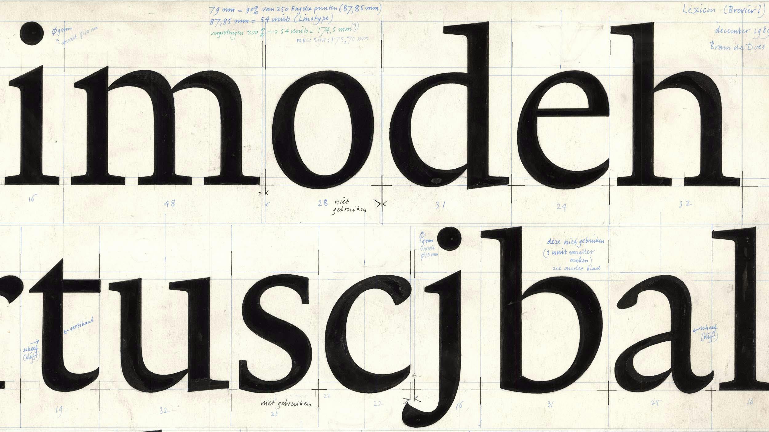
Dutch typographer and type designer Bram de Does had a different experience with his first typeface. Tasked to create a revival of Jan van Krimpen’s Romanée, he ended up proposing an entirely new design based on personal principles that included functionality, harmony, practicality and originality, (or in other words, he wanted his typeface to be good, beautiful, cheap, and special). He was able to define detailed criteria for the first three principles, but had to leave ‘originality’ as something important but impossible to measure.
One of the most original type designers of recent time was another Dutchman, Gerard Unger. Shortly before his passing, we talked about whether it is realistic to expect new typefaces to be original. Unger replied that throughout his life he was unable to make a historical revival: ‘In the late 1980s, I finally decided to make a revival of one of Fleischmann’s Romans. I had perfect photographic enlargements made by Bram de Does. After working onscreen for a while I began to realise that it was not Fleischmann I was working on. The letterforms were turning into something different, into one of my own designs, Coranto.’ Unger's experience, approach and personality emerged in all his typefaces, even when he tried to imitate historical models.
With the metal type era receding farther and farther, and the digital era in its fourth decade, designers will more frequently be inspired by sources which are digital and don’t require the technological transformation that justified the practical need for revivals of metal-era fonts. ‘I don’t care about the source medium for my projects,’ says Sowersby. ‘Unless it’s integral to the concept of my typeface, I don’t think it matters. I don’t think it’s ever mattered, really.’ Others may disagree, and find that working from digital typefaces allows far better reproducibility with fewer variables.
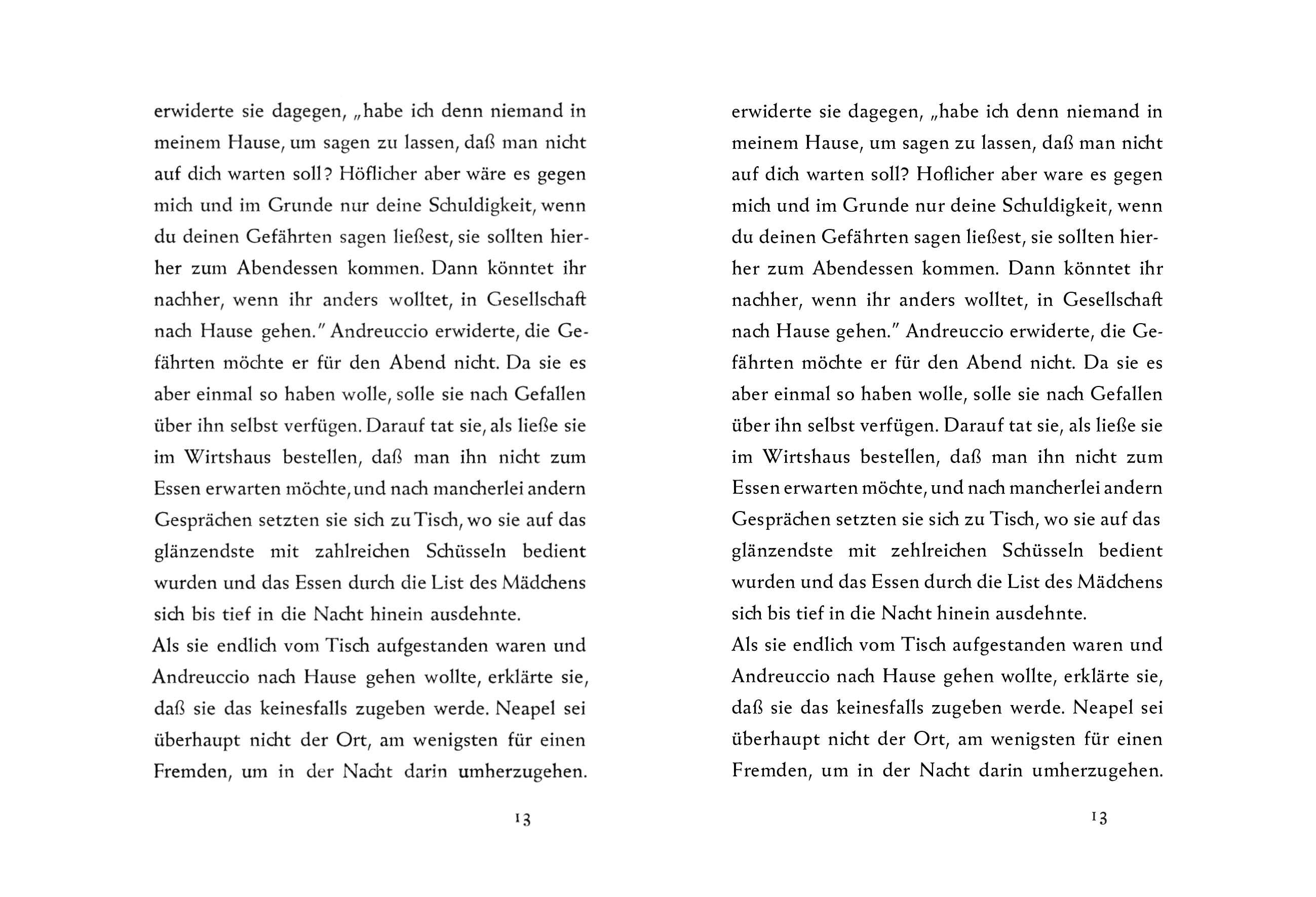
Drawing inspiration from models in the same medium, however, raises another question: where is the boundary between emulation and plagiarism? While working on a new text typeface based on Roman inscription lettering, American type designer Lucas Sharp noticed that his typeface, Eros Text, started to resemble Bram de Does’ Lexicon, a personal favourite of Sharp’s. ‘It was just falling in love with someone’s work, playing with the shapes, making it my own, and bringing my contemporary perspective on it, also bringing awareness of this cool designer from history into the contemporary space,’ he explained. Enschedé Font Foundry, the publisher of Lexicon, was not amused, and sent Sharp a cease and desist letter, finding Eros Text too similar. ‘Personally, I think we were very unfairly singled out. It pointed to a little bit of hypocrisy in the industry,’ Sharp commented at a public discussion in Vienna. ‘We need to decide as an industry where the line of the “too soon” taboo is. The answer cannot be that working with digital-native source material is forbidden, and on the flip side we should not abide those who seek easy profits from others’ ingenuity.’
This is an important, if extremely difficult, issue today when digital reproduction makes it easier to remix, remake, reuse, reassemble, recycle, repurpose and recombine, which generates more possibilities for new works, but also for plagiarism and theft.
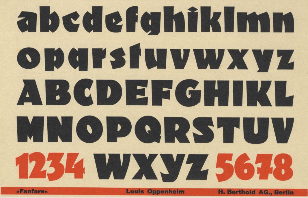
Claiming complete originality in type design (or any creative discipline) can be seen as either naive ignorance, or historical amnesia, since we learn by absorbing influences in the world around us. Achieving the dictionary definition of ‘original’ (‘not dependent on other people’s ideas’) is unrealistic. On the other hand, there are also typefaces obsessed with archaic details, ideas that have been proven regressive and are irrelevant to contemporary demands, mere repetitions of what belongs to the past. Type designers must avoid both extremes, seeking originality in a subtle game of variations and transformations out of which, once in a while, comes the shudder of true creative surprise. ‘Sometimes it feels like we’ve seen all the ways to render the Latin alphabet. There are always new ways,’ commented Stephen Coles of the online typography review Typographica after seeing Orientation, the unique new display typeface by Sandrine Nugue. Orientation simplifies the letterforms in a most surprising way while maintaining legibility, and it has been hailed by many as a brilliant example of original contemporary design. ‘I am not interested in revival; it is too closed and does not allow enough freedom and creativity. But I am honest about crediting my references,’ Nugue explains, pointing to Fanfare by Louis Oppenheim, a 1920s design from Berthold that inspired Orientation.

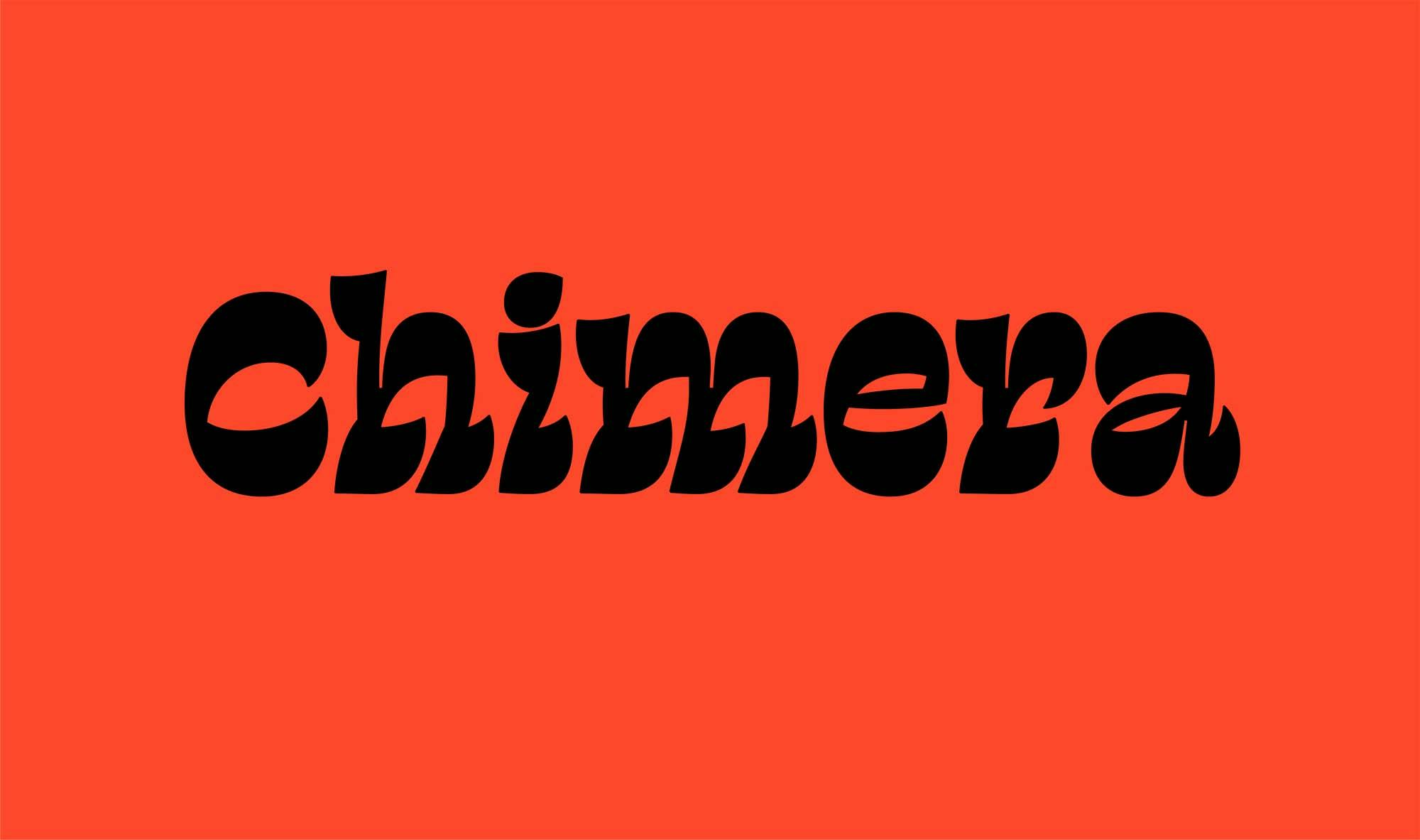
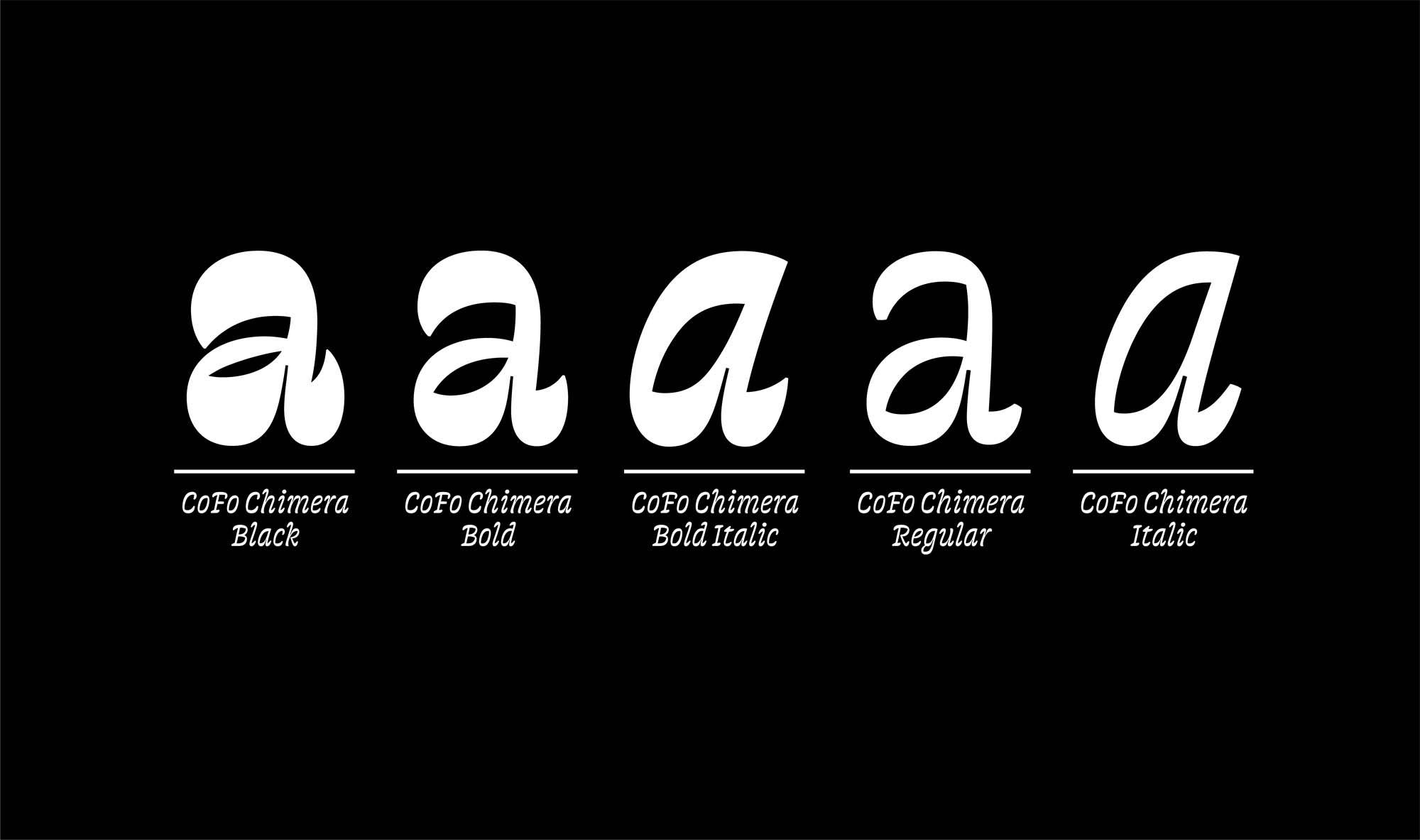
Chimera, by Maria Doreuli, is an experiment in bringing dynamism and beauty into the reversed-contrast typefaces of the 19th century. Chimera is quirky, unconventional, daring. Just as Orientation finds originality within a historical context, this typeface builds on the past to participate in the bigger story of type design.
The world we live in today is the best version of the world we know. Many long for the good old days, but the fact is that more people are healthier, happier and better educated than ever before, largely thanks to progress in nearly every field of human endeavour. It is natural that typography is also evolving, building on the progress of our predecessors who used every means at their disposal to advance the profession. We admire the work of Jenson, Griffo, Granjon, Garamont, Van den Keere, De Does and Unger, who all managed to make a lasting contribution to how we understand typography and type design. Now it is up to the current generation to continue to advance the profession by seeing the new possibilities of type design, by recognising history as an infinite source of accumulated knowledge and fuelling new work that will in turn inspire the work of the future.
History’s main enemy is the end of progress. Repeating what has already been created closes the circle of discoveries. It is unrealistic to expect that every new typeface will be unique and original, but giving up this ambition leads to stagnation.