Syllabics typographic guidelines and local typographic preferences
This essay provides guidelines to fine Syllabics typography through identifying its general and inherent concepts, as well as detailing the nuances found in local preferences within individual communities.
In order to understand the scope of local typographic variation in the Syllabics script, we need to first understand the fundamental styles that exist within the system, how Syllabics spread to communities across the continent, the uses of the Syllabics in these communities – both historical and contemporary – and the encoding practice that was undertaken by the original script encoding committee that developed the Unified Canadian Syllabics repertoire within the Unicode Standard. An exploration of these factors gives us an understanding of, and the context behind, why particular typographic preferences exist across various communities, and helps us investigate the contrast in preferences between communities. Additionally, it indicates why some communities’ preferences are clearly met within the current digital text standards (Unicode), and why others are not.
Section one: Guidelines for Syllabics typography
The Syllabics system – even given its great variability in local preferences and conventions – is still anchored by general typographic conventions that are present across all orthographies, and that are Syllabics-specific. Therefore, for those who wish to employ the Syllabics in typographic works, it is useful to have a guide to the concepts that are unique and important to the Syllabics, in order to implement them correctly. This requires a respect for both the core typographic principles and variations in local typographies.
The following section provides an overview of these fundamental concepts that are generally applicable to the typography of all Syllabics-using Indigenous languages and their respective orthographies.
Rotation
A defining feature of Syllabics typography is the rotation of syllabic (syllable) characters across four potential orientations. While this serves an important linguistic purpose (to inflect the vowel of the syllable), it also has notable implications for the design of Syllabics typefaces, particularly in those that contain a contrast model. Typically, syllabic characters are reflections or rotations of one base character that populate the subsequent glyphs in a series, in some cases with minor optical adjustments. Since the graphic form of the Syllabics developed as a monolinear structure, there is no writing model to dictate a modulation structure in Syllabics typography. Rather, a modulation pattern is fixed onto the characters, and that pattern must also adhere to rotation through the four orientations.
Syllabic
A syllabic is a full- or medium-height character (depending on the style tradition) which represents a vowel or consonant cluster. Each syllabic form represents a consonant, and the base vowel is changed depending on its orientation (ᕓ=ve, ᕕ=vi, ᕗ=vo, ᕙ=va). Rotation is in fact the unique orthographic trait that distinguishes the Syllabics from other scripts, and this also underpins its design structure. Note that each syllabic form is typically unchanged when it is rotated across the four positions.
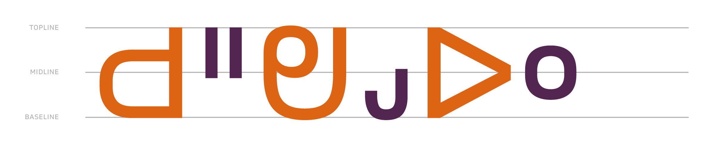
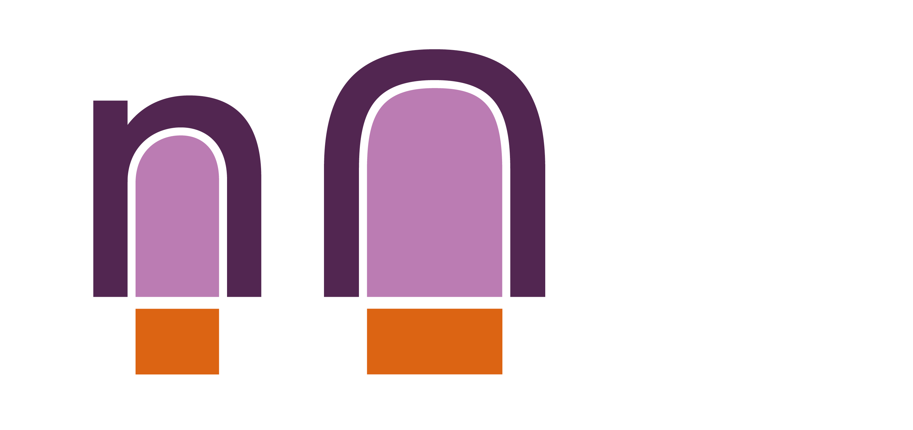
Final
Finals are primary characters that are smaller in size than the full-size syllabics (but are not a diacritic mark), typically being roughly one half in scale of the syllabic characters. Some communities and their orthographies prefer that these characters appear as superscript versions of the a or i position syllabic (ᒪᐦᑭᓯᓐ), while others prefer shapes that do not reference the final pure-consonant syllabic they represent, in a given series (ᒪᐦᑭᓯᐣ).
In many Syllabics orthographies, the finals are vertically positioned at the topline metric, which is the default positioning of finals characters in the Unified Canadian Aboriginal Syllabics (UCAS) code charts. This is the case for the Algonquian and Inuktut Syllabics; however, the orthographies for the languages that use the Dene Syllabics require variation in the vertical positioning of their finals marks between top-, mid- and baseline metrics in order for accurate pronunciation to be represented in these languages. The Carrier Syllabics similarly maintain a preference for their finals characters to be vertically positioned at the midline, although this preference is stylistic, rather than a requirement for accurate representation of the language in text.
Series
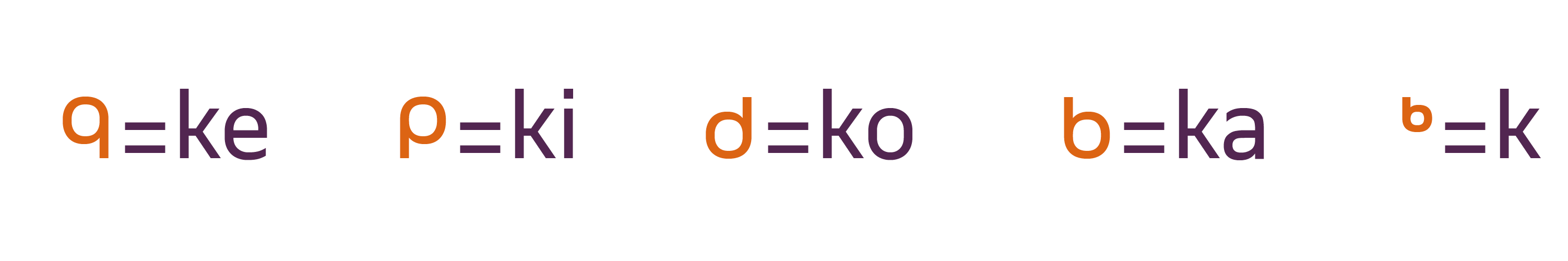
A series in the Syllabics is a collection of the syllabic and finals characters across their respective rotations in a given orthography (ᑫᑭᑯᑲᒃ). Note that the consonant remains consistent, and the vowel is inflected depending on the orientation in which the syllabic is rotated. The final character is used to represent a pure consonant form, and is smaller in size when contrasted with the larger syllabic characters.
Square form vs round form styles
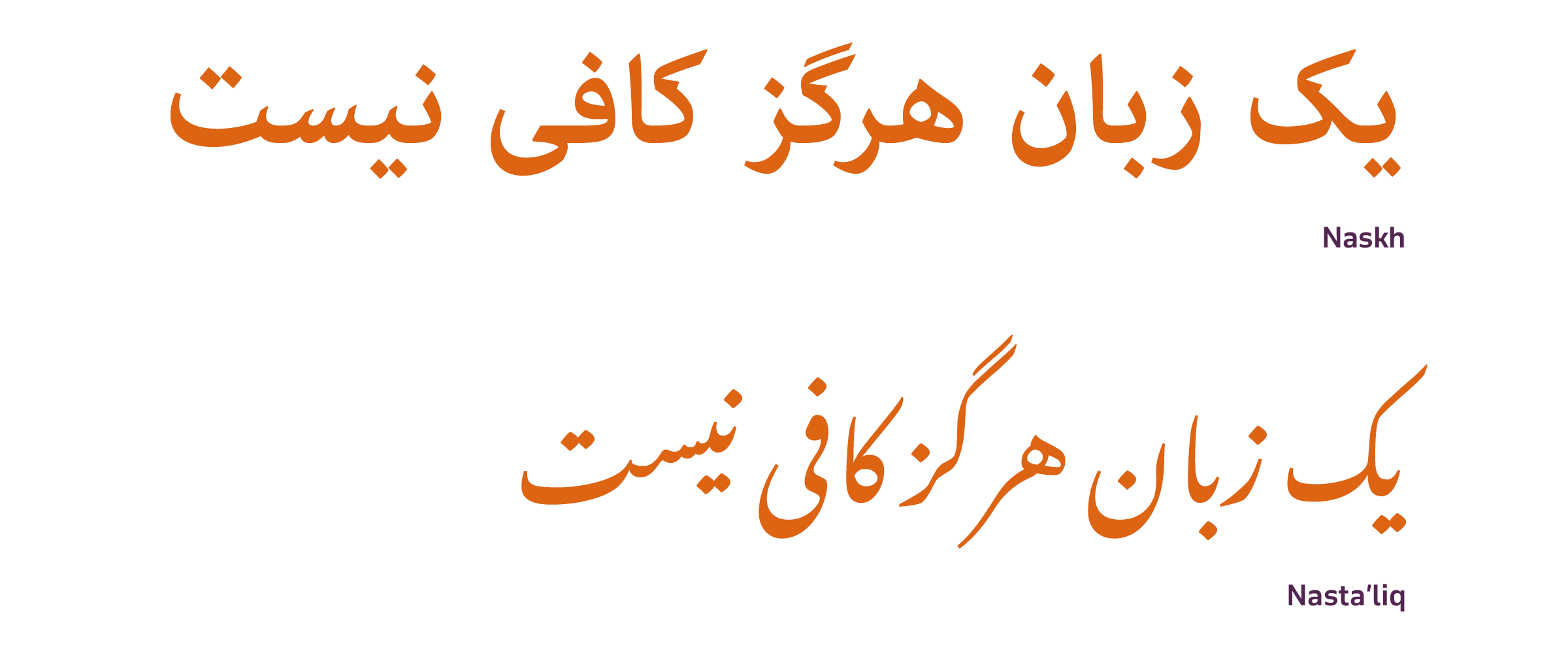
In many script traditions, differing styles exist, with certain user communities strongly identifying with one over the other. This can be seen in the style traditions within the Arabic script, for example, where some communities prefer the Naskh style for general text composition, while others, such as Persian communities, strongly identify with the Nasta’liq style. The same script and generally the same essential characters are being used across these communities, but each community expects to see their language written in their respective preferred style. To ignore this would result in a text that was neither culturally appropriate for local readers nor able to convey adequately the meaning and atmosphere of the text for that readership.
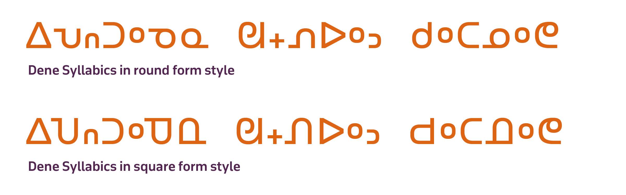
A similar situation exists within the stylistic spectrum of the Syllabics, where there are two dominant style traditions: the square form and the round form style. These systems differ typographically in their proportional relationships, particularly in terms of each model’s rules for height and width proportions for the syllabic characters.
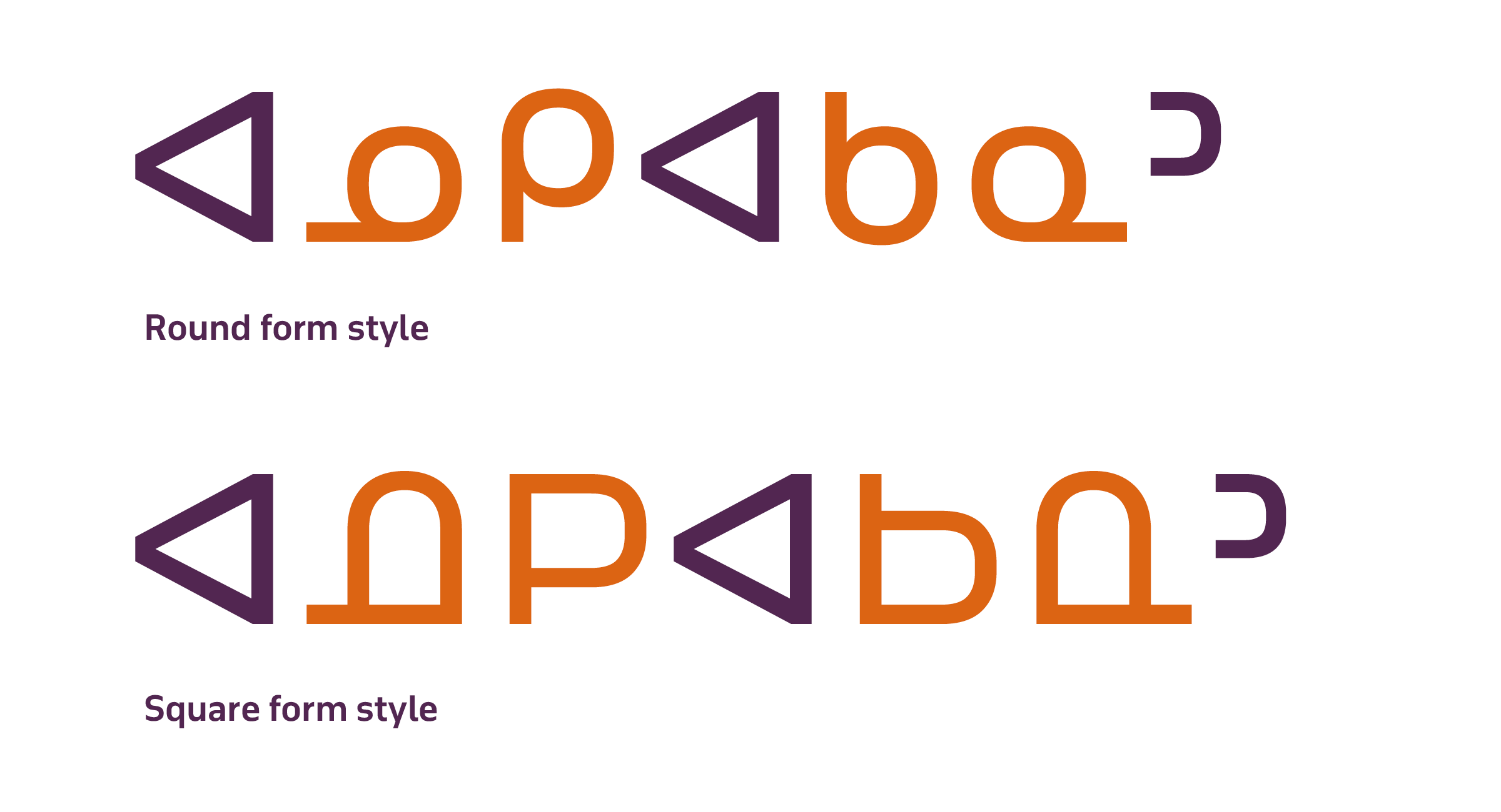
The name ‘round’ in the round form style comes from the open, circular forms used in many of the series. This was the original style to appear in the first printed Syllabics texts, and it is the most common style of Syllabics in use, which has led to it becoming the default style within the Unified Canadian Aboriginal Syllabics code charts.
The ‘square’ form style is characterised by the uniformity of all character heights, with syllabic characters all reaching the topline height. All characters also share an optically uniform width proportion, with the visual ratio of width-to-height being roughly 1:1, giving the character set a ‘square’ appearance. This style was primarily used by French Catholic missionaries in Western Canada, who were importing their printing equipment from France, with their type being supplied from Brussels.
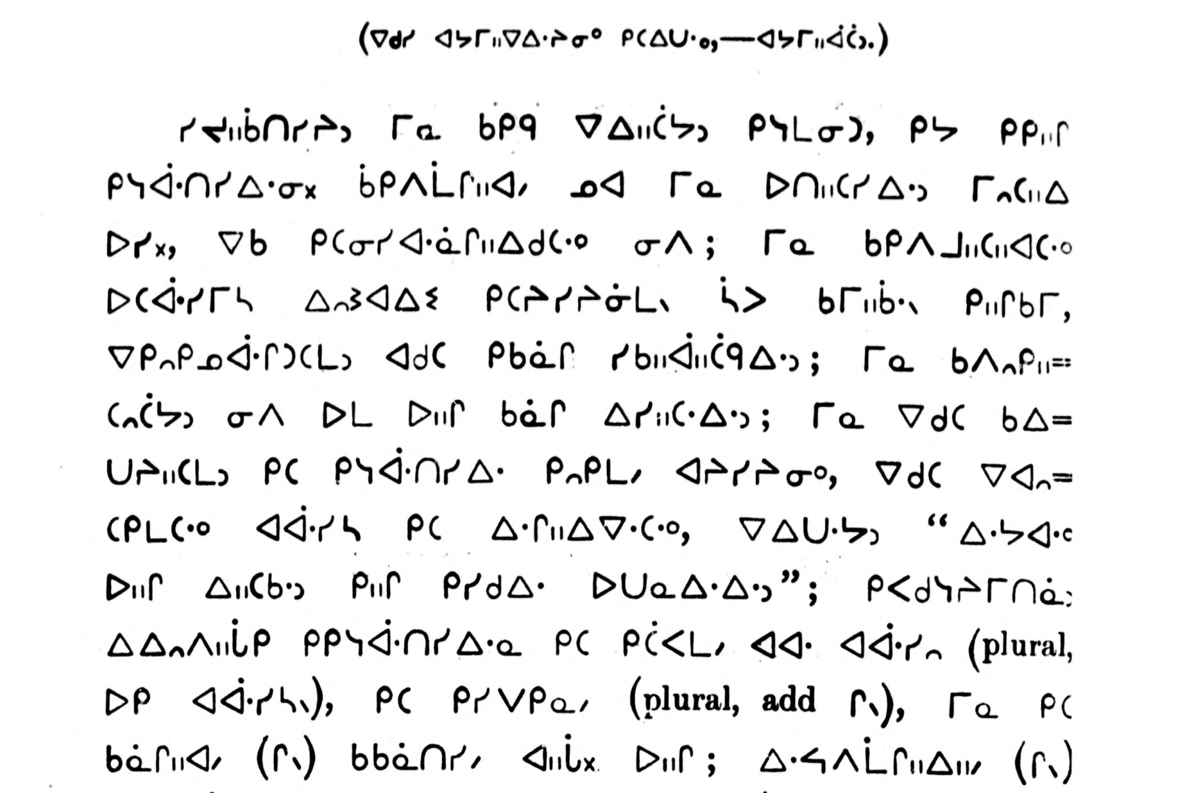
A detail from a page in ᐊᔭᒥᐁ ᓀᐃᔭᐁᐧᒪᓯᓇᐃᑲᐣ ᐊᔭᒥᐊᐃᐧᓇ ᓇᑲᒧᓇ ᒥᓇ ᑭᐢᑭᓄᐊᒪᑐᐃᐧᓇ / Prières, cantiques, catéchisme, etc., en langue crise by Jean Baptiste Thibault, 1886, showing the North Slavey Dene Syllabics printed in the square form style.
Word space
In order for Syllabics word images to be legible and easily read in text settings of any kind, the word space character must be much wider in comparison to the conventional Latin word space.
Bill Jancewicz, Algonquian Syllabics expert, notes that ‘Much more difficulty has been experienced however with the whitespace, in particular the word-space character, which is encoded in BJCree UNI at somewhat wider than an em. The Euphemia word space is much too narrow for legible reading of syllabics.’ 1
This wider word space is required primarily due to the very wide stance of the Syllabics system, exacerbated by the frequency of large, open counterspaces that result in pockets of whitespace throughout paragraphs of text. The space glyph in the Syllabics text must be roughly as wide as the width of the largest counterspaces (commonly, characters such as ᐃᐊᑎᑕ), allowing for word images to be clearly distinguished from one another.
Syllabics typographic grid
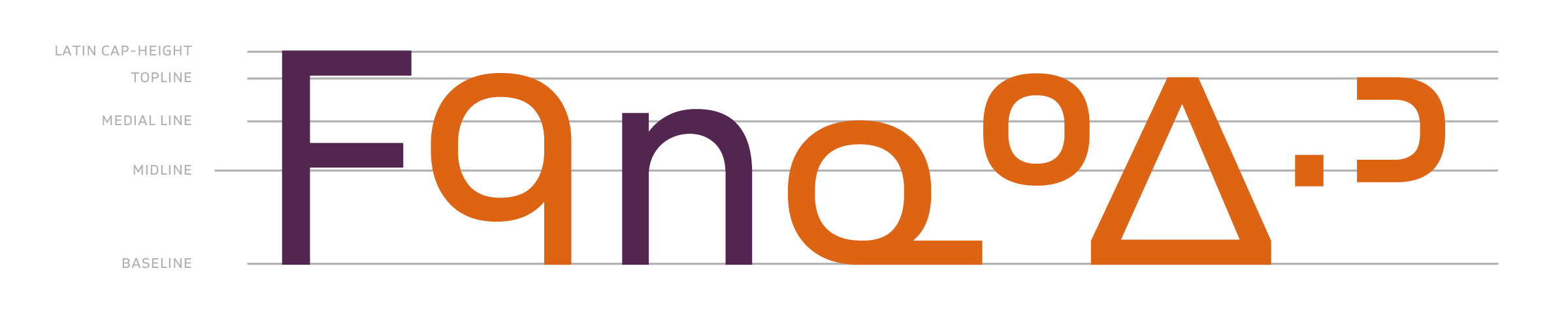
As in any type system, there are inherent vertical metrics that should be observed, which contribute to the optimal appearance of a given writing system. An aspect of the Syllabics typographic grid that must be observed is the relationship of the Syllabics to the vertical metrics of the Latin scripts, as these two systems are frequently used together. This has much to do with the internal counterspaces of the Syllabics, which are wide and usually open, and contribute to a horizontal movement on the line. By contrast, the internal counter rhythm of Latin type is very narrow and vertical, which gives it a more vertical stance in lines of type. For this reason, the topline of the full-height Syllabics characters should be roughly 10–15% shorter than that of the Latin cap height, even when the Syllabics is set on its own in paragraphs of text.
The importance of the midline
In the vertical metric proportions for the Syllabics, the midline is an essential grounding point for anchoring the full-sized syllabic forms (full height and medial height), finals and diacritic marks.
The midline provides a unit of measure for the appropriate and ideal size of the finals characters. While there can be no definitive vertical height metric for the finals marks, ideally they all generally conform to a height proportion dictated by the midline, which allows them to remain at a size that allows for their easy distinction in text settings, making word images easier to decipher.
Syllabics hyphen and full stop
While many orthographies use only Latin punctuation marks, many of the Algonquian Syllabics communities employ a script-specific hyphen and full stop mark. These marks are important in such orthographies – especially the Western Algonquian Syllabics model, whose finals marks risk becoming ambiguous when used with the Latin hyphen and full stop character forms.
Syllabics anatomy
It is common for viewers outside of Syllabics-using communities to view the Syllabics characters as simple geometric constructs without a writing path direction. This is not the case, however, as syllabic characters do possess a construction pattern, which provides a view of the foundational components that build up Syllabics characters. If we look at the handwriting of Syllabics users, we can see quite clearly the common stroke construction and these foundational structures, which together paint a useful picture of the underlying structure of Syllabics typefaces.
Line spacing
While the Syllabics possess a structure that features relative uniformity in the height metric compared to the Latin script, with only diacritic marks reaching above the topline height of the characters, and generally no elements reaching below the baseline, paragraphs of text benefit greatly from larger amounts of line spacing than would be typically seen or needed in the Latin script. The large, wide-open counters in many characters – which tend to manifest frequently across the various orthographies and the patterns their languages produce – result in large ‘pockets’ of whitespace interspersed throughout a given paragraph. These large voids of whitespace can form ‘rivers’ through a paragraph of text that interfere with the reading experience significantly. Increasing line spacing removes such visual distractions and improves the reading experience. These same factors are why the Syllabics word space must be of an appropriate width to suit the wide Syllabics character forms.
Punctuation marks
While it was noted above that there are script-specific Syllabics punctuation marks used by the Algonquian languages with an orthography in this writing system (the Syllabics full stop (᙮) and hyphen (᐀)), all orthographies within the Syllabics writing system utilise Latin script punctuation marks in text settings, including exclamation and question marks, parentheses, brackets, dashes and quotation marks. As revealed in the ‘Syllabics typographic grid’, the Syllabic glyph proportions should ideally be designed at 10–15% of the cap height, and therefore, the same Latin punctuation that is tailored for the Latin script will appear out of place when used with the Syllabics. To solve this, dedicated punctuation marks and special character glyphs should be available that are designed to suit the shorter height of the Syllabics, as well as the wider proportions of the Syllabics glyphs. This allows for a cleaner reading experience for Syllabics texts, especially in documents that have Syllabics and Latin settings running alongside one another, or in embedded settings, which is very common.
Numerals
As in the script-specific substitutions for the punctuation marks and special characters shared between the Latin and Syllabics scripts, a similar solution is required for numerals, in order that they harmonise well with the inherent proportions of the writing system. As previously noted, the shorter height and wider character proportions of the Syllabics are counter to those of the Latin script. The numerals in a typeface that have been designed for use with the Latin script will be too tall, and too narrow in width, to create a comfortable rhythm in Syllabics text settings. This is particularly true for nested settings in paragraphs, as well as lists. It is also worth noting that the Syllabics – a unicase script that features only the rarest occurrences of a descender in some dialects of Inuktut (ᖢᖤ) – only requires the use of lining figures, and not a model varied in height as in oldstyle figures.
Line lengths
Generally, the Syllabics will need a wider paragraph measure than the Latin script to account for the wider stance of the writing system (as noted above). This is variable, however, and depends on the language in which the respective script is being typeset. The Algonquian and Inuktut Syllabics tend to have on average long word character counts, which results in a significantly longer line length needed compared to English or French text. The Dene Syllabics (which also includes the Carrier Syllabics) – in contrast to the Algonquian and Inuktut Syllabics – possess word character count lengths that are much shorter on average, thus allowing for narrower paragraph measures. However, a wider line length is still advantageous for easier reading, as the same internal counter structure discussed above is present in the Dene Syllabics, which benefits from the added space.
Romanisations
While this essay focuses on a discussion of the Syllabics and its inherent typographic conventions, each community that uses this writing system also requires the use of a standard roman orthography. In the Indigenous language communities that use this script, Syllabics is the primary orthography for writing the language, with the romanisations necessary for transliterations of Syllabics texts – mainly for language learning purposes, for accessibility of texts for non-local speakers, and to provide a mode of text input on various digital platforms.
When working with romanisations of a language that also uses Syllabics, it is important to pay close attention to the text composition/decomposition requirements of the roman orthography. In some languages, the standard roman orthography has no special requirements in this area – such as Inuktut, Cree and Ojibway. Others, however, feature glyph sequences requiring combining marks that must stack on top of or beneath the base glyph in order for the romanised text to be readable. This is true for many of the Dene languages that also employ a Syllabics orthography. Care is needed when choosing a font that accommodates these requirements, as most typesetting scenarios for these languages will require the handling of both Syllabics and roman text.
Encoding: UCAS
The Canadian Syllabics were initially encoded in the Unicode Standard in 1999, in a series of blocks carrying the name Unified Canadian Aboriginal Syllabics. This encoding model was an attempt to harmonise the many Indigenous languages and their Syllabics orthographies that used the writing system within one script range. The result was a character map that sought to avoid duplication of characters, making decisions to ‘unify’ the appearance and behaviour of syllabic and finals characters that all languages would use. While this was the goal of the original script encoding committee, in practice, it has resulted in many orthographies – particularly the Dene and Carrier Syllabics – not being accurately represented and supported. Many characters needed specifically for the Carrier Syllabics were disunified in the original encoding for the Syllabics, but despite this, the representative glyphs were erroneously harmonised with the style of the more populous Inuktut and Algonquian Syllabics communities. Further, recent additions made to UCAS by Typotheque’s Syllabics project have added new syllabics characters required for Nattilingmiutut, a dialect of Western Nunavut.
Another factor for typographers to be aware of is that multiple encodings for the Syllabics have existed in digital text – the Unicode Standard mentioned in this section, as well as support in the ASCII Standard – with corresponding fonts following these encoding models. This can result in significant errors in mappings of document texts encoded using ASCII, and intended for use with ‘legacy’ fonts that follow this Standard.
It is therefore important for users to be aware that local typographic variations exist within different communities, and to be able to identify the digital text encoding standard with which a given document has been created. A font should then be selected that addresses the local preferences of the particular community and that pays attention to the encoding model which was used to prepare the text to be typeset.
Section two: local typographic preferences in Syllabics typography
While there are many general conventions in Syllabics typography which permeate the multiple languages that use the writing system, there is also a great deal of local variation in the typographic preferences between individual communities across North America. This is not only due to the large geographic spread of the Syllabics across the continent, but is also the result of the self-governance of some linguistic communities, and the lack of large-scale standardisation in the writing system. For example, the local preferences in some Ojibway communities might show only slight differences from those of nearby groups, or vast ones, often for geopolitical reasons.
In some cases, these variations in stylistic patterns have a long tradition of use by a given community, and should be accommodated as they are important to the community’s independent visual and linguistic identity within a larger language family. The following section documents these variations across the Indigenous communities that use the Syllabics, and provides insights towards employing these variations.
Dissemination of Syllabics across North America
Often, analyses of the Syllabics as a writing system focus on the major and minor language family classifications into which the corresponding Indigenous communities who use the script are divided. However, a more appropriate basis for organising the Syllabics-using communities is to focus on the graphic attributes of the orthographies. This leads to a grouping of the communities into three major traditions: the Algonquian Syllabics, the Inuktut Syllabics and the Dene Syllabics. By collating the languages into groups by the tradition they fall into, we can more clearly follow the development of Syllabics across North America from an historical perspective, and see where, how and why certain styles and practices arrived in certain communities, and we can better detail the nuances of current local preferences.
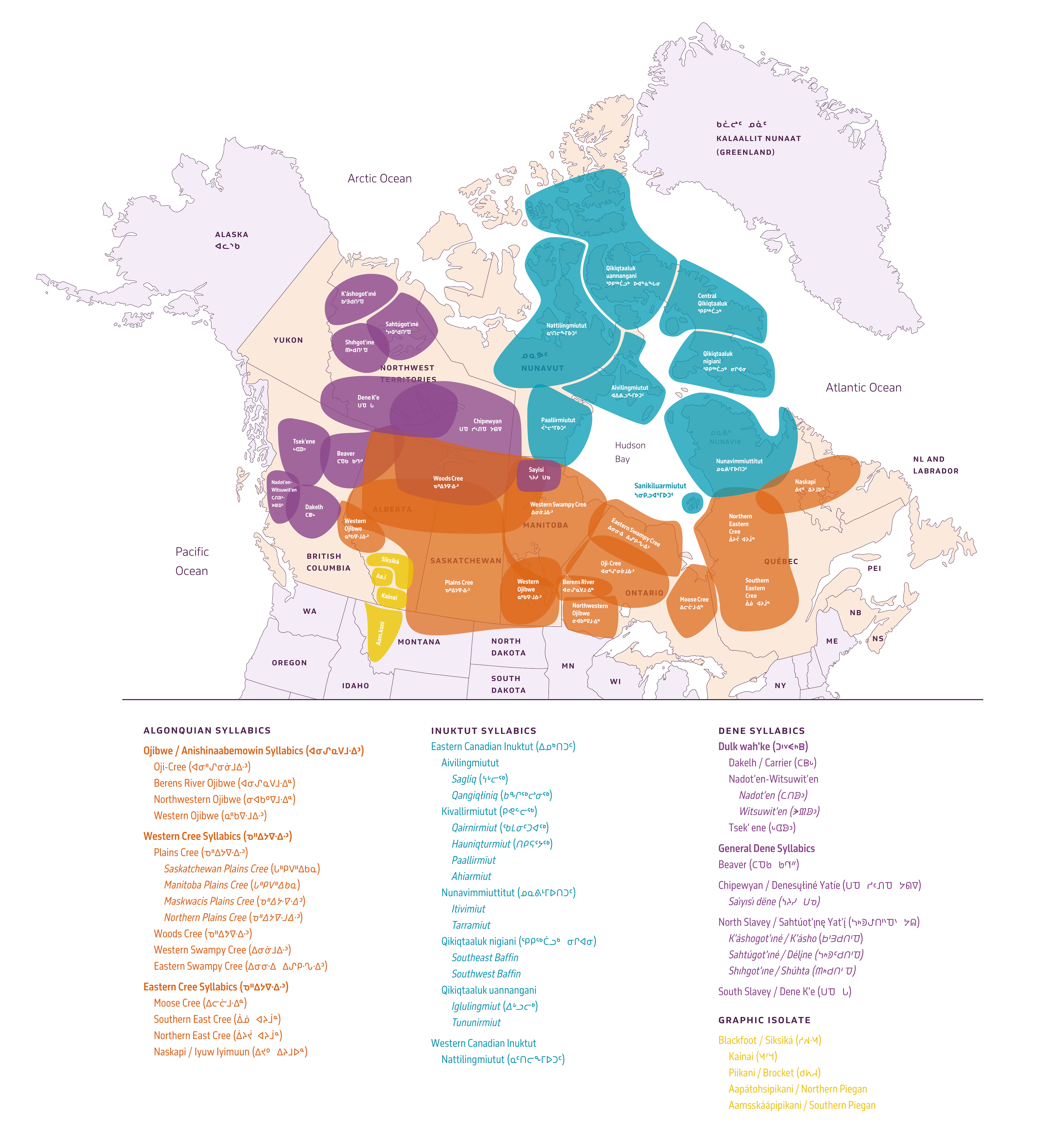
There are multiple origin stories behind how the Syllabics came to be. This essay will refrain from debating that topic; however, one thing is certain: the first surviving printed example of the Syllabics was in the Algonquian language Western Swampy Cree (ᐃᓂᓃᒧᐏᐣ), in the round form Syllabics style. This initial printed work in 1841 formed the basis of the round form style and the Algonquian tradition of Syllabics. All subsequent Syllabics orthographies and the typography inherent to their local regions derived from this source. After this initial publication in 1841, the Syllabics spread west and east to Cree and Ojibway communities. The first printing of Inuktut in Syllabics derived from a press in Moose Factory, Ontario, which was set up to print the Algonquian languages. In the west, the Syllabics were disseminated separately by Anglican and French Catholic missionaries to Cree, Ojibway, Blackfoot and Dene communities, with a clear stylistic variation being present between the two east and west groups.
Algonquian Syllabics
The Algonquian Syllabics were – as the name suggests – used for the Algonquian languages Ojibway (ᐊᓂᔑᓇᐯᒧᐎᐣ) and Cree (ᓀᐦᐃᔭᐍᐏᐣ), and spread to the related dialects in each language from the typographic source in Northern Manitoba (Norway House / ᑭᓄᓭᐏ ᓰᐱᐩ), westward to the prairie communities, as well as eastward into Ontario and Québec, around the same time period. These communities formed variations in both the style of the finals characters that they employed and the style of syllabic characters. Although the Algonquian Syllabic tradition is largely one of the round form style, Western Cree and Ojibway communities – particularly in Alberta – showed periods of using the square form style, as these communities had greater contact with French Catholic missionaries, who were printing works in this style for the neighbouring Dene communities. These missionaries were importing the type supply for printing work in the Dene languages, and this material would have been used for printing in Cree and Ojibway as well.
An early and major printing centre for the Algonquian Syllabics was Moose Factory, Ontario, where a printing press overseen by John Horden printed works in the local Moose Cree (ᐃᓕᓖᒧᐎᓐ) dialect and in the northern dialects of Ojibway. Horden made a significant change to the Algonquian Syllabics orthography by instituting the method of using finals characters in a series, which were superscript versions of the a vowel syllabic in a given series. This pattern was in stark contrast to the Western Algonquian pattern of using distinct finals characters, separate from the syllabic character forms in the series (see Finals section). This divergence in finals between eastern and western Algonquian Syllabics-using communities forms the main stylistic divide, and in particular led to a significant amount of variation in the Ojibway Syllabics of northern Ontario.
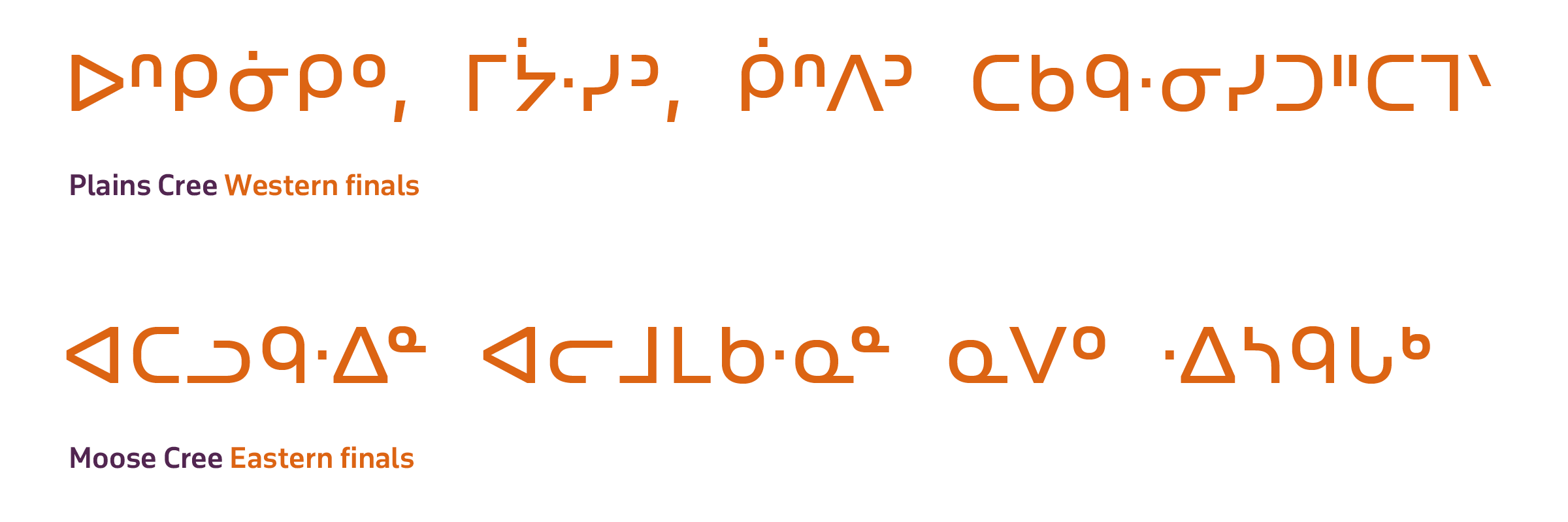
Finals variation across Ojibway communities
The northern dialects of Ojibway – the only Ojibway language communities to use Syllabics as their primary writing system – are noted as having a high degree of variability in the form of the finals characters that several respective communities prefer to use. The northern dialects of Ojibway that use Syllabics comprise Oji-Cree, Northwestern Ojibway and Berens River Ojibway. All of these communities utilise a Syllabics orthography, although the local preference for the form of the finals characters varies.
This divide manifests in finals characters that a/ appear different in form from the base syllabic character in a series, and b/ appear as a superscript version of the base syllabic in a series, commonly the a vowel orientation position in the series.
The high degree of variation in Syllabics typographic preferences in Northern Ontario Ojibwe communities is a result of the lack of any formal standardisation, such as is seen in Inuktut and Cree Syllabics communities. Despite this lack of standardisation, all of the local form variants are encoded in the Unicode Standard.
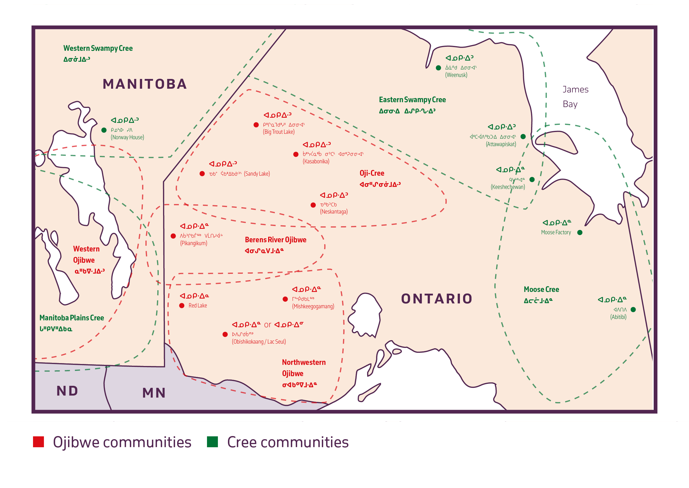
Within this preference for superscript finals, further variation occurs in the preference for the orientation scheme and vertical position of certain finals. In the Lac Seul community, either the a-position or i-vowel position orientation scheme is followed. In the Red Lake community, the standard a-position orientation pattern is followed, with the exception of the n final consonant being vertically positioned centred at the midline.
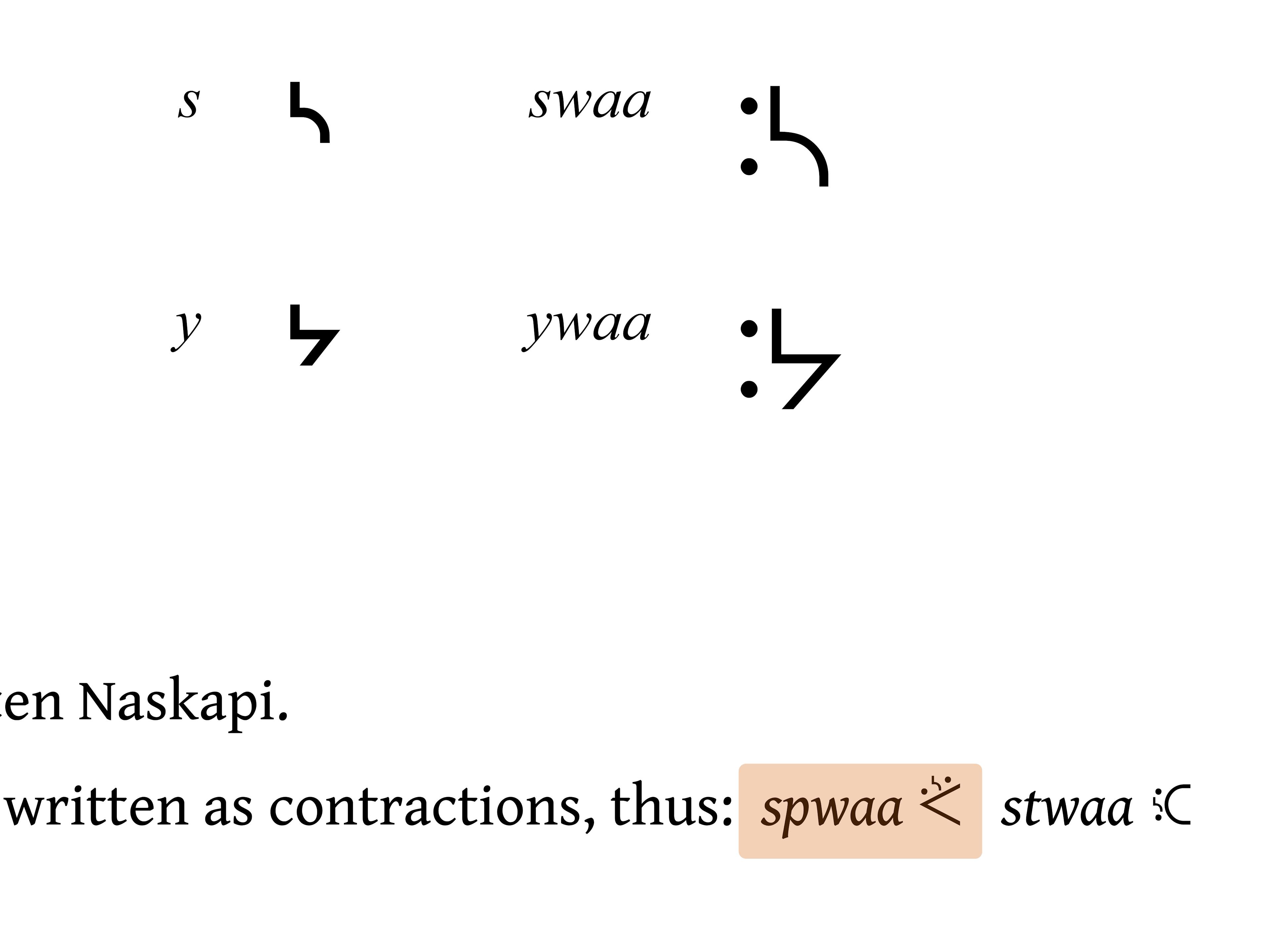
Plains Cree y + w dot transformation preference
There is variation within Plains Cree communities in terms of the use of different forms for the y-series final character. The common form of this in Plains Cree is a plus mark (ᐩ); however, some communities prefer to use a superposed dot mark (ᐝ), which is graphically distinct from the common y-final. It should be noted that this alternative y-final form should take the shape of a closed w-dot mark, as well as an open, small ring character, rather than two open ring characters.
Further, when the y-final follows a w-dot modifier mark in these communities using the superposed (ᐝ) y-final, the double dots combine to form a colon character. There is variation in terms of the shaping of this combination w + y final sequence. Some texts show this character as the same superposed sequence as the alternative y-final, while others distinguish the sequence by rendering it as a ‘kerned’ colon-style symbol.
Naskapi spwaa preferred form
The Naskapi language community follows the Eastern Cree Syllabics pattern, which sees it used as a basis for the Algonquian Syllabics structures, with finals characters being superscript versions of the a vowel orientation scheme.
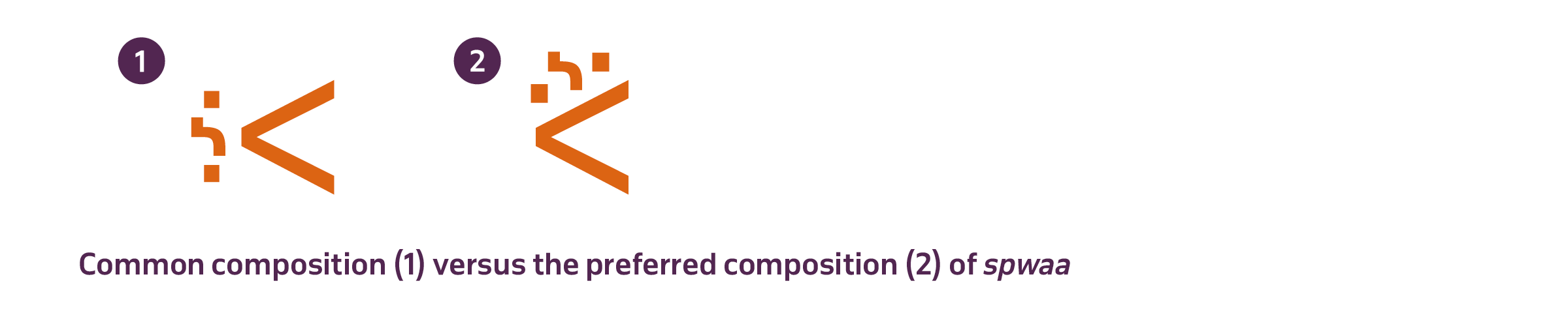
The primary local preference that Naskapi requires is the combination of the syllabic for the spwaa (ᔌ) syllable. Many commonly available pan-Syllabics and Algonquian Syllabics typefaces provide this syllabic composed as a separated inline sequence. The Naskapi user community prefers the composite version of this syllabic form, with the spw modifier stacked on top of the base pa syllabic. While this form is intelligible in either composition, stylistically the local community prefers the composite form.
Inuktitut Syllabics
The Inuktut Syllabics share a strong graphic relationship with the Algonquian, owing much to the relative proximity of Inuktut communities to an early and major centre for Syllabics printing in the area: Moose Factory, Ontario. As Moose Factory was a centre for Indigenous language printing, the resident printer John Horden was approached by a group of Inuktut speakers in Northern Québec to print their language in Syllabics. Horden typeset and printed these early texts in his Cree type material, which therefore provided the foundation for the current style of Inuktut Syllabics: round form style with superscripted finals in the a vowel position.
With the first printed work in the language, the Inuktut Syllabics essentially inherited the Algonquian Syllabics style via the type material that Horden’s press had available. Horden is noted as implementing the Syllabics pattern of using a superscript version of the a vowel syllable position as the final character of a series. While the first book that Horden printed in Inuktut Syllabics used Western Cree finals to note the finals characters in Inuktut, shortly thereafter Inuktut Syllabics adopted the convention of using the a vowel position syllable as the final character in each series. In particular this meant that Inuktut adopted from the outset both the round form shape structure and the pattern of using superscripted final characters oriented after the a vowel position of the given series (ᓀ=ne ᓂ=ni ᓄ=no ᓇ=na ᓐ=n). As printing operations were established in Inuktut communities, the orthography was adapted to suit the unique phonetic needs of the language and the various dialects across the circumpolar region.
In some Inuktut Syllabics communities, a great deal of effort has been made towards orthographic standardisation that allows for a more cohesive and consistent representation of all dialects within a linguistic region. Such is the case with the Inuktut Syllabics (ᖃᓂᐅᔮᖅᐸᐃᑦ qaniujaaqpait), where efforts in the mid-1970s by the Inuit Cultural Institute (ICI) reformed the Syllabics (and roman orthography qaliujaaqpait) into one consistent repertoire. This reform was an attempt to organise all of the various dialects of Inuktut across the Circumpolar region, particularly in Nunavut and the Nunavik region of Northern Québec. Regional variation, however, still persists to the present day.
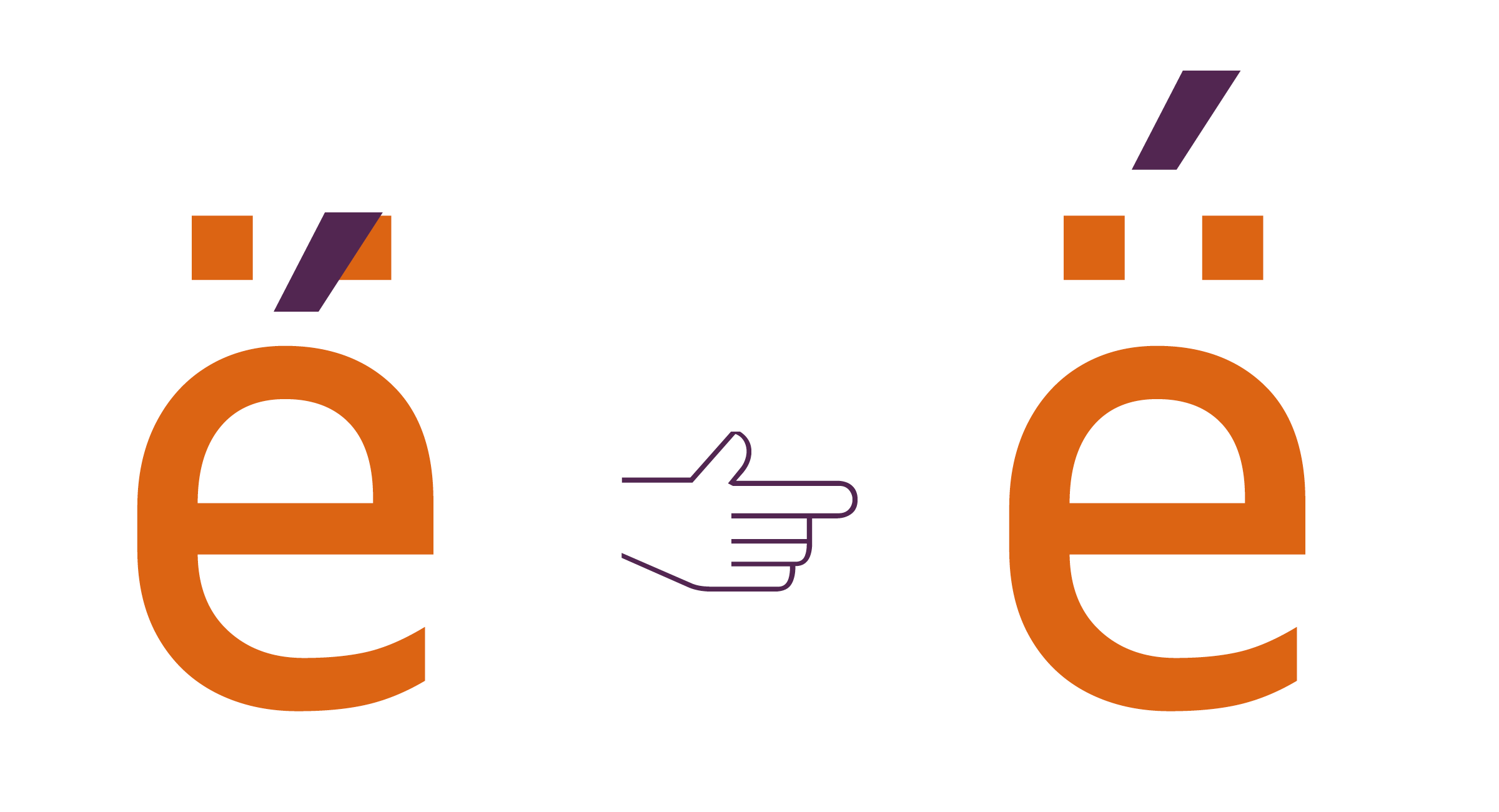
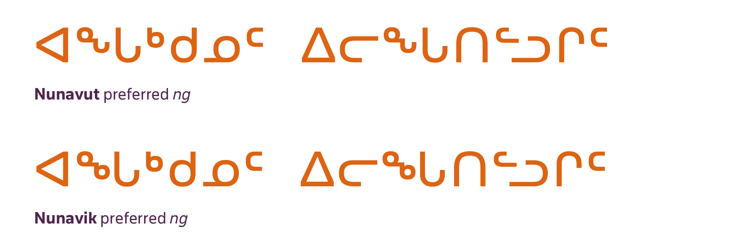
Nunavik ng preferred form
One of the most notable localisation preferences in all of Syllabics typography is the different preferences, in the Nunavik and Nunavut communities, in terms of the final ng character. In the Nunavut region, the form for the ng final takes the shape of a combined sequence of ᓐ + ᒡ, which results in the shape ᖕ. By contrast, the Nunavik region’s communities prefer their ng to be a sequence of ᓐ + ᒃ, resulting in the shape ᖕ.
The Nunavut preferred form (ᖕ) is the default representative form for ng in the Unified Canadian Aboriginal Syllabics code chart, and it is also the most common variant of the form. Nunavik communities deal with this preference by implementing localised typefaces that have their preferred ng shape (ᖕ) in the code point position for this character (U+1595).
While readers in Nunavik encounter the Nunavut ng form more frequently, due to it being the default in many system-level Syllabics typefaces, Nunavut readers occasionally also encounter this form in materials from Nunavik, and refer to it as ᐃᒡᒑᙳᐊᒃ iggaannguak (‘little eye glasses’).
Janet Tamalik McGrath – an Inuktut translator in all of the Inuktut dialects of Nunavut – notes that ‘ICI uses a combo of ᓐ + ᒡ and Nunavik used what we call iggaannguak (little eye glasses, i.e. two little circles) … For me, I just use the Nunavut keyboard and if reading Nunavik, I understand it fine and don’t think about style.’ 2
Both forms are mutually intelligible between either community, with the only difference being that texts set with the preferred ng form for Nunavik (ᖕ) have a graphic distinction that alerts the reader to the fact that it is notably a text from the Nunavik region.
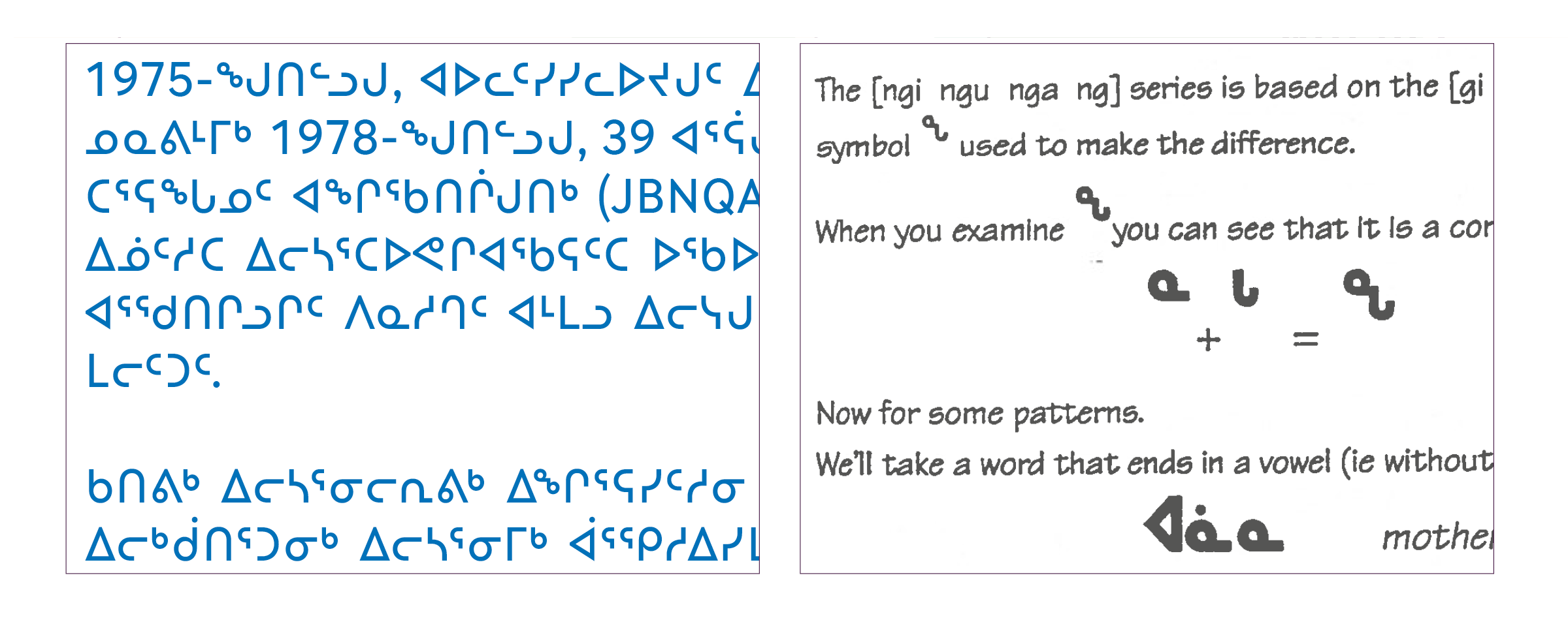
The text, above right, from Mallon and Willman’s Inuktitut elementary dialogues, 1998, shows the composition sequence of the Nunavut region’s preferred form for ng.
This preference is satisfied in Typotheque’s November and Lava Syllabics typefaces through the implementation of OpenType Stylistic Set substitutions, which allows for switching between these two preferred character variants for these user communities.
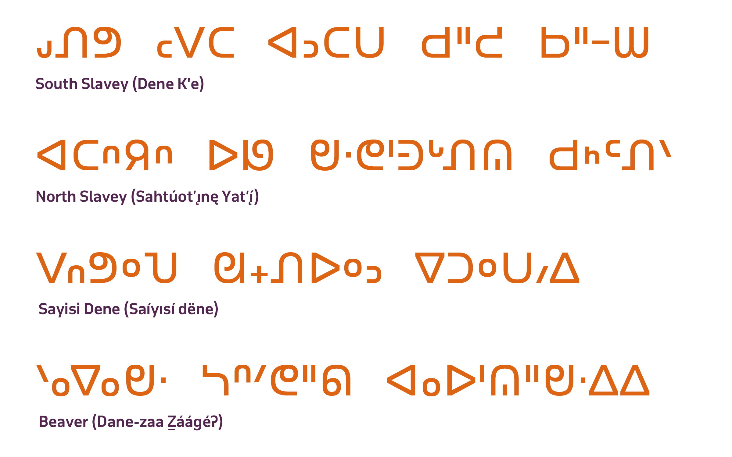
Dene Syllabics
The Dene Syllabics faced orthographic requirements that differed from those representations for the Algonquian or Inuktut languages, primarily in the size of the orthography, and in phonetic distinctions that represent a greater inventory of sounds. Additionally – as mentioned in the section Dissemination of Syllabics across North America – French Catholic missionaries largely adapted Syllabics for the Dene languages, and this led to the use of the square form style. This was not only stylistically distinct and preferred in these communities; it was also required in order to allow the legible reading of Dene Syllabics texts. In order for Dene Syllabics orthographies to represent the many consonants and inflections in the language, finals marks had to be positioned at varying vertical positions in relation to the baseline rather than consistently at the topline. The Dene Syllabics can be split into two distinct yet related groups: the general Dene Syllabics and the Carrier Syllabics.
The square form style preference
The Dene Syllabics use the square form style, with all communities preferring this form over the round form. It can even be argued that the square form use in the Dene Syllabics is a requirement for these orthographies, due to the required behaviours of the finals marks in these systems. In contrast to the Algonquian and Inuktut Syllabics, the Dene Syllabics needed to represent in their orthographies a much greater range of consonants and their corresponding syllables. As a result, finals characters were designed to sit at varying vertical positions in relation to the baseline and topline. This meant that having a uniform height for the syllabic characters was essential in order that readers were able to distinguish these finals marks.
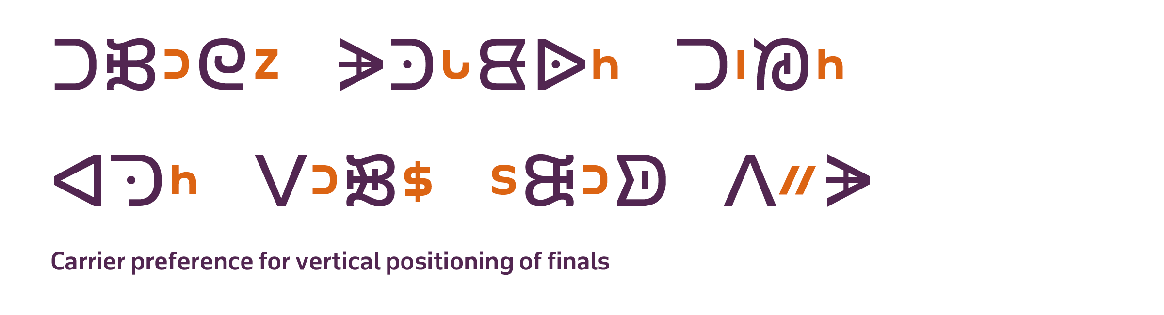
Vertical positioning variation for finals
The vertical positioning of finals is largely stylistic in many Syllabics orthographies; however, in the northern Dene Syllabics orthographies (North and South Slavey, and Chipewyan), this positioning is required for the correct pronunciation of the language. This requirement – although important to these orthographies and languages – creates issues in representation in the current UCAS repertoire in the Unicode Standard. This is because the finals characters required for northern Dene Syllabics are used by other Syllabics orthographies within UCAS, which require these same forms to be rendered at the topline position.
The UCAS code charts use the topline position for all finals characters, and as a result, all commonly available typefaces (especially those at the system level, which are the most accessible to these communities) have finals marks rendered at the topline position. This results in many northern Dene Syllabics communities not being able to render their finals at the vertical positions they require in the typefaces to which they have access.
Chris Harvey notes in his article ‘Syllabic glyph variation’, ‘While final placement in most syllabics languages may be stylistically conventional, it would in no circumstances impede legibility. In northern Dene languages on the other hand, the location of the final indicates pronunciation.’ 3
As a result of these preferences, the Typotheque North American Syllabics fonts November and Lava Syllabics provide the correct vertical positioning schemes for all Dene Syllabics orthographies by offering OpenType stylistic sets for midline and baseline finals, which can be employed at the discretion of the user.
Carrier Syllabics typographic preferences
The Carrier (Dakelh) Syllabics – while graphically very distinct from all of the other Indigenous languages that use Syllabics orthographies – are stylistically linked to the typographic appearance of the square form style, which connects Carrier visually with the Dene Syllabics and the orthographies within that group. As a result, the Carrier Syllabics syllable characters are all expected to appear at a uniform height, without variation in between full- and medium-height characters, as is seen in the Algonquian and Inuktut Syllabics orthographies.
Although multiple version of the system exist, the orthography developed by Alexander and Morice remains the model preferred today by all of the communities with the Carrier Nation, with the syllabic and finals characters and the correct orientations depicted in their charts as the standard.
The Typotheque Syllabics project worked with Dakelh (Carrier) community members and language experts Francois Prince and Dennis Cumberland in order to correct errors in the representative glyphs for the Dakelh Syllabics in the UCAS code charts. While this effort successfully corrects the Dakelh Syllabics character appearances at the text standards level, there are still preferences in terms of Dakelh Syllabics typography that required additional accommodation in the Typotheque November and Lava Syllabics fonts.
Preferred glyph shapes
The Carrier Syllabics prefer all syllabic characters to be of a uniform height (for all syllabic characters to reach the topline, with no variation in medium-height characters) and all finals characters to be vertically positioned at the midline. Having the finals placed at the midline is a stylistically based requirement; however, this does also aid in the readability of Carrier Syllabics texts and the ease of legibility for word images.
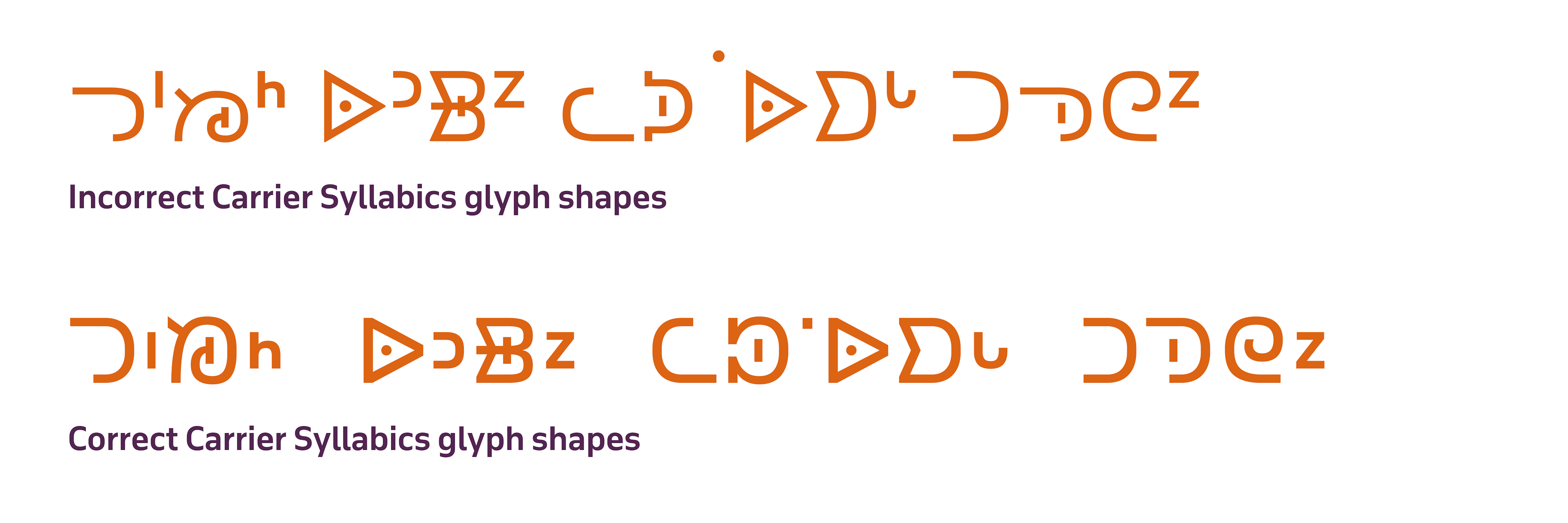
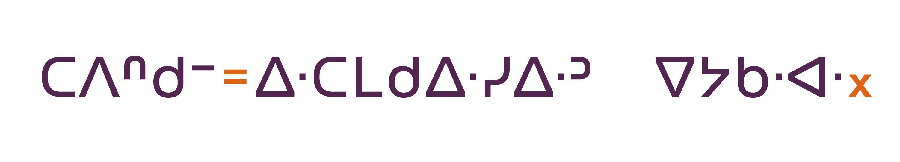
In addition to the preferences noted above, Dakelh users have a preference for the contemporary design of certain finals characters, particularly ᑋ ᔆ ᘁ ᙆ . Historically, these characters were rendered as serifed, Latin-script form characters, which intentionally appeared distinct from other Syllabics finals characters. Francois Prince and Dennis Cumberland confirmed with the author that the contemporary community prefers monolinear shapes for these characters, which they feel better harmonise with the total Syllabics orthography, and which remain legible in text settings. 4
In an email conversation on 21 April, 2021, Cumberland shared further that ‘… Morice used a couple of different printing presses as he upgraded [his equipment] … it is possible he made adjustments [to the orthography as he worked] … and he might of also made errors in some type sets [that he chose to work with] …’. 5
Vertical positioning of finals
The final pure consonant marks for Carrier Syllabics are all vertically positioned at the midline. While this is not as essential for the correct pronunciation of the text as in other Dene languages, it is important for finals to be positioned at the centre point of the word in order to increase the legibility and readability of texts. As the Carrier Syllabics uses its own unique variation of the square form Syllabics style, the vertical centring of the finals marks provides greater emphasis to the pure consonant sounds, and makes them easier to distinguish within a word. In addition to these reasons, this is also the expected correct style and the local preference for the positioning of finals in all of the communities that use the Dakelh Syllabics.
Although there are disunified finals characters for Carrier within the UCAS main block (ᑋ ᔆ ᓑ ᗮ ᘁ ᙆ ᙇ ᙚ ᣵ), the majority of the finals the orthography uses are unified with characters shared with other orthographies – notably the Inuktut and Algonquian Syllabics orthographies. This produces a conflict with the vertical positioning preferences and requirements for the respective finals glyphs ᐦ ᒡ ᑊ ᐡ ᒼ ᐣ ᐟ ᐠ in most commonly available typefaces for the Carrier community.
Modifying marks
Carrier Syllabics uses a raised dot (graphically similar to the dot diacritic mark used in other Syllabics orthographies to mark long vowel extensions) to represent a glottal stop. Note the vertical positioning of the raised dot (U+18DF) above, highlighted in orange. This mark is not centred at the midline, as in the finals characters, but rather it is raised to sit at the topline of the syllabic characters. Historically, this mark tended to sit positioned at the top of the centred finals marks, but in contemporary uses, it is placed at the topline.
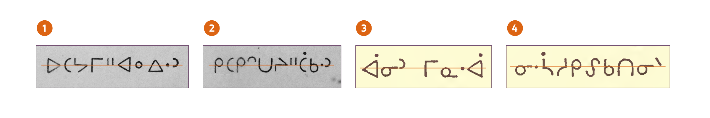
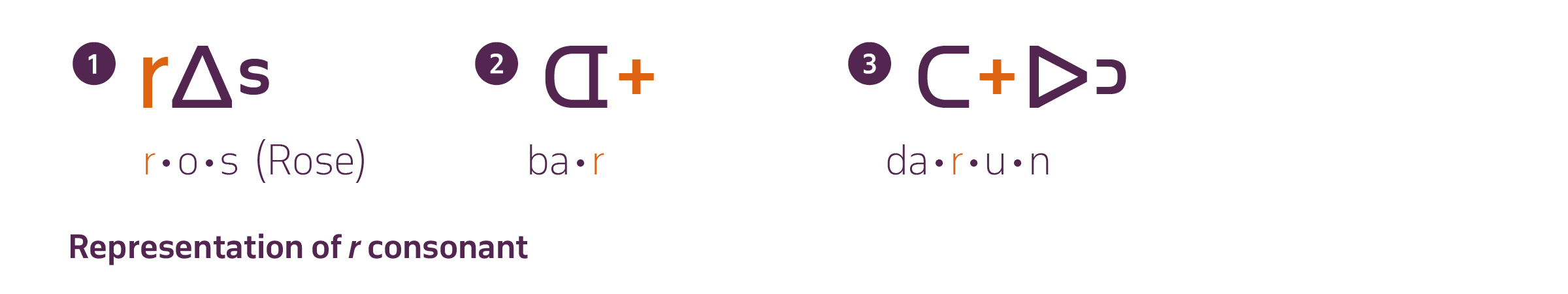
Representation of foreign consonants
The sound r [r] is not found in the Carrier language, and is only featured in foreign loan words – primarily from French and English. This sound is rendered in the Carrier Syllabics system by two separate marks. Morice initially indicated r with a cross mark ᕀ (U+1540), which was rendered proportionally as a final consonant character, and positioned similarly at the midline. In the contemporary Syllabics, two marks are used based on the context in which they occur. Latin lowercase r (U+0072) has been integrated into the modern system to mark r when the consonant is followed by a vowel. The cross mark ᕀ is used to mark all other instances of r in conjunction with other syllables (2). Although this contemporary method is common, some users continue the practice of using cross mark ᕀ exclusively to mark all instances of r, regardless of the context in which it occurs (3).
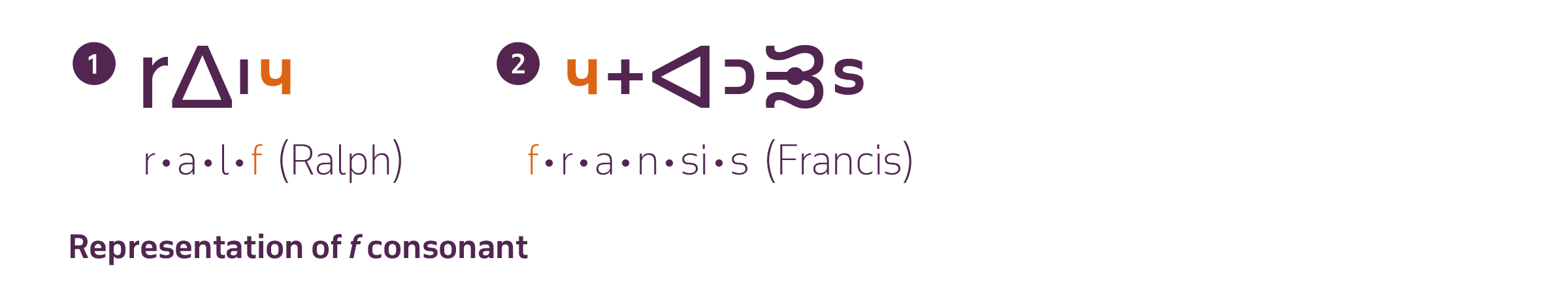
The sound f [f] – as r – is also not encountered in the Dakelh language, with it normally being found in French or English loan words. The shape used for marking the f consonant in Dakelh Syllabics texts is the upturned h character, which functions in the same manner as other finals characters in the orthography. It should be noted that the upturned h (U+1DA3) is not within the UCAS repertoire. This may create rendering conflicts if this code point is shared with another orthography within a type family that has differing requirements for this character.
In summary
The typography of the Syllabics may lack a formal body of literature that users can consult; however, quality typographic implementations can be achieved by observing the practices of local communities in both historical and contemporary documents. By adding to the understanding of the inherent conventions that govern the Syllabics across all of the orthographies that use the script, it is possible to deliver solutions that accommodate the best possible typographic experiences for all readers of this writing system, in their respective languages.
Image sources:
- Base of map vector artwork designed by Freepik, accessed 7 May 2020, https://www.freepik.com/free-photos-vectors/travel
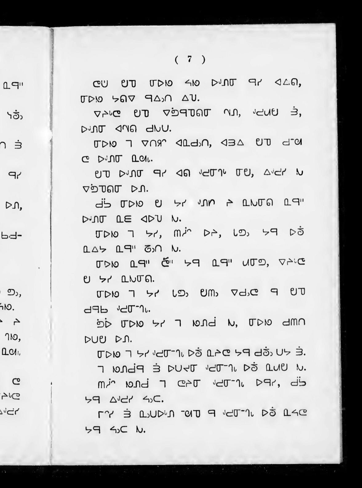
- William Carpenter Bompass, Prayers, lessons, and hymns in the Tenni or Slavi language of the Indians of Mackenzie River in the North-West Territory of Canada, London, Society for Promoting Christian Knowledge, 1900
- [British and Foreign Bible Society], The four Gospels and the Acts of the Apostles, British and Foreign Bible Society, London, 1903
- [Canadian Bible Society], ᑲᐅᔅᑭᒋᒋᐱᒡ ᐊᑎᐸᒋᒪᑭᓄᐅᑦ ᒋᓴᔅ / The Beginning of the Story of Jesus, Naskapi Development Corporation, Kawawachikamach, Québec, 2014
- James Evans;, Swampy Cree Hymn book (ᓇᑲᒧᐏᓇ ᐅᒪᐢᑮᑯᐘ ᐅᑎᑘᐏᓂᐘᐤ). Norway House, 1841. Image from the James Evans Fonds, University of Victoria library, University of Toronto
- Ervin Bird Glass, John McDougall, The ritual of the Methodist Church, with forms of prayer, Methodist Missionary Society, Toronto, 1899
- John Horden, Bible and Gospel history, in Saulteux, Society for Promoting Christian Knowledge, London, 1860
- [International Organization for Standardization], *Information technology – Universal Multiple-Octet Coded Character Set (UCS): Part 1: Architecture and Basic Multilingual Plane: Amendment 11: Unified Canadian Aboriginal Syllabics*. From ISO/IEC 10646–1:1993, FDAM 11, L2/98–128, 1998
- ᐋᕐᕐᑭᓯᒪᑎᑦᓯᓂᕐᓄᑦ ᐸᕐᒣᓀᒍᑏᑦ 2016–2023 / Strategic plan 2016–2023 from ᑲᑎᕕᒃ ᐃᓕᓴᕐᓂᓕᕆᒥᖅ / Kativik Ilisarniliriniq, 2016.
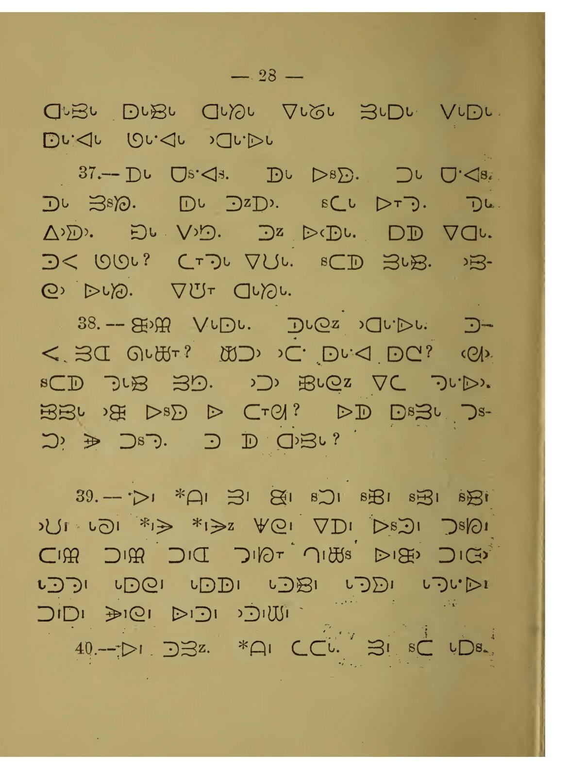
- Louise Perrault, Prières, cantiques et catéchisme en langue Montagnaise ou Chipeweyan. Montréal, 1857.
- John Maclean, James Evans: Inventor of the Syllabic system of the Cree language, William Briggs, Toronto, 1890
- Janet Tamalik McGrath, Letter of support to the Unicode Technical Committee, 3 September 2020.
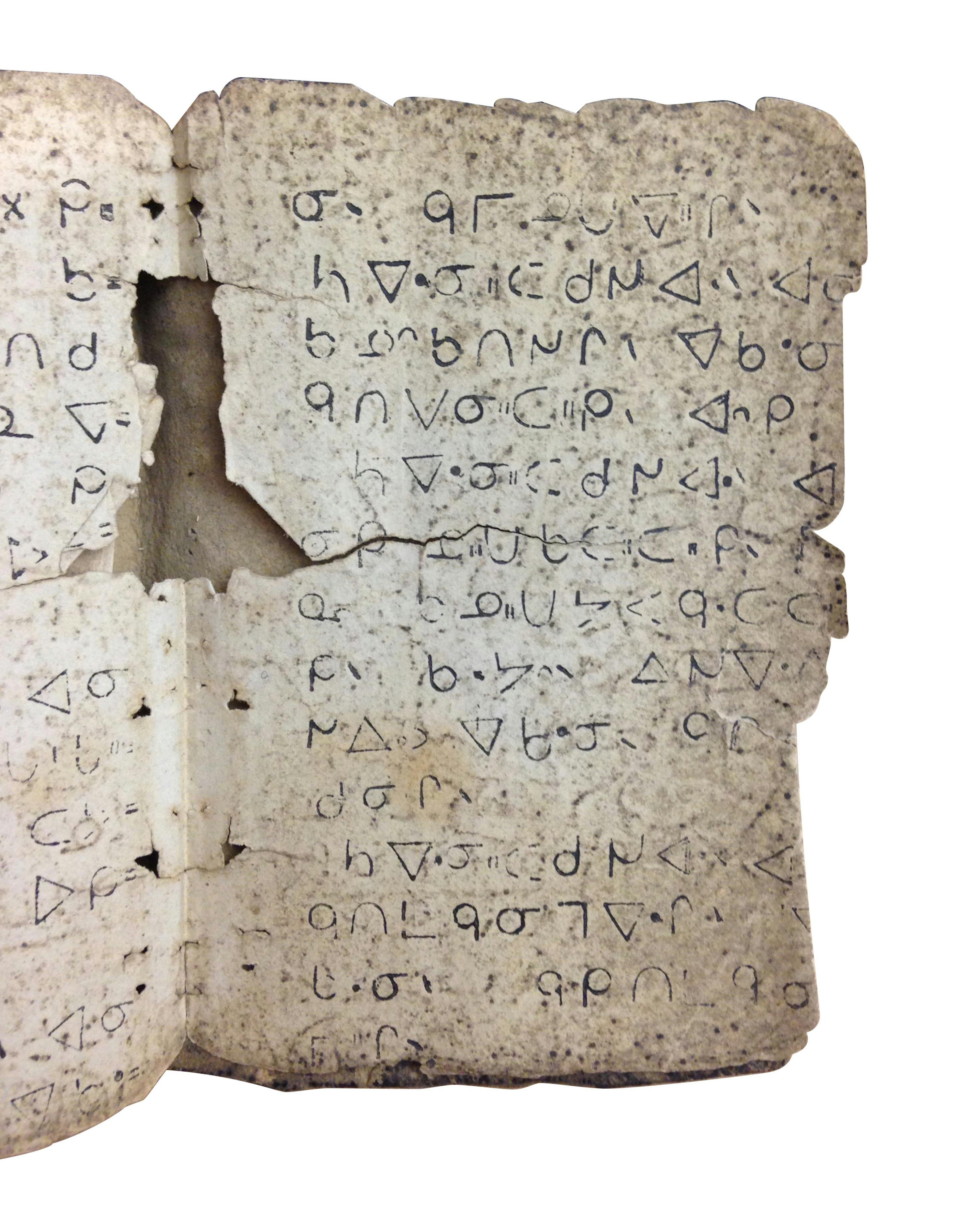
- Adrien-Gabriel Morice, ᗫᣟ ᑐᔆᘼᔆ ᐅᙨᑐᐟᣟᐈᑋ / Carrier reading-book. Fort Saint James, 1894.
- Adrien-Gabriel Morice, Mission Papers (ᑐᔆᘼᔆ ᘇᗘᑊᘄᐟ), Second Edition (ᗪᒡ 2 ᑐᔆᘼᔆ), Volume 11 (ᗪᒡ 11 ᙓᘄᐣ), 1891.
- Louise Perrault, Prières, cantiques et catechisme en langue Montagnaise ou Chipeweyan. Montréal, 1857.
- Jean Baptiste Thibault, ᐊᔭᒥᐁ ᓀᐃᔭᐁᐧᒪᓯᓇᐃᑲᐣ ᐊᔭᒥᐊᐃᐧᓇ ᓇᑲᒧᓇ ᒥᓇ ᑭᐢᑭᓄᐊᒪᑐᐃᐧᓇ / Prières, cantiques, catéchisme, etc., en langue crise, Imprimerie de Louis Perrault, Montréal, 1866
- [Wawatay News], ᐗᐗᑌ ᐊᒋᒧᐎᓇᐣ / Wawatay News, 17 July, 2020 Vol.47, No. 7, PM#0382659799
- Arok Wolvengrey, ᐊᐎᔹᑖᒋᐏᓂᓴ / wawiyatācimowinisa / Funny little stories, University of Regina Press, 2007.