
The history of History
Two years after releasing History, Peter Bilak reflects on the process of creating this skeletal system in which different styles are imposed on a Roman capital base. Previous experiments are mentioned, as well as inspiration sources for the typeface.
Type design, like many disciplines, has often been driven by technology, each wave of change in printing technology provoking the development of new approaches to design. In the eighteenth century, for example, innovations in papermaking and inking techniques inspired new typefaces with much higher contrast between the thick and thin strokes of the characters. The introduction of pantographic punch- and matrix-cutting in the late nineteenth century enabled numerous variations of a typeface to be manufactured from a single drawing, transforming typefaces into flexible systems with vast ranges of typographic variants. In the mid-twentieth century the adoption of photocomposition systems meant that spacing and kerning could be adjusted with greater precision, inspiring (among other things) the development of more fonts simulating handwriting. Most recently, the personal computer has spurred a wave of new fonts based on previously unexplored motifs, such as modularity or random chance.
Seeing type design solely as a problem-solving exercise is limiting, however, reducing type design to a response mechanism‚ a craft detached from its own history. When the idea of cultural progress is supplanted by technological progress, the less obvious motifs of type design such as continuity or self-awareness are neglected. Solving a particular technological problem is only a short detour in history’s path. Solving all the technical problems would mean the end of type history, but this history can itself be the prime inspiration for new designs.
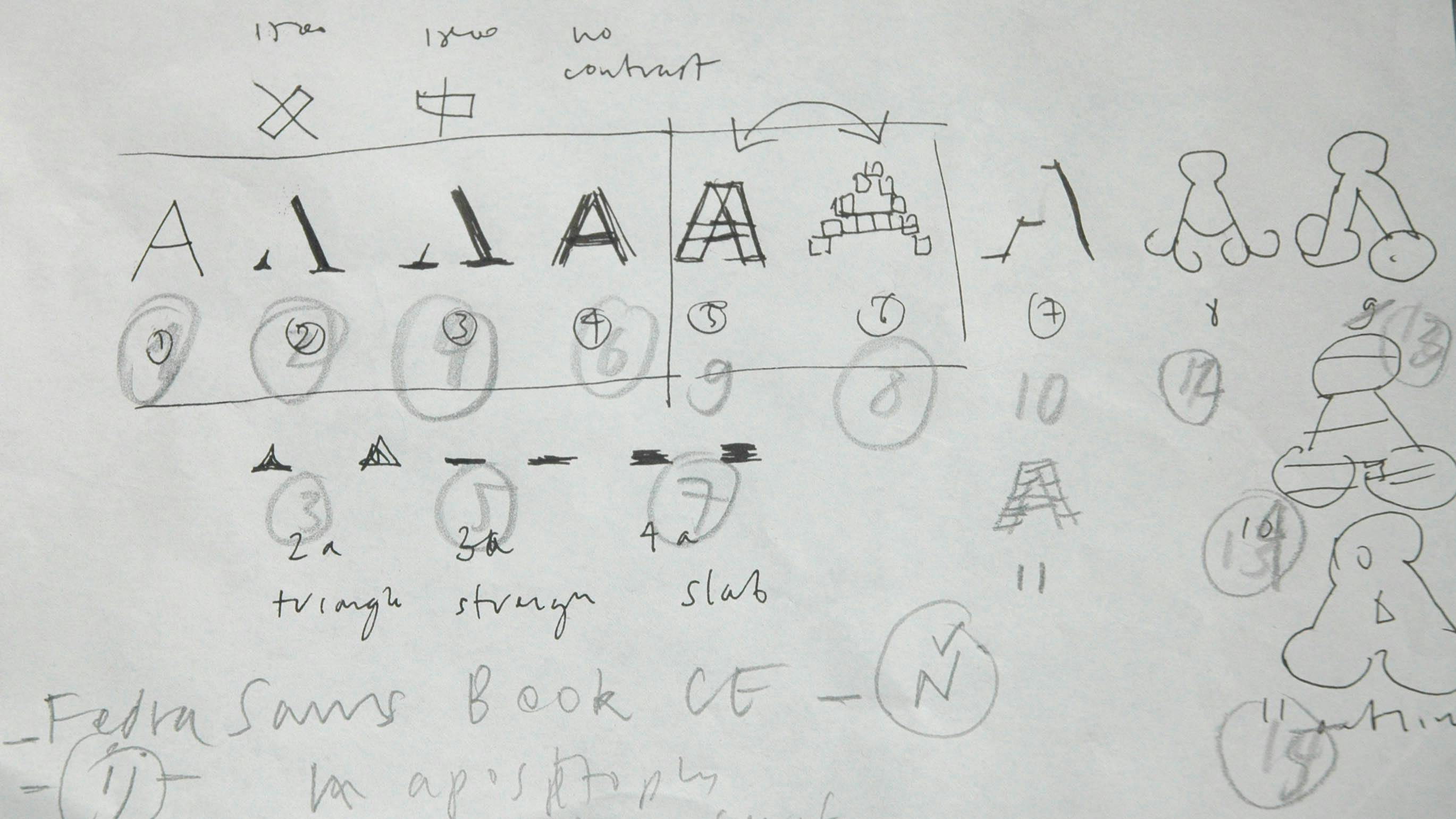
The History type system was in development longer than any other project I ever worked on. Its beginnings can be traced to the early 1990’s when I experimented with decorative layering systems inspired by 19th century types, trying to dissect Tuscan typefaces into their structural components.
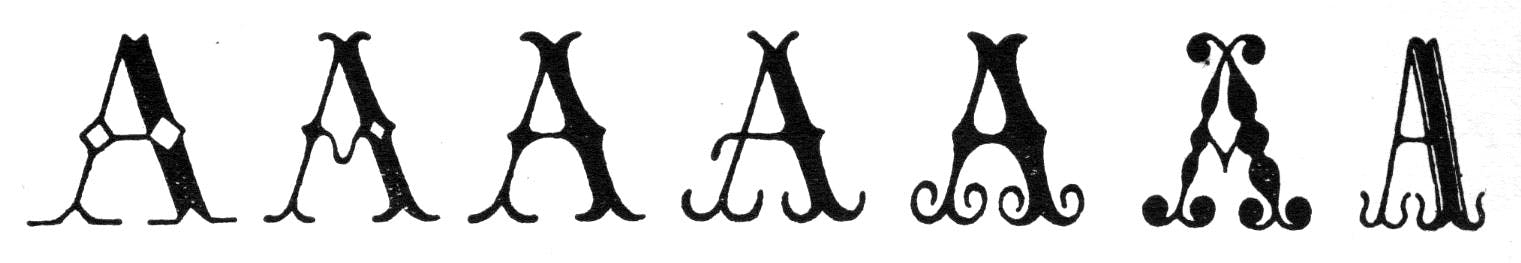
While most historians and designers regard this period with horror, and many history books call the typefaces decadent or regressive, I found Tuscans very charming and inspirational. I started drawing a layering font that incorporated the possibilities of Tuscan types, but because of technological limitations, I never completed the project.
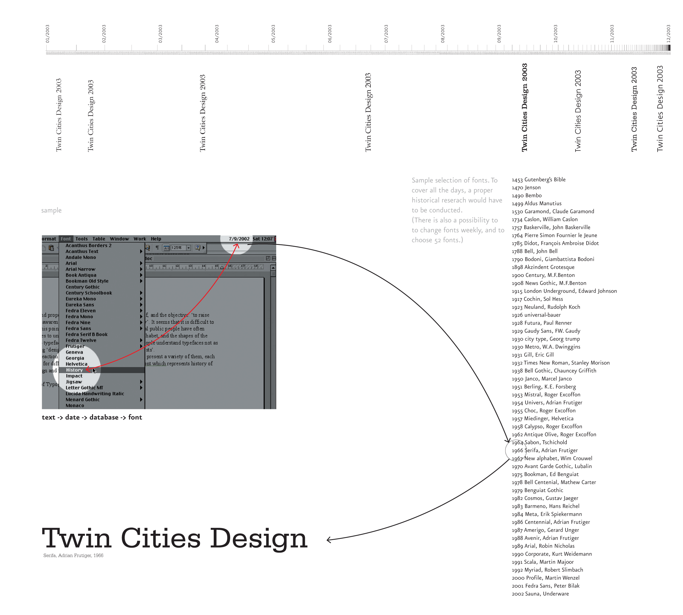
Years later (2002) the project took a new twist as I worked on a proposal for the Twin Cities typeface. Instead of proposing one new typeface for St.Paul and Minneapolis, I presented the idea of a typeface system inspired by the evolution of typography, a conceptual typeface that reused existing fonts. I called this proposal ‘History’. A user would select ‘History’ from the font menu, not knowing what font would be used. History would be linked with the computer’s calendar and with a predefined database of fonts, presenting a different font every day. For example, one day it would use the forms of Garamond, but the next day when you opened the same document, the font would change and present the text in a new typeface, say Granjon, that was created later than Garamond. The idea was that the constant changes would confront the user with the continuous development of typography.
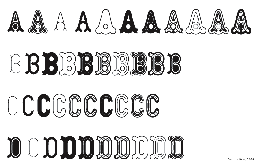
And finally around 2004 I started working more intensively on a system of layering letterforms that could be recombined. I kept adding new styles, and because every style had to use the same proportions as the previous one so that they would work together, it was getting increasingly more complicated to draw them. The danger was that this could be a never-ending project, and I could keep adding more and more styles, which would take more and more time to incorporate. In 2008, I finally decided to limit the number of styles to 21. It was an arbitrary decision, but I liked the number, as it reflected the 21 centuries of typographic history encompassed by the project.
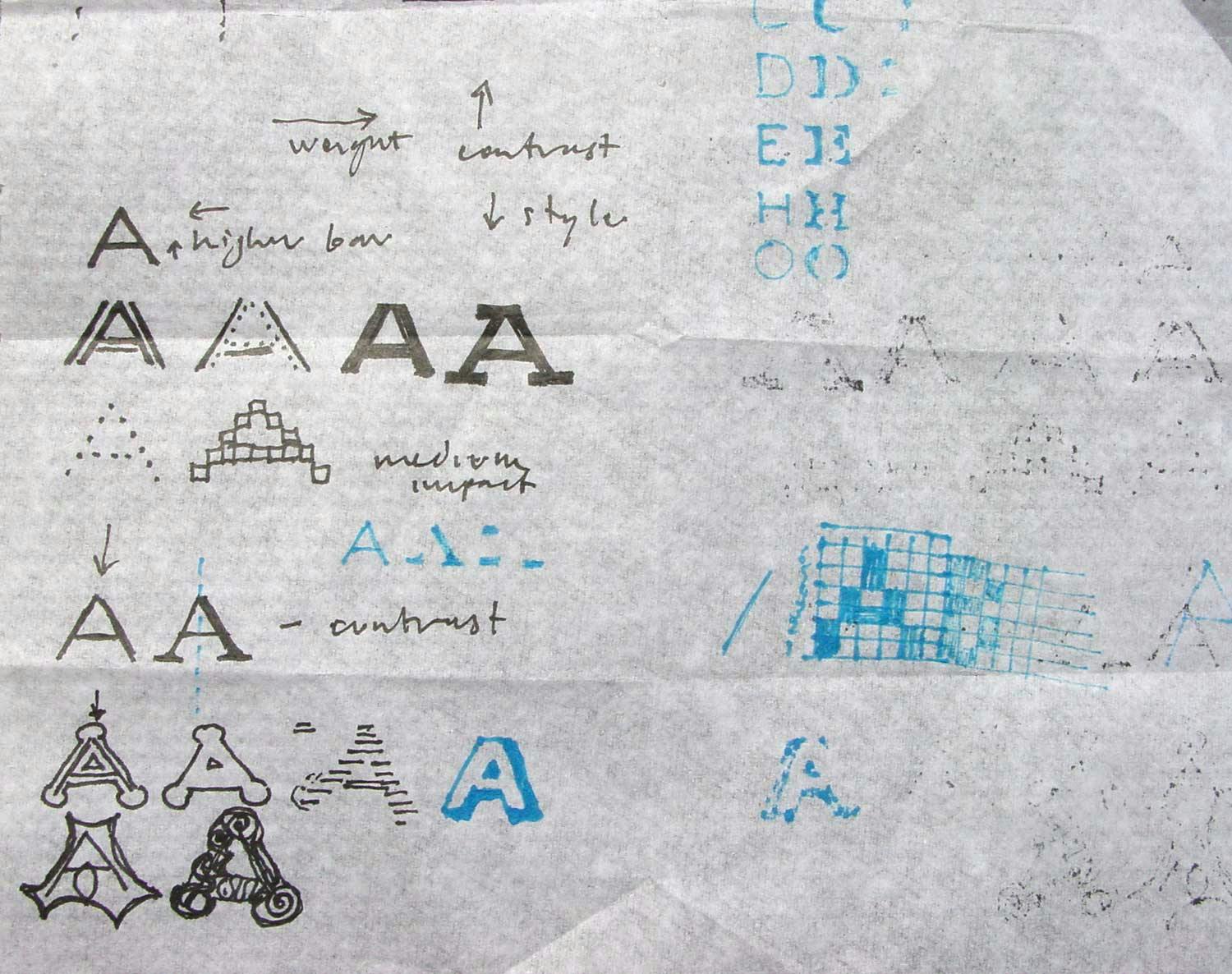
Based on a skeleton of Roman inscriptional capitals, History includes 21 layers, 21 independent typefaces which share widths and other metric information so that they can be recombined. Thus History has the potential to generate an infinite number of unique styles through the superimposition of layers encompassing humanist renaissance, transitional, baroque, script-like, early grotesque, 19th century vernacular and digital types. While careless use can generate freakish results resembling Frankenstein’s monster, more careful experimentation can produce not only amusing, but surprisingly fresh and usable typeface samples. With History, one can replicate typographic history or, on the other hand, extend it. For example, you can take a hairline skeleton of letters inspired by Roman inscriptional capitals from year 80 AD (layer 1), dress it up with a high contrast of thick and thin strokes as Bodoni used in his work (layer 3), and finally apply 18th century ultra thin serifs (layer 10) to emulate the style typical of the work of Didot and Bodoni. Or you can take a low contrast model of letters with oblique stress (layer 2) and combine it with bracketed serifs derived from a broad nib pen (layer 8) to end up with letters reminiscent of Nicolas Jenson’s Roman from 1470. Making approximations of historical typefaces is instructional, but not very interesting, (and frankly, one should use real Didot or real Jenson typefaces); it is far more interesting to extend history and mix styles which historically have not co-existed. Take, for instance, bitmap letterforms found in early low-resolution computer screens (layer 7), and combine them with the thin serifs of Bodoni (layer 10) to get something unexpected. And add the swooshes found in 15th century humanist calligraphy (layer 17) to top it off.

Realising that controlling 21 different layers can be a daunting task, I proposed to supply not just the 21 font files, but also the History Remixer application. This web-based software processed text input through an interface which allows the user to work with the layers, activating, deactivating, arranging, setting colour, and luminosity. The application generated an open PDF file which one can then fine tune in Illustrator or some other programme. This application was retired in 2015, and replaced with online previewing options of History layers. Playing with History in InDesign, or other design applications, although is much more work, is probably more enjoyable because unexpectedly fresh letterforms result. One can happen across new possibilities, and this game of discovery was one of the important reasons why I did this project.
I chose ‘History’ as a deliberately irreverent, cheeky name, but by no means intended it to be disrespectful. It is mostly a direct reference to the fact that I embraced no single point in the past, but rather a very large part of history of typography. My sincere intention was to participate in the sequence of typographic discoveries and allow the user to actively engage in this process as well.
~~~ sideimage  Milan Kundera Immortalité, 1990
I should acknowledge some sources of inspiration behind this project. Of course the history of typography was the primary inspiration. In addition, however, there are some works which were particularly inspiring to me at the time. The ‘polyhistorical’ model of Milan Kundera’s Immortality provided the theoretical foundation of the project in the way it mixes personalities of the past and present, describing an imaginary dialogue between, say, the German poet Goethe (1749-1832) and the American novelist Hemingway (1899–1961), even though those two could never really have met.
~~~
Milan Kundera Immortalité, 1990
I should acknowledge some sources of inspiration behind this project. Of course the history of typography was the primary inspiration. In addition, however, there are some works which were particularly inspiring to me at the time. The ‘polyhistorical’ model of Milan Kundera’s Immortality provided the theoretical foundation of the project in the way it mixes personalities of the past and present, describing an imaginary dialogue between, say, the German poet Goethe (1749-1832) and the American novelist Hemingway (1899–1961), even though those two could never really have met.
~~~
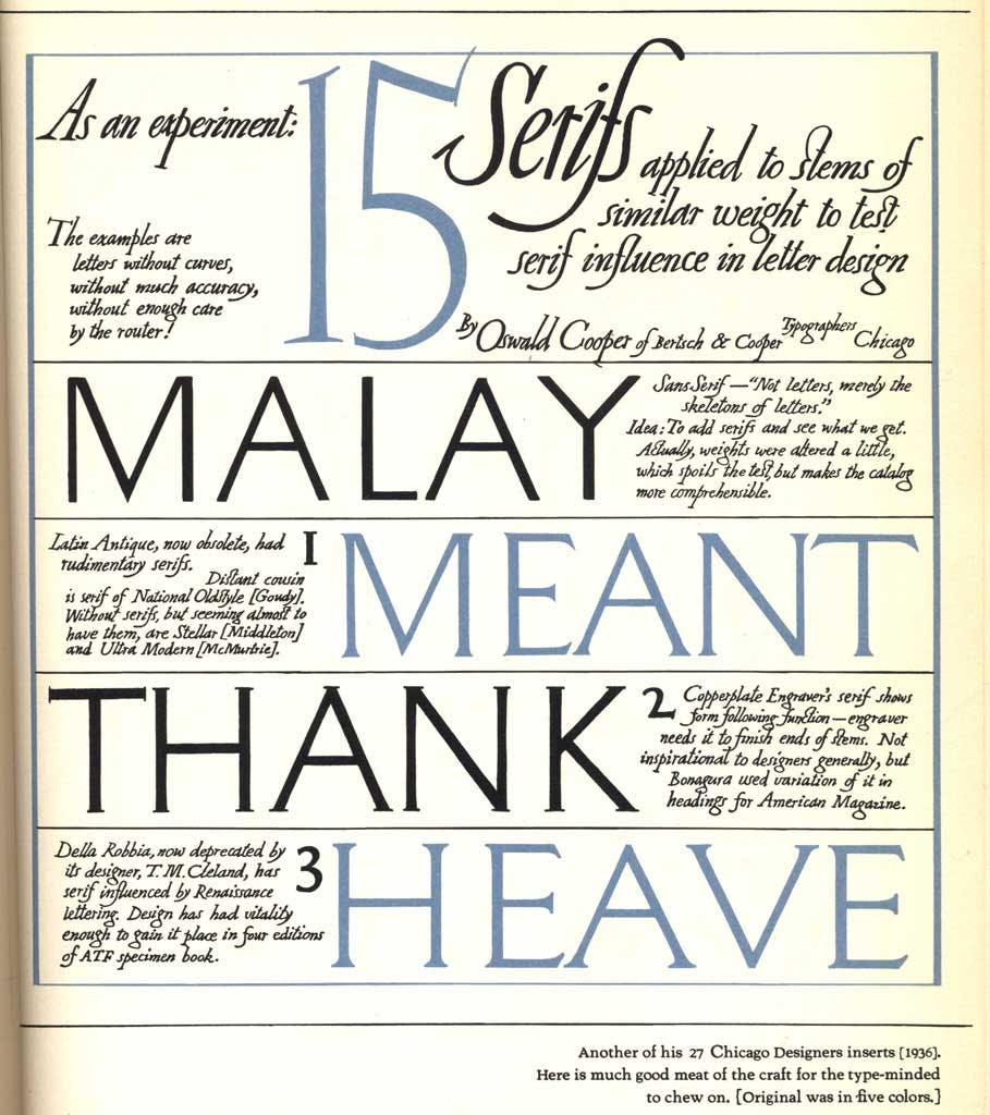
But there are also some precedents in the history of typography that allowed me to explore the area of multiform works. Oswald Cooper’s experiments from 1936, which involved applying 15 serifs applied to stems of similar weight to test their influence in letter design, was of particular interest.
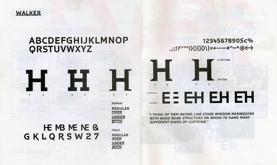
And more recently, Matthew Carter’s typeface for Walker Art Center opened my eyes to new possibilities. I should also mention other useful experiments, such as the early manifestation of Multiple Master technology documented in typefaces such as Adobe’s Penumbra designed in 1994 by Lance Hidy. With the use of Multiple Master, Penumbra can continuously change from sans serif to fully serifed.
Some reviews and user responses suggest that History is more of an educational tool than a functional typeface system. Yes, surely one can use it to explain and explore the constructions of Roman letterforms, but I still would like to emphasise the practical aspect of the system. I sincerely hoped, but couldn’t predict, that fonts would be used commercially.
Running a type foundry for a decade, I’ve learnt that though our clients are often extremely creative professionals, they don’t have time to learn too many new things, and many features of our fonts go unnoticed. It is all very well and good to create style sets, extended language support and ways to make sure that a different (slightly higher) hyphen is used automatically when the text is converted to capitals, but does it all matter when most people don’t even know what OpenType fonts are? I don’t have precise usage statistics, but my guess is that 90% of our clients use only the basic character set and never realise that the font, which they licensed for quite a bit of money, can do a whole lot more than respond to the computer keys they push.
As evidence I can quote occasional conversations with users of our fonts who complain that small cap fonts are missing (when in fact they simply need to be activated by an OpenType feature), or that when they type English text it is still in English even though the font claims to support Russian (indeed the font doesn’t translate words automatically, but only renders the content). So does it make sense to spend nearly 15 years of (discontinuous and at times not very intense) work on an even more complex font system that cannot be used properly in Microsoft Word, and is rather challenging to use in design applications as well?
Now, more than a year after the original publication of History, I can say that it was probably worth the effort. The fonts are indeed being used, and I am continually amazed when I see their real-life applications. I am not sure if I only see the beautiful samples because people don’t bother sending me the horrible ones, or if it’s the high barrier of difficulty of using History that puts the system in the hands of dedicated designers. Whatever the reason is, seeing History in use is deeply satisfying.
One things that I’ve learned from this project is that despite the ubiquitous market research in design and the calculated decisions of designers, it is still worthwhile to do projects that I personally believe in. Even the day before History’s release I had no idea if anyone would ever use the system, but that was less important, as I found the work gratifying, and I focused on the creative process rather than its market potential. It is satisfying to see that this naive approach can work even in a world driven by commercial pressures. It gives me the courage to dedicate time to personal research which, when it is rigourous enough, can find its application in the wild.
The first paragraph is from the previously published article ‘History of a New Font’, 2004