Theory of Type Design, a book review
Back in 2005, I wrote a somewhat tongue-in-cheek article, ‘In Search of a Comprehensive Type Design Theory’, in which I argued that ‘Type design [...] seems to resist attempts to establish an encompassing theory by its very nature. Type design is not an intellectual activity, but relies on a gesture of the person and his ability to express it formally’. I’d been teaching type design for a number of years, and that article was a reaction to frequent student requests to reveal the ultimate truths about type, its fundamental rules and principles. For me, however, type design is a series of personal discoveries built on upon the collective memory of the whole profession. I think it’s easy to acquire basic skills but nearly impossible to distill the vast diversity of type into some kind of grand unified theory of type design.
That’s why I was eager to read Gerard Unger’s Theory of Type Design.
Gerard Unger (1942–2018), the venerable Dutch type designer, a pioneer of digital type and an eyewitness to the important technological shifts of the past five decades, is not only a professor of type design, but also a prolific writer and researcher, and there is probably no one more qualified to write a book of this sort.
In 25 concise chapters, a length perhaps too short to allow in-depth exploration of the subject, Theory of Type Design provides a framework and terminology for the components of type design and typography. It discusses the inner workings of text, its structure, pattern, texture, consistency (or deliberate inconsistency), coherence and rhythm. More than on strokes or letter-shapes, it focuses on the organisation of text, on aspects of layout that affect its clarity, especially when the reading process is nearly automatic, when shapes, words and sentences flow directly into the reader’s brain, aided by the conventions of typesetting.
In his writing, Unger is more interested in investigating the discipline than providing answers. He is also aware that often there are no answers; for example, a formula for the perfect relationship between negative and positive forms (text fitting or spacing) is impossible to derive, as letter shapes are too diverse to be governed by simplified rules. He urges designers to formulate their own research questions rather than wait for accepted research results, to reach out to scientists and to work together with them. The book’s chapter on legibility consists mainly of questions: do the fine details of type matter in small sizes when text dissolves into a texture? Does high x-height in a typeface aid legibility? Are serif typefaces more legible than sans?
Theory of Type Design provides thoughtful insights from a master practitioner, but the book doesn’t reveal any ready-made theories or methods for making typefaces more effective. It is not a book for type design students hungry for neatly formulated rules, but a resource for an advanced professional interested in discovering more about the complexity of the craft.
All of which raises the question of whether this book does indeed present the comprehensive theory of type design that the title promises. If we follow the generally accepted understanding that the word ‘theory’ means a formal system of rules supported by evidence, or a set of hypotheses that can be proven true or false, basic principles leading to a generalised system of type design creation, then the answer is ‘no’, and the title of the book is inaccurate. But Unger seems to use the word ‘theory’ to mean a scholarly foundation for reflecting on and discussing his practice-based research, and in this he succeeds deftly.
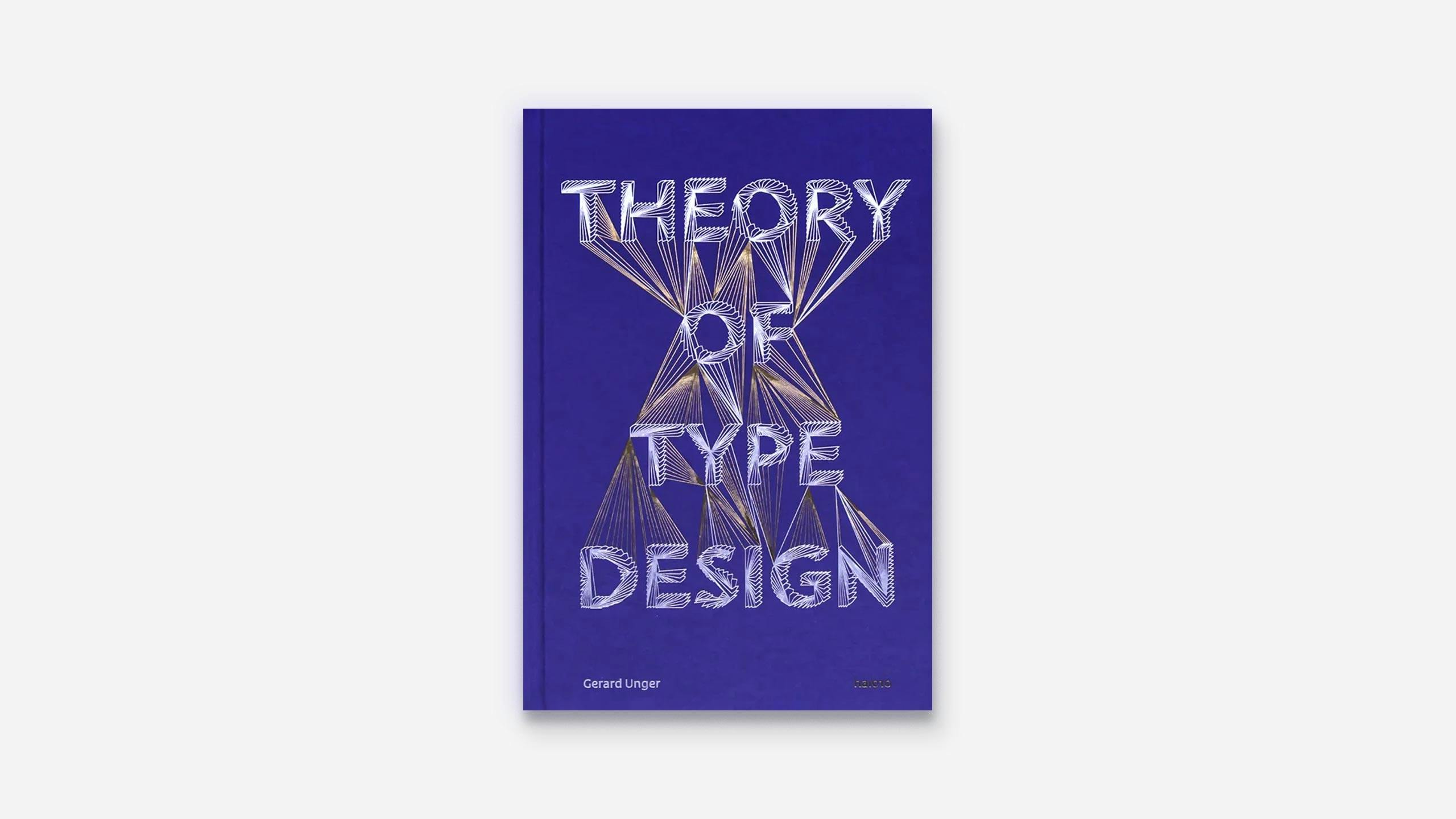
While Unger designed his previous books himself, for this one he engaged his former student Hansje van Halem. On the one hand, this choice may seem surprising, since she is known less for functional typography and more for creating vibrant, hypnotic patterns on the boundaries between type and image. On the other hand, however, perhaps Unger chose her precisely to demonstrate the rich possibilities that type design and typography offer. The two worked together closely, and the book combines van Halem’s experimental lettering and Unger’s typefaces. It also features decorative endpapers that van Halem produced as a side project with printer Jan de Jong. Van Halem put all illustrations at the end of each chapter, which makes the reading somewhat less continuous, as one has to flip back and forth between the text and the examples that it refers to. Physically, the format of the book allows easy handling and comfortable reading, and the book binding (by Bindery Van Waarden) is up to the standards of the best book production in the Netherlands.
Theory of Type Design encourages us to continue to explore and inquire. Gerard Unger’s research, writing and practical work establish him firmly in the history of the profession, along with Eric Gill, Stanley Morison, Adrian Frutiger, or Gerrit Noordzij, practitioners who seek to elevate the level of discussion in type design.