Typeface As Programme: Interview with Dimitri Bruni
Jürg Lehni: Together with your partner Manuel Krebs with whom you founded NORM, you have just published a specimen booklet for your new font “Replica” on Lineto.com. Mainly as blind-text to present the different cuts in various sizes, it features a text of a conversation between the two of you about the process of designing the typeface. I am interested in the paragraph where you describe the lack of a clear concept in the design of the typeface “Standard” that proceeded Replica, as opposed to the the strengths of Replica, namely a programmatic and very systematic procedure, defined by a freely chosen, strong limitation. Could you briefly explain this basic concept?
Dimitri Brunni: Yes, in contrast to Standard, Replica has begun with a clearly defined method. Based on our experiences with Standard as a “failed” neutral typeface, we soon noticed that we had to start with formal, almost mathematical decisions, which would then affect the drawing and the form. Without knowing exactly what the result would look like, we began by defining formal principles. The most important of these definitions was to enlarge the grid that the FontLab software provides for designing fonts. We multiplied this grid ten times, so that we were working not with a 700 grid (700 units is the standard caps height in FontLab), as the software intends, but just a 70 grid. Consequently we had many fewer possibilities to place nodes and Bézier control points, which extremely limited the freedom of drawing. On a plane that would normally have 121 dots available, we only had four from which to choose.
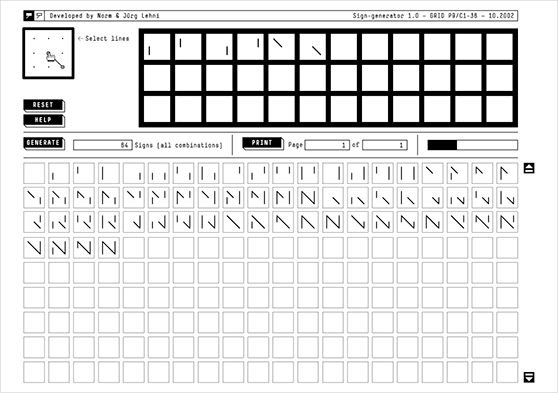
This programmatic approach is very interesting when considering that digital type is based on software and is formulated in digital form itself. You mention the strongly reduced possibilities through the coarsened grid, an observation that reminds me of another work of yours: The Sign Generator. Here you had a grid of only 3 × 3 points, on which by software you generated all possible combinations of different connecting lines between the 9 available points – very much in the sense of Sol Lewitt. The resulting 65536 signs (= 216) then were studied and carefully grouped by formal themes. Are these two projects related?
I see the connection between both project in their formal reduction. Sign Generator was about the definition of a very simple principle that mainly allows the display of the following:
• All letters of the latin alphabet: 26 signs.
• All other signs that this 3 × 3 grid based principle can offer: 65510 signs.
The aim was to create a tool or program capable of systematically producing these results.
Sign-Generator 1.0 (Software Version), developed by Norm and Jürg Lehni, 2002
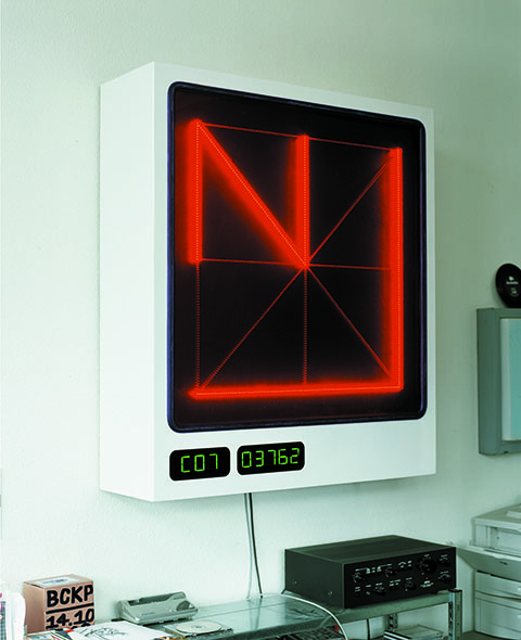
Sign-Generator 1.0/EXT (Hardware Version), created with Uli Franke, 2003
113cm x 100cm x 30cm, Metal, Perspex, Plastic, LCD-Display
With Replica, things are a bit different. The focus is on the exploration of the boundaries of the possibilities of drawing, or the precision of drawing offered by the FontLab software. We have reduced these possibilities by factor 10, a concept that was defined before the actual drawing process had started and which had a very strong impact on the resulting drawings. In this sense, both projects are about causal systems that are defined by rational or mathematical principles and have a strong impact on their results. A sort of a numerical design process as it were. But despite these formal definitions, Replica offered far more room and need for intuitive decisions than I would have expected.
So both projects seem to be formally related, but in a way they also occupy opposite positions regarding the creative process, which in Sign Generator is mainly delegated to the machine and reduced to the selection and grouping of the resulting sings. How does this way of working compare to the conscious reduction of means of work in Replica?
Sign Generator is part of a study about the principles of latin alphabet, the formal realisation is more a visualisation of the outcome of this research than a definitive aesthetic proposal. Replica on the other hand is a font family that needs to comply to clear typographic goals. We wanted to prove that this was possible even with such reduced means, a bit like a battlefield between calligraphy and construction.
Did you know that the limitation of the 700 grid are not just defined by FontLab but go back to technical limitations in the early days of PostScript and TrueType, which defined the EM square to 1,024 points? Of the 1,024 points, a bit more than 300 are generally used for umlauts on other signs that go over the cap height, resulting in 700 for normal caps. The reason for this limitation lies in the lack of speed and limited amounts of memory of early raster image processors (RIPs) that Adobe licensed to producers of early laser printers so they could support the PostScript standard. These processors could only scale letterforms efficiently if the EM square was based on a power of two. And the less bits were consumed for each coordinate of the outlines, the smaller the total font files were, meaning faster upload to the printer and therefore faster execution. In the meantime these limitations are technically obsolete, but maybe out of lack of interest of the industry, or lack of leverage of the type designers, nothing seems change anytime soon in this respect. How do you feel about such technical limitations? Were they always latently in the way and part of the reason for making them a topic of a whole typeface, or is it easy to work around them? If you had the possibility to change the current typeface standards, what would you do?
[social]I was not aware of the origins of these limitations. The first time I became aware of them was when I switched from the Fontographer software to FontLab. Fontographer allowed the placing of points with a precision of a tenth of a coordinate (350.2, 123.4, etc), which basically meant a grid size of 10,000 points. But when generating the font in PostScript format, the software automatically rounded all coordinates to the standard of 1,000 points, which was fatal for the drawing since it was not really controllable what happened to the anchor points and control points. With FontLab these tenths of coordinate values are not allowed anymore. One cannot draw next to the grid, which is defined in the settings. Replica was drawn with a grid set to 100 points. This raster cannot be ignored when drawing the outlines, it becomes part of the design process, a tedious undertaking. In order to render this hidden concept visible, we have published the Replica specimen booklet, in which these aspects are displayed and thematised.
Restrictions and limitations always have played an important role in our work, especially in relation to formal aspects and design. We tend to see freedom or “multiple choice” as a hindrance in creative work. I believe in efficiency and economy of means, and in that sense I can live well with the flaws of current type standards and the lack of leverage of type designers.
The arcade game “Galaga”, published in 1981 by the company Namco/Midway, is next to many other games of the same company a very good example of working with limitations. The game is conceived for a screen resolution of 224 × 288 pixels, offers 256 levels of increasing difficulty and weights only 20KB. I see it as an example of perfect symbiosis between design and programming, which has already fascinated at that time.
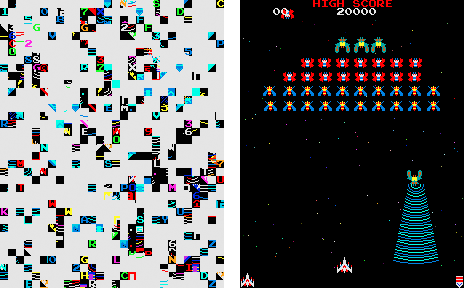
Screen shots of the arcade game Galaga, which on startup unintentionally unveils its building blocks and visual vocabulary as it loads all graphical sprites into video memory.
You touch upon a subject that I find very interesting: The influence of technology, means and ways of working on the expression and aesthetics of the results. Your attitude to work with technological tools that you describe seems to stand in a strong contrast to the role of software in the creative sector today. How do you see the dangers and potentials of software in this field?
We designers are completely dependent on existing software like InDesign, Photoshop, Illustrator, etc. These packages allow us to realise and produce our creative products by means of industrial standards. Operating systems and software applications today have become extremely complex and computers accordingly more powerful. The increasing amounts of data now require hard drives with capacity in the range of terabytes. Most programs that we use are not designed for specific tasks, but for a as broad a field as possible, and they contain 90% of unnecessary functionality and useless clutter such as filters, effects, etc. These tools play an essential role in the creative process and are quite determining already at an early stage of the work.
As an alternative to this way of working there are many reasons to produce new tools as well as to modify, convert and subvert existing ones in order to be able to use them for very precise, specific reasons.
These very interesting observations raise more questions. How do you see the role of programming languages within design in the future? Do you think designers should increasingly also become programmers in order to again be able to formulate their tools more freely, or will this remain a niche interesting only for the ones that really have an affinity for this way of thinking? Do you see it as a drawback to not be able to write software yourself?
It is true that our way of working often seems to be close to the systematic, programmatic logic found in software. In this way we do have an affinity to software and programming even without knowing how to write software ourselves. But at the same time, it is maybe again better not to have all the possibilities available, since as we found out earlier, limitations are supporting the creative process, and there is always room for intuitive decisions that could be hindered by too much systematic thinking.