Bara, a new font by Nikola Djurek
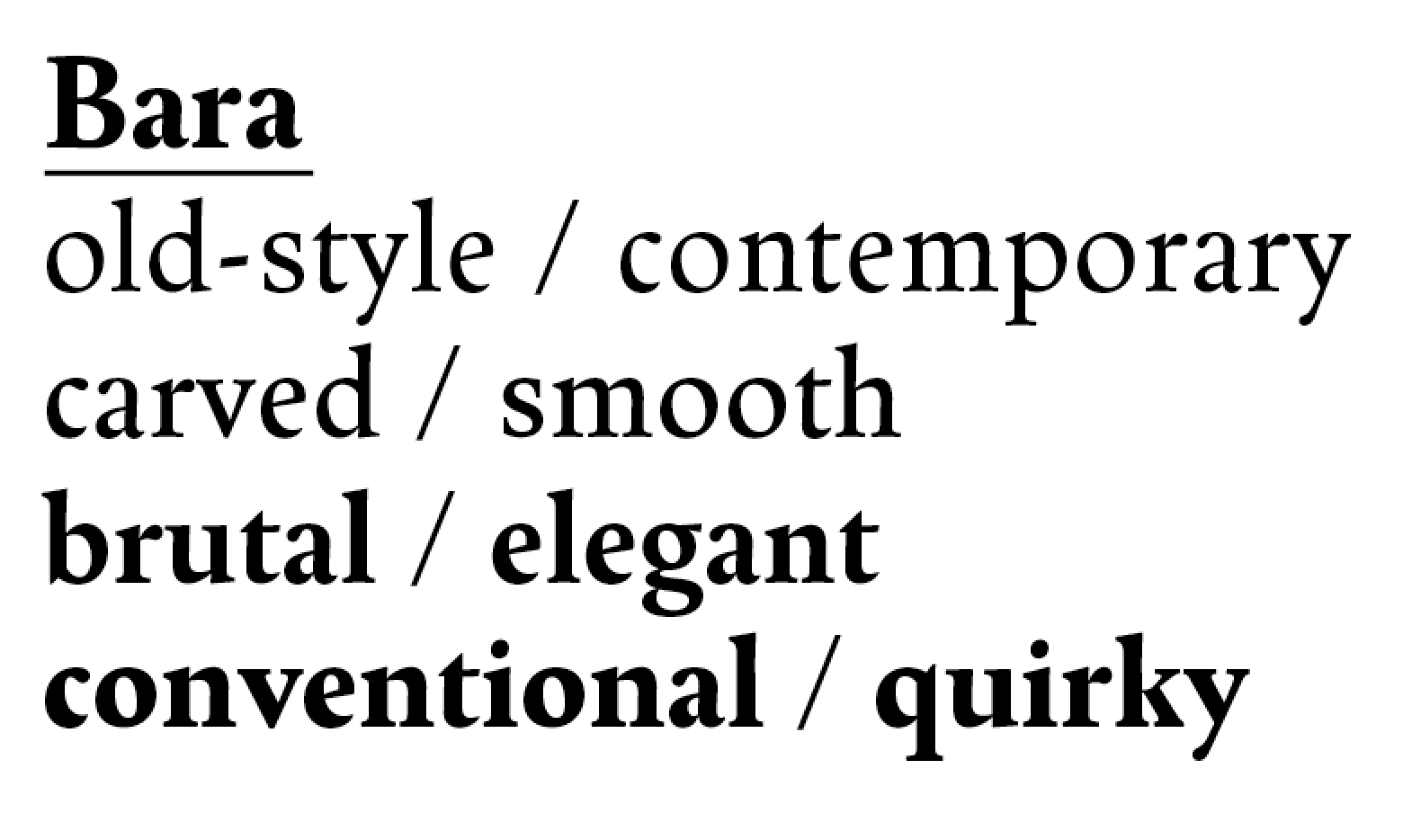


Bara is inspired by the carved, incised metal types of the Dutch Golden Age. It is not a historical revival, but a loose interpretation of Schefferletter, (also known as Enschedé English-bodied Roman No. 6), a historical typeface whose origins are unclear, but which probably dates to the early 16th century.
Narrow and elegant, it defines a new all-purpose text family with three optical sizes while preserving some particularities of the original metal type. At text sizes, Bara gives text a pleasant, slightly darker texture; at larger sizes, it draws attention to its warm, unorthodox details, such as the abruptly ended strokes of ‘e’ or the ‘c’.
Bara is available in three optical sizes: Normal for small text, Display for subheads and medium-size texts, and Grande, for large titles and headlines.