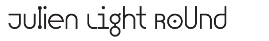
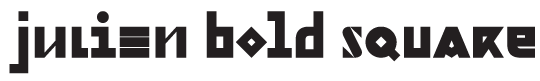
Julien, geometric display typeface
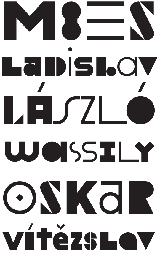
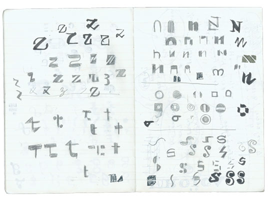
We are pleased to present a new typeface — Julien. It’s a playful geometric display typeface loosely inspired by the early 20th century avant-garde. It is based on elementary shapes and includes multiple variants of each letter (over 1000 glyphs per style), as well as intelligent OpenType scripts that select glyphs to create the best word shapes. Julien is a unicase typeface in which upper case and lower case letters are mixed together.
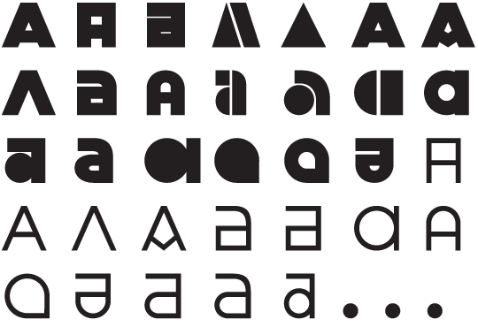
Julien was designed for the digital environment and includes numerous variants of letters which can be combined to achieve a better rhythm of shapes when setting words. The pseudo-randomisation script triggered by the Contextual Alternates feature gives the typeface a unique flow. There are specific rules for repeated letters, and it is fun to play with the fonts in applications which understand OpenType substitutions.


Read more about development and inspiration behind Julien.
More images on Flickr.