Julien — the making of
I have always admired the typography of the European avant-gardists, especially that of such early 20th century art movements as Dada, Futurism, and the Bauhaus school. Leading Bauhaus figures like László Moholy-Nagy and Herbert Bayer considered typography to be primarily a medium of communication and favoured a highly functional approach, the use of radically simplified forms, and full embrace of the 20th century machine culture. Despite the prevailing conservatism in Germany, Bauhaus typography stripped letters of all ornamental elements, preferring characteristically plain, unadorned type prints, a reduction to essentials and the functional use of colours.

Cover for the 1923 book Staatliches Bauhaus, Weimar, 1919–1923, designed by Herbert Bayer under the leadership of László Moholy-Nagy.
The ideas of Bauhaus spread to other countries and gained wider popularity. In Czechoslovakia, where I grew up, popular culture was permeated by modernist ideas. I grew up surrounded by books and graphics inspired by the Bauhaus aesthetic: works of Devětsil (an influential group of avant-garde poets, writers, artists, and designers), Karel Teige, František Muzika, Ladislav Sutnar and others. These were not limited-print editions, but affordable, mass-produced books that brought inventive typography and strong imagery to the general public. This production was cheap, and not especially celebrated. It was not until much later that Czech avant-garde book design became a focus of academic inquiry.
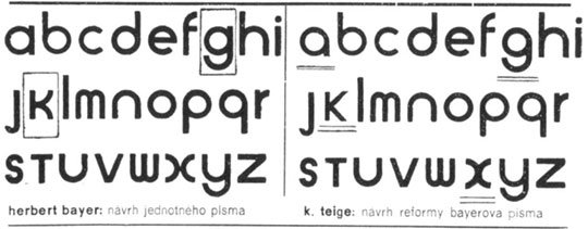
Karel Teige, proposal of the reform of Herbert Bayer's Universal typeface (1925), as featured in ReD (vol. 2, no.8) in 1929
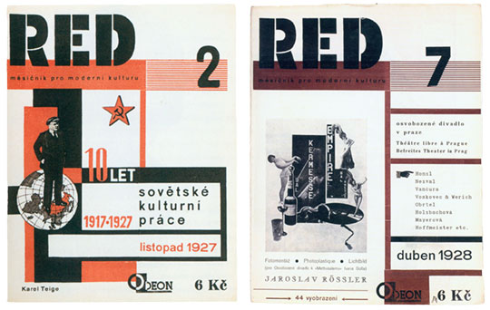
Covers of ReD monthly (Revue Devětsilu), designed and edited by Karel Teige 1927, 1928
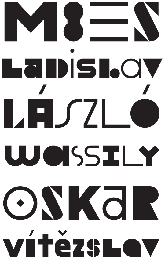
[signup]Being fascinated by the power of simple, geometric forms, I had always wanted to make a typeface loosely inspired by the European avant-gardists. For a long time I had intended to make a typeface whose main forms were based on circles and squares. The idea was simple: not only to use elementary shapes as the basis of the typeface, but also as the names of its six styles: ●●●●, ■■■■, ●■●■, ○○○○, □□□□, ○□○□, the most aptly descriptive names I could think of. Although the circles and squares are encoded in Unicode, this naming scheme eventually turned out to be unusable because of limited application support. Julien, the typeface that came out of this exercise, comes in two weights, one very light, and one very dark. Each weight comes with three different styles, round, square and mixed. The style name indicates the predominant shapes within the set, so you can choose the visual character of your words accordingly.
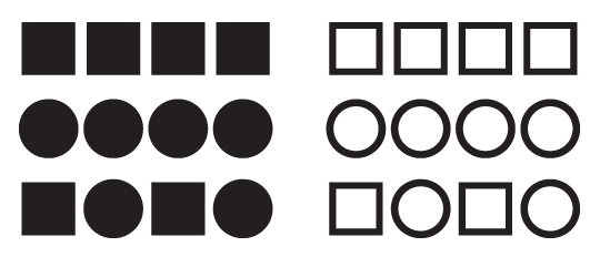
Proposal for the typeface naming scheme (not used for technical reasons).
Part of the charm of avant-garde typography is its rejection of readily available fonts in favour of lettering custom-made specifically for each project. Converting hand lettering into a digital font is always difficult, the results often being too static and too predictable. Julien was designed for digital environments and includes numerous letter variants which can be combined to achieve the best combination of shapes when setting words. The pseudo-randomisation script for OpenType substitutions, written by Tal Leming, also creates a unique flow of shapes. There are specific rules for repeated letters, and it is fun to play with the fonts in applications which understand OpenType substitutions. Julien is scripted, but also customisable, which means that you can overwrite the rules by inserting your preferred shapes directly from the Glyph palette. In the spirit of the avant-garde, Julien is unicase only, (mixed upper case and lower case letterforms), combining the shapes that fit together to create the best word shapes.
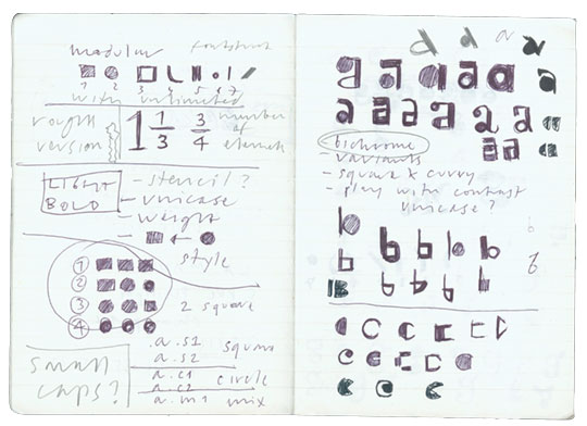
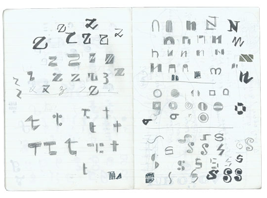
First sketches of Julien (spring 2010)
[social]Like all our fonts, Julien is a tool for designers, and not complete until it is used. I’d be delighted to see how you are using Julien. Please do send us samples of your work for inclusion in the Fonts In Use section.