
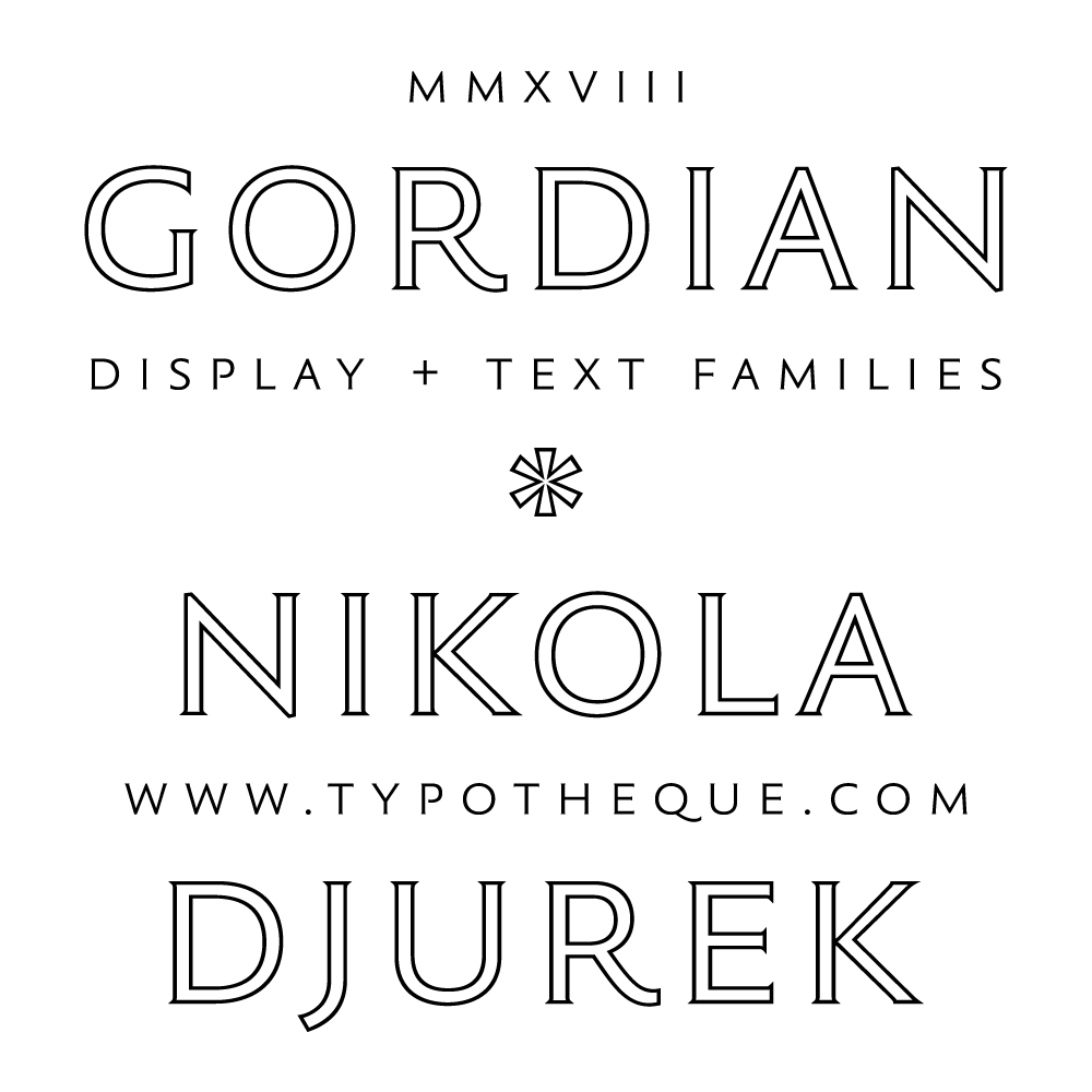
New typeface: Gordian
Nikola Djurek has been making wine for as long as he has been drawing type, and wine labels have often served as testing grounds for early versions of his fonts, but this is his first font actually inspired by a wine label, or rather by the idea of what a modern, sophisticated wine label should look like.

Gordian, an elegant sans-serif with very slightly modulated strokes, is rooted in classic Roman square capitals, figures designed to be engraved in stone. Besides wine making and font designing, Djurek has also practiced stone carving, which is reflected in the subtle chiseling of Gordian’s flaring stroke endings. These traditional roots, however, combine with modern characteristics (wider B, E, F, P and S characters, plus a complete set of lowercase letters) to create a distinctly 21st century typeface, and there is also a generous selection of alternative glyphs which can serve to give the text either a more classical or more modern feel.
Gordian has four weights designed for intermediate text sizes, each with true italics and small caps. It also includes 12 stunning display styles in two versions, Kapitalen (four weights of plain single capitals) and Knot (eight sets of entangled double capitals), the latter featuring smart OpenType functions that create various interactive patterns. See the PDF presentation.
Naturally, Djurek’s 2018 vintages will sport Gordian on their labels, a perfect marriage of content and form.


See a short documentary about the work of Nikola Djurek
Illustrations by Shiva Nallaperumal