
Parmigiano, two years later
Parmigiano type system came out in 2014, with additional Parmigiano releases in 2015, creating a complete solution for most demanding designers. Early applications of fonts are important as they often set the tone, and influence a second wave of users. We are delighted to find Parmigiano it the inspirational cultural publications. Let’s see how Parmigiano has been used since published exactly two years ago:

Múzeum Café is a 100-page, bi-monthly magazine published by the Museum of Fine Arts in Budapest covering domestic and international art events, workshops and developments. In its recent redesign, Péter Salát Zalán from the creative team Lead 82 chose Parmigiano type system for the journal. Múzeum Café is using various optical sizes of Parmigiano, Headline for the large titles, Caption for the main body text, and Parmigiano Sans as the complementary typeface style. The designer of the Múzeum Café Péter Salát Zalán has received multiple international awards for his work.


Hungarian is also an interesting language, unrelated to languages of Hungary's geographic neighbours, and the only one that uses double acutes called hungarumlaut.

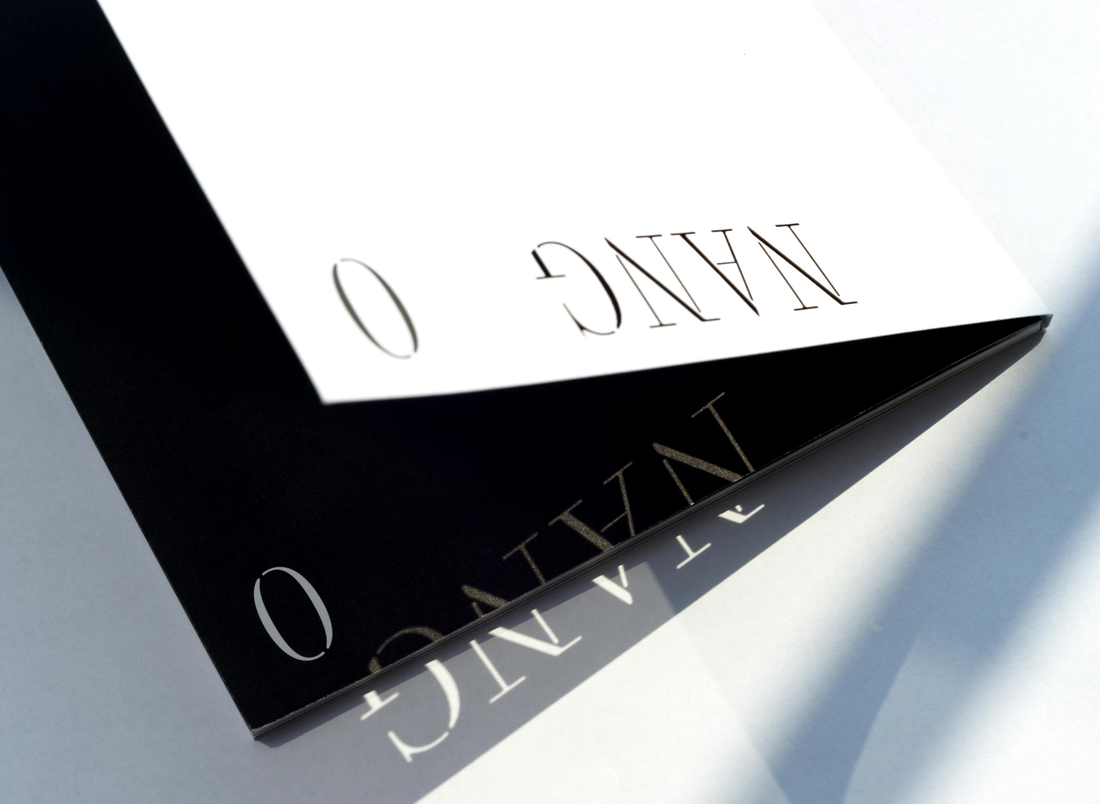
Another recent project using Parmigiano is Nang, a brand new independent magazine dedicated to the cinema culture in Asia. As Nang exists in print and online, the basic Typotheque Print & Web license fits it perfectly.


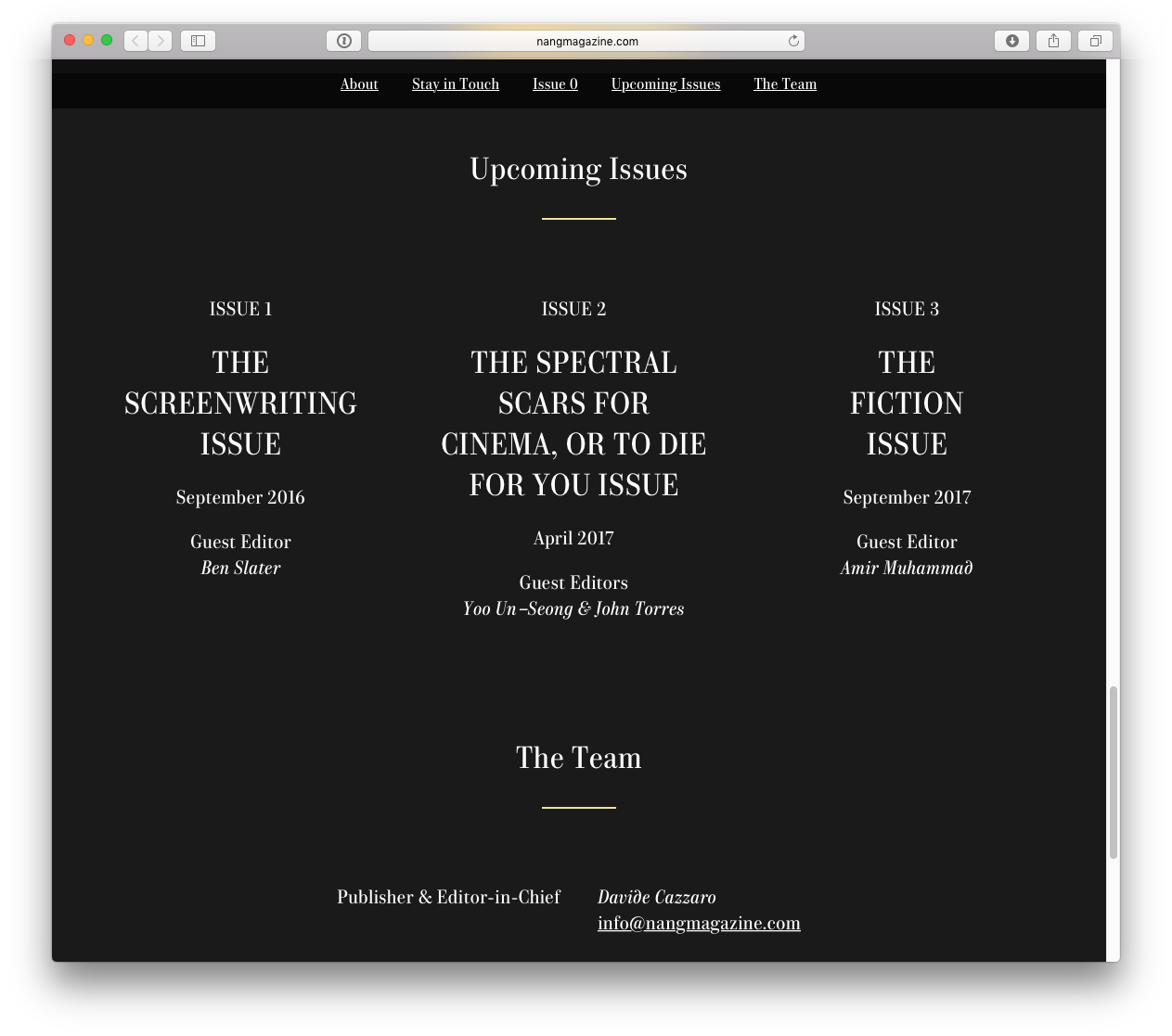
Edited by Davide Cazzaro, each of the 10 planned issues is set to explore a specific theme and created in collaboration with a different group of guest editors and contributors. The magazine is designed by Korean designers Shin Shin (Shin Haeok & Shin Donghyeok). Nang uses Parmigiano Stencil for the magazine word mark and main titles, accompanied by Parmigiano Text.
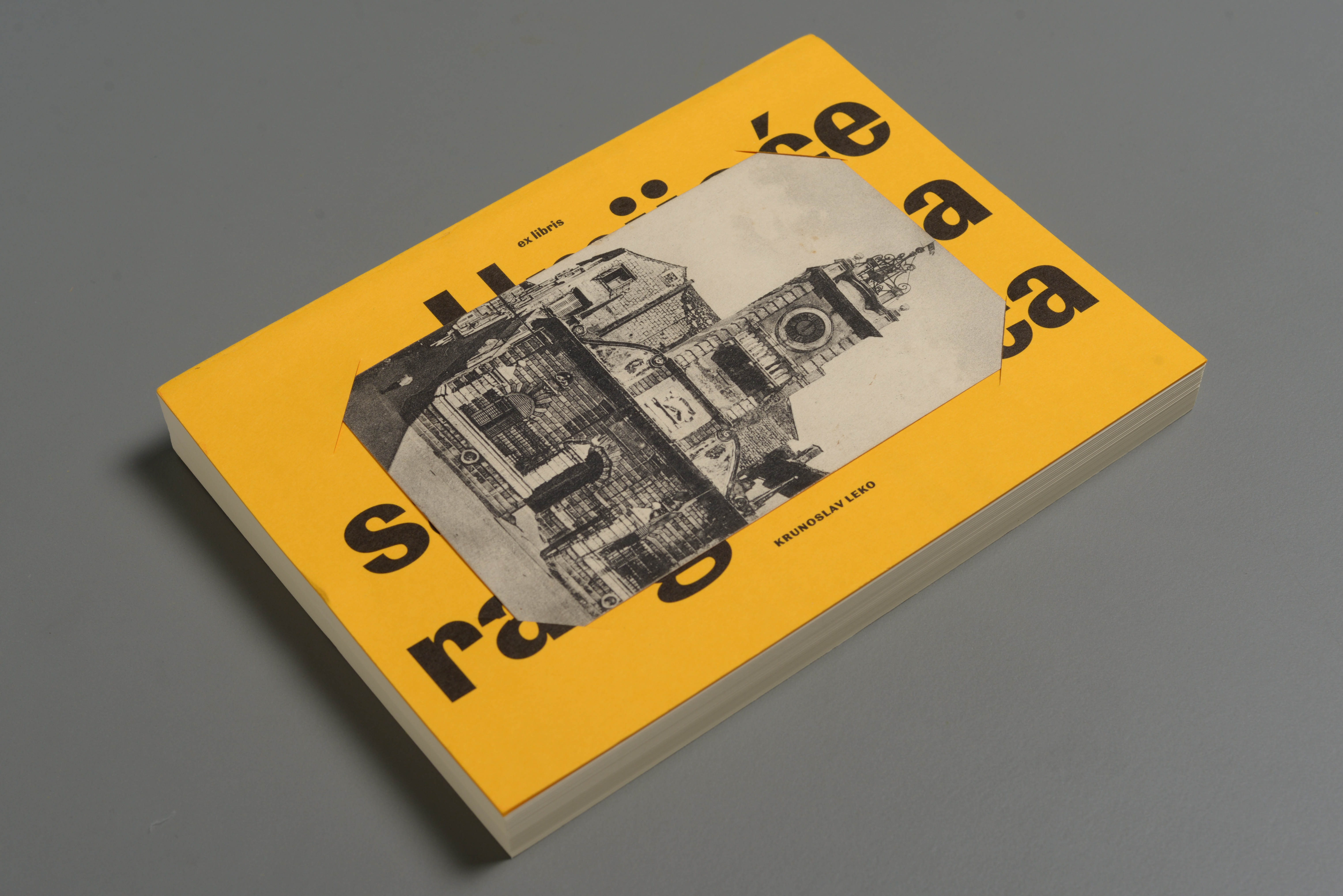
Finally, another cultural publication that uses Parmigiano is Croatian book Umijeće sakupljanja razglednic (The art of collecting postcards) dedicated to cartophilia and its methods of selection and presentation of postcards.

Beautifully bound, written by Krunoslav Leko, designed by Damir Bralić, Lana Grahek and Igor Kudiz, using Parmigiano Sans for headlines and captions, and Parmigiano Text for the body text.
Obviously, we don't see all examples of our fonts, only those that the users actually share with us. If you used any of Typotheque fonts, please send us samples, and receive a €20 voucher for the next purchase.