
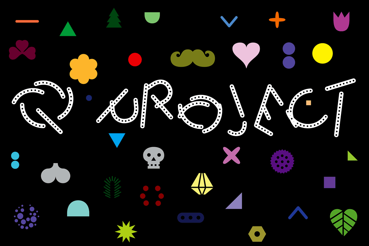
The Q Project, an open-ended typographic play system
Q, designed by Peter Biľak, consists of 6 uppercase base fonts plus 35 attachments that can be added as individual layers (Q Base and Serifs). It also comes with a variable font with a motion axis (Q Mechanic), as well as three levels of basic shapes that can be combined into new forms (Q Shapes).

The base fonts and the attachments are available as sets of fonts which share vertical and horizontal metrics so that they can be combined and layered. With the use of colour, they provide a nearly infinite number of variations. The base layers can also be combined to produce layering effects.

Q Mechanic is a separate font that combines two bases, Q Normal and Q Dots. It features an unusual implementation of OpenType’s Discretionary Ligatures feature, replacing single glyphs with multiple substitutions to break the letters into pieces.NB: This particular GSUB Lookup Type works fine in web browsers and Apple’s Pages and Keynote, but in Adobe software, it requires the Adobe World-Ready Composer to be activated.

Q Mechanic is a Variable Font, an extension of existing OpenType font format that can contain entire design space of variations, and give the user full control to choose which variation from the multiple fonts to use. With the use of a slider, anyone can modify or animate the appearance of Q Mechanic. The font contains three instances, Gravity, a force that attracts the strokes towards the baseline, No Gravity, that release the gravitational pull, and stroke begin to float, and Normal, a static instance in the middle of the two forces.

Finally, the Q Project comes with three sets of shapes that allow the creation of new letterforms. Shapes 1 is rooted in classic Roman inscriptional lettering. It presents a collection of brush strokes proposed by Edward Catich that can be used to recreate all capital letters of the Latin alphabet. The shapes are assigned to keystrokes of their font, or you can use the online interface to drag, drop, and rotate them. Shapes 2 is a more abstract, monolinear collection of elements for building capital letters, while Shapes 3 is a collection of rudimentary geometric shapes that can be used to create letters, other forms, or anything really. The combination of three levels of abstraction provides room to explore the conventions of typography and create new models of the alphabet.

Beyond the standard OpenType fonts, the Q project also includes physical drafting stencils with the basic shapes needed to construct the capital letters of the Latin alphabet in various styles. Just as with creative toys such as Lego or Meccano, you can build what the designer envisioned, or you can ditch the instructions in favour of free play and create something else entirely.

For more information about the Q Project, see this PDF presentation and the article ‘The Importance of Play’, which describes the intentions of the project and includes a concise history of modular type.

Animation by DIA