Typotheque’s 20th! Edge’s 20th!

We registered the typotheque.com domain in September of 1999, and the first version of our website went live later that year, which makes us 20 years old (pheeew!). While we usually do about four new typeface releases in a year, we are celebrating this milestone with four releases this month, one every Tuesday.
If you looked at the Typotheque catalogue in 1999, you saw 15 type families, of which only one is still available (Jigsaw), the rest being retired as our focus changed to creating more systematic type families exploring new areas of design.
One of those retired typefaces is Omar Sans, a geometric typeface drawn on an orthogonal grid. (For those who remember the actor Omar Sharif, yes, the name was a silly joke.) Last year, we received a surprising email from Mucho, a Barcelona-based design firm and one of our early clients, enquiring about this typeface. We tried to discourage them from using it, but they insisted, so Ermin Međedović, Omar’s creator, dug up the old 8-bit PostScript files from the 1990s to give the font another go-around.

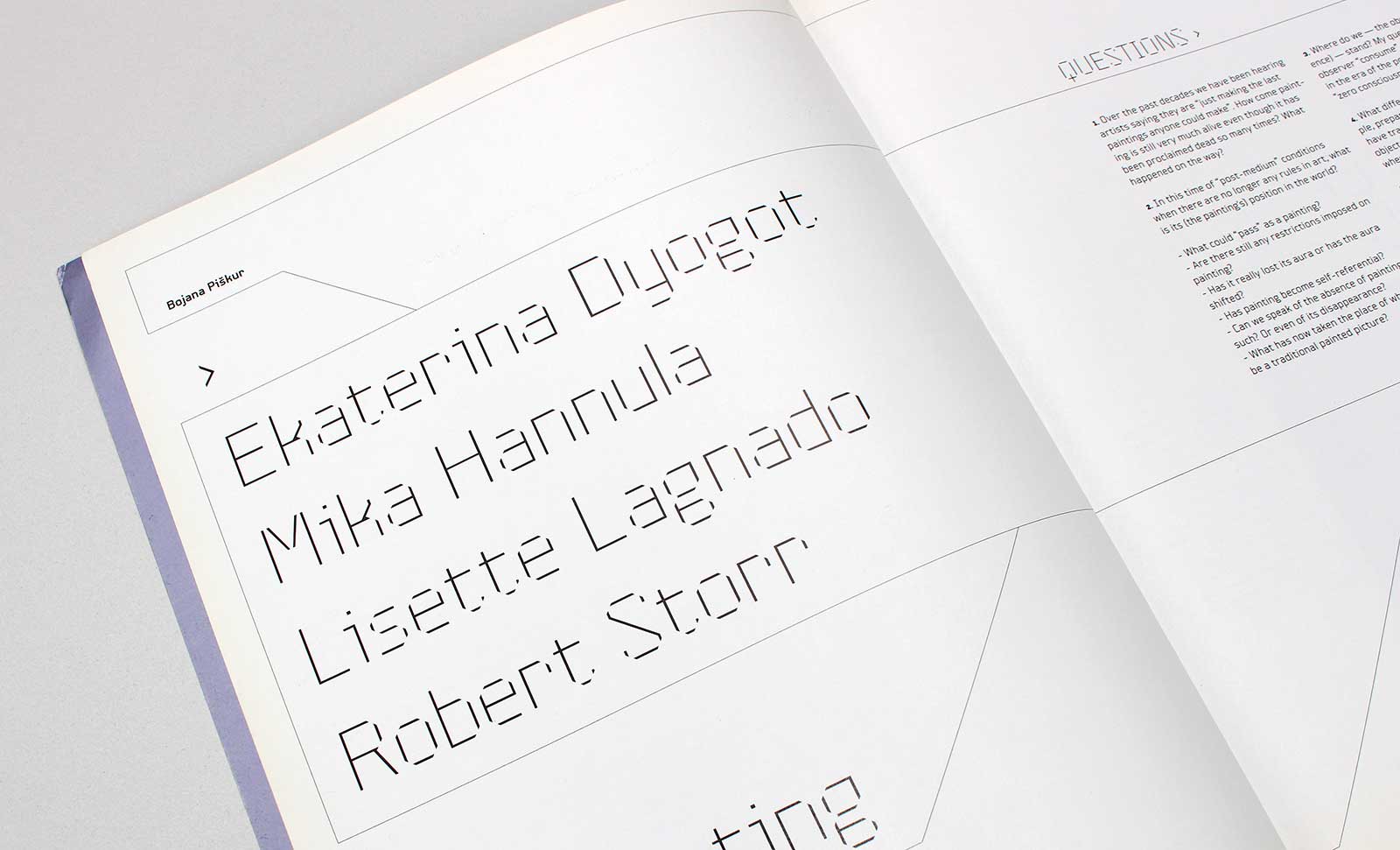
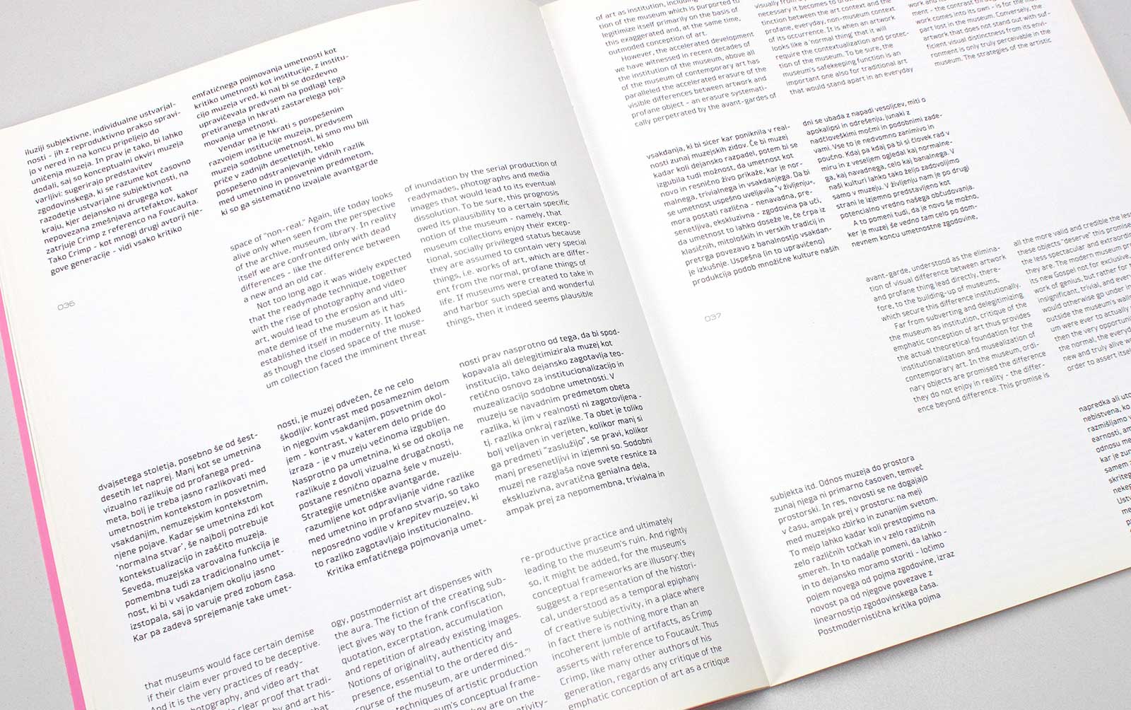
Omar Sans was used for the cultural magazine MARS designed by Slavimir Stojanović in the 1990s.
Međedović approached the process in the same way as he would the revival of a historical typeface, first redefining the purpose, design characteristics, proportions, and individual shapes, and then expanding the character set from its original 140 characters to 1074 per weight. He also went further and added new, never-before-published styles, pushing the geometric concept to extremes: in its lightest version the counter spaces are larger than the actual letter shapes, breaking the forms into isolated strokes. With so many additional features, the typeface deserves a new name, and so we are pleased to introduce Edge Sans, a bold, playful design ready for strong headlines and logos.
See also the detailed PDF presentation.


