Zico — Lettering and Sports in a Font


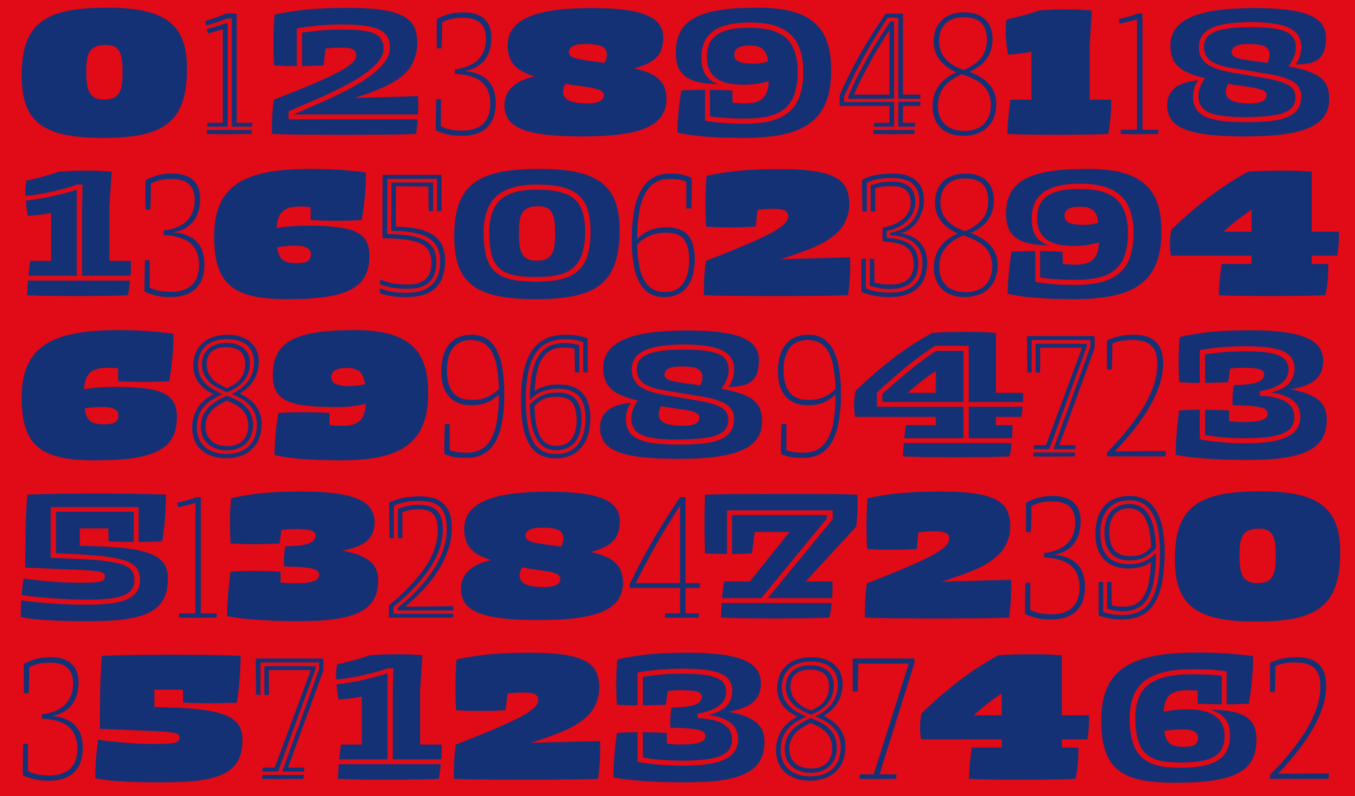
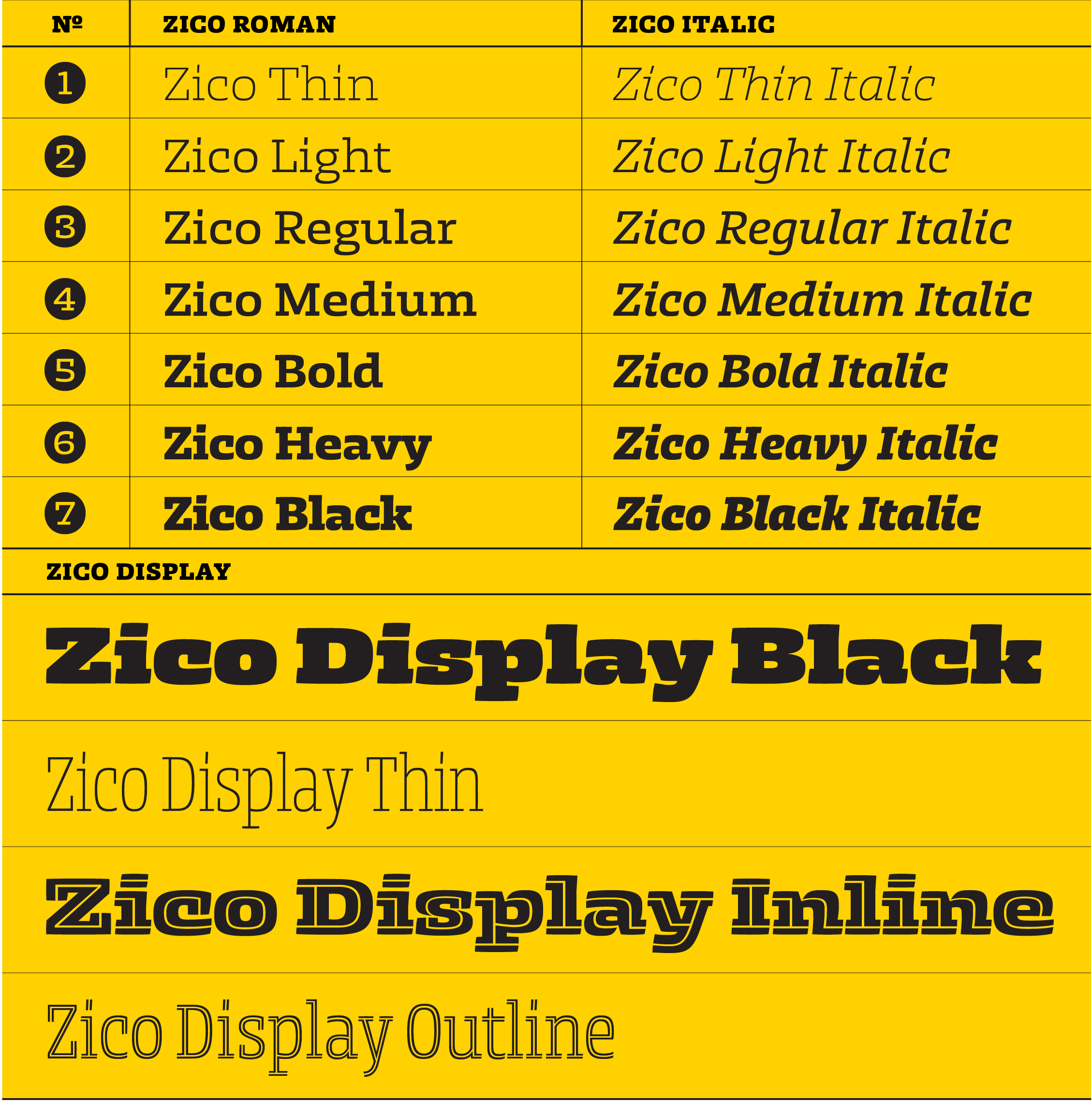
Zico is sturdy and dominant, but not constructed, preserving the dynamics of the hand lettering that inspired it. Its Thin styles are precise, almost monolinear shapes, but the contrast increases just enough at heavier weights to open up the counters, which makes the Regular styles suitable for continuous text settings, while Black styles are saturated and compact. The Display styles reduce white space to a minimum, sometimes resulting in unusual contrast distribution.
Zico and Zico Display families are powerful toolkits for the most demanding designers, carrying everything you need to create effective text hierarchies, strong headlines and eye-catching titles.
Read more about the development of Zico in this article by the author.
