Zico Sans

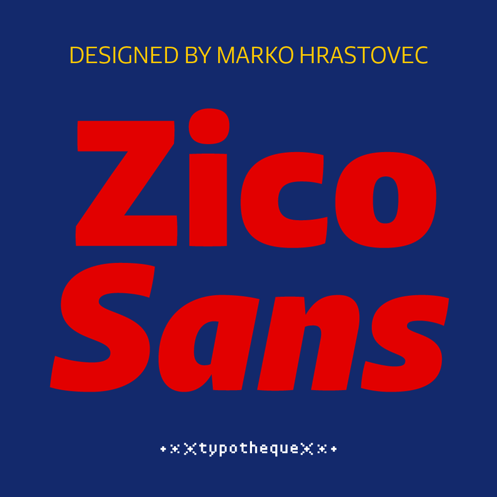
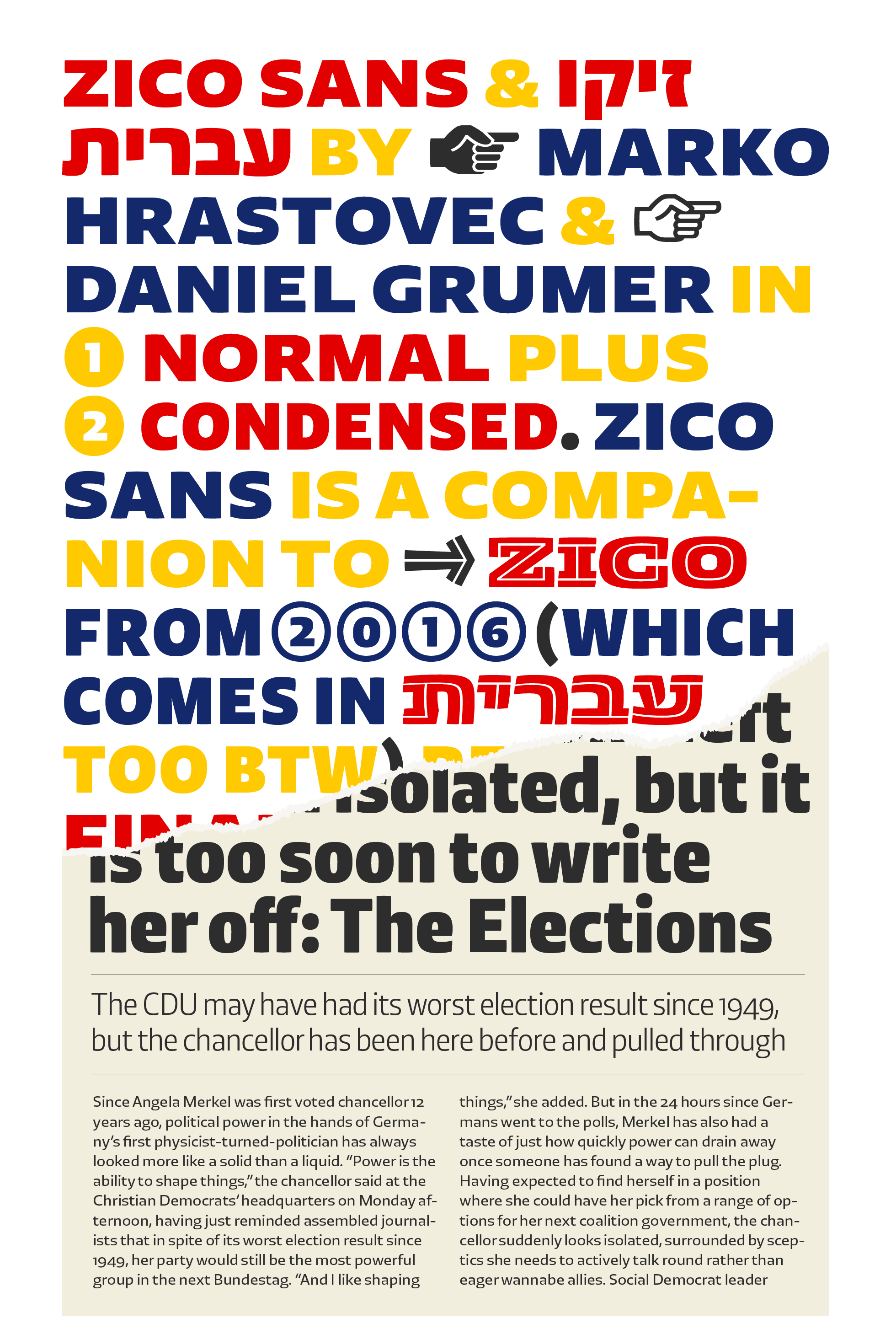
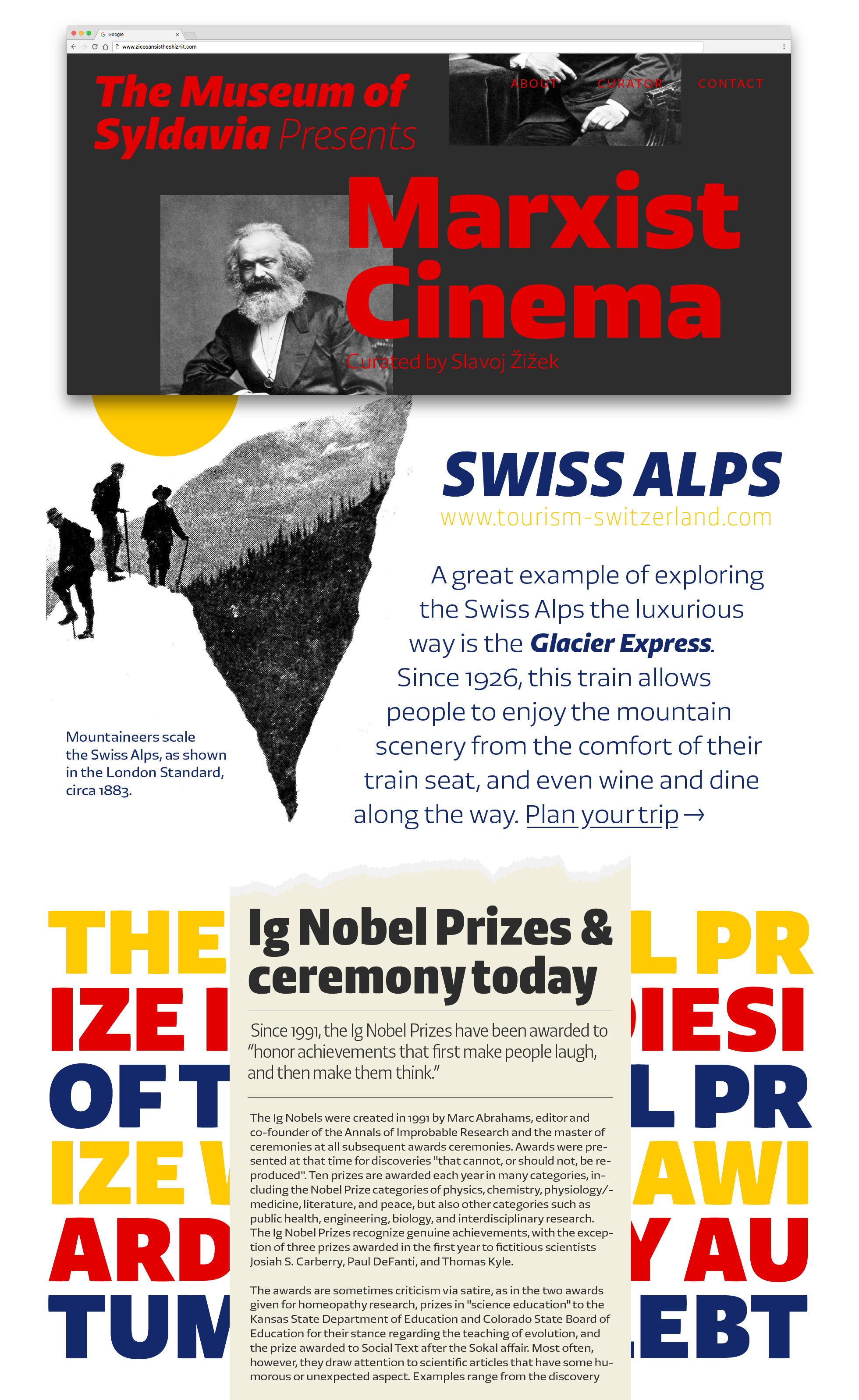
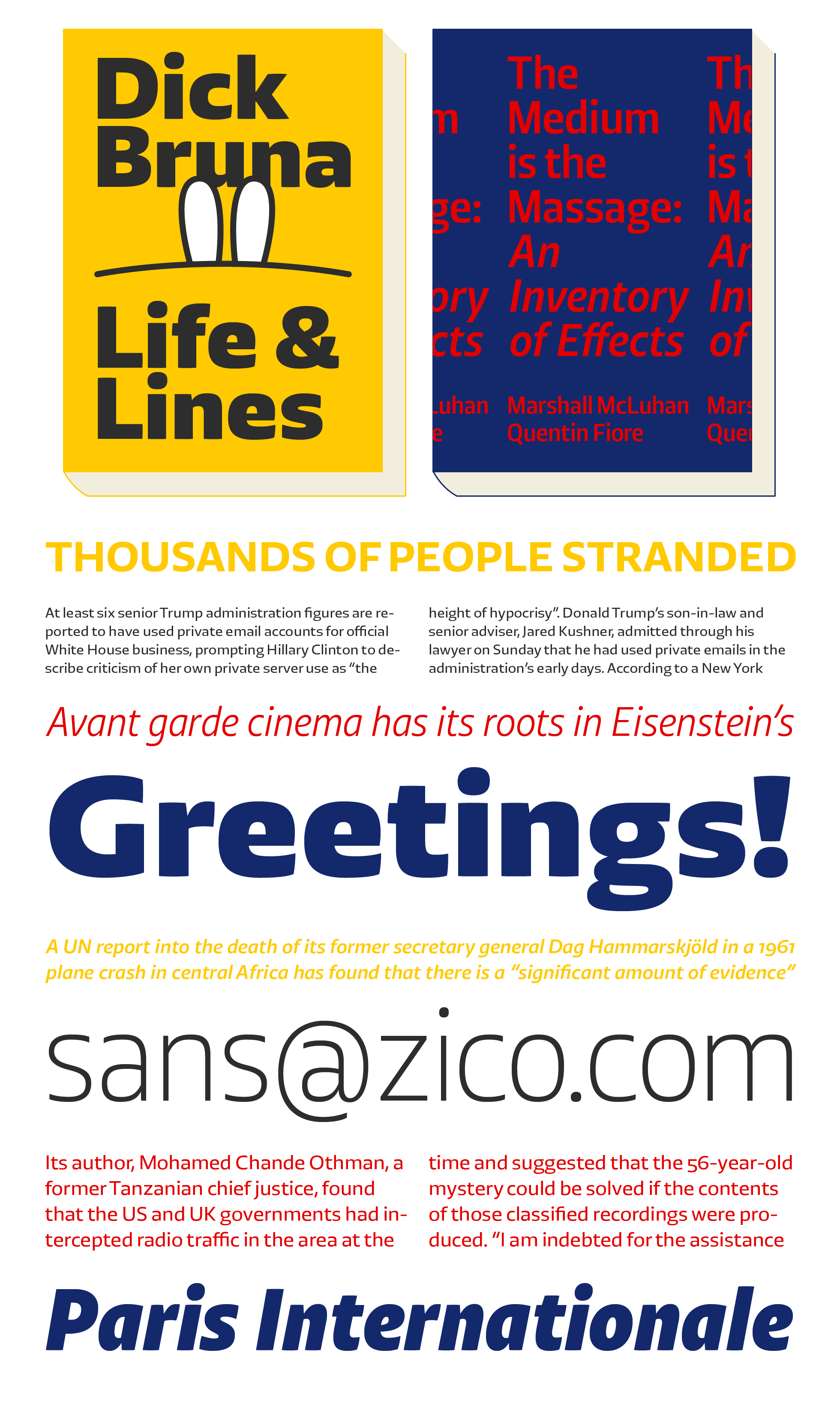
Unlike the original Zico Slab, which is inspired by the letterforms typically used in sport jerseys, Zico Sans is a versatile Sans Serif family with wider applications in mind. By dropping the robust serifs, Zico becomes a natural high-performance typeface with low contrast and plenty of optical compensations that make even the darkest weights work at small sizes. Since the basic proportions are rather wide, Zico Sans also includes a Condensed version, for situations where space-saving typography is required. As a result, Zico is an attractive and adaptable Sans Serif family in two widths with a progression of weights from Thin to Black.
Download the PDF specimen of the Zico font family, and see below for more details.

Zico is inspired by sports aesthetics, first released in its beefy Slab-Serif version and a corresponding Display version. Zico Sans preserves the slightly square-ish but dynamic appearance of the original Slab, and further simplified its basic structure to remove all unnecessary elements. While Zico uses super-ellipse and is drawn around the rounded rectangle, it escapes the retro-futuristic connotations of typefaces such as Microgramma or Eurostile, by being less geometric, featuring open counters, and using dynamic humanist letterforms. Its wider proportions make it an excellent choice for use in the smallest sizes.


Illustrations by Shiva Nallaperumal. Hebrew version by Daniel Grumer.