A Brief History of Sans Serif typefaces

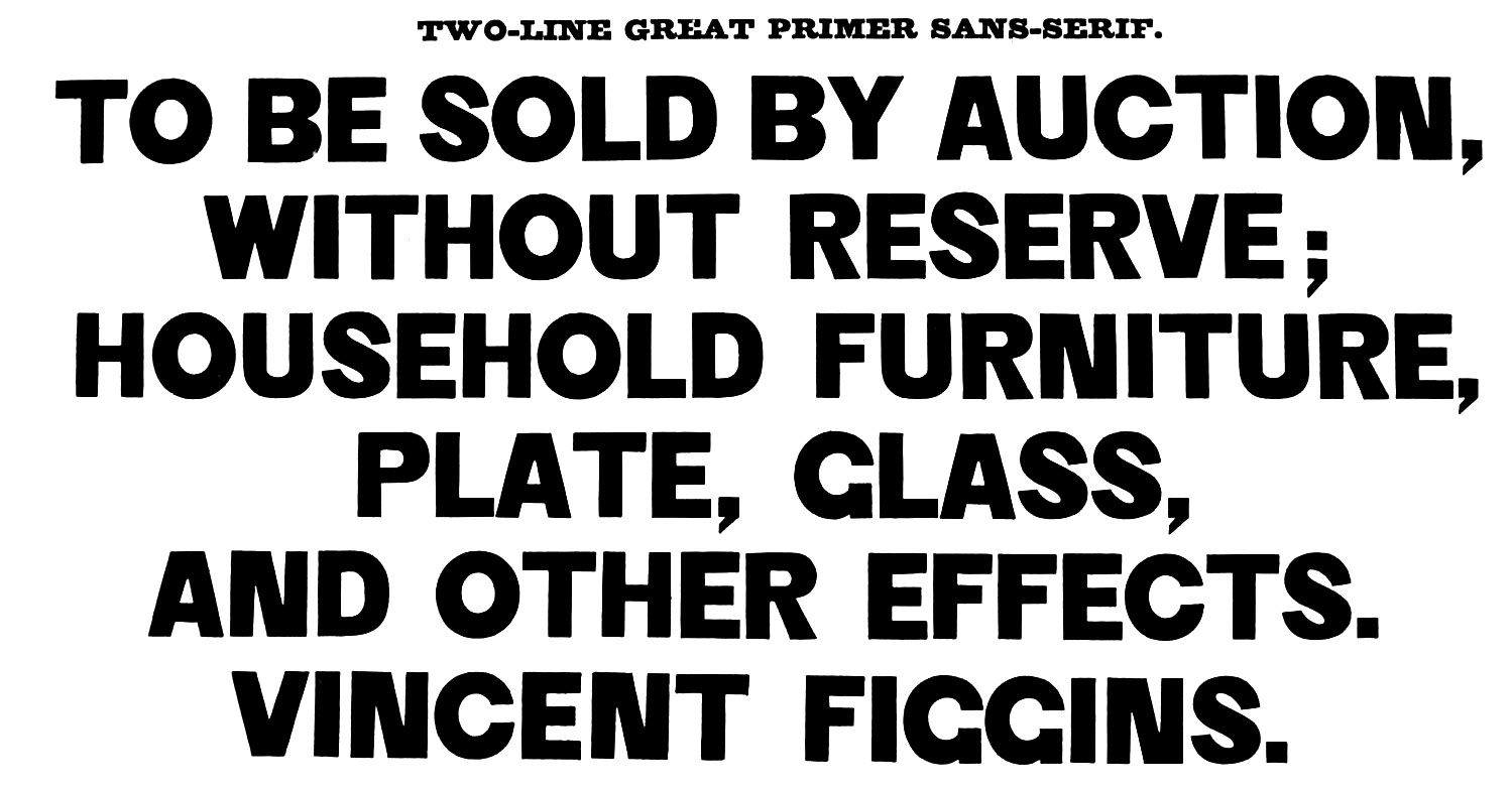
The first low-contrast Latin letters without serif terminations appeared on jubilee coins from 1809, and later under the name ‘Egyptian’ in the 1816 William Caslon IV type specimens. Some two decades later, a very heavy serifless font appeared under the name that we use today, sans serif, in the Vincent Figgins specimen book from 1832. These rather unrefined letterforms were based on the skeletons and structures of previous serif text typefaces, characterised more by the absence of serifs than by the introduction of any fresh, unique feature. In the early 20th century, a new generation of artists, designers and architects took a different approach to sans serif design, rejecting existing conventions and searching for letterforms that would reflect the technological developments of the era.

Specimen of Printing Types, Vincent Figgins, 1834
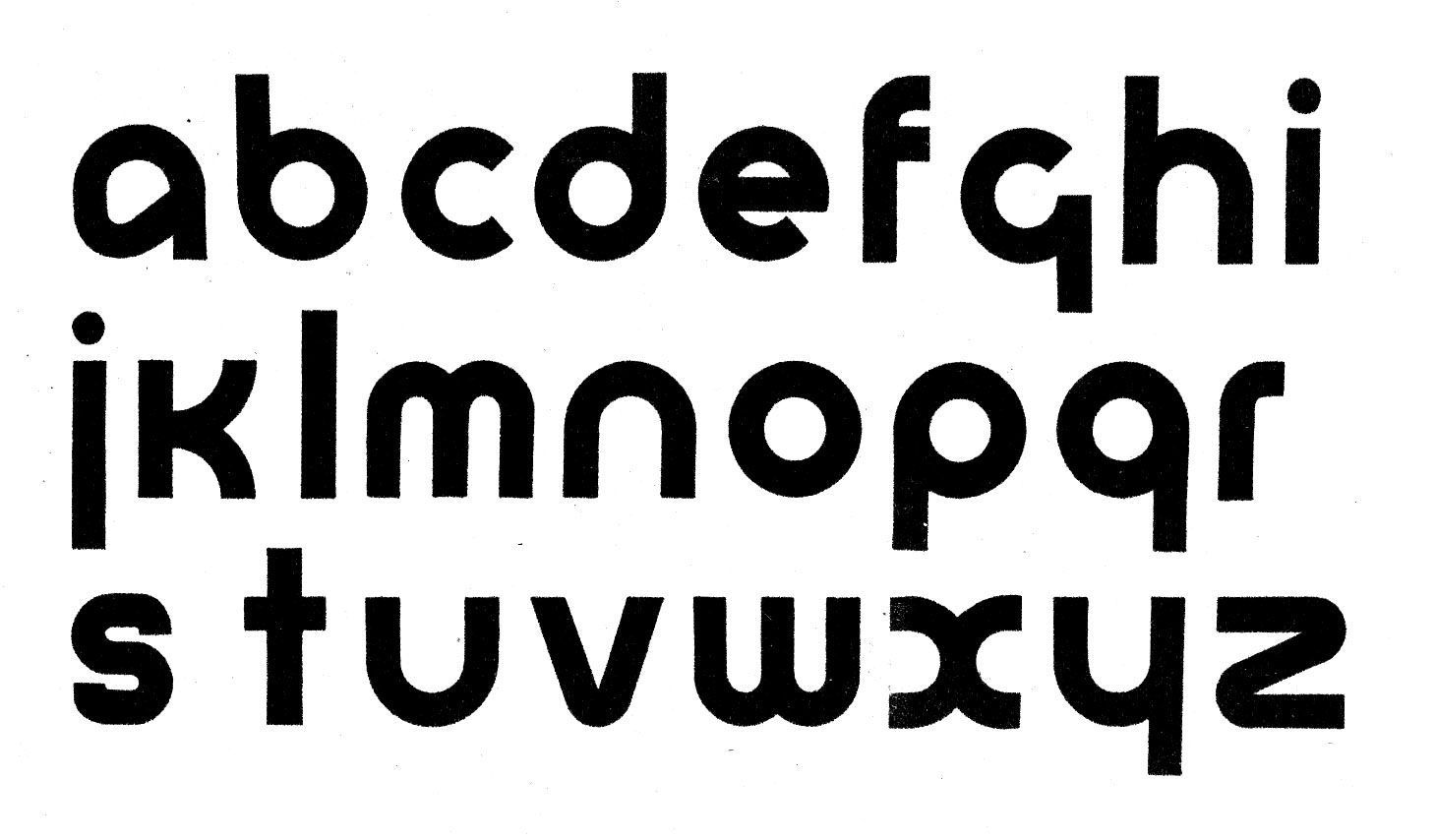
Herbert Bayer’s Proposal for a Universal Type (1925) presented idealised, minimalistic letterforms, advocating not only a simplified, lower-case-only alphabet, but also a complete reform of orthography. It was a radical step in Germany, where Gothic script was still widely used and where all nouns are capitalised, and although it was never cut as type, the concepts behind it had a lasting influence on the following generation of typefaces.

Herbert Bayer, proposal for the Universal type, 1925
While Bayer’s stark geometric forms were driven by ideology rather than aesthetics, subsequent typefaces were more pragmatic, reflecting a search for clean forms suited to the mechanised process of printing. Paul Renner expounded a general theory about reductionist letterforms for the mechanised era, sharing the views of architects such as Le Corbusier, that an era’s arts are affected by its technologies. As an inevitable consequence of modern manufacturing processes, the new typography, just like the new architecture, was the not just an evolution of the old, but a rejection of it, pitting modernity against antiquity.
“The impression of our printing types is not thrown onto the paper from left to right like handwriting, rather it descends with an impression from above. The script of the future will have to be an honest expression of all these technical processes,” wrote Renner in 1927.
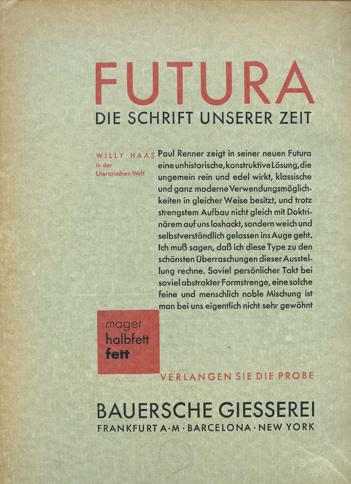
Renner’s Futura (1927) is one of the most influential type designs of 20th century. Initially drawn with a compass and ruler, using circles, squares and triangles as basic elements, it still retained classical proportions rooted in Roman inscriptional capitals. Heinrich Jost and his staff at the Bauer type foundry, which published Futura, introduced careful optical adjustments and stroke modulations, breaking the strict geometry and bringing an overall consistency to what was otherwise a rather quirky design.

Futura advertising in the German trade magazine Archiv für Buchgewerbe, issue 10/12, 1927
Just like Bayer’s Universal, Futura was more outward looking, intentionally international, a contrast to the nationalistic tendencies of the time. Universal, Futura and their contemporary, Erbar-Grotesk (1926), paved the way for countless other sans serifs that explored the possibilities of modular geometric construction, including the popular typefaces of the 1950s, Neue Haas Grotesk, Helvetica and Univers.
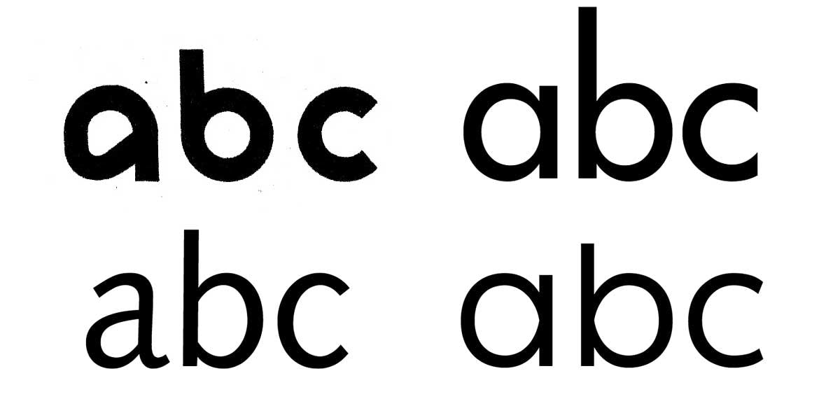
The work of Swiss graphic designer and calligrapher Hans Eduard Meier, on the other hand, is informed by his understanding of history and of type’s calligraphic heritage. His 1959 compendium The Development of Writing is a study of the evolution of writing forms, starting with Greek lapidary inscriptions from the 5th century BC and continuing through modern sans typefaces. As he wrote, Meier also worked on the design of what would become Syntax, a font combining the modernity of sans letters with certain characteristics of Roman types of the 15th and 16th century such as Bembo, Jenson or Garamond. The design evolved slowly, taking shape over several decades, and underwent several changes up until its publication in 1968. In contrast to the cold neutrality of the more ubiquitous and successful Helvetica and Univers, Syntax is historically conscious, rooted in the Renaissance, showing that ‘sans’ didn’t necessarily mean ‘mechanically constructed’. It established humanist sans as a new genre that would eventually include such admirable typefaces as Scala (1988), Quadraat (1992) and Thesis (1994).

Early, unpublished version of Syntax by Hans Eduard Meier, 1959
The sans model is the youngest model of letterform construction, coming after the serif and slab, and perhaps also the most self-conscious. While in the early 20th century it was reactive, standing in opposition to traditional typefaces, with time and with broader application in continuous text, it began to embrace the past.
Today, new sans typefaces can choose which heritage to draw from, or even combine elements of both, as does our new release, Ping (2019), a geometric sans in the tradition of Erbar and Futura that features abstract, reductionist forms. At the same time, however, Ping is not hesitant to show traces of handwriting. Ping reconciles the seeming opposition of geometry and humanism by reducing the number of strokes used to build the letters. Just as humanist cursive is usually written without lifting the pen, Ping attempts to define most letters with the least possible number of strokes, striving not for mathematical geometry, but for simplicity of construction. It is rational but not faceless. It is a not-so-geometric Sans. Or a not-so-humanist one.

Over a decade in development, first sketches of Ping come from 2008, when it was originally designed as a proposal for a luxury car manufacturer.
The historical development of the sans serif has helped Ping to take its place in a broader context. Just like Futura, Ping intends to transcend national borders, making itself usable across numerous writing scripts. Ping is now available in Armenian, Cyrillic, Greek and Latin, with Arabic, Devanagari and Hebrew in development and other writing scripts planned for the future. And like Syntax, it rejects rigid or overly mechanical models, avoiding the sterility of ruler-and-compass constructions. It is a resolutely modern typeface, exploring the possibilities of the present moment while respecting the past.