Parmigiano Type System, a tribute to Bodoni
Riccardo Olocco and Jonathan Pierini’s Parmigiano is a reinterpretation of the work of Giambattista Bodoni (1740–1813) commemorating the bicentenary of his death.
We are grateful to Olocco and Pierini for having spared us yet another series of fonts with Bodoni’s name stuck onto them. Besides being a reasonable and delectably evocative name, Parmigiano represents an intelligent application of some neglected Bodonian precepts to digital type design. —James Clough
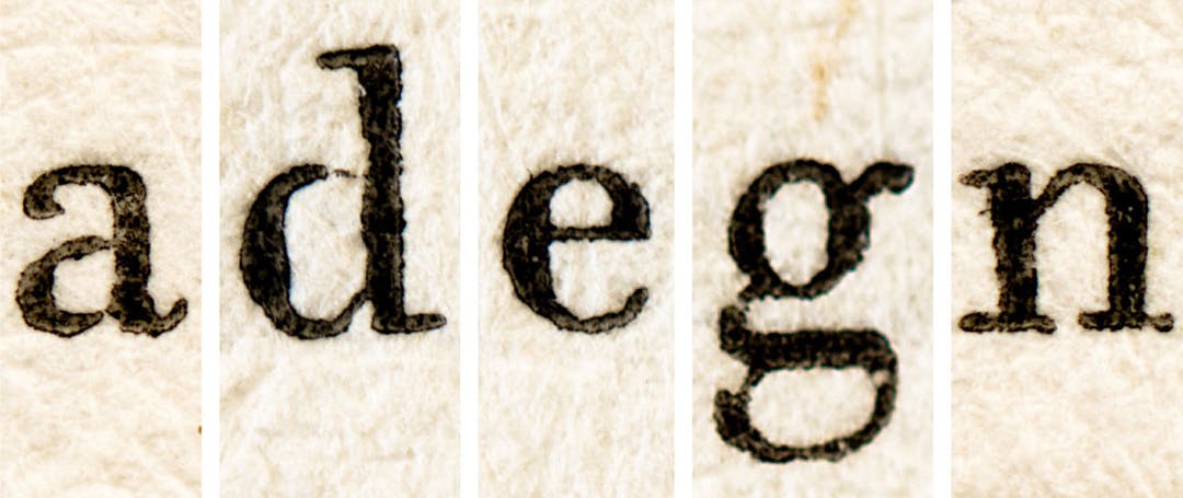
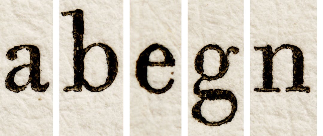
‘The first idea of designing a vast family of Bodonian fonts came after I started taking macro photographs of original copies of Bodoni’s 1818 Manuale Tipografico.’ remembers Riccardo Olocco, co-author with Jonathan Pierini of the Parmigiano font family. ‘My purpose was to analyse his roman types in order to develop some fonts inspired by his work.’
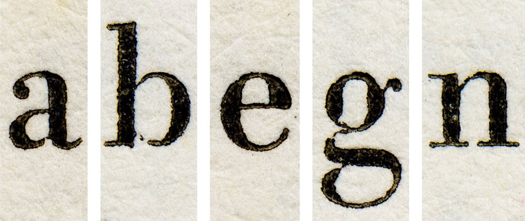
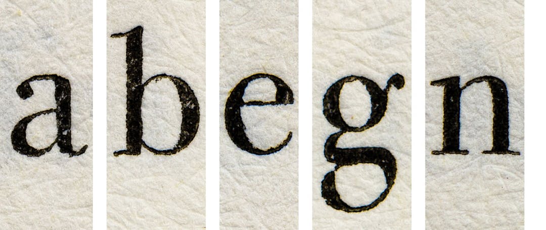
The idea most designers have of Giambattista Bodoni’s work is based on ATF Bodoni, designed by Morris Fuller Benton in 1910, the first of many typefaces to take Bodoni’s name. Benton was inspired by the original types but had to work within financial and mechanical limitations Bodoni would never have accepted. In spite of this, he achieved a masterful synthesis which is more vigorous but less modulated and less organic than any of Bodoni’s romans.
‘Reworking the Bodonian romans,’ say Olocco and Pierini, ‘we eschewed a philological approach and kept a distance from Benton’s and other 20th century designs. Our intention was to interpret Bodoni according to contemporary taste.’
Olocco and Pierini tried to transpose Bodoni’s work to the modern era, imagining what he would have produced if he were alive and working today, what his approach to type design would have been. The result was a set of typefaces that are contemporary, irreverent descendants of Bodoni’s letterforms.
‘As Bodoni spent most of his life in Parma,’ they explain, ‘we decided to call them Parmigiano,’ (Italian for ‘from Parma’, and also the name of a cheese that also comes from that region). ‘We also decided to add other roman styles to the serif ones and even sans or slab serifs. Of course Bodoni himself never cut such shapes, and we can presume that he would feel offended by our choices.’
The Parmigiano family also features different cuts for use in specific point size ranges, an idea rooted in the history of typography and typical for Bodoni’s era. Typical adjustments for fonts to be used at smaller sizes include enlarged counters, shortened ascenders and descenders, thickened serifs, decreased contrast and wider letterspacing.

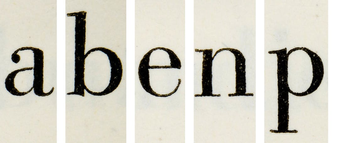
Parmigiano Headline is the group leader, the posh and self-confident cut of the family. Of all the other styles of the family it is the closest to Bodoni’s original designs and has the most contrast. It also features smaller bowls as well as delicate and subtly refined shapes. Its generous ascenders add elegance, and its narrow proportions balanced by round letterforms make it a space-saver. Parmigiano Headline is perfect for use at big type sizes without sacrificing the black and white rhythm within the line, a great choice for advertisement and magazine titles.

Headline’s frugality, delicacy and controlled width recall some of the display cuts in Bodoni’s 1818 Manuale Tipografico. Far from being a facsimile of any of Bodoni’s types, however, Headline is more of a synthesis of the key features to be seen in his bigger romans. It was specifically conceived for setting titles and headlines, and is not recommended for sizes smaller than 20 points.

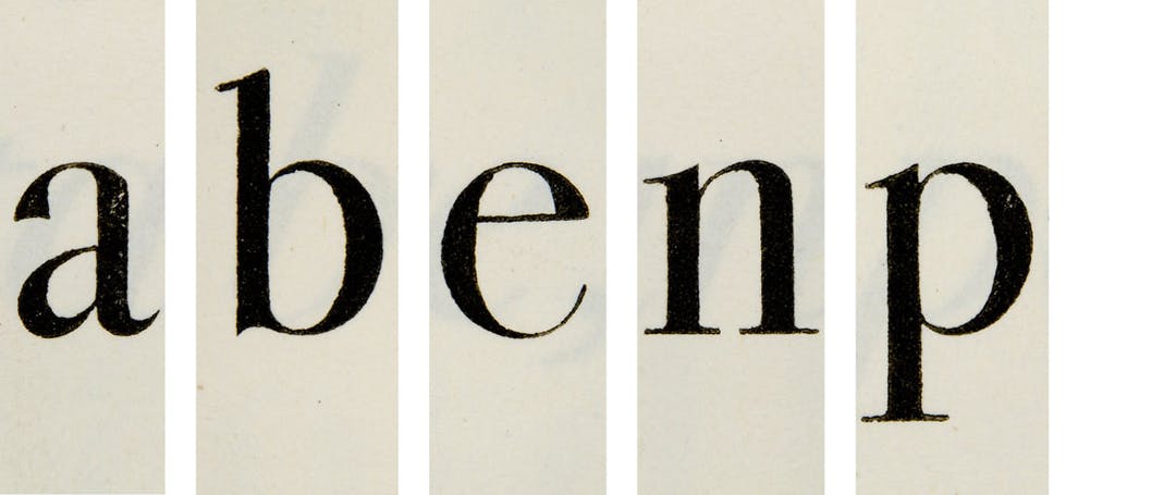
Parmigiano Text has a delicacy which contrasts with the Piccolo version and it is more solid than the Headline cut. Highly versatile, it is an ideal choice for setting magazines, books or any other long texts whose contents need to be easily accessible. Designed for smooth readability, its sharp and elegant letterforms make for a comfortable, relaxed reading experience, while its thin, horizontal serifs, vertical axes and the round terminations on certain lowercase letters give it a thoroughly contemporary feel.
Compared with the continuous text typefaces cut by Bodoni himself, Parmigiano Text has a higher contrast and a less eccentric structure. While it retains a certain distinction, eye-catching details more suited for display purposes have been softened in order to offer a more neutral effect, making it the easiest to use of the Parmigiano fonts. It is recommended for use in sizes 10 points or larger; sizes smaller than 10 points are adeptly handled by Parmigiano Caption, which was designed for this purpose.

Parmigiano Caption was conceived to accompany Parmigiano Text for setting secondary texts such as captions and footnotes. Parmigiano Caption guarantees superb readability and consistent quality in print at sizes smaller than 10 points, completing the Parmigiano family and making it perfect for work with complex texts in several sizes.

The idea of a sans serif to accompany a roman inspired by Bodoni raises the question of how to apply Bodoni’s design sensibilities to a typeface he would never have designed. Parmigiano Sans owes a design debt to early nineteenth century Grotesques such as William Thorowgood’s Seven Line Grotesque (1834), which were characterized by pronounced contrasts between thick and thin strokes, brusque terminations and an overall roundness of the letters. While these features are quite obvious in the bolder cuts of Parmigiano Sans, the lighter weights show less contrast and the Light cut is almost monolinear.

Parmigiano Sans was designed to strike a balance between the primitiveness of the early grotesques and a less eccentric and normalized structure. Although the proportions and the weights of Parmigiano Sans are based on Parmigiano Text, thanks to the fine crafting of details it gains a unique personality which makes it suitable for a wide range of uses. Parmigiano Sans shows its sturdy and no-nonsense qualities for texts in small sizes. When used in progressively bigger sizes its details gain prominence, which, in combination with its narrow proportions, makes it a good choice for headlines.

Parmigiano Piccolo may at first seem utterly foreign to Bodoni’s design principles, and its thick-set, ungraceful design would seem to belong to another family. Although it shares the same structure as the other cuts of the system, Parmigiano Piccolo is closer to the Scotch Roman models of the early 1800s, with their reduced contrast, shorter ascenders and descenders, and rather narrow proportions. And just as the Scotch Romans were the outcome of commercial considerations, Parmigiano Piccolo focuses on practicality and legibility. Although its features set it apart from the elegant refinement of the rest of the Parmigiano family, it is the one to trust in critical conditions. Thanks to its reduced contrast and strong serifs, it is the perfect choice when the texture of the paper or the quality of printing threaten your text, or when you are looking for a deliberate touch of roughness.