Typeface design beyond a single script
The concept of designing typefaces for different writing scripts with shared design solutions, matching relative size and rhythm of text, is relatively new. Multilingual typesetting has existed ever since the arrival of the printed book, but each writing script has been doing its own thing – indifferent towards size, weight, proportions, line length and the shapes of other scripts.
It was the infamous Jan van Krimpen’s Romulus Greek experiment (1931) that challenged the prevailing expectations that discordant typefaces ought not to be used together. This experiment brought the English and Greek text together, at the expense of modifying the accepted shapes of Greek, with the consistent contrast angle borrowed from Latin being used across both scripts. In his 1957 book On Designing and Devising Type, van Krimpen describes this experiment as ‘introducing ... purely typographic roman into Greek’, removing the calligraphic Greek features. Today Romulus Greek is used as a prime example of a heavy-handed Latin-centric design approach, which misunderstands the nature of Greek script, its origins and history.
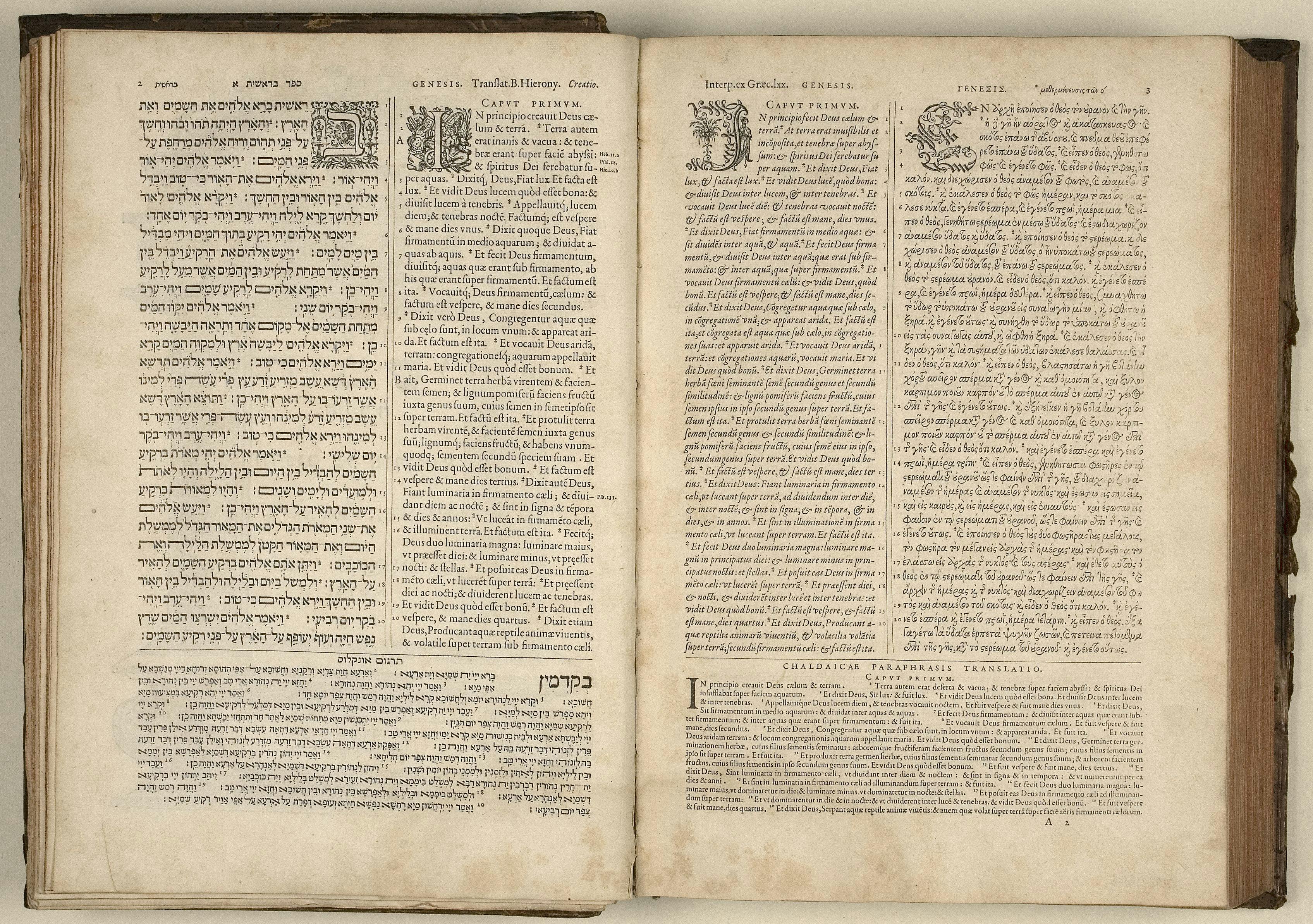
Unicode, a standardising technology for the consistent encoding and representation of text across the world’s languages, was formally introduced in 1991, with the intention to cover all living and dead languages, and to create a foundation for processing, storage and interchange of text data in any language and software. For the first time, Unicode allowed the coexistence of various writing scripts using the same fonts on the same page. Yes, you could typeset different scripts before this, but it required various hacks and use of numerous fonts and encodings, resulting in documents that were not interchangeable. Unicode promotes an interconnected, globalised world, where people exchange messages across platforms.
If Unicode and OpenType format meant that fonts could support any writing scripts within one file, what should those fonts look like? The first Unicode-compliant fonts didn’t seem to care too much about appearances. Arial Unicode (1998) is a collage of various fonts ‘glued’ together, without considering their proportions or purpose – just as the 18th-century printers showed little care about using various typefaces alongside each other. In Arial Unicode, the Latin part is expressed in a low-contrast sans design, Armenian contains serifs, Devanagari is an upright design with high contrast, Tamil is slanted, and the Gurmukhi script is a monolinear design.

As unsatisfactory as these choices are, perhaps it was even intentional, as Unicode explicitly is not concerned with design style; encoded characters are just an abstract notion of shapes, with no implied appearance of glyphs, no difference in encoding between a sans, serif, or a script typeface. Lucida Sans Unicode, which precedes Arial Unicode, designed by Charles Bigelow and Kris Holmes in 1993, contained a much smaller character set, supporting only Latin, Greek, Cyrillic and Hebrew, but it also explored the relationships between shapes of various scripts. ‘Within one font, we wanted the different alphabets and symbols to maintain a single design theme’, to reduce the haphazard combinations found in Arial Unicode and promote design harmonisation. ‘By “harmonization”, we mean that the basic weights and alignments of disparate alphabets are regularized and tuned to work together, so that their inessential differences are minimized, but their essential, meaningful differences preserved”, explained the authors in their paper ‘The design of a Unicode font’. Adobe, one of the pioneers of DTP and the co-developer of OpenType specifications, adopted the same model of connected scripts that could be thoughtfully combined together. Robert Slimbach designed a useful set of typefaces supporting Latin, Greek and Cyrillic, with shared design parameters, where strokes appear as if designed by the same tool, sharing horizontal and vertical proportions.
That approach seems to work well for writing scripts that are connected and related by shared histories. Greek had an influence on both Latin and Cyrillic, Modern Cyrillic was reformed following the Latin lead, and Latin brought some influences later back to Greek. It could perhaps be extended to other, not-too-distant scripts, Georgian and Armenian, but it stops working as soon as we leave the European continent and start working with Semitic scripts, such as Arabic or Hebrew. Typefaces designed in the 1990s and early 2000s followed Adobe’s approach, which had worked so well for European scripts, but which for Arabic and Hebrew only resulted in unnatural proportions of the typefaces, with incorrect writing contrast and heavily distorted letterforms. It took another decade before the emergence of more lasting designs, informed by each script’s history.
The Latin script is relatively systematic and contains a limited number of formal solutions for stroke structures, and it is not possible to find specific solutions for, say, Arabic, simply by looking at the Latin design. Commonly, designers overly standardise the design of a writing script, based on the Latin typeface; however, most writing scripts have a completely different logic in terms of construction of letterforms, and the Latin contains little information to help define what the shapes in a Thai or Devanagari typeface should look like. Therefore, when designing for a different writing script, it is better to prioritise purpose over harmonisation of shapes. Or in other words, the individual shapes should be informed by the script’s collective history, seeking appropriate expression within each script, rather than applying uniform solutions and overly forcing one script to conform with another. It is difficult to make an assumption that, just because a particular set of shapes and decisions works for one script, it will also work for another. But if we can’t usually borrow solutions for one script from another, how should multiscript type design be approached, in order to create a harmonious appearance?
When creating a different language version, we at Typotheque usually aim to translate the intention of the typeface, rather than relying solely on an examination of its forms. A useful metaphor comes from the world of literary translation. A translator is not aiming for a literal translation, but rather tries to reproduce as closely as possible the intentions of the author, while using an entirely different vocabulary. It is a game that involves an understanding of the authenticity of text and its meaning, rhythms and tones, rather than being limited to the exactness of the words. American translator Linda Asher, who translated dozen of authors from French to English, says that in her work she looks ‘for the meaning, the sound of the text, the song, which is to say the style, and my goal would be to find the English to answer in kind’.
In type design, similarly, we strive to understand the purpose of the text, and see how it can be expressed in a different writing script. For instance, a newspaper typeface may use different conventions in the Middle East than in Germany, and understanding the conventions and context is not just informative but essential for the job. Ultimately, we are working to convey the same atmosphere to readers across different cultures.
Besides the elusive search for meaning, in type design we also aim to fulfil the technical requirements of various alphabets so that they work together. For example, we maintain a specific typographic ‘colour’ of the text, so we can retain the same characteristics and importance of text in a structured layout. The idea behind this is the preservation of the typographic hierarchy of complex text, so particular styles can be used to structure text in any script. There is no fixed value for the ‘normal’ weight of various language versions, and the core of the designer’s work is to find the right solutions.
Choosing the appropriate proportions of letters across scripts is one of the most important attributes of multiscript typography. The difficulty lies in the fact that it is impossible to measure two unrelated scripts and match their heights. For example, you could pick the tallest Latin characters, match them to the tallest Arabic or Devanagari characters, and scale the rest accordingly. However, the result would be disproportionately small Arabic or Devanagari, as Latin has very consistent heights of letters, but Arabic and Devanagari letterforms vary considerably in size, their tallest letter structures being much taller than those in Latin.
Of all the writing scripts in the world, and there are over 200 of them, only a handful can inherit the height of letters from Latin. Cyrillic, for example, uses the same height of caps and lower case, and even directly copies some characters. But all other scripts need to be evaluated on their own, according to specific and relative size of text. Even a script as similar to Latin as Armenian typically has a different height, just as Hebrew does, and Thai – and essentially any other writing script.

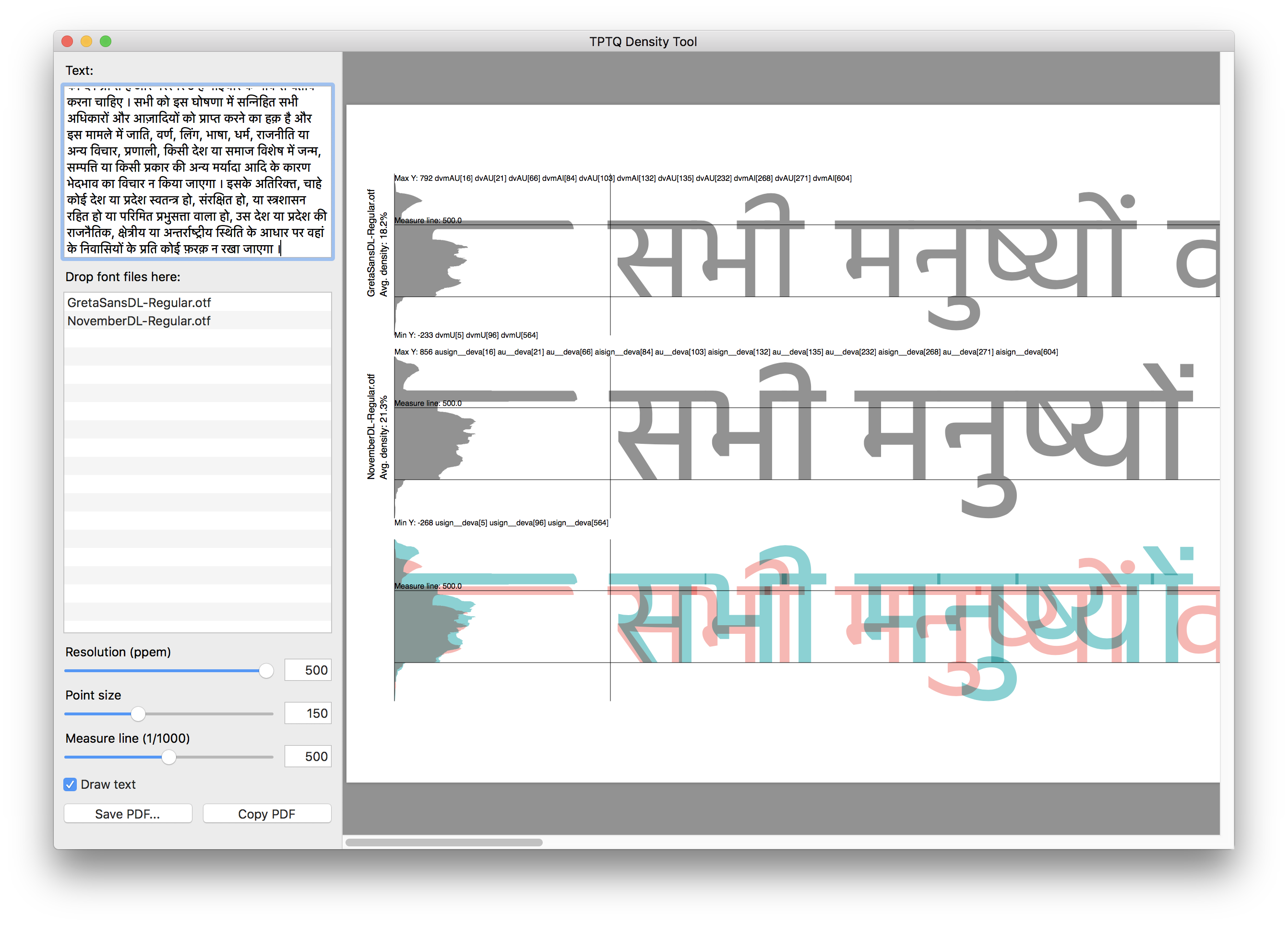
Habit, experience and perception are all involved in evaluating the best relationship of sizes between scripts. To make this evaluation easier, we have also developed tools that visualise what one sees, to better observe particular patterns. Together with Just van Rossum and Liang Hai, we developed Density Tool, a Mac-based tool to analyse and compare vertical heights and horizontal density of various writing scripts. We use it to study proportions of unrelated writing scripts, for example to decide on the height of Devanagari or Arabic typeface next to the Latin. Because the Density Tool renders real text, including dynamic positioning of marks, above and below forms, it also provides accurate values for the yMax and yMin in the OS/2 Table. The rendered graph shows the horizontal density of the rendered text: the length of a bar represents the amount of ‘ink’ in that horizontal area, and ‘average density’ represents the grey-value of the text, averaging the number of black pixels representing the glyphs, expressed as a percentage of the extent to which the glyphs’ bounding boxes are filled. A higher value means that the glyph uses more pixels, and the text is therefore heavier and darker. While the script will not give fixed answers, it provides a useful visualisation of text patterns that enable informed decisions to be made about the proportions of various texts.

It may not only be a case of adjusting other scripts to Latin. Sometimes, the Latin needs to adjust to other scripts, since it may be the more flexible. We design typefaces within a square, sometimes referred to as an em-square, but it is the designer’s decision how to use that space. The same space is used differently in different fonts: on the left is Greta Sans with its relatively small size but plenty of space left for diacritics; on the right is Fedra Sans with a large x-height, both used at 72 points.

Hangul (Korean script) and Hanzi (Chinese) don’t allow for much flexibility. Chinese can be set horizontally or vertically, and needs to use the square efficiently. Therefore, it is the Latin that has to adapt to CJK type. In the case of Greta Sans Korean, designed by our friends at Sandoll in Seoul, the Latin had to be scaled by 125%. And the design is about more than just the scale of two scripts. Korean readers have different expectations about the colour of the text. So when we decided to work on the Hangul version of Lava, it became immediately clear that it would require a new, much lighter version of the Latin, which would better match the Hangul text. For the Thai version of Lava, we also specially developed a new, lighter Latin, to match the expected weight of the typical reading style of Thai.
Communication across cultures and borders keeps pushing designers to find new solutions for working with text that often had never previously been combined with other writing scripts. While new precedents are being created, designers also have a responsibility towards the readers to respect the content, and safeguard the subtleties of various cultures. We hope that the tools and fonts that we make allow for better dialogue across cultures, evaluating each script according to its culture, and revealing more information about the working of multiscript typefaces.