Greta Typeface System
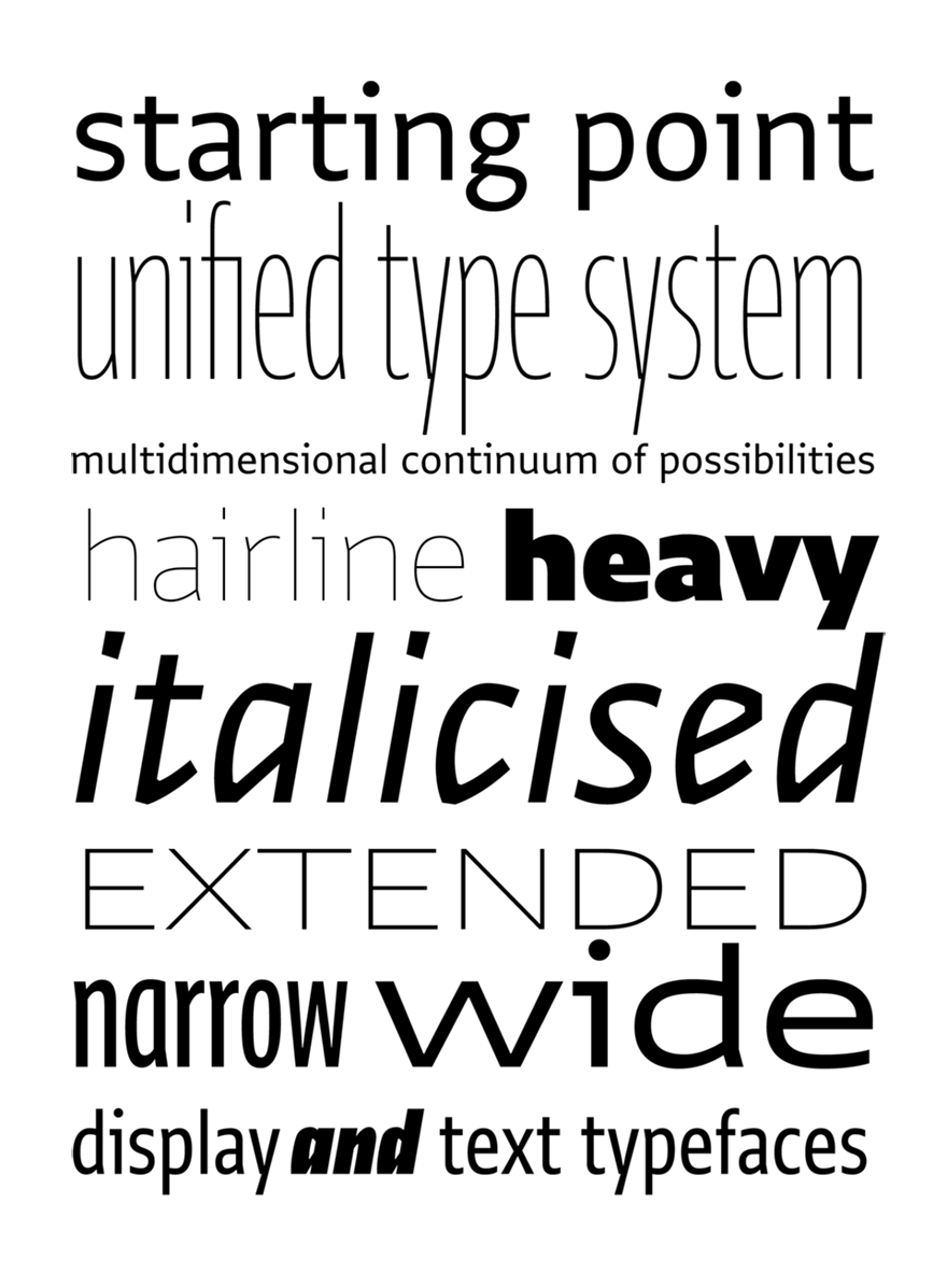
Greta Sans explores a multidimensional continuum of possibilities, going beyond the relationship between weight and width, dissolving the boundaries between display and text typefaces. It is a powerful toolbox capable of dealing with the most complex typographical situations.
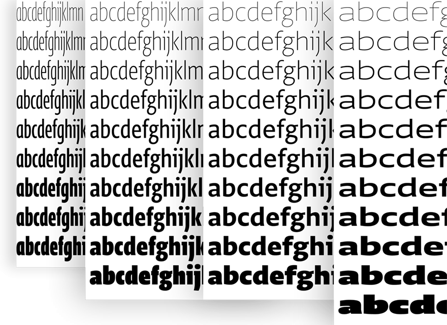
Greta Sans comes in 10 weights which, combined with its four widths (Compressed, Condensed, Normal, Expanded), create a tremendous range of possibilities. Read more about the process in the Designing Type Systems article.
Continuous Optical sizes
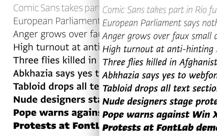
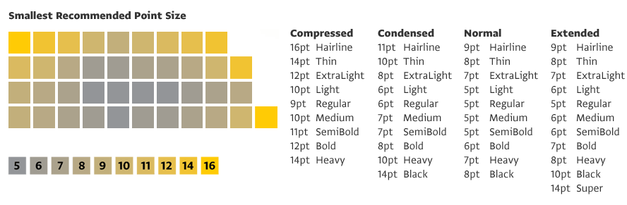
Greta Sans is designed as a continuous optical size system. While the basic text styles (Regular) are spaced and optimised more loosely for use at small sizes, the surrounding extremes (Hairline, Black) are designed to be used as Display types, and therefore spaced and kerned tightly. The resulting spectrum then runs continuously from Display to Text to Display use.
Choosing Weights
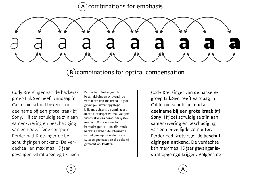
Most widths of Greta Sans include 10 weights which give you precise control over the colour of the text. Choose adjacent weight to achieve an even colour Ⓑ, for example you can set body text in 12pt Light and notes in 7pt Regular. Skip weights if you are choosing style for the emphasis Ⓐ. In general, it is sufficient to adjust the weight by one degree, use SemiBold (and not Medium) to emphasise text set in Regular.