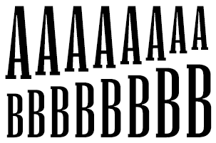
Mississippi, a dynamic typeface with variable height


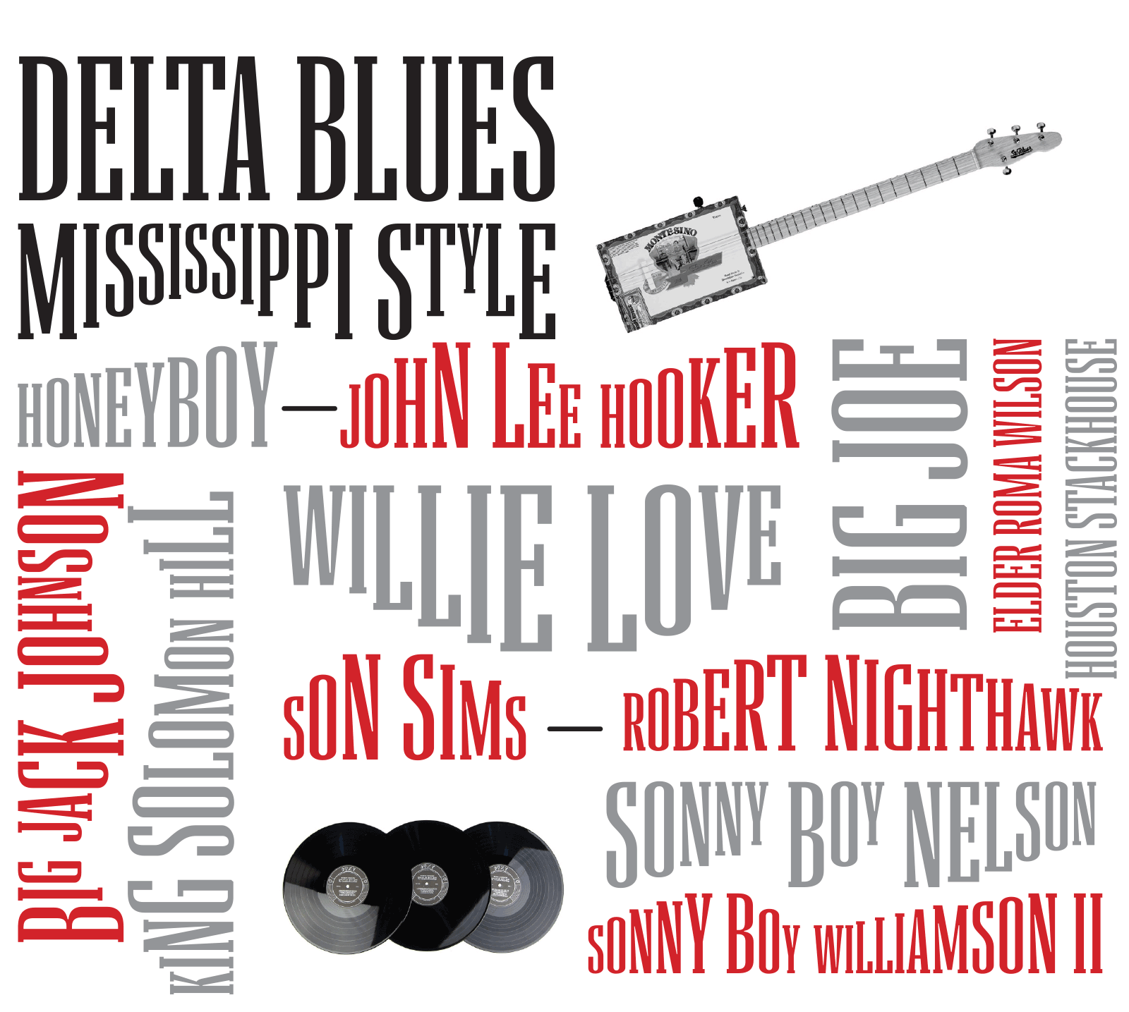
Formally, Mississippi is inspired by the aesthetics of mid-20th-century America with its blues music, endless highways and bold advertising. Mississippi is both a high- and low-brow typeface, taking cues from America’s sophisticated fashion typography as well as from its underbelly of cheap ephemera. Mississippi is also distinctively musical, drawing on the fiery, passionate Delta blues, and giving unexpected movement to traditional typography. Mississippi works best in strong headlines, striking logos, and longer words.


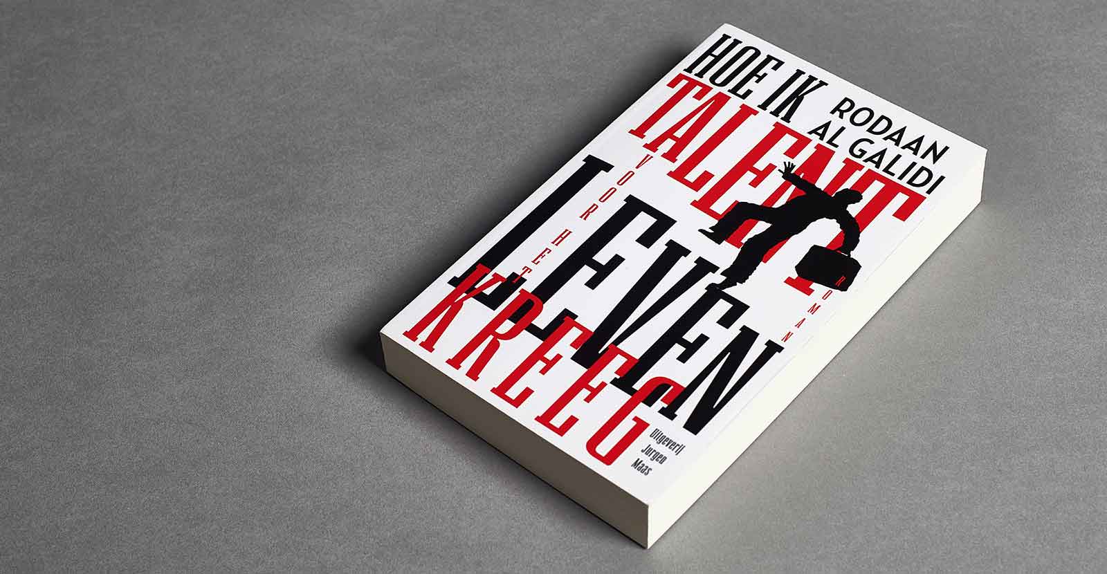
Dutch book designer Tessa van der Waals used Mississippi for the book cover of the newly published book Hoe ik talent voor het leven kreeg, by the Iraqi writer Rodaan Al Galidi.

Mississippi Gradient Bottom Inside, great for multiple words

Mississippi Gradient Bottom Left, great for single words

Mississippi Gradient Bottom Right, great for single words

Mississippi Gradient Top Left, great for single words
Animation by Gen Ramírez
See also other smart fonts by Nikola Djurek — Plotter Wave, Francis Gradient, Tremolo Gradient, Delvard Gradient, or Audree.