Münchenstein, the forgotten typefaces by the designer of Helvetica
Swiss type designer Max Miedinger is primarily recognised as the designer of Helvetica. Nikola Djurek, fascinated by Miedinger’s lesser-known typefaces, has now created the Münchenstein font family, bringing together Miedinger’s first and last typefaces.
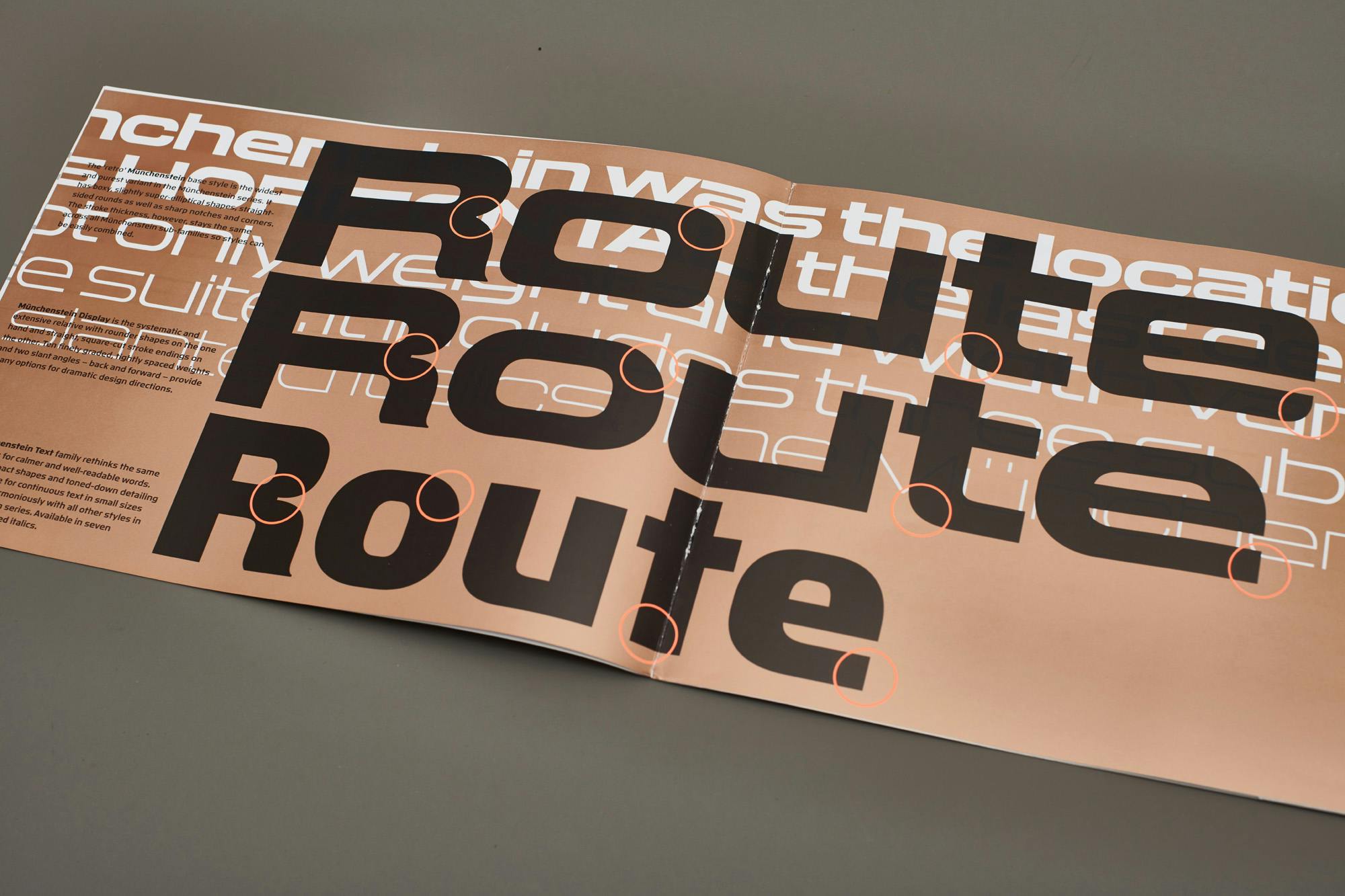
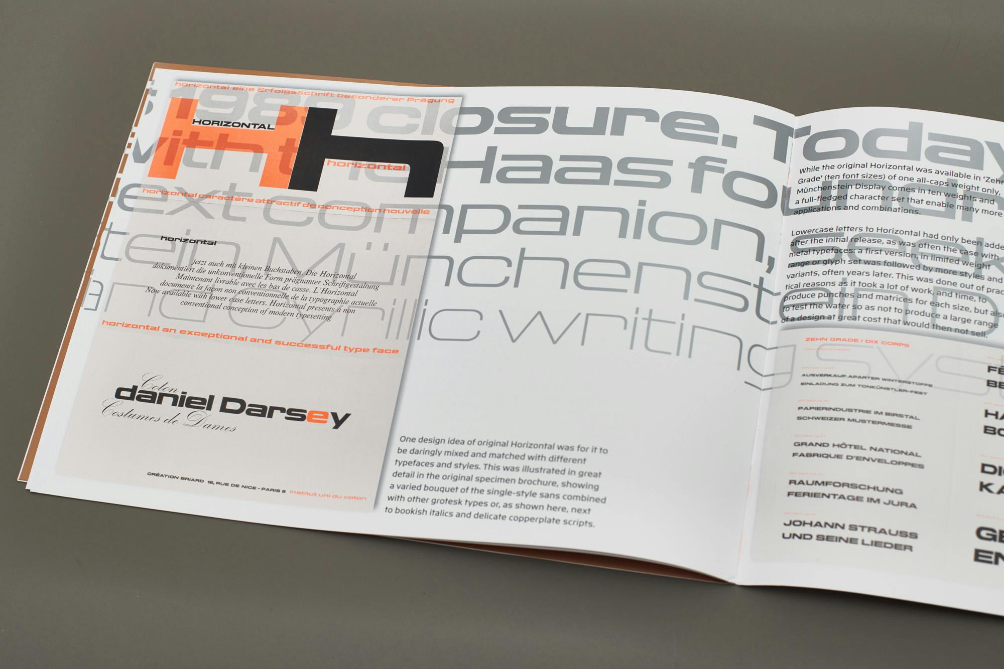
Over the five decades of his career, Swiss type designer Max Miedinger designed just three typefaces. His second design was a phenomenal success; Neue Haas Grotesk (1957) – renamed Helvetica in 1960 – is perhaps the most used, and most recognised, typeface ever created. There was no such success for his first (Pro Arte, 1954) and third typefaces (Horizontal, 1965), which have been largely forgotten over the course of history.
Nikola Djurek’s interest in Horizontal was sparked by its distinct, wide forms, which to him offered potential beyond the original single-style, capitals-only version. He undertook two research trips to Basel to visit the Basel Papiermühle, which houses the Haas Type Foundry archive, to document the design. Together with Indra Kupferschmid they also traced Miedinger’s surviving relatives, to gather as much information as possible about the design as well as to let them know of Djurek’s ambition to revisit the typeface and pay homage to Miedinger’s body of work.
The geometric, boxy letters have a striking presence, more radical than Eurostile (1962) without ever having enjoyed Eurostile’s popularity. In fact, Miedinger designed Horizontal because ‘progressive graphic designers’ wanted ‘an extra-wide modern Grotesk titling face’ that they could combine with a variety of other serif and sans serif text faces.
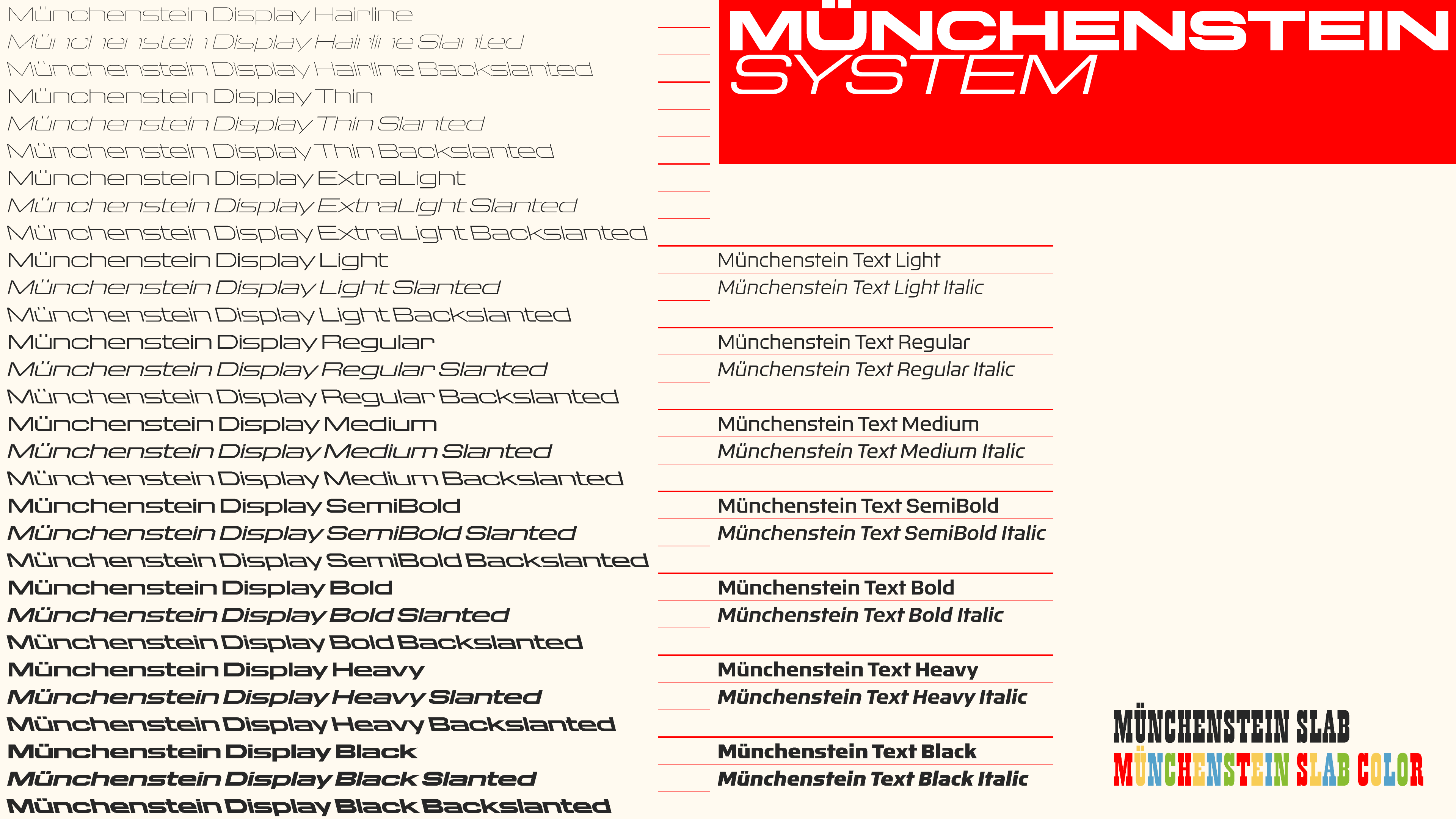
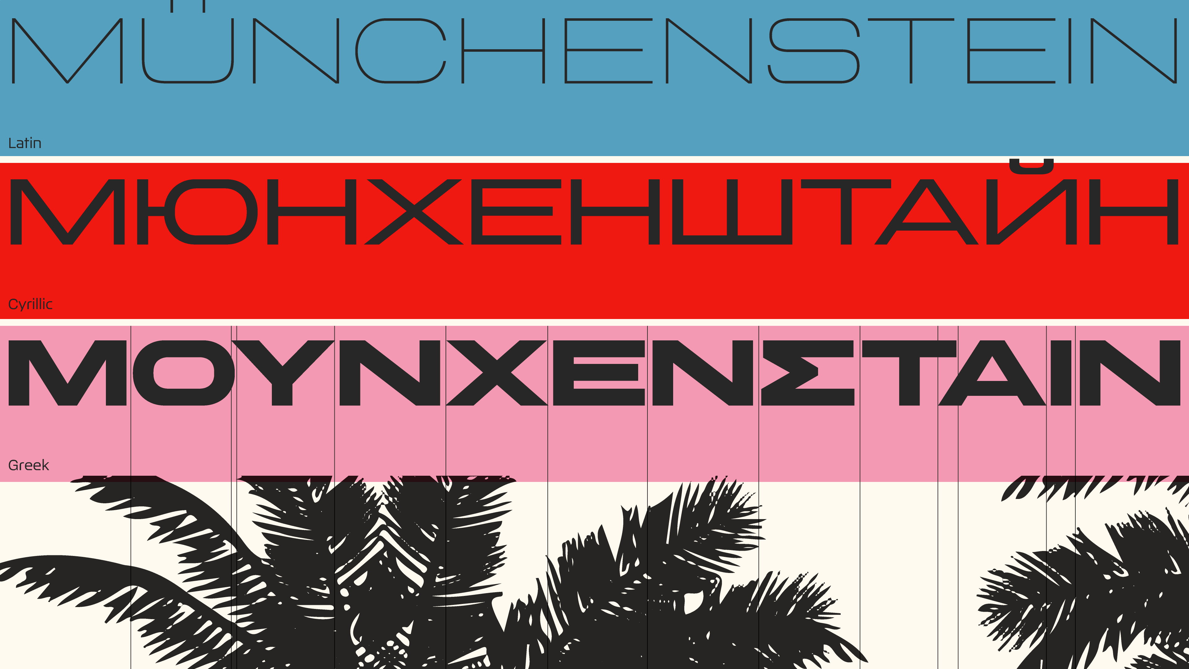
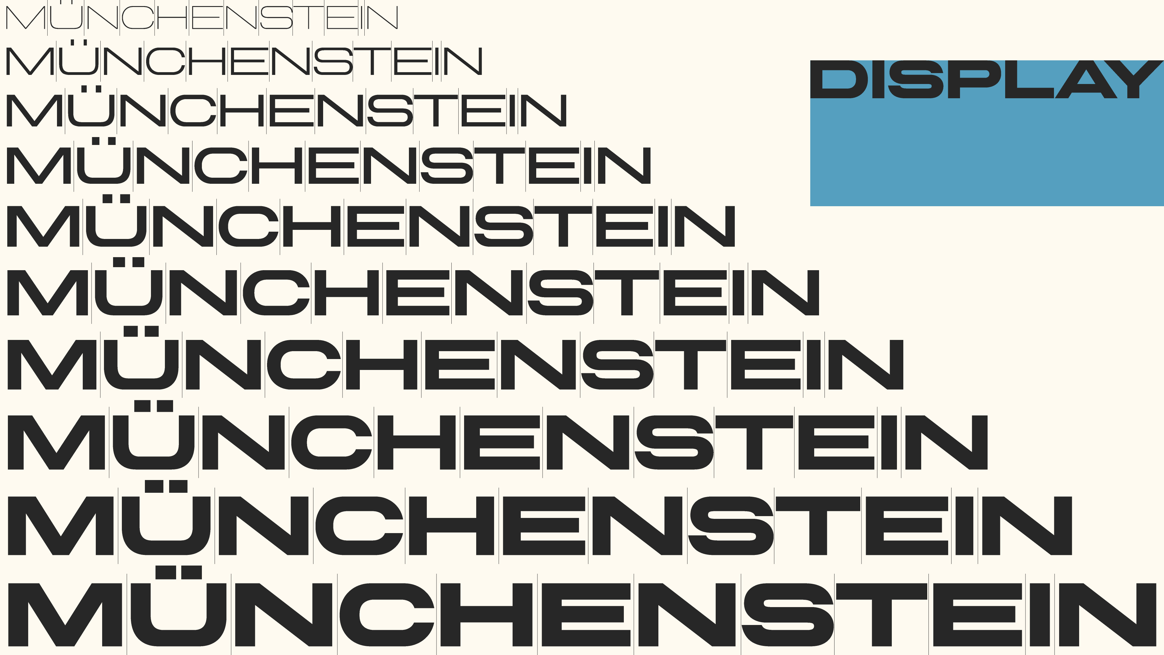
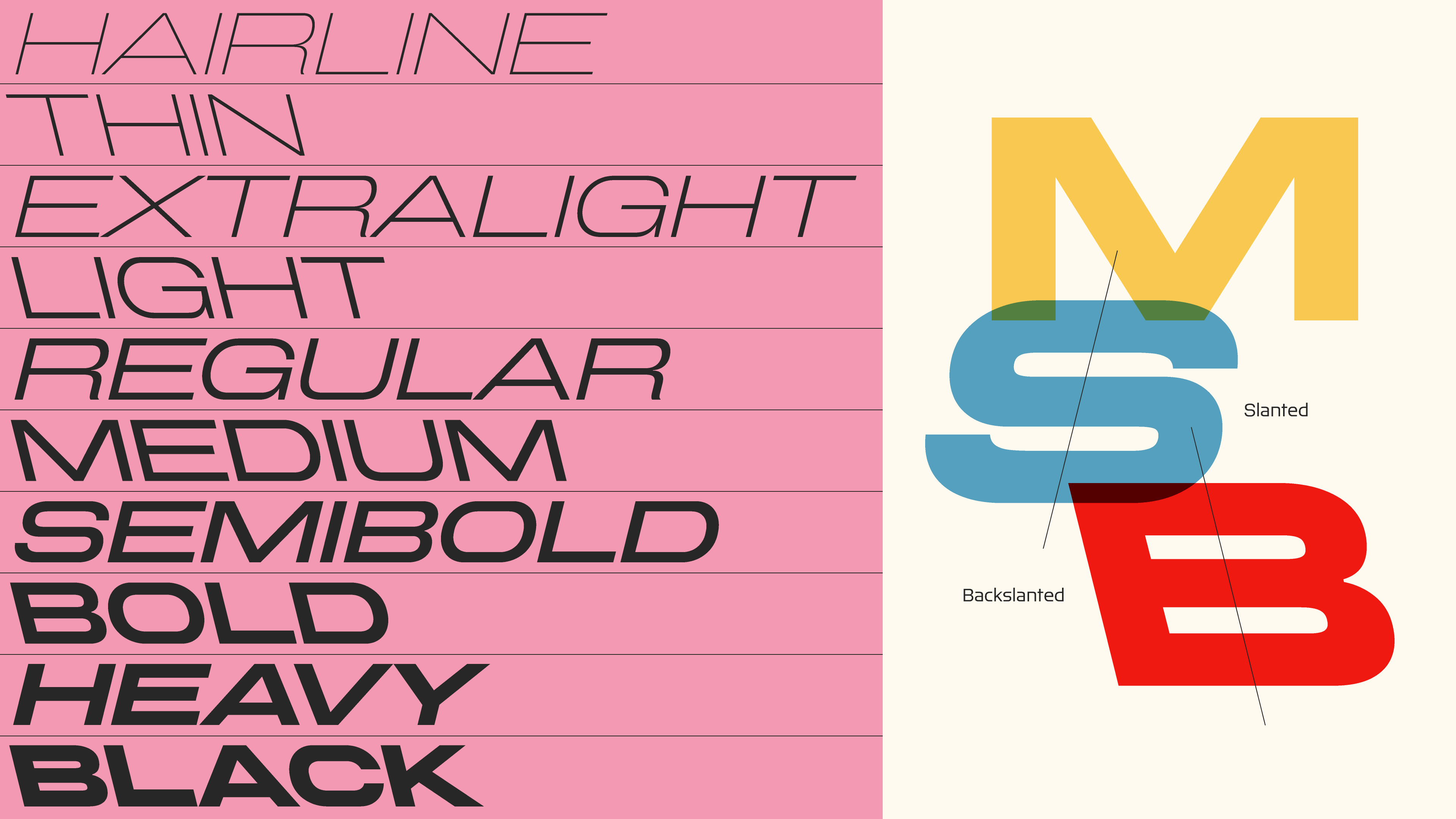
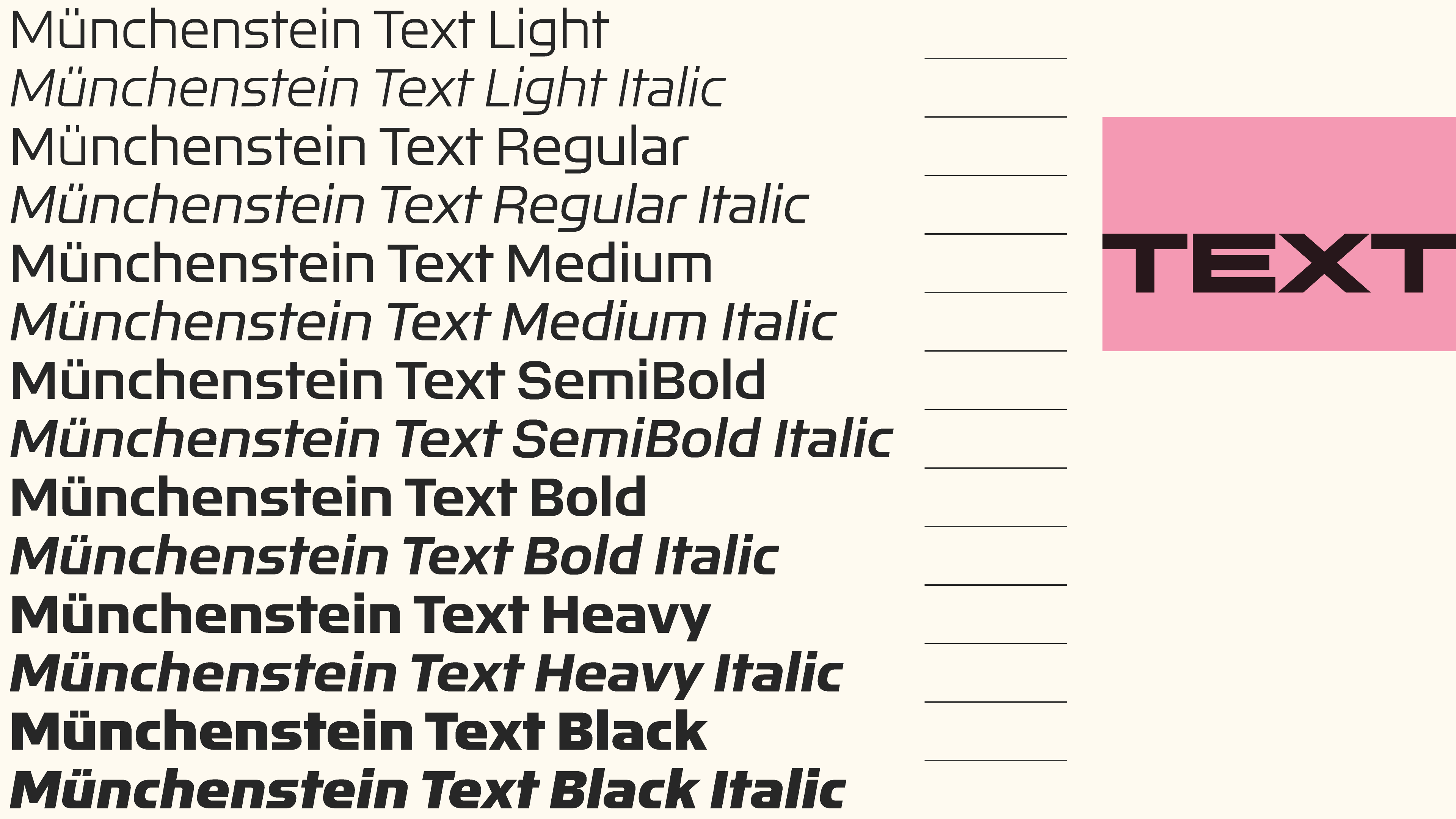
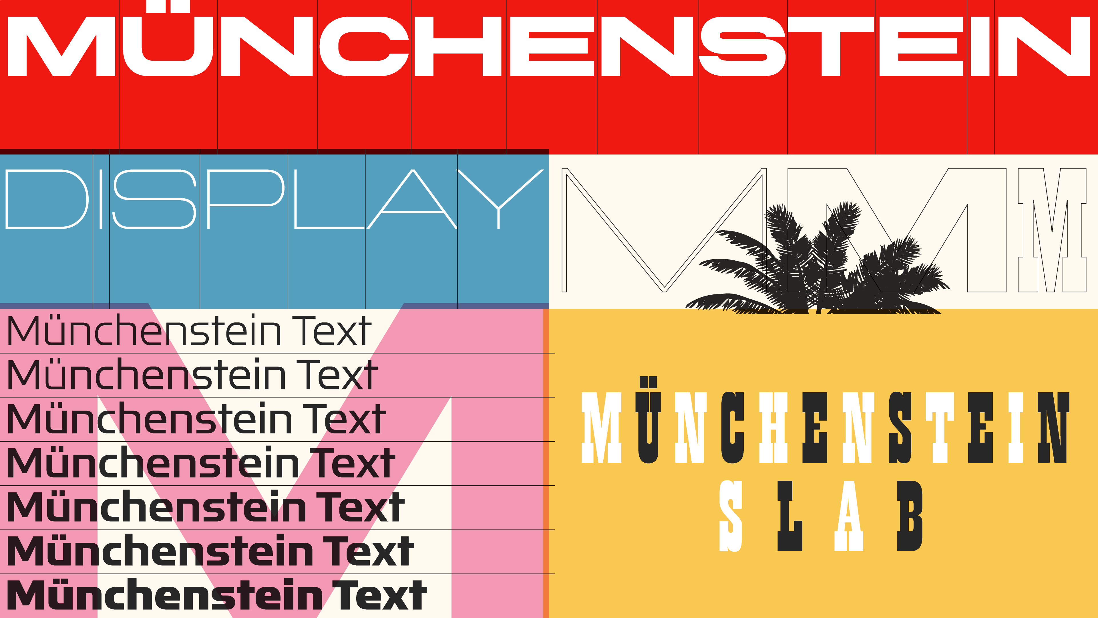
Instead of opting for a supporting typeface, Djurek created a family of fonts that could play a leading role in any expressive piece of design. Instead of a restricted one-style typeface, Münchenstein (named after the place where the Haas Type Foundry was based until 1989) comes in Text and Display versions, each in ten weights, forward and backward slants, advanced layout features and variable fonts – basically everything one might expect from a 21st-century font.
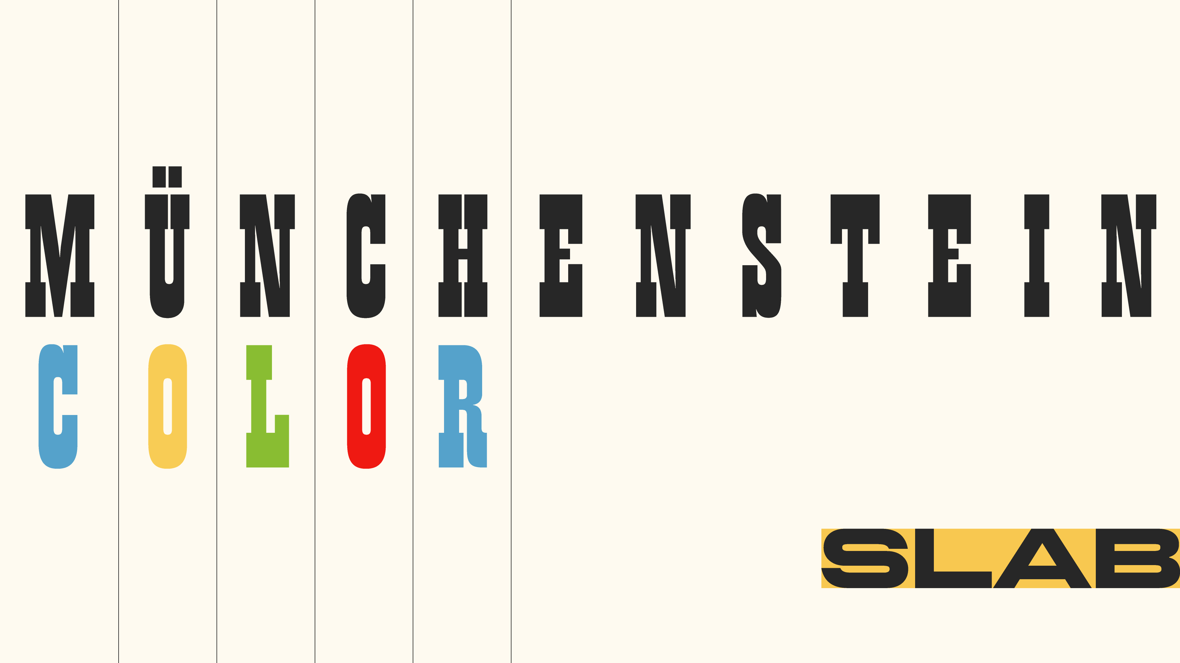
Miedinger’s very first typeface design was Pro Arte, a charming mid-century narrow slab serif with inverted stroke contrast. Djurek adopted Pro Arte into the Münchenstein family under the name Münchenstein Slab; it also comes in a colour-font format, recalling the spirited and vivid type specimens designed by Miedinger to demonstrate the typeface. The single-style display font is intended for use in headlines; Miedinger suggested using Pro Arte ‘sparingly and always generously tracked out’.
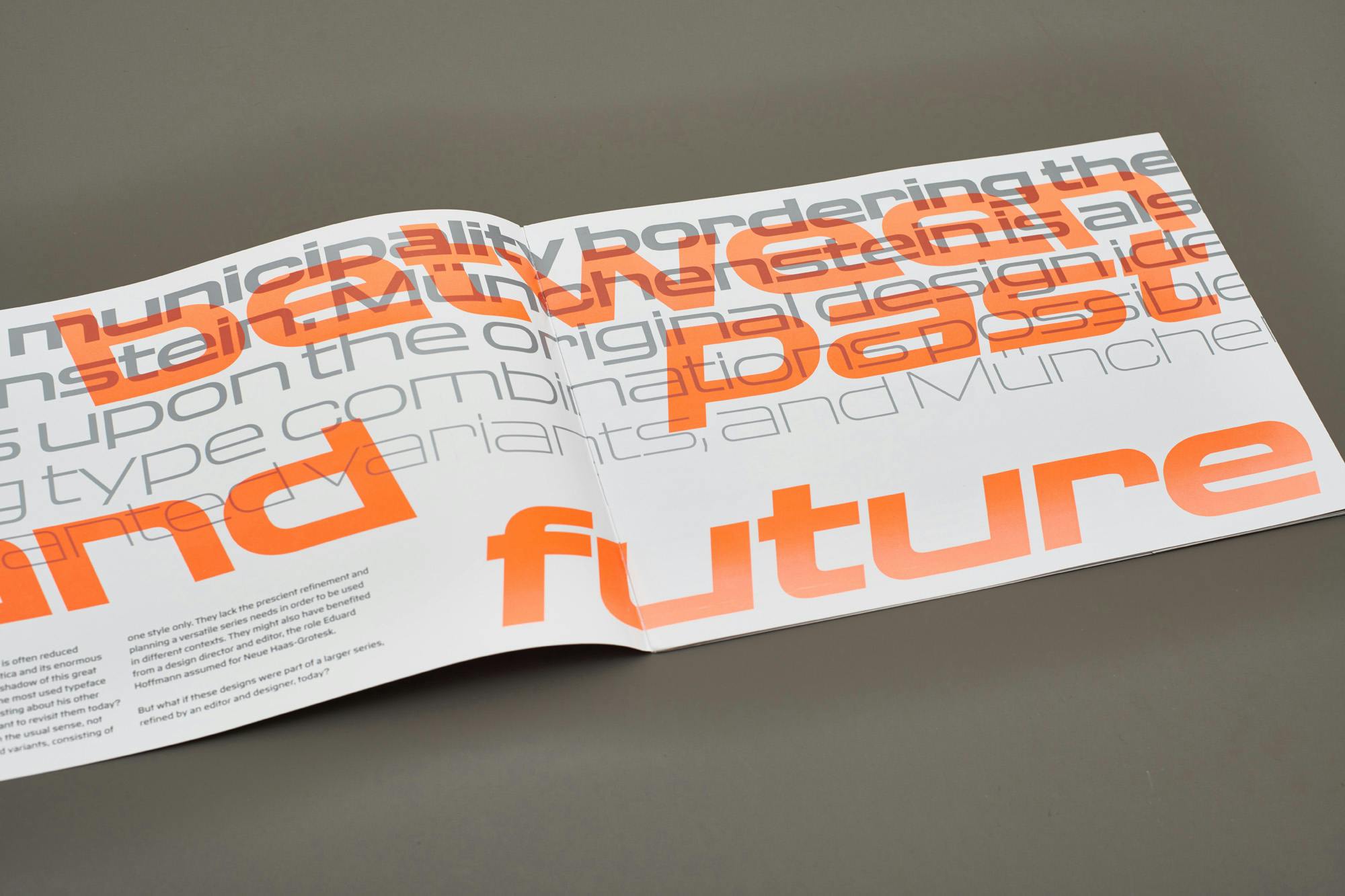
Download the PDF specimen of the typeface family for free, or purchase a printed copy of a specimen, designed by Atelier Carvalho Bernau, with an article by Indra Kupferschmid.
The new Münchenstein font family resurrects a forgotten design history while bringing the design into the modern age by making it suitable for contemporary needs, thus honouring the work of Max Miedinger and the Haas Foundry.