Greta Text
About
Greta Text is a contemporary typeface family specifically designed for the demands of print and online newspapers; it consists of four primary text weights (each in three grades) and is optimised for use at small sizes.
PDF SpecimenGreta Serif System Overview
Greta Text
- LightItalic
- RegularItalic
- MediumItalic
- BoldItalic
Greta Text Narrow
- LightItalic
- RegularItalic
- MediumItalic
- BoldItalic
Greta Display
- LightItalic
- RegularItalic
- MediumItalic
- BoldItalic
Greta Display Narrow
- LightItalic
- RegularItalic
- MediumItalic
- BoldItalic
Greta Grande
- LightItalic
- RegularItalic
- MediumItalic
- BoldItalic
Greta Grande Narrow
- LightItalic
- RegularItalic
- MediumItalic
- BoldItalic
Greta Text Variable
Aa
LightBuy
Copenhagen
Light ItalicBuy
Damascus
RegularBuy
Istanbul
Regular ItalicBuy
Jerusalem
MediumBuy
Ouagadougou
Medium ItalicBuy
Providence
BoldBuy
Ulaanbaatar
Bold ItalicBuy
Varanasi
BoldBuy
In its most general sense, the term ‘world’ refers to the totality of entities, to the whole of reality or to everything that is. The nature of the world has been conceptualized differently in different fields. Some conceptions see the world as unique while others talk of a ‘plurality of worlds’. Some treat the world as one simple object while others analyze the world as a complex made up of many parts. In scientific cosmology the world or universe is commonly defined as ’the totality of all space and time; all that is, has been, and will be’. Theories of modality, on the other hand, talk of possible worlds as complete and consistent ways how things could have been. Phenomenology, starting from the horizon of co-given objects present in the periphery of every experience, defines the world as the biggest horizon or the ‘horizon of all horizons’. In philosophy of mind, the world is commonly contrasted with the mind as that which is represented by the mind. Theology conceptualizes the world in relation to God, for example, as God’s creation, as identical to God or as the two being interdependent. In religions, there is often a tendency to downgrade the material or sensory world in favor of a spiritual world to be sought through religious practice. A comprehensive representation of the world and our place in it, as is commonly found in religions, is known as a worldview. Cosmogony is the field that studies the origin or creation of the world while eschatology refers to the science or doctrine of the last things or of the end of the world.
RegularBuy
In its most general sense, the term ‘world’ refers to the totality of entities, to the whole of reality or to everything that is. The nature of the world has been conceptualized differently in different fields. Some conceptions see the world as unique while others talk of a ‘plurality of worlds’. Some treat the world as one simple object while others analyze the world as a complex made up of many parts. In scientific cosmology the world or universe is commonly defined as ’the totality of all space and time; all that is, has been, and will be’. Theories of modality, on the other hand, talk of possible worlds as complete and consistent ways how things could have been. Phenomenology, starting from the horizon of co-given objects present in the periphery of every experience, defines the world as the biggest horizon or the ‘horizon of all horizons’. In philosophy of mind, the world is commonly contrasted with the mind as that which is represented by the mind. Theology conceptualizes the world in relation to God, for example, as God’s creation, as identical to God or as the two being interdependent. In religions, there is often a tendency to downgrade the material or sensory world in favor of a spiritual world to be sought through religious practice. A comprehensive representation of the world and our place in it, as is commonly found in religions, is known as a worldview. Cosmogony is the field that studies the origin or creation of the world while eschatology refers to the science or doctrine of the last things or of the end of the world.
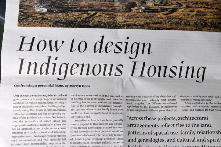
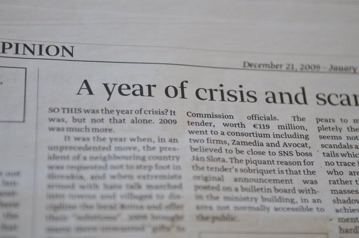
Greta Text In Use