
Articles
21 resultsFedra typefaces reviewed
Typeface stories by Andy CrewdsonA brief look at Peter Bilak’s ‘synthetic’ approach to type design which examines both his earlier Eureka and more recent Fedra families.Acerca de Fedra
Essays by Peter BiľakUna breve mirada al enfoque ‘sintético’ con que Peter Bilak entiende el diseño de tipos. Se examina Eureka, su diseño anterior, y las recientes familias de Fedra.History of a new font (notes on designing Fedra Serif)
Essays by Peter BiľakType design as accumulated knowledge and continuity: a look at the role of type designers, history and technology, revivals and invention.OpenType features in web browsers — Tests
Tutorials by Gustavo FerreiraA collection of tests for OpenType feature support in web browsers. Based on the latest draft of the CSS Fonts Module Level 3 specification, and the latest public version of each browser.OpenType features in CSS
Tutorials by Gustavo FerreiraOverview and sample code for accessing OpenType features in CSS.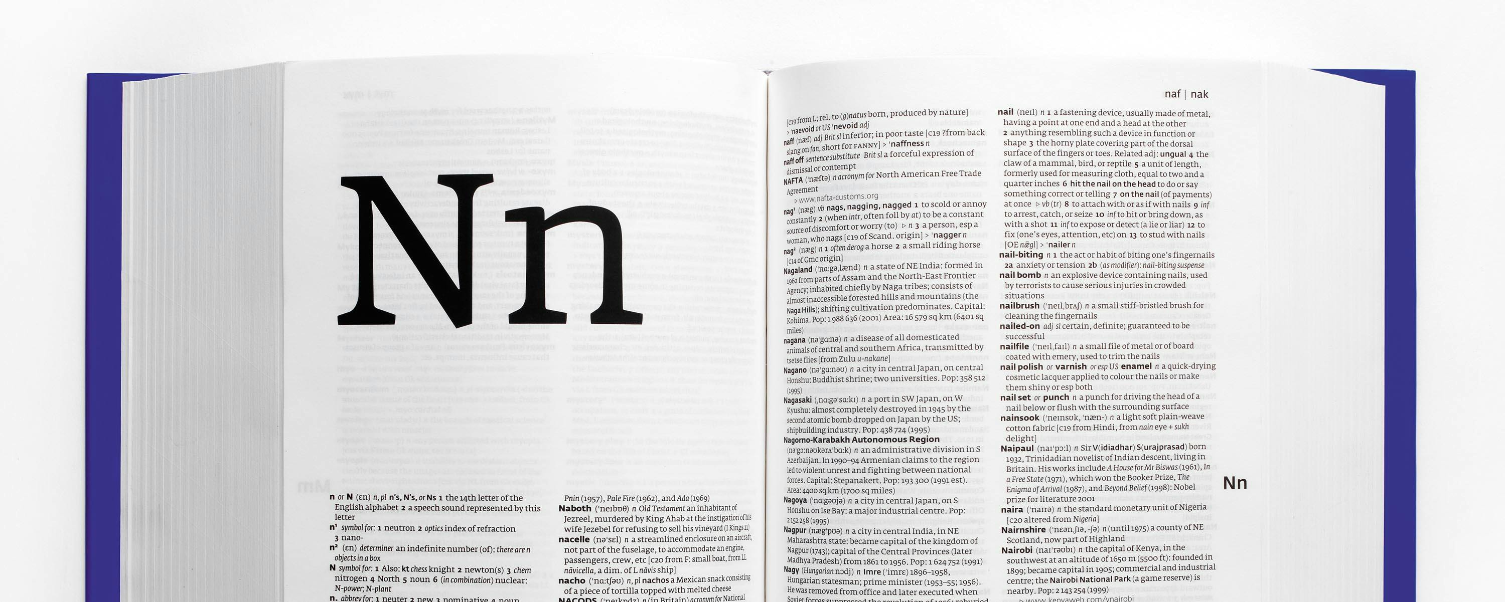
Microtypography, Designing the new Collins dictionaries
Essays by Mark ThomsonThe art director of Collins describes the process of designing the new set of dictionaries, their history, layout and choice of type. Due to the scale at which a dictionary’s content is expressed and the particular way in which the content is read, microtypographic decisions have an unusually large effect.
Font hinting
Tutorials by Peter BiľakHinting, or screen optimising, is the process by which TrueType or PostScript fonts are adjusted for maximum readability on computer monitors. This text compares different ways of hinting (black & white, grey-scale, ClearType, DirectWrite), and explains the behaviour of fonts under different rasterisers.Microtipografia: Il progetto dei nuovi dizionari Collins
Essays by Mark ThomsonL'Art Director di Collins descrive il procedimento seguito per il progetto di una nuova serie di dizionari, dal punto di vista storico, del layout e della scelta dei caratteri. Data la scala alla quale il contenuto del dizionario viene espresso, e il modo particolare in cui viene letto, le decisioni microtipografiche hanno un effetto amplificato.Peter Biľak, founder of Typotheque, Dot Dot Dot
Interviews by Rudy VanderLansRudy VanderLans talks with Peter Biľak about the Typotheque founder’s education, design practice and experience as an ex-pat Slovak living in the Netherlands. Dot Dot Dot is discussed, as well as the typefaces Biľak has produced and his current teaching practice.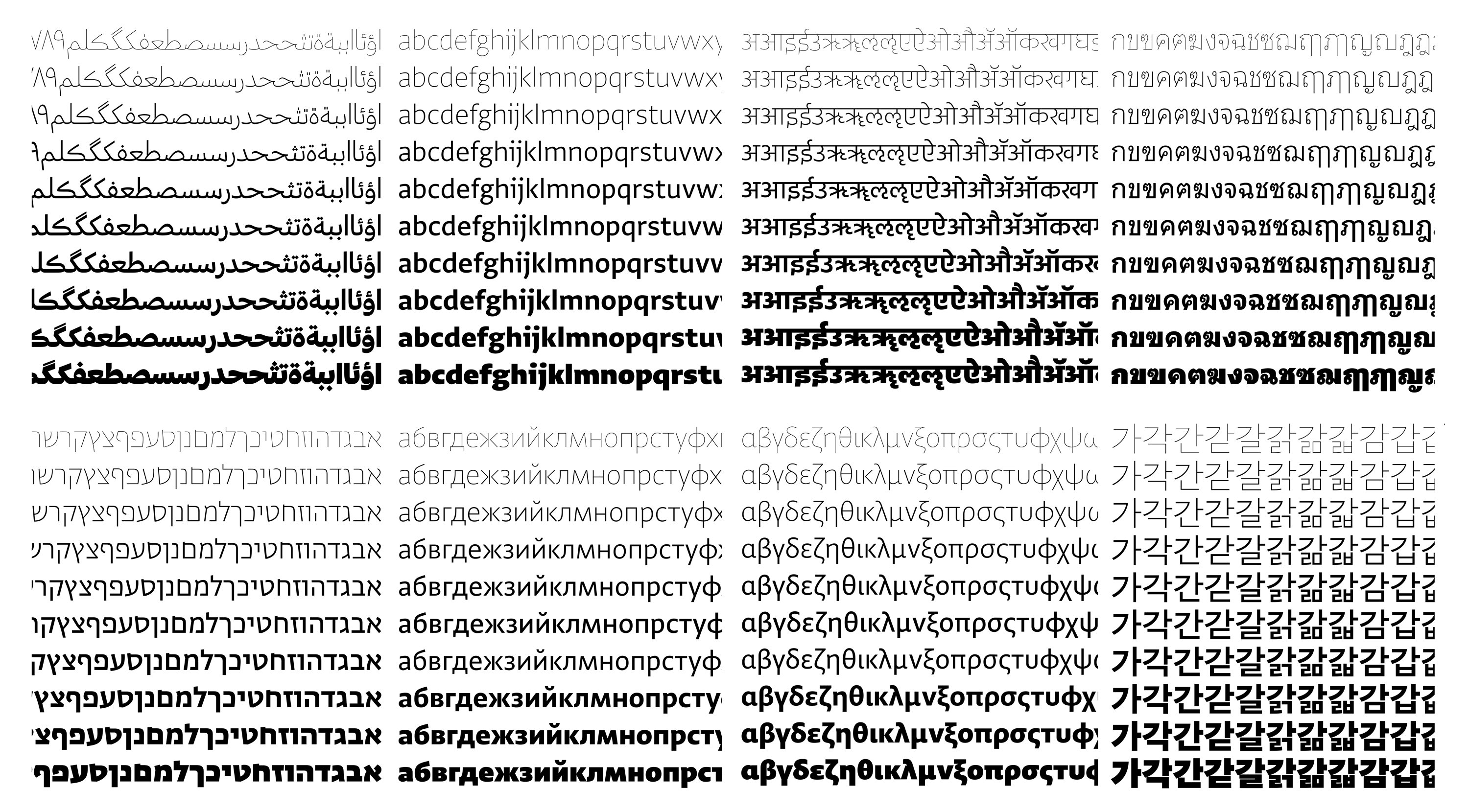
Designing Type Systems
Typeface stories by Peter BiľakGreta Sans was been planned from the outset as a system of interrelated styles. From the very beginning, work proceeded on multiple styles simultaneously. This text is a reflection on the process of designing large typeface systems.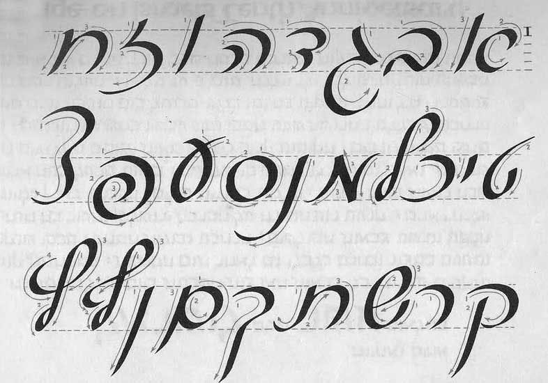
Secondary Style in Hebrew Typography
Essays by Michal SaharTraditionally, Hebrew printed typography doesn't have a notion of ‘italic’, a concept linked with the evolution of the Latin alphabet. Hebrew, however, when written by hand used cursive forms taught at schools simultaneously from when children start to read, the informal style hasn’t integrated into printed typography. Michal Sahar proposes a cursive Hebrew for continuous text.Peter Biľak interviewed by Mark Thomson
Interviews by Mark ThomsonPeter Biľak speaks with Mark Thomson about his beginnings, running a type foundry, magazines, print media in general, modern dance and typography. This interview appeared in Eye magazine No.75, Spring 2010 in the Reputations series.
Conceptual Type?
Essays by Peter BiľakIn November 2010 Peter Biľak was invited to give a talk at a one-day conference ‘Conceptual Type – Type led by ideas’ in Copenhagen about the underlying ideas behind typefaces. This lecture questions the possibility of conceptual type and compares type to other disciplines.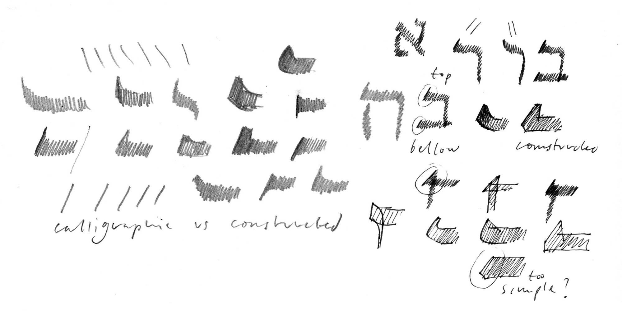
Designing Hebrew Type
Essays by Peter BiľakAn article on the process of designing typefaces for the language other than your own — challenges of looking at unfamiliar patterns, letters, and their cultural significances.
Caratteri concettuali?
Essays by Peter BiľakNel novembre del 2010 Peter Biľak è stato invitato a intervenire alla conferenza di un giorno tenutasi a Copenaghen ‘Conceptual Type - Type led by ideas’; tema del convegno, le idee che stanno alla base della progettazione dei caratteri. Questo intervento si interroga sulle possibilità dei caratteri concettuali e compara il type design ad altre discipline.E-A-T, a selection of contemporary Czech and Slovak type design
Reviews by Dan ReynoldsDan Reynolds reviews a travelling exhibit of Czech and Slovak type design from the past two decades, and compares this exhibit to the Fresh Fonts exhibit of Swiss design shown in Zurich until July 2004.
About Uni Grotesk, a Central European geometric Sans
Typeface stories by Peter BiľakUni Grotesk is a modern adaptation of the ubiquitous but awkward Universal Grotesk, a typeface that dominated communist Czechoslovakia.Beziehungen innerhalb der tschechoslowakischen Typografenszene
Essays by Johanna BiľakDieser Artikel basiert zum Teil auf meiner Forschung für die Ausstellung über das tschechische und slowakische Schriftdesign mit Schwerpunkt auf der Entwicklung der Typografie in den letzten zwanzig Jahren, die ich zusammen mit Alan Záruba 2004-2006 kuratierte. Die Ausstellung mit dem Titel 'Experiment And Typography' wurde erstmals 2004 an der International Biennale of Graphic Design in Brno gezeigt und zog später weiter nach Prag, Den Haag, Bratislava, Cieszyn, Ljubljana, Warschau und Budapest.Czechoslovak Typography Connections
Essays by Johanna BiľakThis article is partly based on the research for the exhibition on Czech and Slovak typeface design that we co-curated with Alan Záruba in 2004-2006 focusing on the last twenty years of typography development. The exhibition entitled 'Experiment And Typography' was first presented at the Biennale of Graphic Design in Brno in 2004 and later travelled to Prague, The Hague, Bratislava, Cieszyn, Ljubljana, Warsaw and Budapest.
Typeface design beyond a single script
Essays by Peter BiľakCreating a new language version of a typeface is akin to a translation, whereby purpose, intention and respect are as important as proportion and design.