Fonts
- Plotter DisplayPlotter Display5 styles
- NotaNota8 styles
- MoteMote12 styles
- PlotterPlotter4 styles
- Oli GroteskOli Grotesk16 styles
- Plan GrotesquePlan Grotesque8 styles
Products
 €12,50
Dot Dot Dot 17
By Stuart Bailey
Issue 17 of the Dot Dot Dot magazine covers design in the widest possible sense while steering clear of both commercial portfolio presentations. €12,50
Dot Dot Dot 18
By Stuart Bailey
Dot Dot Dot began life as a graphic design magazine, but whose content has gradually widened to cover art, music, language, film and literature.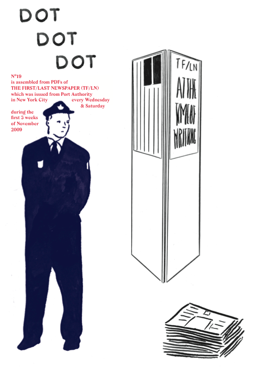 €75
€75Dot Dot Dot 19
By Stuart Bailey
After eighteen issues, Dot Dot Dot remains the must-read journal. Curiously it has become the venue for creative writing on the most diverse subjects. €12,50
Dot Dot Dot 16
By Stuart Bailey
A publication which began life as a graphic design magazine, but whose content has gradually widened to cover art, music, language, politics, film and literature.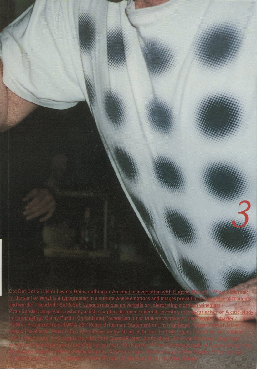 Sold Out
Dot Dot Dot 3
By Peter Biľak and Stuart Bailey
Independent art/design publication which began life as a graphic design magazine, but whose content has gradually widened to cover art, music, language, film and literature.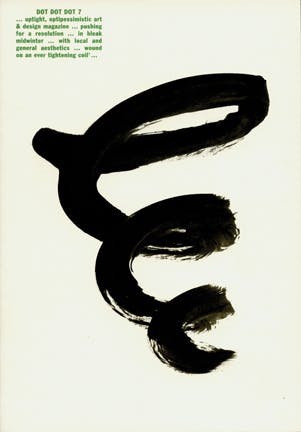 €75
€75Dot Dot Dot 7
By Peter Biľak and Stuart Bailey
Art/design publication which began life as a graphic design magazine, but whose content has widened to cover art, music, language, film and literature.
Articles
Peter Biľak, founder of Typotheque, Dot Dot Dot
Interviews by Rudy VanderLansRudy VanderLans talks with Peter Biľak about the Typotheque founder’s education, design practice and experience as an ex-pat Slovak living in the Netherlands. Dot Dot Dot is discussed, as well as the typefaces Biľak has produced and his current teaching practice.Taking Credit: Film title sequences, 1955-1965 / 3 Visions in Motion
Essays by Emily KingPart three of ten of Emily King’s dissertation for the V&A/RCA M.A. Course in the History of Design. The dissertation focuses on the relationship between graphic design and film in the middle of the past century. here she lays down the modernist roots of her work.Microtipografia: Il progetto dei nuovi dizionari Collins
Essays by Mark ThomsonL'Art Director di Collins descrive il procedimento seguito per il progetto di una nuova serie di dizionari, dal punto di vista storico, del layout e della scelta dei caratteri. Data la scala alla quale il contenuto del dizionario viene espresso, e il modo particolare in cui viene letto, le decisioni microtipografiche hanno un effetto amplificato.About Nothing, really
Essays by Peter BiľakDesign is concerned with creations of form, rather than philosophical discussions about holism and acceptance of non-form. However, can the absence of matter teach us more about our true nature?Eric Gill got it wrong; a re-evaluation of Gill Sans
Typeface stories by Ben ArcherThis article is intended for an audience of contemporary designers and students who are at least one step removed from mid-century British typographic culture; it is a critique of the Gill Sans typeface and the idiosyncrasies of its creation from a contemporary perspective. The central argument is that an earlier typeface by Eric Gill’s mentor, Edward Johnston, is a superior piece of type design.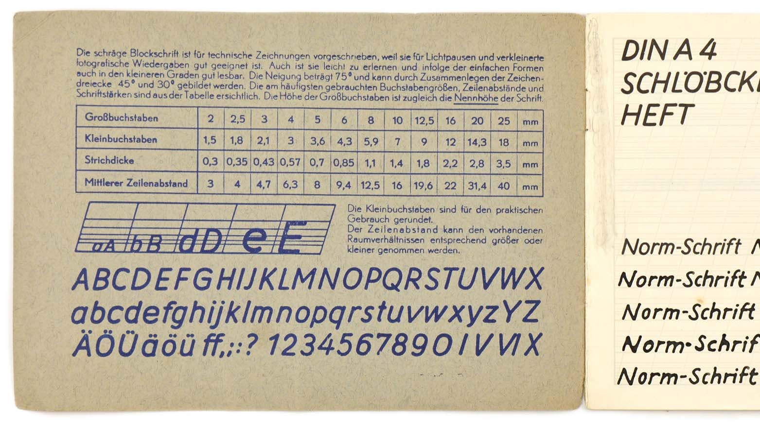
From Lettering Guides to CNC Plotters — A Brief History of Technical Lettering Tools
Essays by Florian Hardwig, Thomas MaierThis article highlights some major steps in the historical development of lettering tools for drafting.
Blog
Typotheque at 33pt conference in Dortmund
LecturesDot Dot Dot 16 available now
New issue of DOT DOT DOT (No.11)
Dot Dot Dot No.10 available now
New issue of DOT DOT DOT (No.15)
Dot Dot Dot 14 available now
Help
I use an online prototyping whiteboard tool – what font format do I need?
Online prototyping tools such as Figma, Sketch, Invision, Figjam, Miro, Mural, Canva, etc. usually use desktop font formats, and need OTF (OpenType) fonts rather than dedicated webfonts (WOFF). You can get a desktop licence for you and your collaborators.Does Typotheque use any cookies or tracking JavaScripts with its webfonts?
No, we don’t use any cookies or tracking scripts. We use industry-standard CSS with @font-face rule and WOFF2 fonts. In the case of self-hosted webfonts, we don’t monitor any use of them. When hosted webfonts are used, we only log the number of server requests, but no personal information or IP addresses are stored.I have a font download code; how do I use it?
If you have received a code for a free font download, you can redeem it directly online. You will need to create an account before downloading the fonts. 1/ Go to this page[http://www.typotheque.com/my_account] and register a new account (if you don’t have one already). 2/ After successful registration, go to ‘Corporate Fonts’ https://www.typotheque.com/my_account/corporate_fonts[https://www.typotheque.com/my_account/corporate_fonts] where you can enter your code. 3/ At the last step, you will be prompted to agree with the terms of the End User Licence, after which you can download the fonts.Typotheque Club
Ordering
Other Pages
Payment Security
SSLAbout
Typotheque is a Netherlands-based type design company, world languages experts, developing modern and authentic fonts for the majority of languages.Typotheque Specimens
Authors
 Sandoll is a type foundry in Korea, founded in 1984 by Geumho Seok. As a representative type foundry in Korea, Sandoll seeks to ‘build fonts, for the beautiful world’. The foundry’s activities range from custom fonts for corporate’s branding to retail fonts for printing and digital devices. The foundry has a variety of experiences of multi-language projects such as CJK development and Korean-Latin matching. Also, Sandoll launched SandollCloud service in 2014. Designer Yejin Wi and Suhyun Lee designed Korean version of Greta Sans through the collaboration with Typotheque.
- Dutch writer, typographer and designer. Middendorp started writing on theatre and performance arts, and later specialized on type design. He is the founding editor of FontShop Benelux Druk magazine, and author of acclaimed bookDutch Type.He currently lives in Berlin.
- Italian graphic designer, partner of studio Alizarina, where she works mainly on editorial projects. She teaches at the Scuola Politecnica di Design in Milan, wrote two books on Italian graphic and type design, and contributes regularly to Progetto Grafico magazine.

Maria Doreuli was born in Moscow, and studied at graphic design at the Moscow State University of Printing. She has received the MA degree from the Type & Media course at The Royal Academy of Art (KABK) in The Hague. Since 2013 she has worked as an independent professional based in Moscow, and running Contrast type foundry.
 Jyotish Sonowal studied at the renowned National Institute Of Design in Ahmedabad, India, and after his graduation joint the Indian Type Foundry. He designed mainly Bengali fonts (Bangla) as his native language is Assamese. He is now based in Toronto, Canada.
 Ermin Međedović, a native Croat living in Slovenia, is an accomplished graphic and type designer. He is an accomplished graphic and type designer, who has worked for big advertising agencies, run his own design studio, and created several custom typefaces. He taught type design at the Design Academy in Ljubljana and works as design director at the Delo Publishing house and runs Lettermin Type Foundry on the side.