Dash, a typeface with different speeds and expressions
Based on science and research, but written with the mastery of a skilled hand, Dash is a handwriting typeface system that makes full use of variable expression.
After carrying out research for over a year into educational handwriting models, and documenting the evolution of handwriting in the Western world, we have developed a typeface that not only uses the collective characteristics of handwriting as it is taught in schools, but also emulates how handwriting evolves over time into a personal expression of an individual.
Handwriting starts with an intuitive gesture, yet even the most characteristic handwriting is a product of a collective writing model designed to preserve readability. We worked with the French researcher and writer Sébastien Morlighem to document writing models and their evolution from the beginning of compulsory education in different countries. We then collected hundreds of real examples of handwriting from around the world and compared the teaching models with the individual handwriting samples.
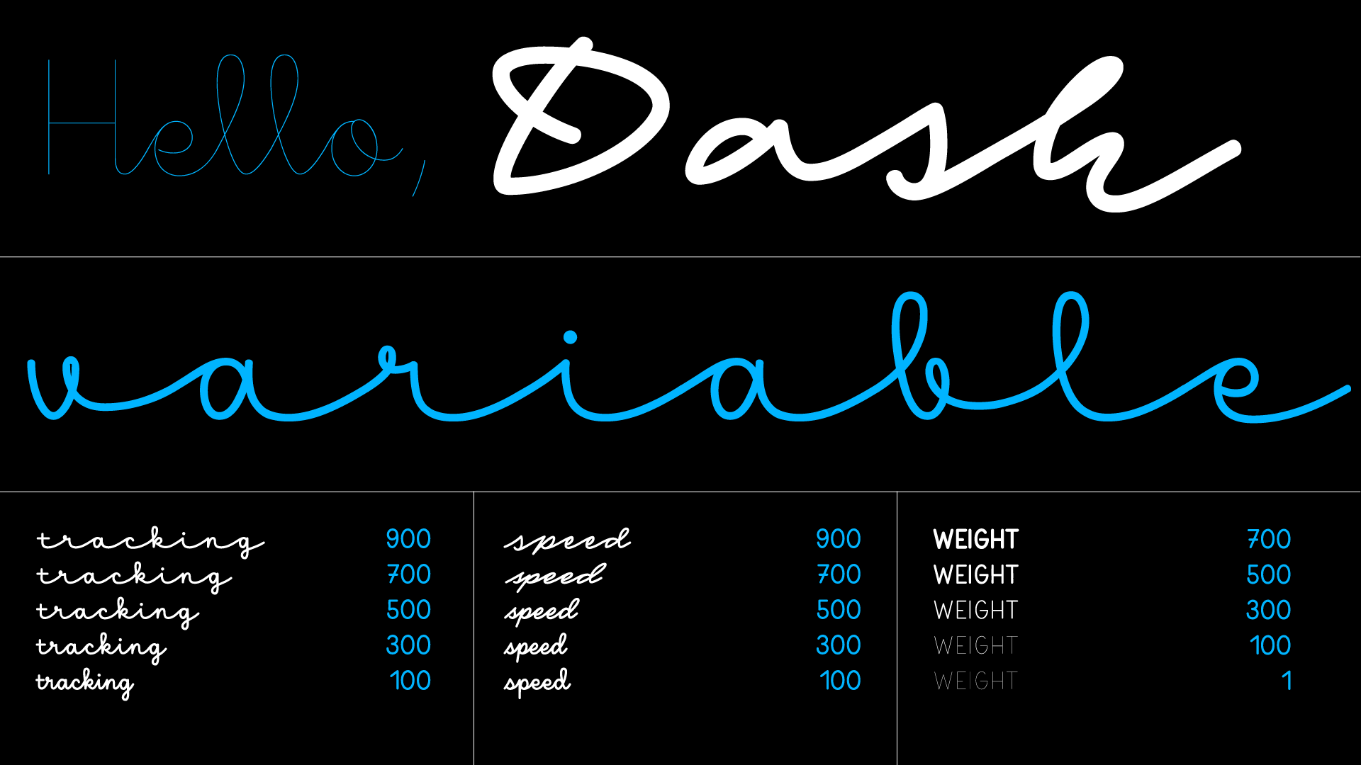
Dash, variable version
This historical research and study of handwriting served as a starting point for designing Dash, a typeface system that is rooted in the accepted models of writing. Inherent in it is the potential to deviate by degrees from the standard models – which is precisely what turns the concept of collective handwriting into real individual expression. We worked with Petra Dočekalová, Czech type designer and lettering artist, to interpret these sources, investigating universality and personalisation of handwriting by increasing the speed of writing and testing the limits of legibility.
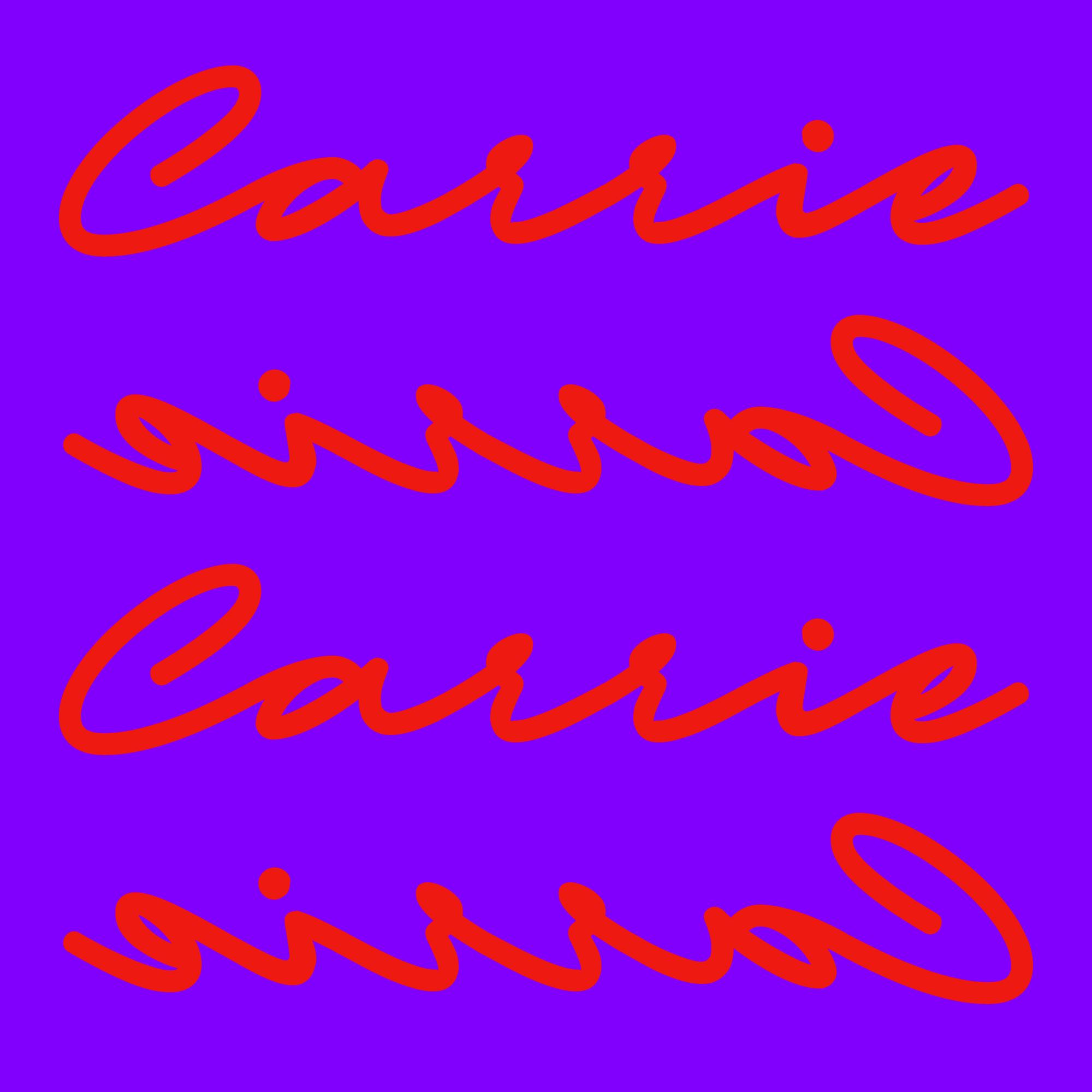
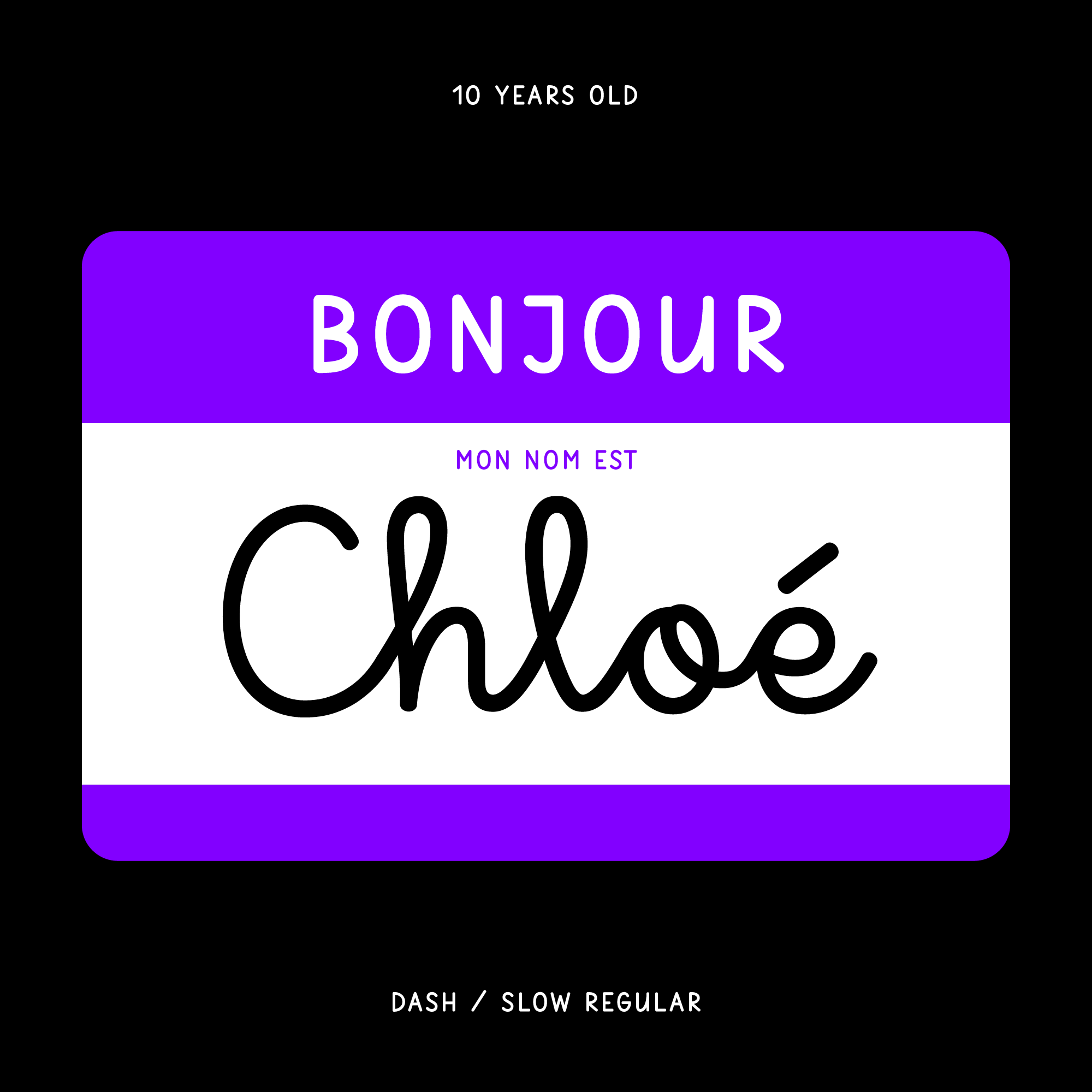
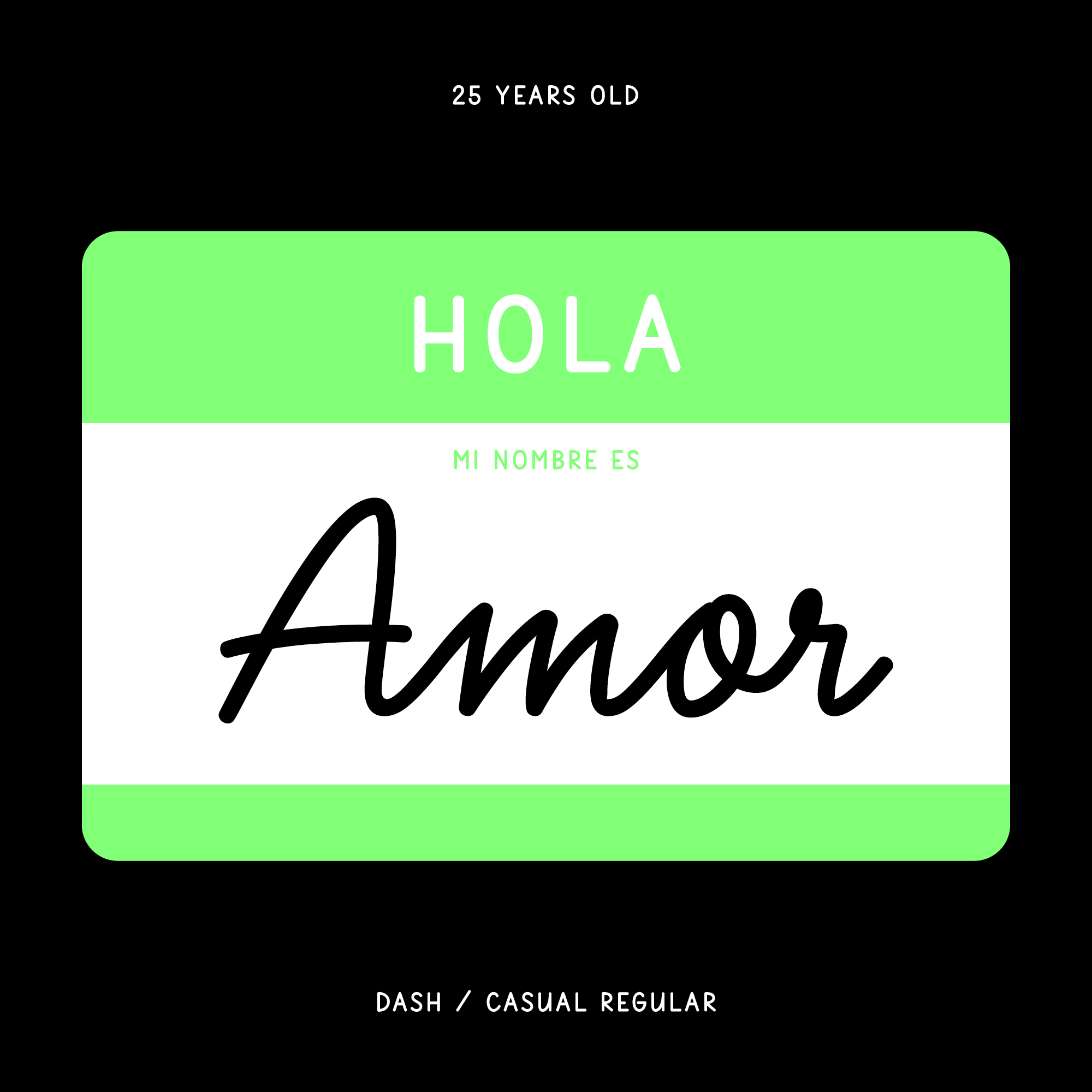
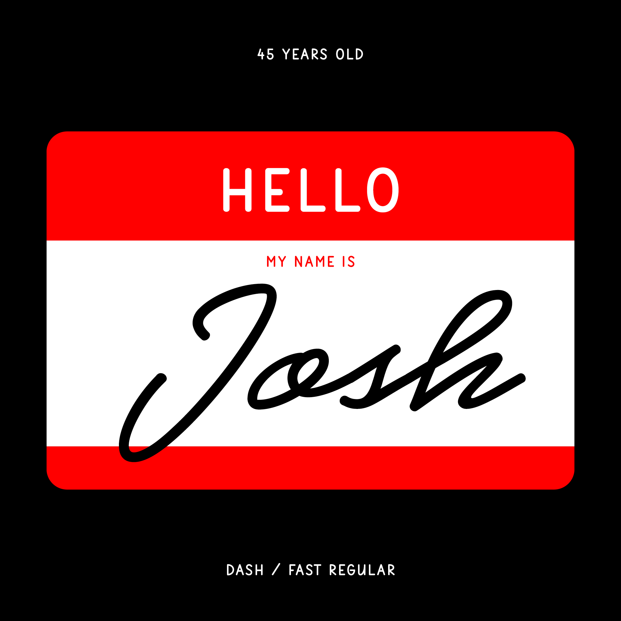
Dash is the result: a connected script typeface that comes in four speeds of writing. For the user, this means that the speed of writing can gradually be increased, turning a generic model of writing into a highly distinct and expressive kind of handwriting, whereby the letters are stripped down to their essential forms. Dash also allows for variation in the intervals between letters, and this too can be changed by the user. Finally, as is expected from today’s fonts, the weight of the type can be controlled, simulating different writing pens.
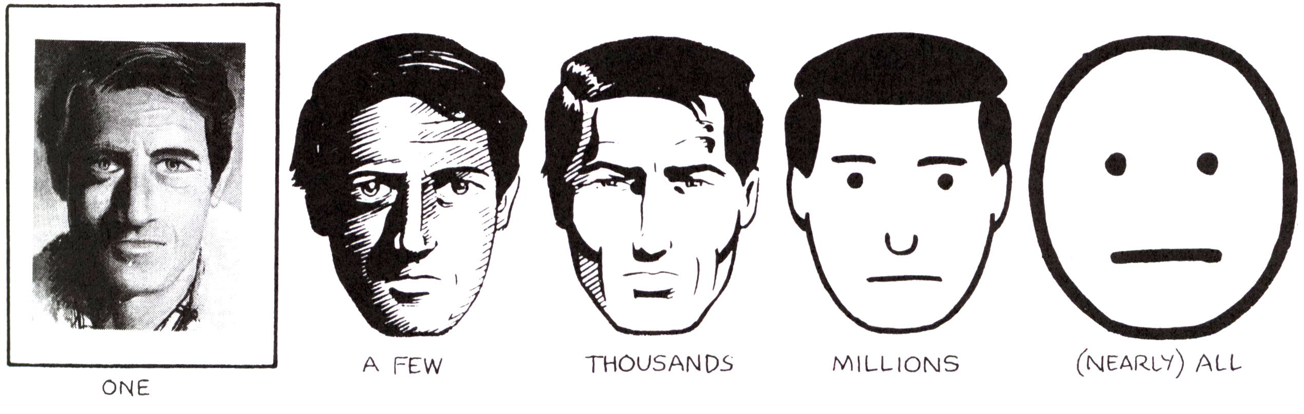
Dash reverses what the comic artist Scott McCloud explains in his seminal book Understanding Comics. The slow version of Dash is depersonalised, allowing the meaning to materialise in the reader’s mind, and as the speed of writing is increased, so is the viewer’s ability to identify the particular style of writing, which then becomes more specific, emphasising the writer’s personality and shifting the tone of voice from ‘we’ to ‘I’. In this way, a collective writing gradually becomes the expression of an individual, as one manipulates the slider that controls the speed of writing.
To make this personalised writing even more specific, we have studied how forms of letters change based on local preferences. For example, a Spanish writer crosses the minuscule q, while an Italian writer prefers a simplified form. Czechs write the minuscule t without lifting the pen, while an English writer lifts the pen and crosses the t. Dash respects these differences, and the font is programmed to switch automatically to the forms of letters based on the language being used.

This observation of local preferred forms of writing led to an in-depth study, Familiarity Effect in the Perception of Handwriting, researched by the Typotheque in-house cognitive psychologist Héctor Mangas Afonso.
Dash is a rich and complex project, the result of scientific research into familiarity of handwriting and history of education, masterfully interpreted by type designer Petra Dočekalová. The results are open-ended. The research aspects are part of open science, and can be consulted and used by anyone interested in the subject. We recognise that there is a lot more to explore and discover, and so the project will likely grow in the future.


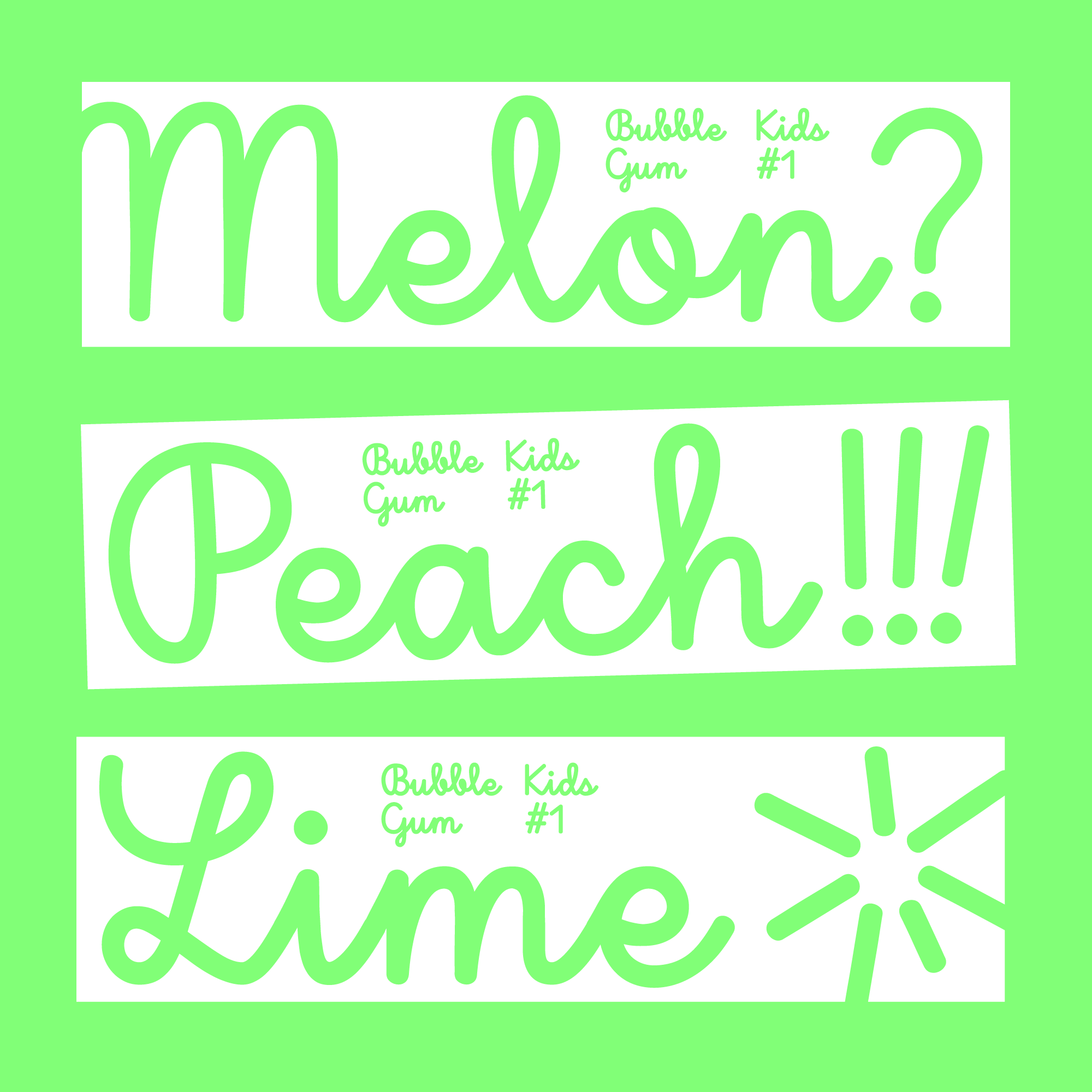
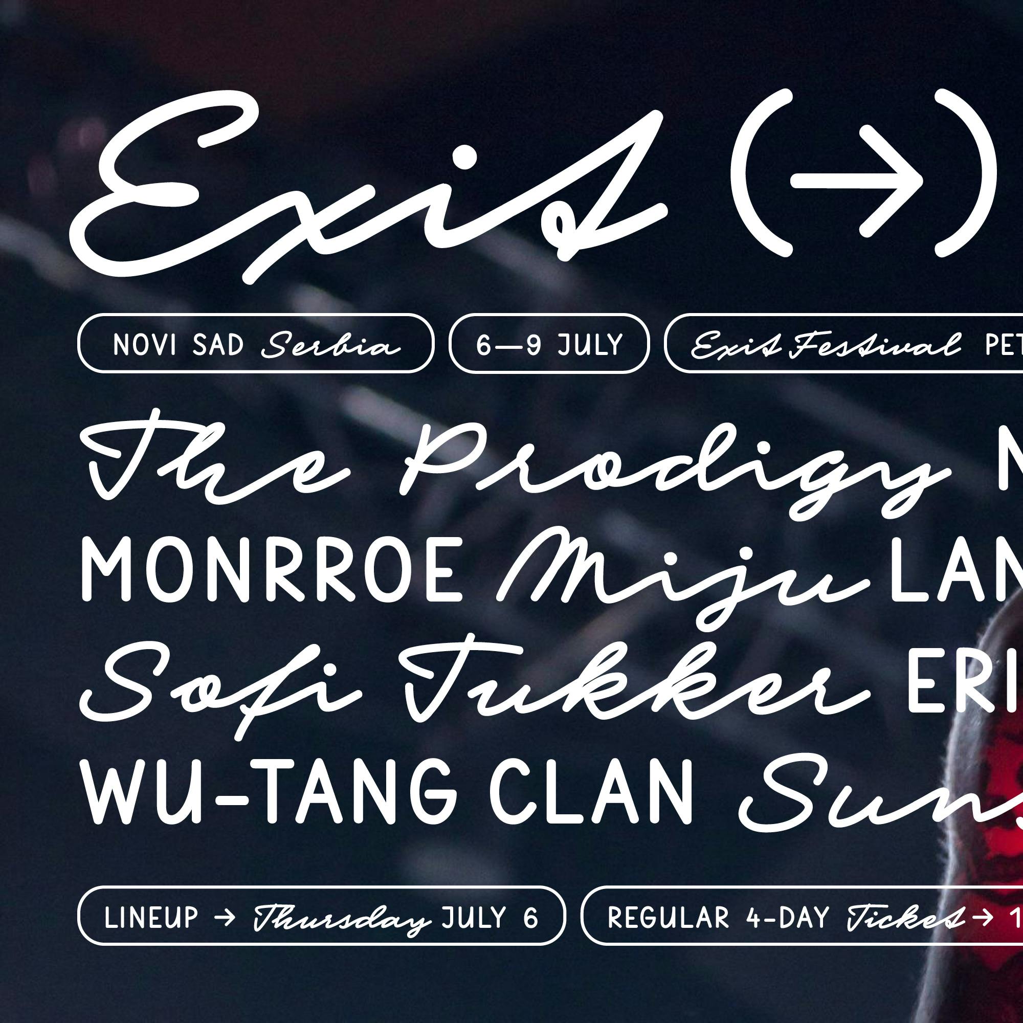
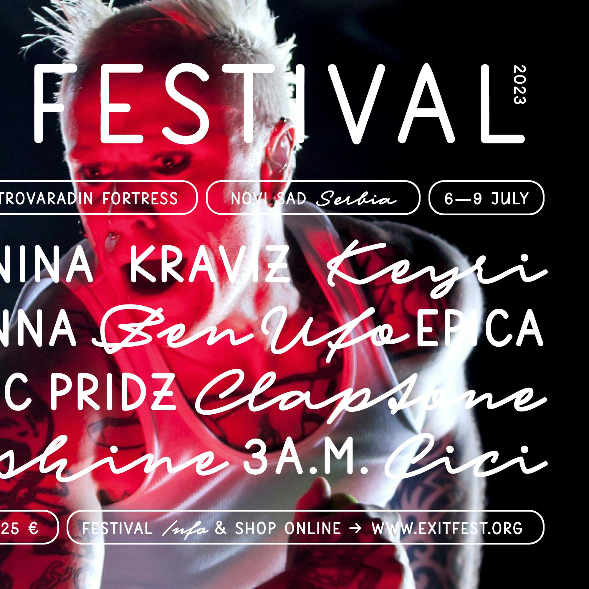
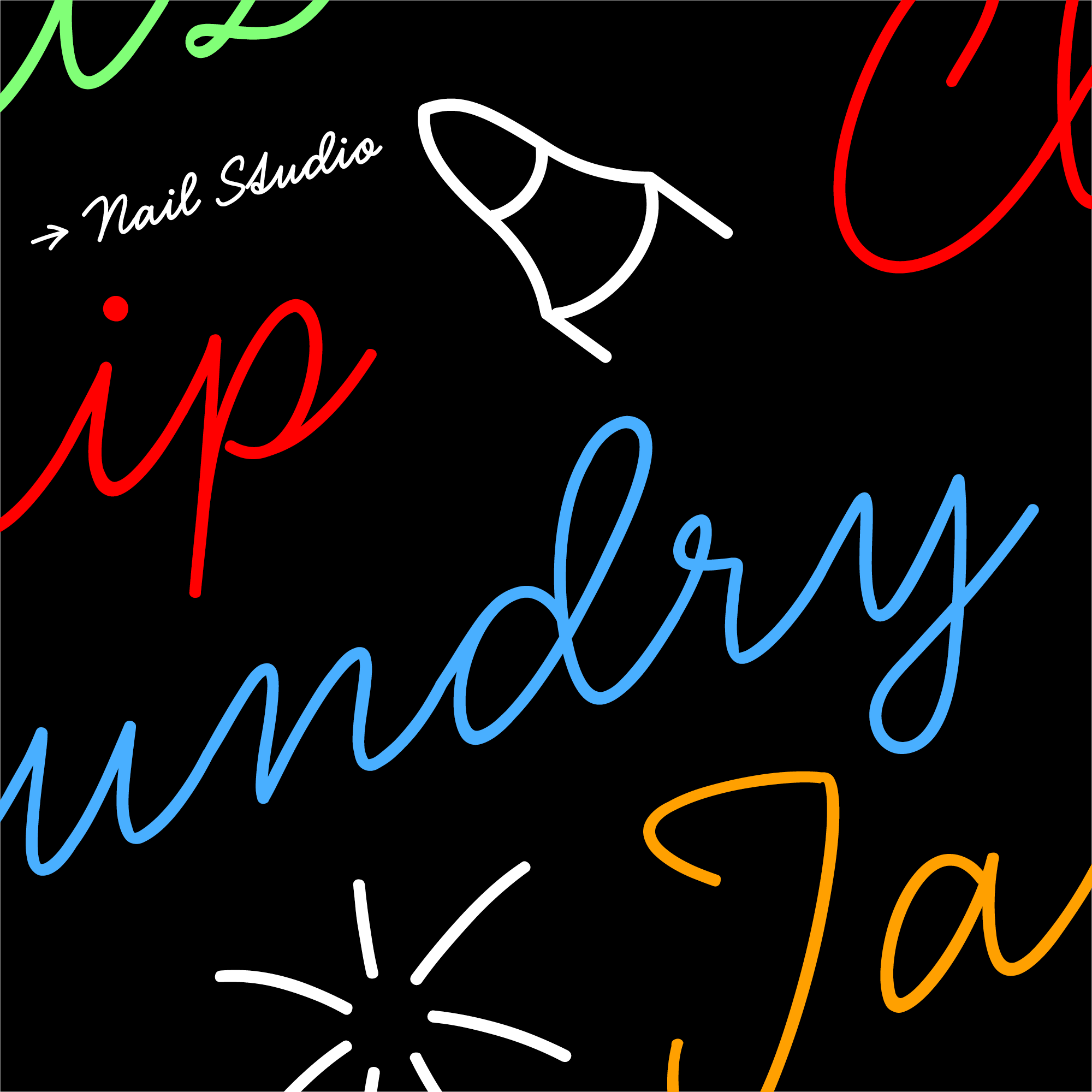
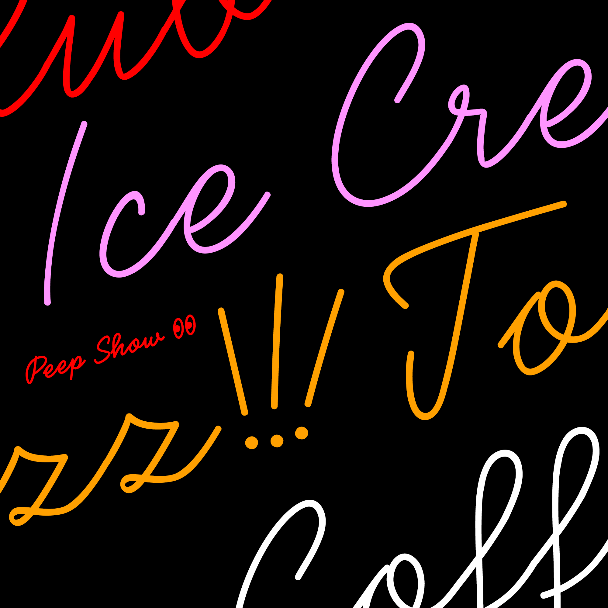
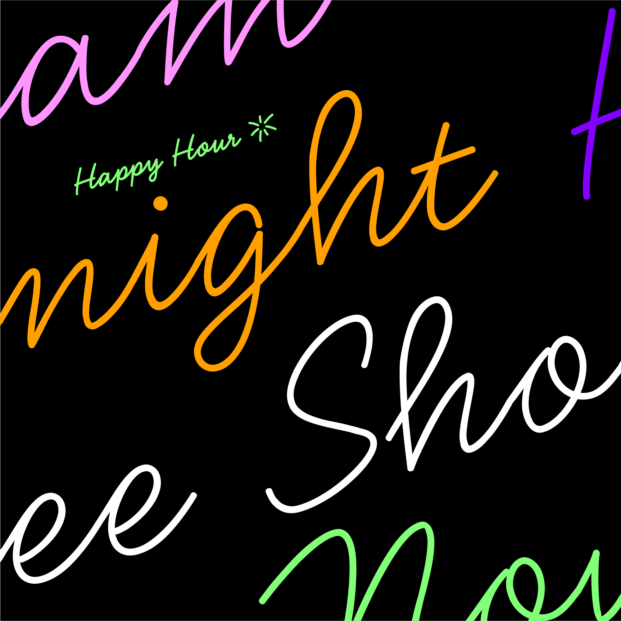
Type specimen illustrations by Marius Corradini.