
Related Type Families

From the single-style, monolingual fonts of the metal-type era to the complex, sprawling, multi-script families of the digital present, typography and type design have evolved, not only to embrace developments in print and communication technology, but also to support a world where unity and diversity must meet if we are to survive.
In the early 20th century, typefaces were monolingual, designed to be marketed and sold exclusively in regional markets. The extensive multilingual character sets we explore today were infeasible in an era when each character was cast in metal and the high cost of international shipping made it more economical to produce type locally. Not only that, there were few situations that required typesetting in more than one language, multi-lingual bibles being a rare example.
It was also an era in which serif typefaces represented conservative tradition, while geometrical sans serif typefaces were a relatively new trend, a deliberate rejection of the past represented by Paul Renner’s Futura (1927), Rudolf Koch’s Kabel (1928), and Sjoerd De Roos and Dick Dooijes’ Nobel (1929). This diametric opposition was so strong that in 1928 Jan Tschichold was able to proclaim that ‘among all the types that are available, the [sans serif] is the only one in spiritual accordance with our time’; thus serif and sans serif faces were rarely used together.
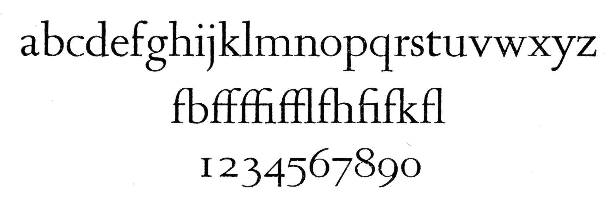
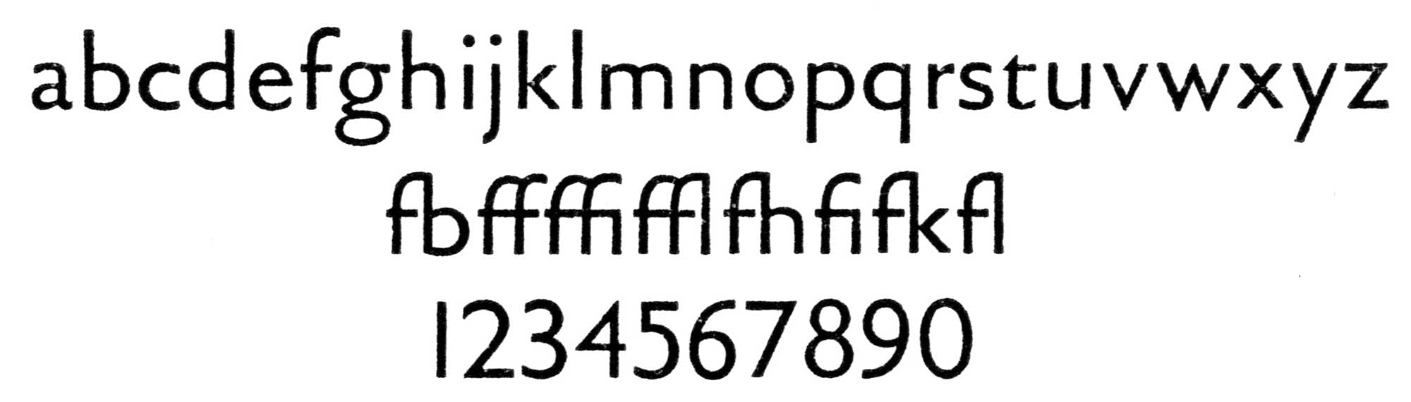
The German graphic and type designer Lucian Bernhard is credited with being the first to explore the incorporation of serif and sans serif typefaces into one large family, and soon afterwards the Dutch type designer Jan Van Krimpen followed suit with Romulus (1932). The sans and serif forms of Romulus share the same construction principles, creating the first published type family of its kind. It was a project far ahead of its time, the beginning of a trend that would not become popular until decades later.
A powerful impetus for change was the devastation caused by the second world war. Political, economical and social leaders recognised that Europe’s recovery depended on international unity and cooperation as an antidote to the nationalism that had brought the continent to ruins. As this exchange of information between nations and cultures became more common and more necessary, many kinds of documents required multilingual typesetting.
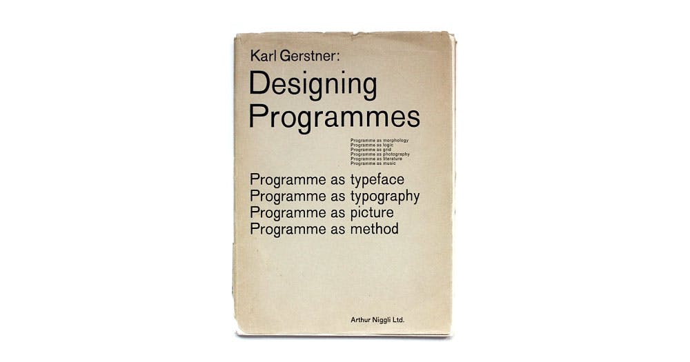
It was perhaps Karl Gerstner in his seminal Designing Programmes (1964) that envisioned the embodiment of these new ideals in all elements of typographic layout, saying that to design was ‘to pick up determining elements and combine them,’ calling for an integral typography and unity of expression. He called for an end to disputes over flush left or flush right setting, symmetrical or asymmetrical layout, serif or sans serif fonts. Typographers would embrace them all as tools for expressing the content of the text. Even Tschichold, looking back with the wisdom of hindsight after the second world war, had reconsidered his original statement: ‘In the light of my present knowledge, it was a juvenile opinion to consider the sans serif as the most suitable or even the most contemporary typeface. A typeface has first to be legible, nay, readable, and a sans serif is certainly not the most legible typeface when set in quantity, let alone readable […] good typography has to be perfectly legible and, as such, the result of intelligent planning’. By the 1970s, designers were exploring the applications of these different forms, free of the factiousness of the previous decades.
In 1974 Dutch designer Gerard Unger created related sans and serif typefaces nearly by accident when he was working on a new serif typeface specially designed to create more robust designs specific to the requirements of the Hell Digiset system. ‘While adapting Demos to Digiset technical constraints, adding and taking away pixels, I started taking away so many pixels that a sans serif remained,’ he recalls. ‘So I started to think about the cooperation between a serif type and a sans serif. The example was, of course, the Romulus project.’ The result, Praxis (1976), served not only as an ideal companion to Demos, but also as an attractive alternative to the already popular and ubiquitous Univers (1954), Helvetica (1957) or Akzidenz Grotesk (1898).
ITC Benguiat Gothic (1979) was the second post-war family of related sans and serif typefaces, followed by Lucida (1984) by Kris Holmes and Charles Bigelow, ITC Stone (1987) by Sumner Stone, Rotis (1988) by Otl Aicher, and Corporate A.S.E. (1989) By Kurt Weidemann. These new typeface families were designed for optimal legibility on low-resolution devices such as laser printers, and Lucida’s outlines included hinting, instructions to improve rendering of the fonts at small sizes. Other innovations further expanded the range of these families. Stone Serif and Stone Sans were joined by Stone Informal, an upright cursive referencing handwriting. Rotis included both Rotis Semi-Serif (something between a sans and a serif) and Rotis Semi-Sans (a non-monolinear sans serif).


Beyond experiments with letterforms, however, the late 1980s also saw the accelerated exchange of information across national and cultural borders. Multilingual books, documents, advertisements, periodicals and branding, once common only in markets such as Switzerland or Belgium, became more widespread throughout the global village. Language-specific fonts, inadequate in the new market environment, had to be expanded and extended. The development of desktop publishing technology facilitated their production, since localising digital fonts to support various languages was much easier than localising metal type or photo-lettering sets. Typesetting norms and conventions also had to be modified or developed to accommodate multilingual situations. While a single typeface style may be sufficient for setting a multilingual document, modern typographers also look for unique solutions that give different languages different voices, or differentiate their roles, or facilitate page navigation.
Pairing typefaces can be a challenge, and type compatibility is more an art than a science. Designers are frequently advised to choose contrasting fonts, as combinations that are too similar can slow or confuse the reader, or just ‘look wrong’. Another useful tip is to select a serif and a sans serif, making one the dominant type and assigning the other a complementary function. Also, mixing sans and serifs at different sizes is generally easier than making them work at the same point size.
Type designer and typographer Martin Majoor, the designer of the Scala typefaces (1990–97), believes that ‘mixing serif with sans only makes sense when the seriffed typeface and the sans are designed from the same basis, or even from the same skeleton.’ Majoor refers to typefaces directly derived from each other, sharing similar horizontal and vertical proportions. These related type families are a safe solution for multilingual typesetting and complex editorial projects, as they guarantee a consistent optical x-height, an important factor in treating various languages with equal respect. In the last few decades, the usefulness of such families has sparked a proliferation of broad type design systems, sometimes also called superfamilies.

Typotheque has been developing related sans and serif since the mid-1990s. Currently our collection contains 26 related sans and serif type families, which we take an opportunity to present in detail in this type specimen. They build on the rich typographic history of previous centuries, and hope to provide useful tools for demanding typographers.
First published in Typotheque type specimen No.12