New Approaches in Great Britain
This second part offers an overview of new approaches developed in Great Britain during the 20th century, inspired by writing history or modern pragmatism.
Latin scripts and Italic handwriting
It is important to examine the new approaches that were taking shape in Great Britain – where vertical writing was also disappearing – as they diverged from the North American ones. A strong interest in the history of Latin scripts began to unfold at the same time under the primary – but not exclusive – impetus of calligrapher, educator and type designer Edward Johnston.
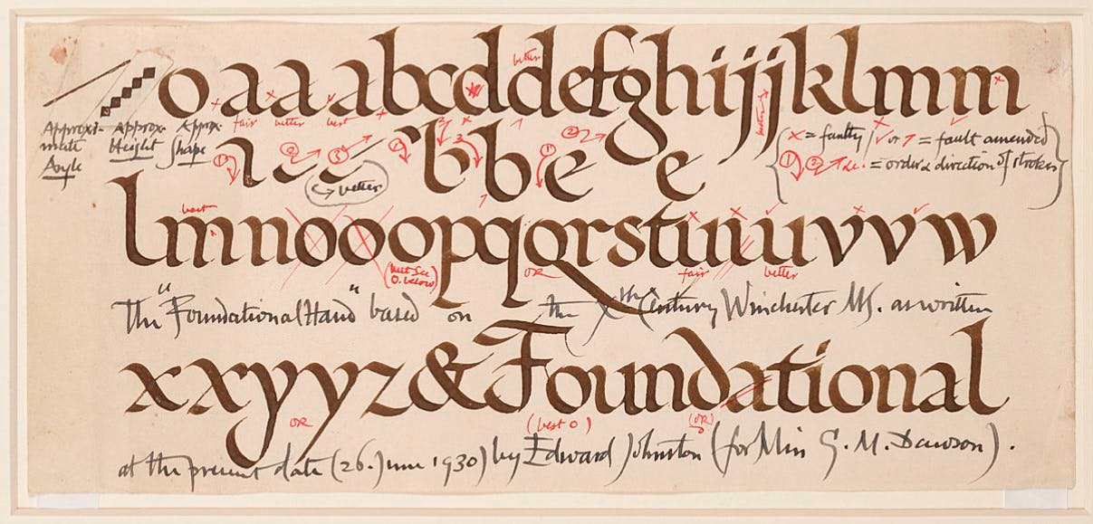
His major study, Writing & Illuminating, & Lettering, has been constantly republished since its first edition in 1906, and laid the foundations for a renewal of humanist handwriting studies. He gradually developed a model inspired by the Carolingian minuscule, called ‘Foundational hand’.1
The standing of Johnston’s work has been fruitful and diverse, and has clearly been felt by a new generation of designers and ‘writers’ such as Graily Hewitt and Anna Simons; it therefore would benefit from assessment in terms of handwriting education.
An earlier and far less known contribution came from Monica Bridges. In 1898, this educator published A New Handwriting for Teachers, a booklet presenting a model of vertical cursive writing, as well as a selection of examples inspired by 16th-century Italian calligraphy, or ‘Italianised gothic’ as she put it.2 Bridges can be considered the forerunner of the Italic handwriting movement that would rise to prominence after the First World War.
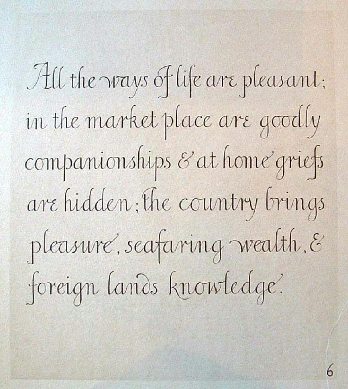
One of the most prominent promoters of this movement was arguably Alfred Fairbank, a fervent admirer of the Renaissance masters calligraphers such as Ludovico Vicentino degli Arrighi and Giovanni Antonio Tagliente. He published several books, the most important being A Handwriting Manual (1932). In its introduction, Fairbank was truly convinced that this modernised formal hand could be taught to a wide range of people:
‘The italic hand, with which this book is concerned, is one equally suitable for use by the young child at school and by the adult. The child needs a simple but practical and interesting system, whilst the reforming adult who is discontented with what his writing has become, and wishes for relief from the boredom of scribble, asks for a script that has grace as well as legibility and speed. […] The purpose of this book is to give instruction to the adult who is bent on reforming his handwriting or who is a teacher of children. It is assumed the teacher is generally in both these categories and will wish to write in the style he or she teaches. […]
In addition to teachers and amateurs there are those who are interested professionally in the design of lettering: namely, calligraphers, typographers, commercial artists, signwriters, etc. To these a knowledge of the italic letter and the principles governing its form and design are obviously desirable. Because italic lends itself to variety so much more than the Roman letter, the study of italic by letterers and printers is therefore of importance. […] The instruction given here is in the writing of a careful copybook hand in the italic style of the author’s model. A model, of course, is not an indication of what the developed hand should resemble, for exemplars are written slowly and with precision, so as to make teaching clear and to indicate the desirable movements, and they need at first to be copied slowly. Models are better if they are pure calligraphy and do not show expressions of personality. […]The model offered, therefore, is a set version of italic handwriting in which are incorporated common characteristics of the humanistic cursives of the Renaissance and favours narrow curving bends rather than pointed angles. There are numerous versions of italic handwriting of the fifteenth and sixteenth centuries, but the model is not derived from any one source, though it is held to be essentially true italic.’ 3
Another approach was put forward during the late 1920s by Marion Richardson, a former student of Johnston.4 As an art educator, she was particularly interested in devising methods adapted to the different needs of children, with the aim of helping them to develop their own expression and skills.
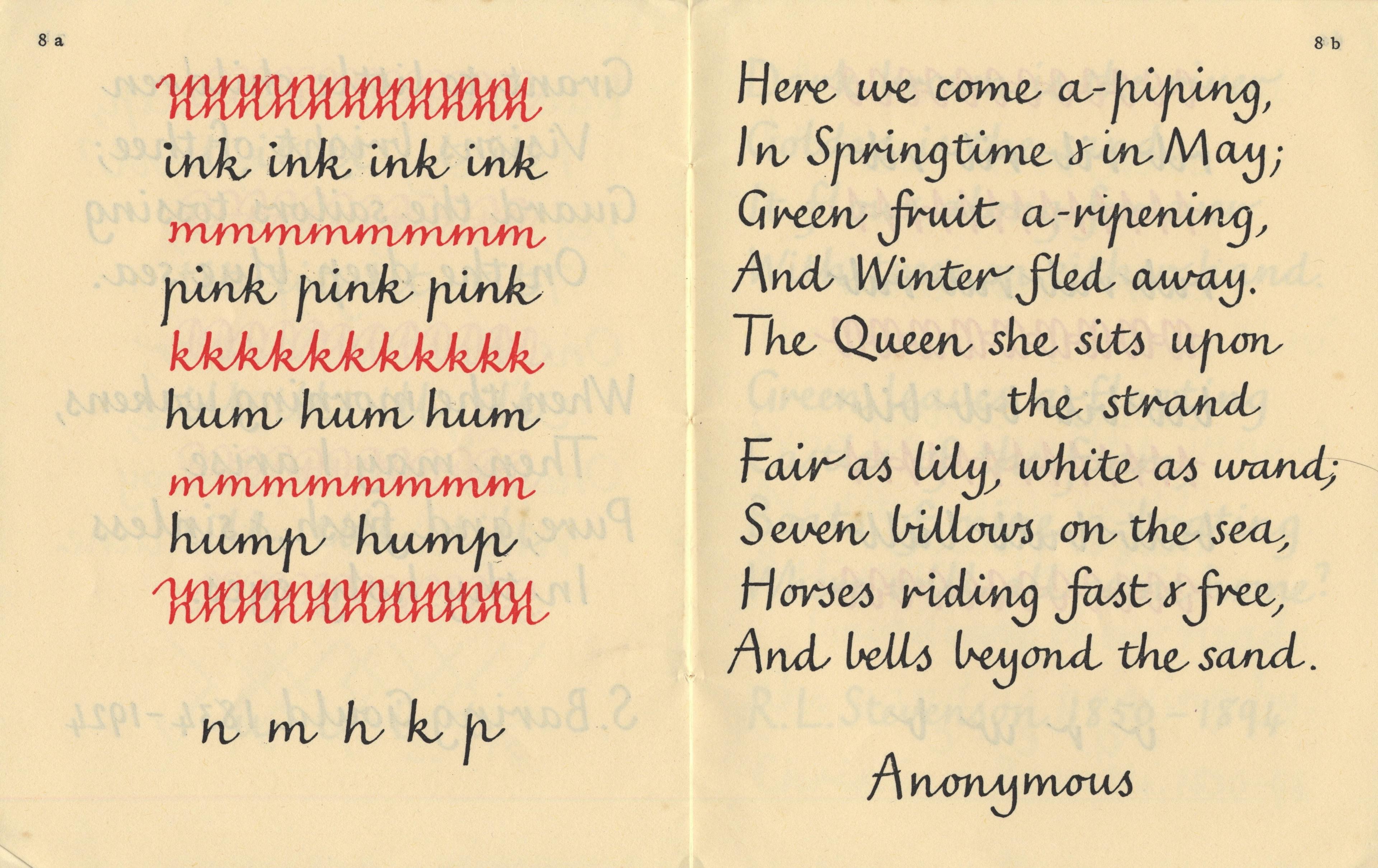
Richardson first published the Dudley Writing Cards in 1928, where Johnston’s influence and preference for the broad-nibbed pen can be seen on her hand. She continued to refine her method, particularly after being appointed as an art inspector in London County Council schools. Her next and seminal publication, Writing and Writing Patterns, is a series of five booklets combining, as the title suggests, letterforms and graphic shapes:
‘These cards and books are designed to give a child practice in the essentials of a simple running hand, which will serve him throughout school life and be the foundation of a good adult hand. A free cursive writing employs only easy movements of the hand and arm, such as are used in primitive forms of decoration and childish scribble.’ 5
The new model shown in these booklets is upright and uniform, with rounder strokes and joins between letters. In a sense, Richardson built a method that was the opposite of Fairbank’s, proposing a writing scheme that was not attached to a purely formal, intimidating view of calligraphy and that encouraged the emergence of a personal attitude towards handwriting. Her contribution proved essential and was acknowledged during the subsequent decades for its part in the development of new methods.
The advent of print script
Alongside these multiple aesthetic positions based on a more or less formal interpretation of historical models, another direction was simultaneously asserting itself. At the end of the First World War, ‘print script’ (also known as ‘ball and stick’), a generally upright, unconnected, elemental variation on the Latin alphabet, began to be highlighted as a better way of teaching handwriting.
Its origins are far from unique or simple.6 Given its name, one might assume it is a direct transposition of sans serif typefaces, in vogue since the 1830s. It could also be an adaptation of lettering models designed for specific professional trades, as shown in this example, a slanted ‘single stroke lettering’ by Zaner and Bloser:
‘This alphabet in variously modified forms has long since been the favorite with architects and mechanical draftsmen. It is script-like in construction, and about as plain as lettering can be. Use pencil head and base lines for the minimum letters, and for the capitals, if you need them. Use a smooth, round-pointed pen, such as the Zanerian Medial, straight holder, and India ink. Aim to secure uniform slant and spacing, not by rule but by the eye, and uniform width of stroke and letter. Use a slow, deliberate, sure motion, letting the hand rest on the side.’ 7

In Great Britain, it appears to be mainly derived from many experiments on formal writing, and Johnston seems to be, unwillingly, its indirect instigator:
‘In 1913 Edward Johnston gave an address on penmanship at the London County Council Teachers annual conference. In making suggestions for an ideal course on the teaching of handwriting, he stated that his Foundational Hand would make a good model and that it would develop into a fluent hand. […] Johnston, however, did not wish it to be thought that he was directly responsible for the Print-Script characters, since he was not consulted in the experiments. He referred to these letters as “rather formless skeletons of Roman lower case”.’ 8
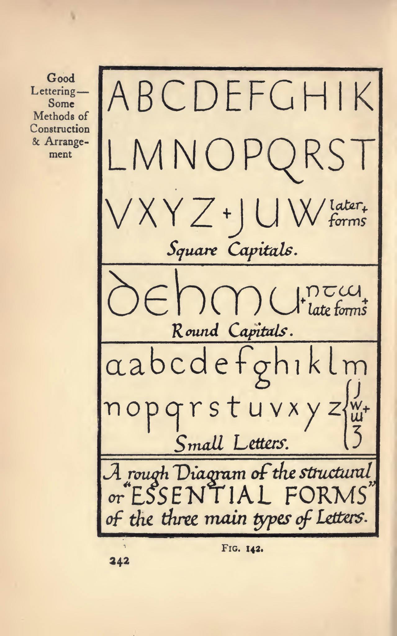
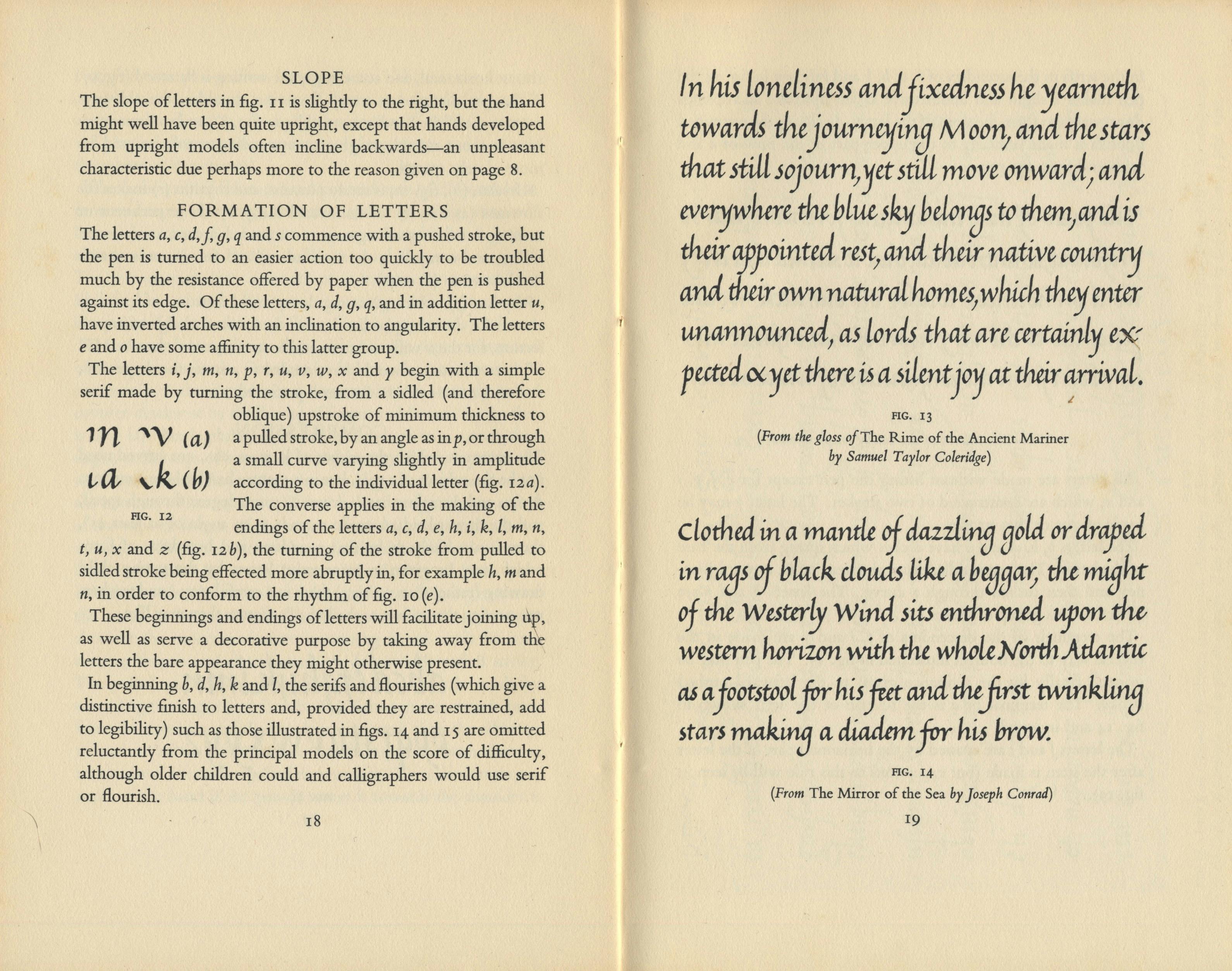
Such ‘skeletons’ or ‘essential forms’ can be found in two plates reproduced in Writing & Illuminating, & Lettering, obviously related to Johnston’s Foundational hand. He also made a perceptive comment in his book about inscriptional ‘Raised letters’, noting that it was ‘quite possible to make a beautiful and characteristic alphabet of equal-stroke letters, on the lines of the so-called “Block Letter” but properly proportioned and finished’. 9 This idea contains the seed of his sans serif typeface designed in 1916 for the London Underground.10
As early as 1919, S. A. Golds’ A Guide to the Teaching of Manuscript Writing was at the forefront of change. The author and educator explains in the foreword of this manual her motives for this innovation, called ‘manuscript writing’:
‘The system of writing advocated in this little book is an attempt to revive, in a simplified form, the beautiful manuscript writing of bygone years, and an earnest endeavour to help towards the improvement of the writing of the present day. The letters adopted are extremely easy, consisting only of straight lines and simple curves; all unnecessary loops and tails are eliminated, and the ascending loop, which is always a serious difficulty to the young child, disappears altogether.
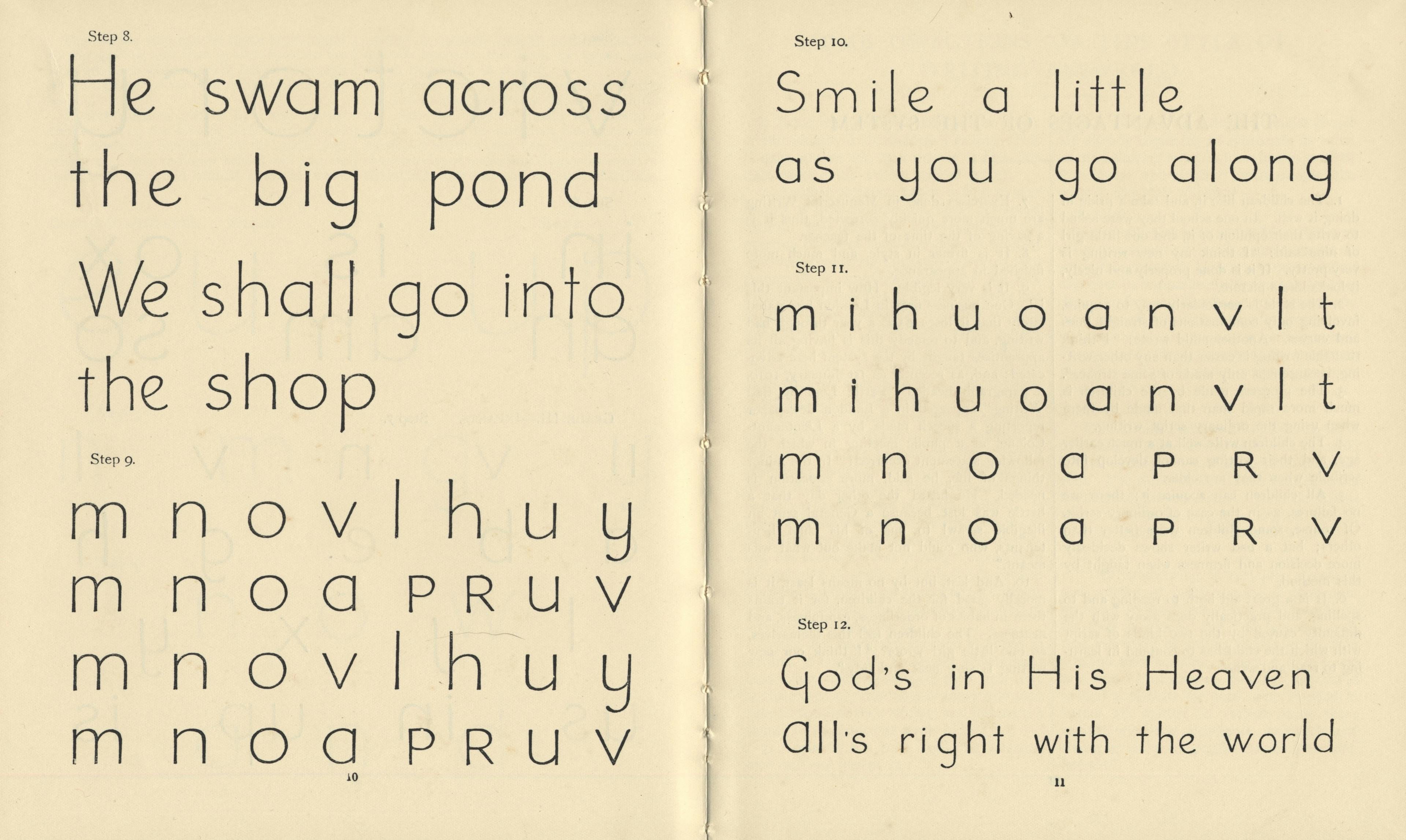
This kind of writing seems to come almost naturally to the little ones, whose control over the finer muscles of the hand is not sufficiently developed to enable them to make the more difficult letters of which the ordinary alphabet consist. By this method quite young children can learn to write without any undue effort, and much time can thus be saved for more important work later on, the mechanical art of writing having been mastered quite early in life.’ 11
In the same spirit, Marjorie Wise, also a former student of Johnston, undertook the elaboration of a manuscript writing method. Her manual, On the Technique of Manuscript Writing, was published in the USA after her enrolment at Teachers’ College, Columbia University. Wise’s actions seem to have quickly led to the implementation of this new way of writing in a number of American schools.12 This contribution has had a lasting influence and can be seen in the development of the D’Nealian method, created by primary school teacher Donald N. Thurber and introduced in 1978. It combines a slanted manuscript model with a slanted looped cursive inspired by the Palmer Method.
By the middle of the 20th century, print script had spread not only in the English-speaking world but also to many European countries (and, let us not forget, their colonies). It is still firmly established nowadays and used either as an exclusive model or as a first training step before learning to write a slanted or vertical continuous cursive. It was equally appraised and criticised; in 1979, the indefatigable letterform researcher Nicolete Gray stated, as she was presenting a fresh ‘way of writing’, adapted to the popular ballpoint pen:
‘Undoubtedly some people, by taking trouble, can write good italic and copperplate hands with all-direction pens. But with most people good hands formed in these styles tend to deteriorate and grow slipshod and formless. For the average child of today in England – and I believe also in North America – no proper style of handwriting has been developed. In the formative stage they are probably taught printscript (or manuscript); that is, they are taught to copy letterforms which have been developed as detached typographic forms, with all cursive characteristics eliminated. This inculcates a way of thinking about letters which dies hard: the idea that the letter has one basic form, which is typographic, and that it is the shape only, not the way in which it is made, which matters. Thereafter, children may learn some form (probably a debased traditional form) of cursive writing; many just “join up” their printscript model.’ 13
The far-sighted Gray predicted the appearance of clumsy, artificial ‘connected print script’ models that are still widely used today in English handwriting teaching.
Hybridisation
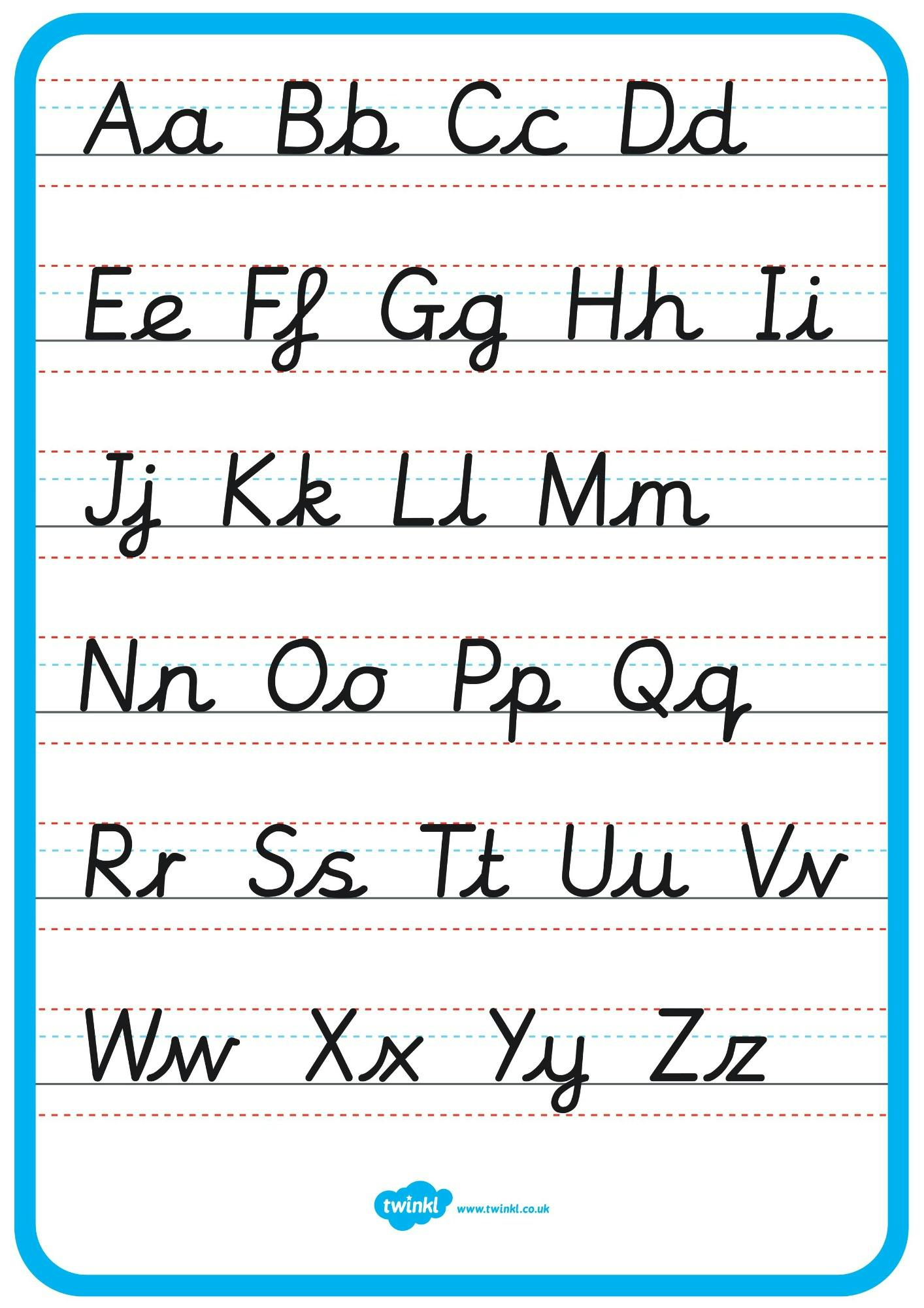
Fortunately, a more balanced and successful convergence between italic handwriting and print script had already taken place in the 1950s. One can mention, among several methods, the work of Charlotte Stone for the Beacon handwriting manual series, with the involvement of Fairbank and Winifred Hooper, or the Nelson handwriting scheme that debuted in the early 1960s.14 Both based their designs on an oval structure to move away from the formal stiffness of the usual print script model and to add a welcome touch of cursiveness.
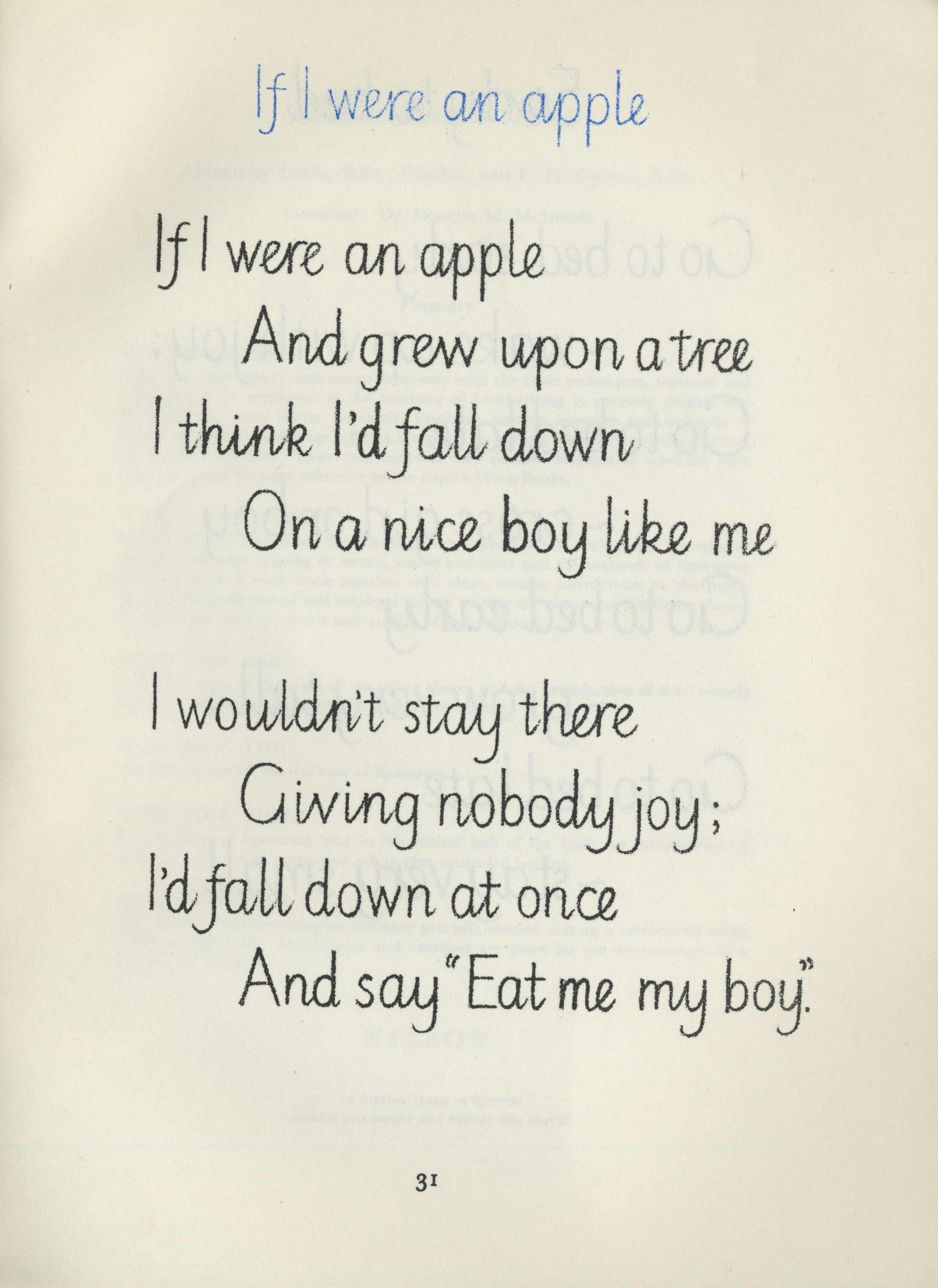
Rosemary Sassoon, renowned designer, calligrapher, educator and author, has provided a significant synthesis and upgrade of this combination. Her approach, based on practice and thorough research, began in the 1980s. Her first output was a doctoral thesis at the University of Reading, Joins in Children’s Handwriting, and the Effects of Different Models and Teaching Methods, defended in 1988. At the same time, she began working with type designer Adrian Williams to develop, over a period of 30 years, the extensive series of digital fonts that bears her name. Williams has recounted the circumstances and motives for this process on his website:
‘Her research convinced me there was a need for well-designed typefaces based on solid evidence. The fonts available at the time in the UK seemed to have been hijacked from other countries and not suited to British preferences. I wanted to be involved in seeing this worthwhile project to a successful conclusion.
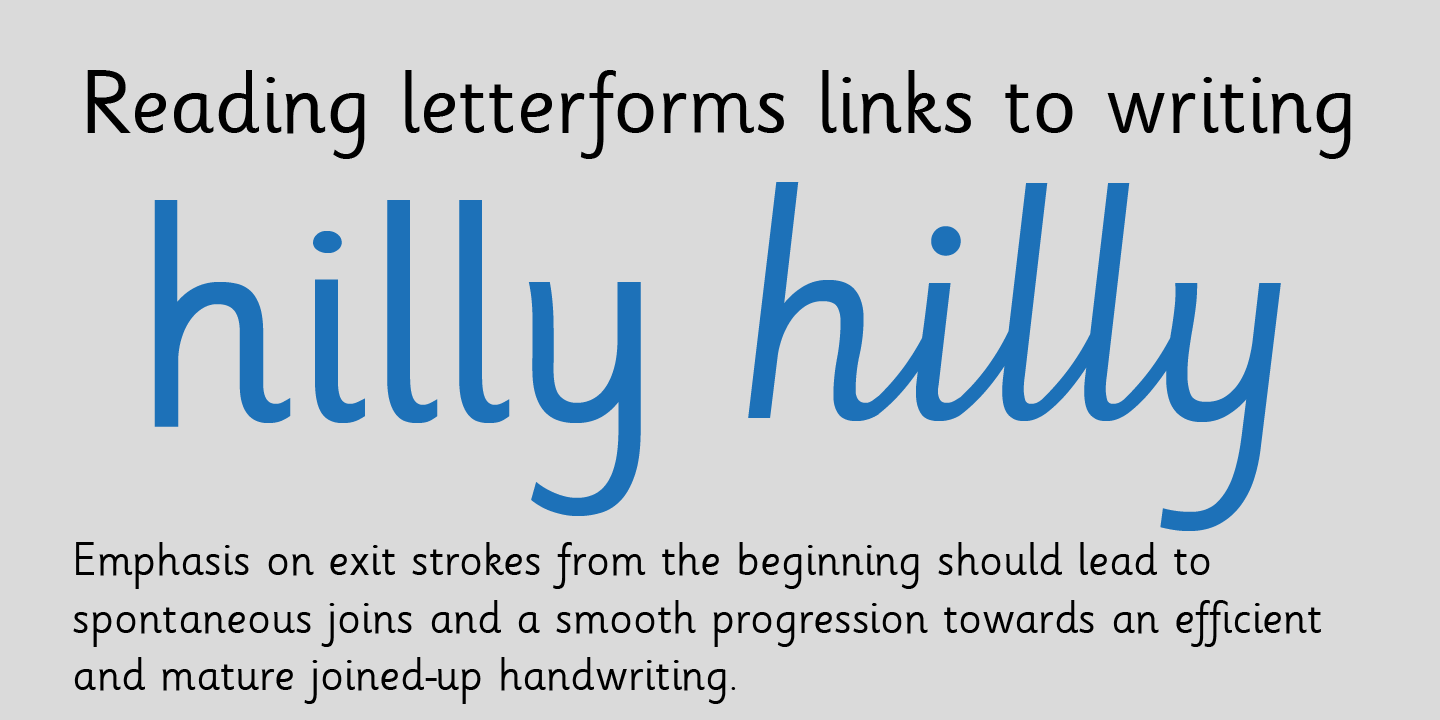
Together, we developed a whole range of font products that are now used worldwide in schools for teaching reading, handwriting and phonics. […] I had an idea the project would go well, but no clue it would be so successful. After many years, realising that letters that joined together would be the next logical step, we developed joined handwriting fonts and thought that would be the end of the development journey. […] This continues the concept of bridging the gap between the type children are given to read and the type used in copybooks for handwriting. Demonstrating this crucial step in learning how to join letters in their copybook worksheets provides teachers with a valuable resource.’ 15
Indeed, the introduction of desktop publishing in the 1980s and the rapid shift to digital typeface design have made it possible to adapt existing models and create new ones, thus widening their distribution and diversifying teaching possibilities, at school and at home.