Cursive handwriting in Central Europe
This fourth part reveals other traditions of cursive writing in Central and Northern Europe, much different from Western Europe models previously discussed.
Cursive handwriting in Central Europe
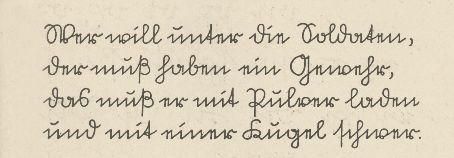
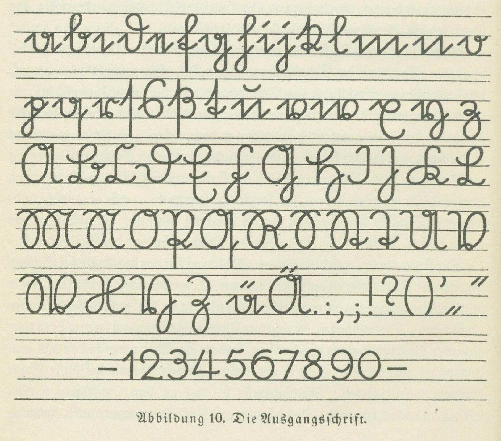
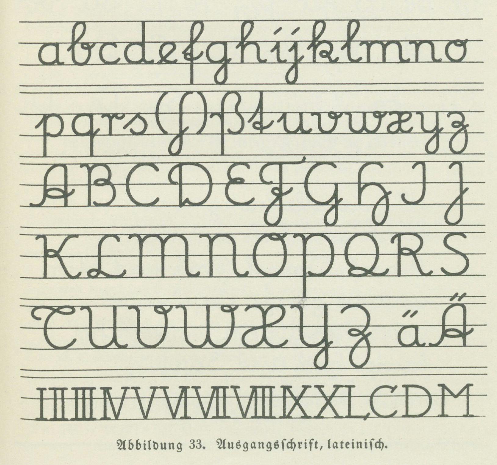
It seems that the influence of the vertical writing methods promoted by the hygienic movement also faded in the early 20th century in Central Europe. The only example that can be considered in some way a continuation is the Sütterlinschrift. This script was designed in 1911 by Ludwig Sütterlin at the request of the Prussian Ministry of Culture and Education, and introduced from 1915 onwards for teaching in schools. In contrast to the Kurrentschrift, the dominant style of the 19th century (pointed metal nib, pronounced 45° angle), the Sütterlin is a very simplified model, combining round and angular strokes.
In the manual presenting the new model to the teachers, Neuer Leitfaden für den Schreibunterricht Urheber, Sütterlin expressed his criticism on the effects of the English Roundhand on handwriting:
’The English way of writing, introduced to Prussia by [the calligrapher Johann] Heinrigs in 1809, not only brought to our school the slim, thin and, according to the taste of the time, elegant “English Roundhand”, which is strongly inclined to the right, but also soon imprinted the same character on our German script, without, however, being able to significantly change its basic forms. Furthermore, the writing instrument that was largely responsible for the undeniable degeneration of our script, the pointed pen, was also generally introduced in schools. The disastrous effect of these interrelated facts on our German writing system cannot be explained without going beyond the scope of this work.’ 1
The Sütterlinschrift was created in opposition to the above, and was ideally intended to be written with modern broad-nibbed fountain pens, such as the ‘Gleichzugfeder’, invented by Friedrich Soennecken – himself a strong supporter and revivalist of the Ronde style. In fact, Sütterlin also designed a rounder version of his model, called ‘lateinisches’.
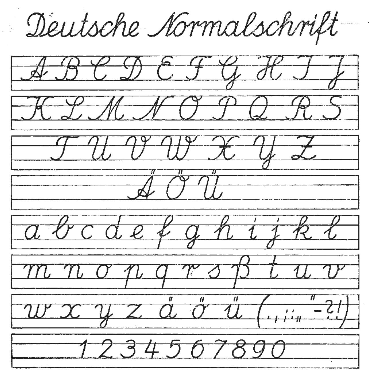
The infamous decree issued by the Nazi regime in January 1941 banned the Fraktur script in favour of the Latin alphabet. It was followed by another decree forbidding the teaching of Kurrentschrift and Sütterlinschrift in schools. A new slanted cursive model, the ‘Deutsche Normalschrift’, was introduced to replace both.
After the Second World War, this model continued to be used in West Germany with some modifications and a change of name in 1953, ‘Lateinische Ausgangsschrift’, which is still used in several states of the Federal Republic of Germany.
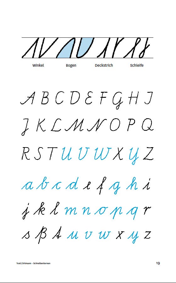
In East Germany, the long-standing work of the calligrapher and teacher Renate Tost should be singled out. After graduating from and starting her career at the Hochschule für Grafik und Buchkunst in Leipzig, together with Elisabeth Kaestner she designed the ‘Schulausgangsschrift’ between 1961 and 1968, a cursive model which she documented and described in several articles and publications. After completing additional studies in art education and a PhD at the Karl Marx University in Leipzig, she taught at the Pädagogische Hochschule Dresden from 1975 to 1992.
With Frank Ortmann, Tost recently published a new manual, Schreibenlernen mit der Hand bildet Formsinn und Verstand, using the latest version of her ‘Schulausgangsschrift’, available as a digital font since 2014 and recommended in Bavarian primary schools by the Ministry of Education.2
This book was written to improve teachers’ basic knowledge of cursive writing and to help them understand that ‘learning to write by hand activates linguistic, motoric, cognitive and, last but not least, aesthetic processes in the best possible way and thus influences each other positively’. 3
There has also been a renewed interest in writing models over the past decade in Central Europe. In Slovakia, Ján Filípek, type designer and founder of DizajnDesign studio, teamed up with illustrator, children’s books and textbook designer Martina Figusch Rozinajová to develop Školské písmo, a typeface family supported by the Fund for Support of Arts and released in 2020, according to the following motivation:
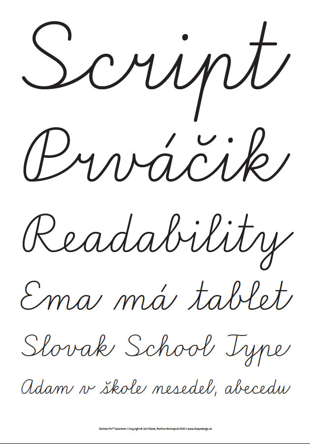
’All teachers, pupils and parents are familiar with the current handwriting model, which has been used in Slovak schools without significant changes for almost 100 years. However, in the modern approach to teaching, it has its limitations: it is unsuitable for left-handed pupils as well as for pupils with learning, reading and writing disabilities. The current version is not digitised, which makes it difficult for educators and publishers to prepare teaching materials.
Therefore, together we have digitised and modernised this model and adapted it for left-handed people and pupils with learning difficulties. In order to facilitate the work of teachers, parents, graphic designers and publishers in the making of school books, textbooks, children’s books, magazines and teaching aids, we have decided to make our new typeface available free of charge to everyone.’ 4
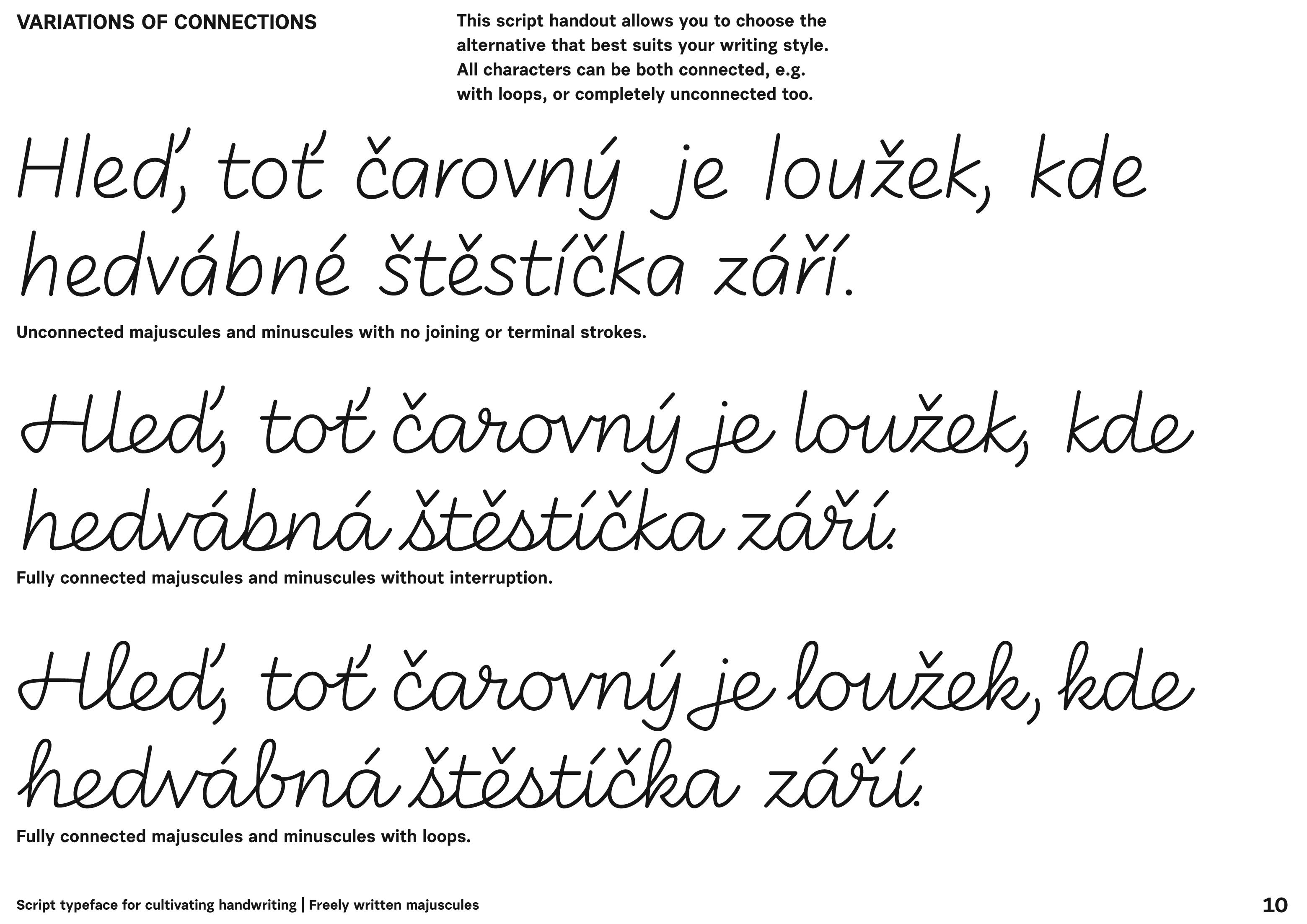
In Czechia, type designer, lettering artist and researcher Petra Dočekalová completed her thesis in 2020 at the Academy of Arts, Architecture and Design in Prague, on the subject of Fostering increased appreciation for handwriting, penmanship, and a personal handwriting style. The design outcome of this research is a ‘Script typeface for cultivating handwriting’, comprising several series of capitals and ligatures and three levels of connectedness.
We believe that she is at a unique crossroads of skills and expertise and that her perspective, from her own experience, is worth sharing at length: 5
’My first experience with calligraphy was in secondary school, but I got much more involved in 2014 when I started handwriting and sign painting for my master’s project (reviving the craft of sign painting in Czechia). Since 2016, I have become a sign writer and letterer, with everyday practice in various shops, writing for all kinds of commissions, using the Czechoslovak style and traditional shapes and script styles I’d learned and developed during my studies. I also started to educate others by showing how a bartender can master a script for a specific bar or create better handwriting by switching the writing tool and grip. But slowly, I understand that being a mere letterer and teacher doesn’t help with the terrible handwriting of others that I encounter every day. I know that I must dig deeper into the school writing model’s roots that affect the entire society. By changing and developing this obsolete model, we can make magic. That’s where my deep fascination and search for the theory of writing – Gerrit Noordzij’s term – began. With my PhD thesis and typeface, I only skimmed the surface of the entire scope. This work deserves a lifetime and I would like to dedicate mine to it. I undertook this PhD because I needed to be grounded in scientifically proven aspects that affect handwriting. Palaeographic theory and research follow and find the historical moments during which a specific manuscript was in its best condition. Neuroscientists’ research shows us how writing and fine motor skills affect brain connections and help to deepen our memory. Pedagogical research gathers knowledge about teaching methodology with the development of technology, as for instance digital tools versus ergonomic habits. Teachers also come across the teaching method of writing based on their skills with multiple children, teenagers and adults.’
As her thesis focuses on the evolution of Czech writing models, we wondered whether she felt she belonged to a ‘local’ or regional tradition:
’I would rather say local in the entire Czech Republic (Czechia). But my approach is more about paying attention to tradition, respecting the historical reference and giving the tradition an upgraded, up-to-date look. Also, in the meaning of regional/local, the models for school handwriting and the scripts for advertising are found across the whole country. The local differences are more visible between countries; I’d say there are fewer regional differences. I do run workshops with people from the USA and various European countries, so I came across many interesting shapes of Latin cursive scripts and writing habits. For example, uppercase (majuscule) “S, L, F, T” or lowercase (minuscule) “t, s, p, b” could be understood as completely strange and irrelevant for readers in other countries and vice versa. In terms of the overall style of the script in local tradition, I prefer being as genuine as possible, even if it means staying truthful and writing with less readable characters.’
We also asked her if she has any preference for slanted versus vertical writing:
’I prefer a model somewhere in the middle, with just a slight slope (3° or 4°). Then the fear of achieving a narrow line disappears, and it avoids the big or extreme slant, which is not ideal either. It causes even more damage by forcing the writer to keep a regular rhythm and hold the writing tool at a mechanical angle; it also affects our sitting position while writing etc. No human hand is like a robot’s pincer. We don’t draw perfect circles and connections on point. A natural, fluent, smooth writing model should combine the angles of main stems and the irregularity of oblique shapes and stems too, and still could feel and look balanced, elegant, and pretty readable. From my observation and workshop experience: slanted models (from left to right and back) usually teach us faster handwriting technique than if we learn to write the same shapes vertically. Slanted models are more rhythmic and dynamic. Vertical models are generally more precise, slower, and somewhat naive looking – writers who stick to the model lines, and regular shapes tend to be more patient and careful. By adding slants, writers tend to speed up, and won’t make the perfect line that starts and ends on the same point. They also tend to elongate the ascending and descending strokes, accents and punctuation marks. A slanted hand usually creates the main stroke (stem) with a small bend based on the hand’s finger position. Slanted models could be slightly problematic for left-handers, so a vertical angle is more versatile for learning (only). I also like back slants for left-handers. Loops could be drawn easily in slanted vertical writing. It’s easier to totally abandon them and make the handwriting less complicated and more light and readable. The funny part is that the steeper the slant is, the more we evaluate the handwriting as having a better-looking shape (I have many ideas about why this can be perceived as false). But in fact, the slant creates the true opposite – less readable shapes. The slant has the power to hide and somehow correct the visual aspect of letterforms because, on narrow stems, you immediately see any inconsistency; on slanted, you do not. That’s why most people think of slanted handwriting as the better (-looking, more readable) one, which is not true.’
Dočekalová mentioned in the description of her typeface that ‘the clear basic shape of the minuscules is derived from the script Bastarda’; we were curious to understand this choice:
’Yes, an oxymoron, right? Bastarda is a single-stroke script, though unconnected, very open, bright, with a skeleton fitting in the invisible square, with vertical loops, sometimes triangular. Its readability is lowered by the flat, wide writing tool and longer ascenders and descenders, but the skeleton itself is “simple” if you apply a monolinear thin stroke and change the metrics. I do know that just a skeleton of the Bastarda doesn’t make a handwriting model on its own, but adapting these core principles in the creation of the brand new model is what I needed to try. I found it fascinating that Bastarda was used smoothly for over 300 years, and maybe I see something in it that others hate or just don’t see, and maybe I am wrong. But I do prefer its features over German Kurrentschrift or English-shaded Latin. Bastarda influenced my typeface, but not blindly, rather as slightly evolved and elevated. I tried all the other scripts too. I “tested” the entire evolution of lettershapes by learning to write them by myself – not to perfection, but to that point at which I could understand its fundamental principles, dead-end roads, etc. Many contemporary European writing models are based on the Italian Renaissance-born Cancellaresca. From my writing experience, it’s tough to learn seamlessly, even for a skilled calligrapher. I think its bone skeleton is better developed as a font rather than a cursive. Not everyone can execute it well; its principles lie in rules and rhythms, good balance and proportions. Instead, I searched for lettershapes that were more universal, good for every level of skill, whose perfectionism wouldn’t cause frustration, but that were rather “normal and adaptable”, for everyone’s everyday use. Let’s face the fact that not everyone wants to have nice handwriting. It’s our unique code, our personal expression and statement. As typographers, we tend to design “better looking”, more “readable”, and “nicer and more enhanced” typefaces. But it doesn’t necessarily apply the same way in handwriting.’
Cursive handwriting in Northern Europe
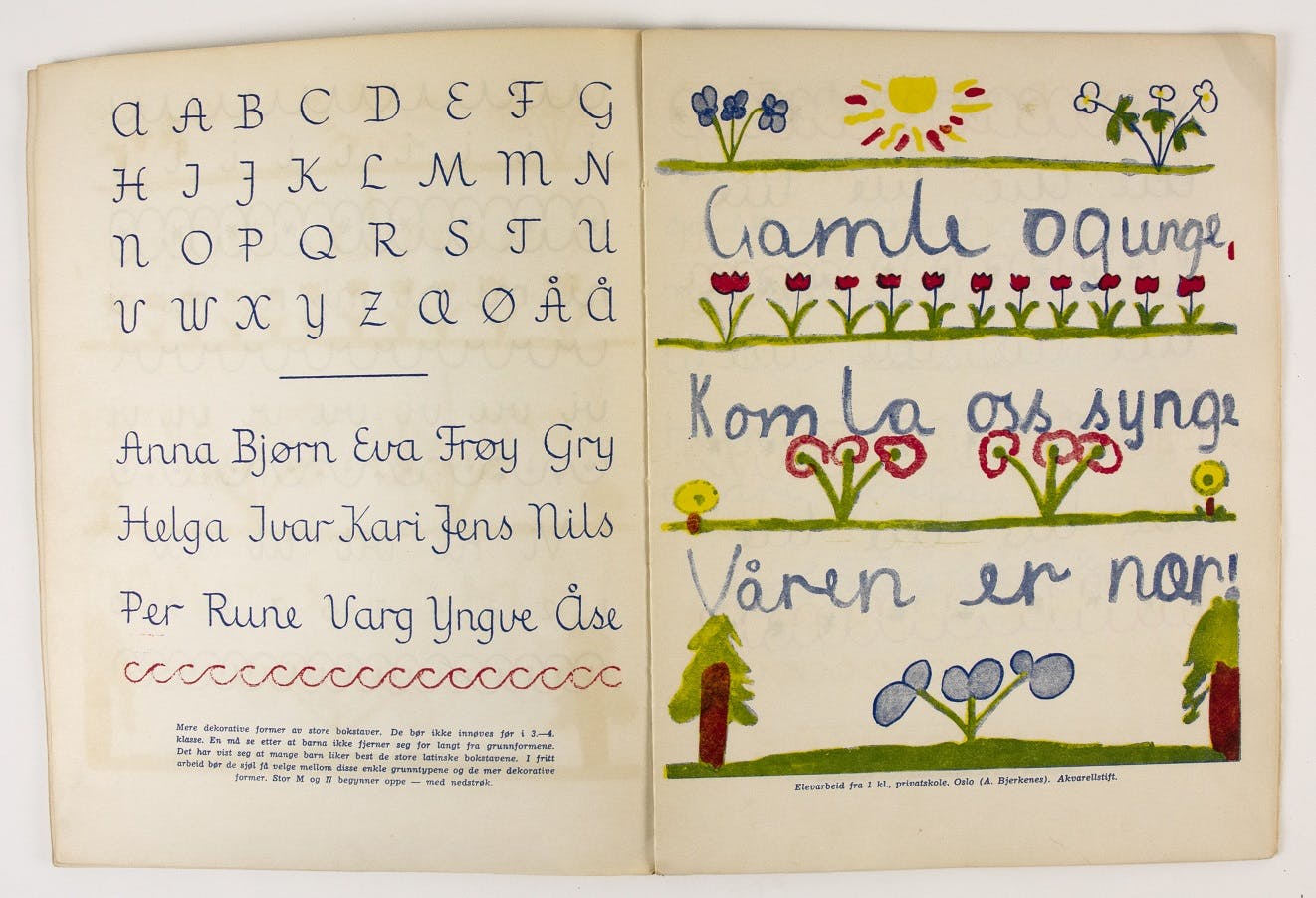
From Central Europe to North Europe, cursive writing has developed in many different ways. In Norway, in 1947, the Church and Education Department introduced ‘Formskrift’, a new model designed by Alvhild Bjerkenes on the basis of examples from other countries, Marion Richardson’s approach in particular. 6 This change represented a clear reform, especially because vertical writing was supposed to give a better writing position than slanted, an unexpected echo of the hygienic movement’s concerns. 7 This model was adapted in Denmark by Christian Clemens in 1952.
Bjerkenes continued to develop new and different models over the next few decades. There has been a shift towards slanted cursive writing with new contributions in the 1980s, notably from calligrapher Jacob Rask Arnesen. 8 The main cursive model taught in Norway nowadays is ‘Løkkeskrift’.
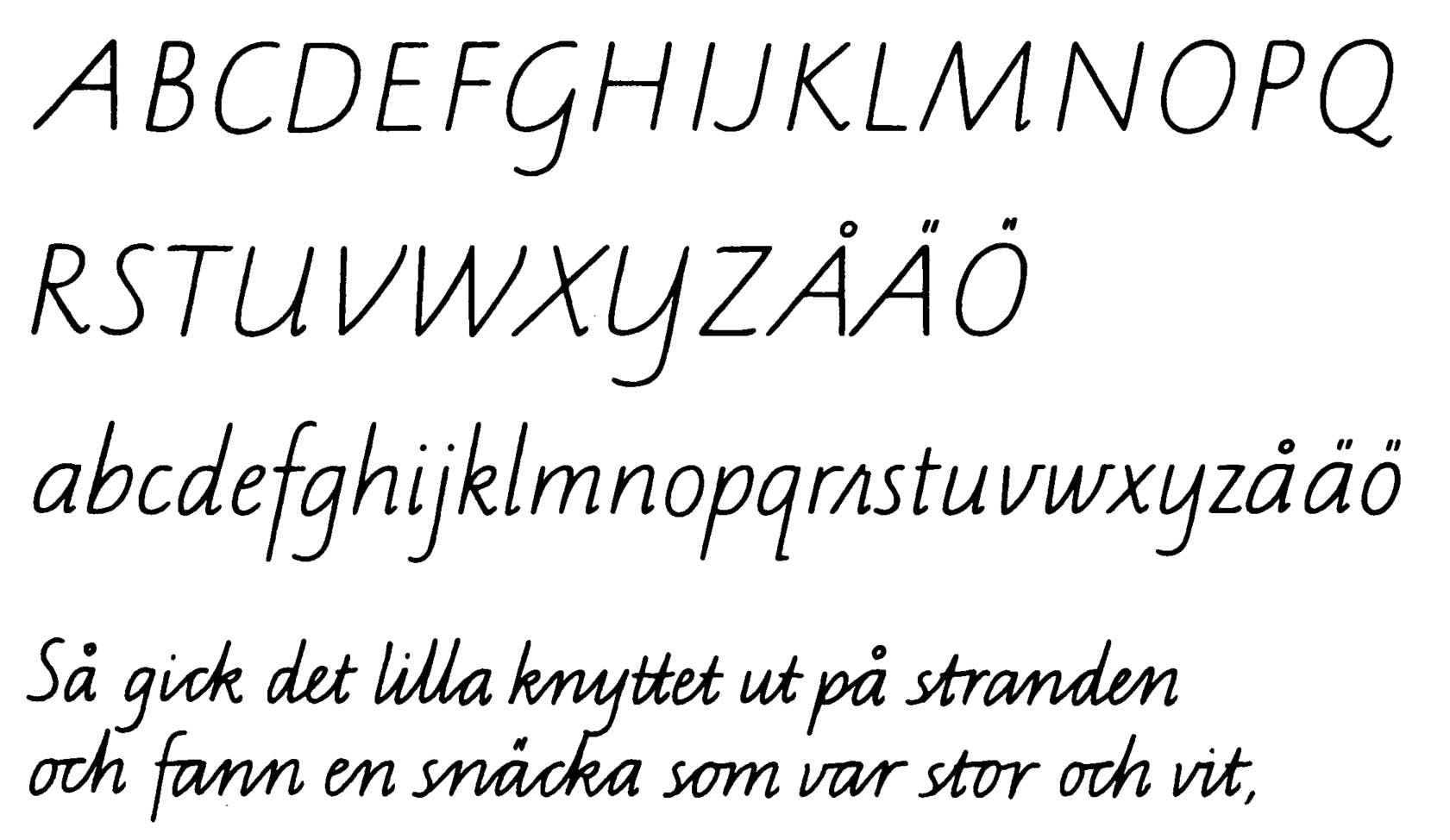
In Sweden, the Board of Education set up a committee in 1959 to investigate whether it was possible to introduce a new standard handwriting course in the country’s primary schools. Until then, there had been no national instructions that obliged them to use a specific model. After some research and experimentation, the Board decided in 1972 that one style would become the only reference for all schools. This new model, named ‘SÖ-stilen’ and designed by calligrapher Kerstin Anckers, was much inspired by italic handwriting. 9
This British influence is particularly enduring in the region, as it also inspired a new method of teaching handwriting in Iceland. As for Sweden, the need for reform led to the design of a fairly simple yet dynamic upright model by Gunnlaugur S. E. Briem in 1985. 10
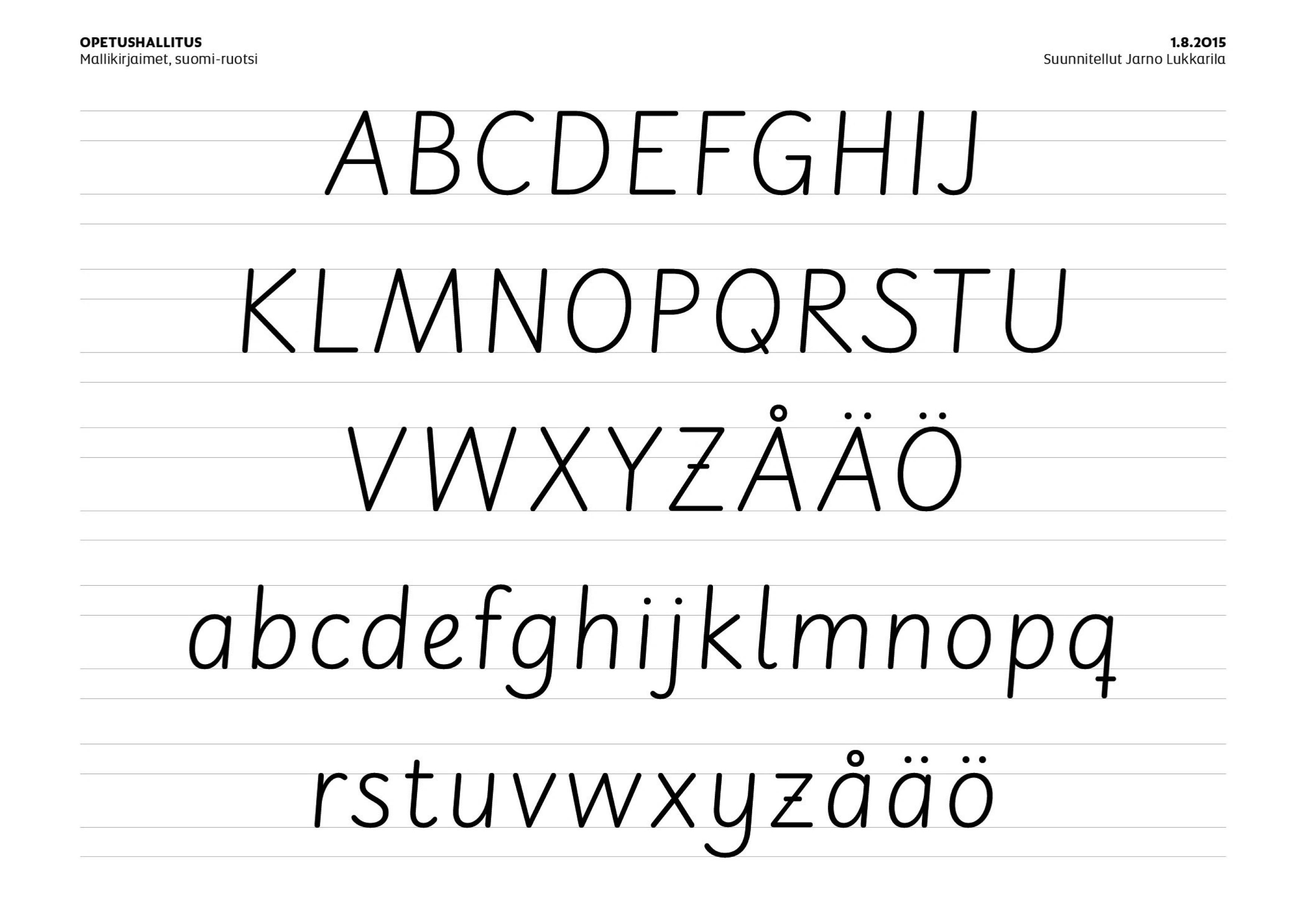
More recently, the Finnish National Agency for Education supported the design of the Alku handwriting system by the Typolar studio, founded in Helsinki by Jarno Lukkarila in 2003. 11 This typeface family represents perhaps the quintessential combination of italic handwriting and print script as developed in Great Britain in the 1950s, now tailored for the digital age.
Other scripts, such as Cyrillic and Greek, have both been influenced to varying extents by the Western world and its writing practices. This affected the development of cursive handwriting and its teaching in a number of different ways during the late modern period.