Cyrillic and Greek handwriting
This final part describes the influence of Latin script on other writing systems, namely Cyrillic and Greek, and especially on their cursiveness.
Cyrillic handwriting
In Russia, Tsar Peter I the Great carried out an orthographic reform and introduced a new Cyrillic alphabet called Civil Script between 1708 and 1710. This reform was facilitated by the dissemination of Latin script among educated Russian towards the end of the 17th century. It was a compromise between the supporters of the national tradition and those of the European culture.
Therefore, new typographic foundations were established, clearly based on long-standing humanist standards. Moreover, new cursive models were developed for handwriting, also deriving from Latin calligraphic styles. The dissemination of the English Roundhand on the Continent at the beginning of the 19th century had a crucial effect on Cyrillic. It led to the rise of a consensual pattern, unequivocally fuelled by the widespread use of the pointed pen.
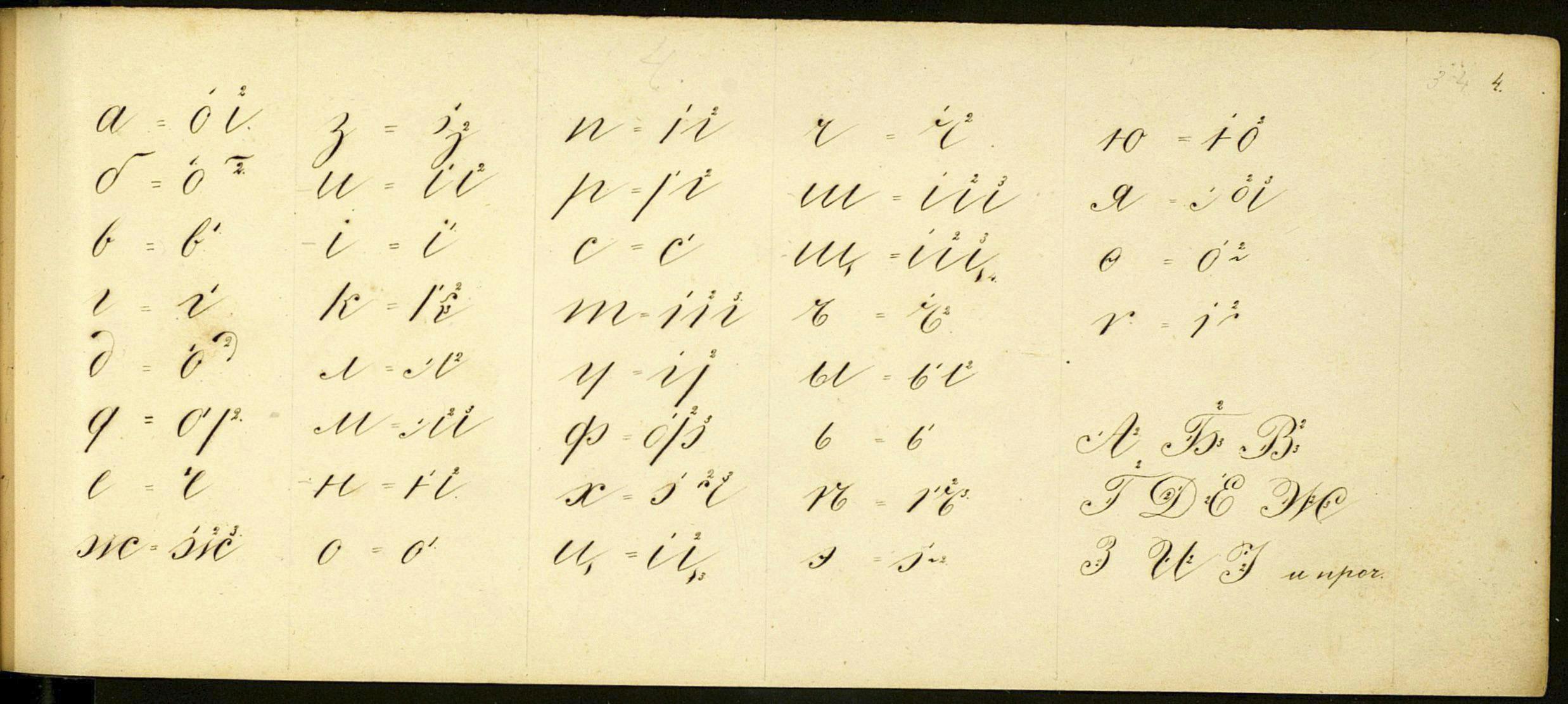
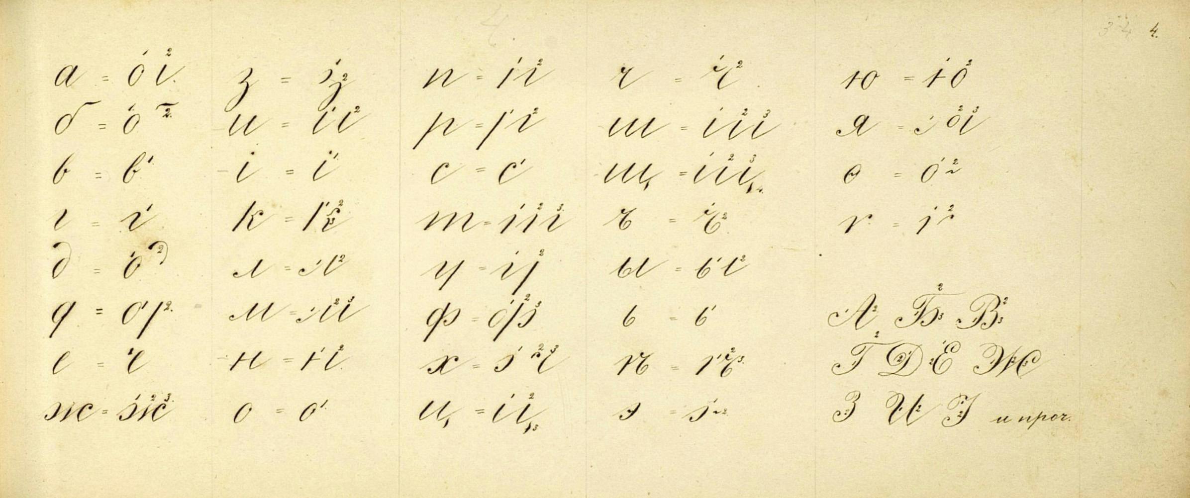
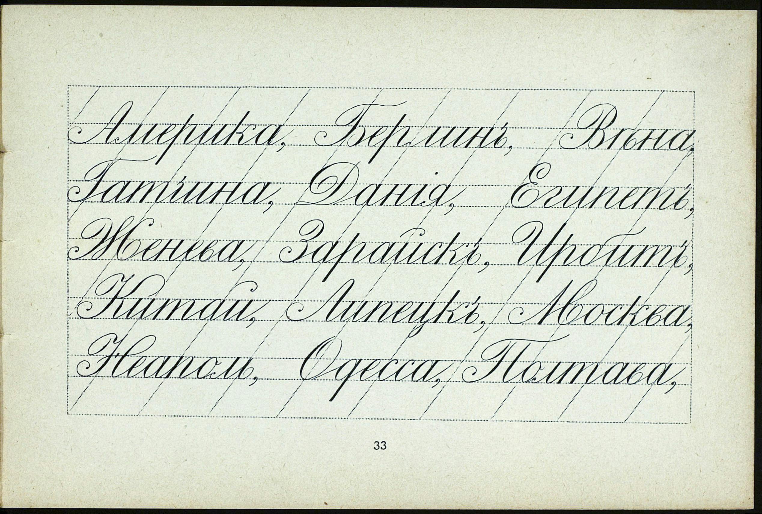
At that same time, other approaches were put forward in order to defend regional identities against the domination of the Russian Empire. One interesting example can be found in Bukvar Yuzhnoruskii (South Russian Primer), compiled and published in 1861 by the Ukrainian poet and artist Taras Shevchenko, in St Petersburg.
This booklet was intended for adults and adolescents attending free Sunday schools, created in 1859 by Ukrainian intellectuals to promote their native language for education. It comprises an alphabet of printed and handwritten letters, traditional texts for reading by syllables, chants of individual Psalms of David, daily prayers, numbers and a multiplication table, as well as folk proverbs.
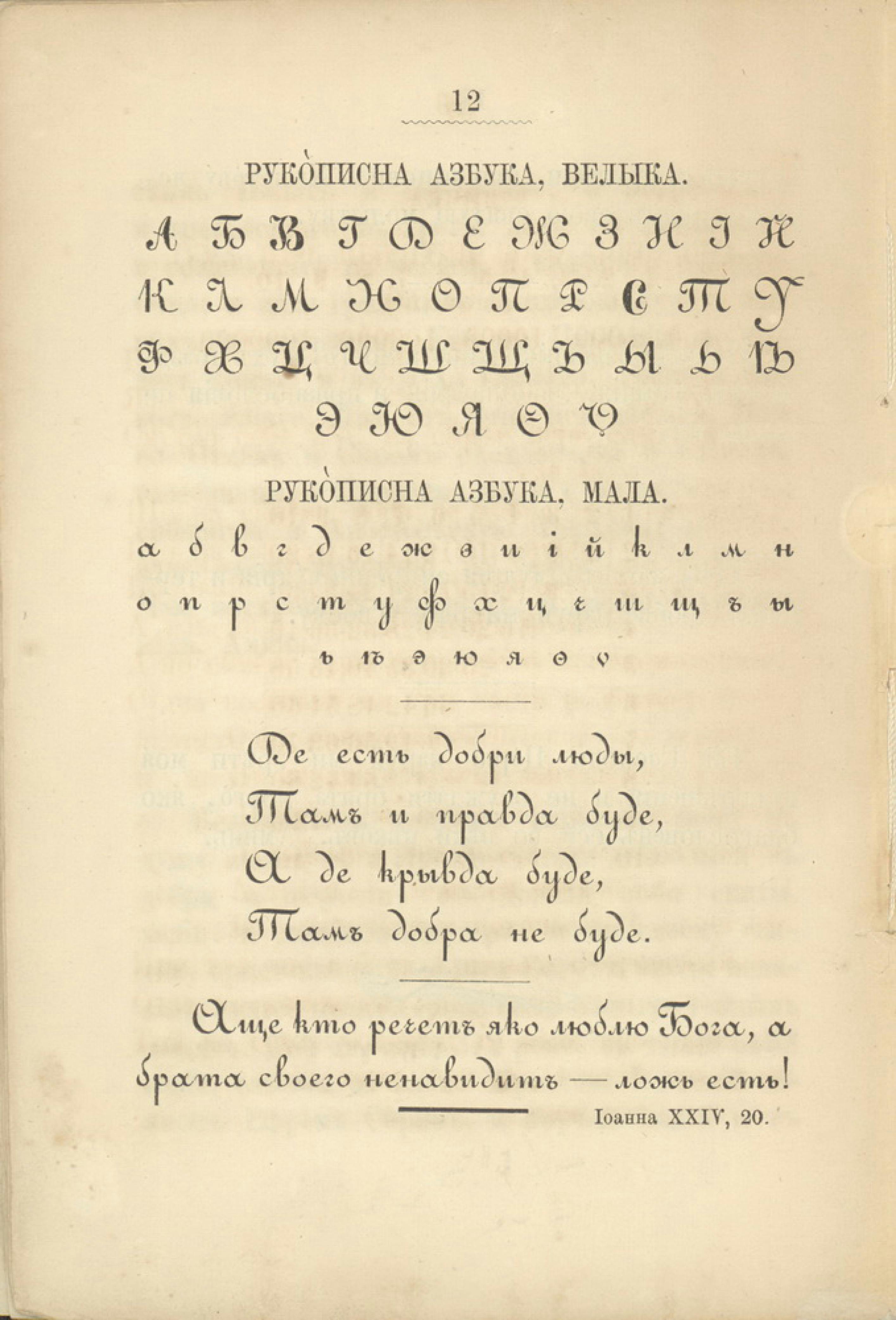
The chosen handwriting model is, surprisingly, inspired by the Ronde. It is not known whether it was used extensively and consistently, but this is possible evidence that regional linguistic differences could be supported by other Cyrillic models, even if they were still derived from Western references.
The European educational and hygienic movement and its support for vertical writing, as described at the beginning of this essay, seemed to have a very limited impact on the Cyrillic region. A rare manual published in 1907 shows, among other models, an upright English Roundhand. Nevertheless, the slanted ‘English-Cyrillic’ style continued to flourish in countless copybooks.
The Russian Revolution and the advent of the Soviet Union in 1922 provoked an unprecedented attempt to replace Cyrillic (and other writing systems in use in the new federation such as Arabic) with Latin. The Bolsheviks considered Cyrillic ‘bourgeois’ and tainted with the Tsarist past; they believed that Latin would be the ideal vehicle for fighting illiteracy and expanding socialism all around the world. The New Alphabet Committee (Yeni Alif) was formed in 1928 to prepare the Latinisation reform.
However, the regime of Joseph Stalin halted, then cancelled, the project shortly before its implementation in January 1930. Cyrillic maintained and increased its hegemony in the Union republics. The cursive writing style in use before the Soviet era remained the norm. It should be noted that it has evolved slightly, the main new feature being a less steep slope. A more conspicuous change happened during the 1960s: a new monolinear version was introduced. This development is not unlike the one taking place around the same time in other European countries such as France, as discussed earlier.
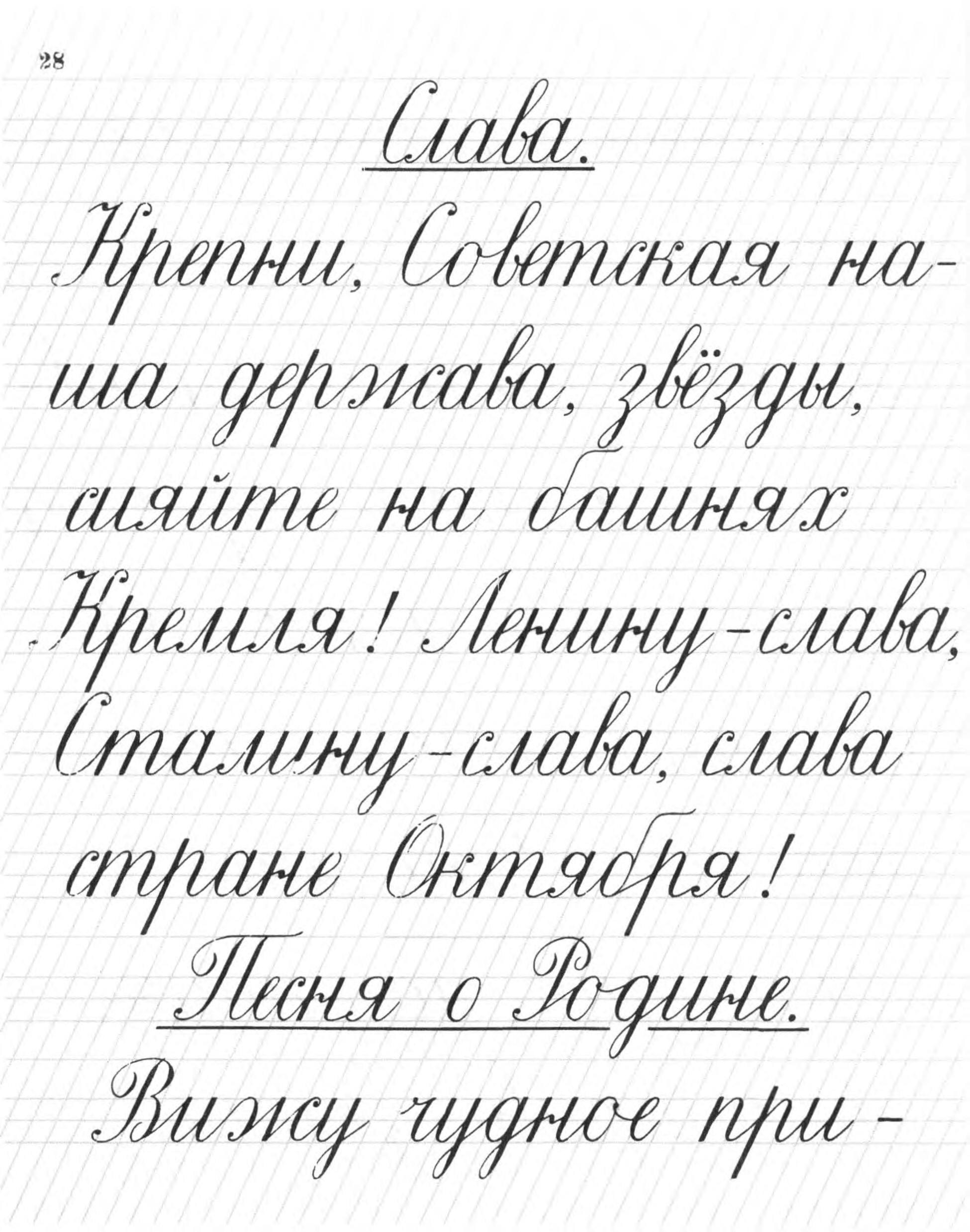
In the last 60 years or so, the evolution of this style has been minor, affecting the design of certain letters, their proportions and the variation of the writing slope. Regarding this last feature, it is arguably a lasting and determining factor in the Cyrillic region as well as in Central Europe and Scandinavia. In Bulgaria, the model that was developed in the same way has a distinctive spirit of its own. It is slightly slanted and rounder than most of the models still in use.
Nowadays, numerous Cyrillic alphabets are still being written that follow this sloped cursive pattern. The fall of the Soviet Union in 1991, the independence of several countries and the advent of the Russian Federation did not affect this deeply rooted fact.
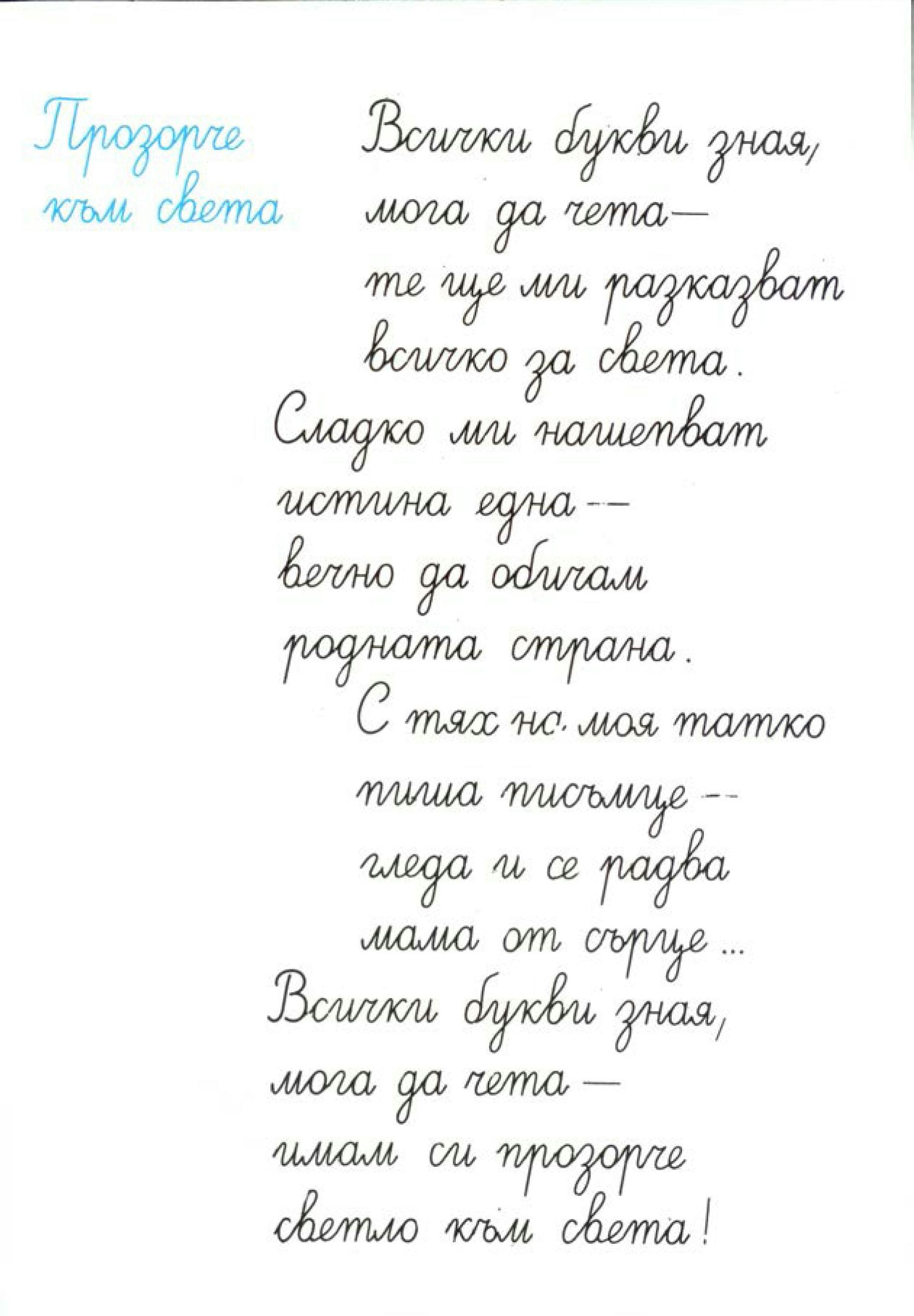
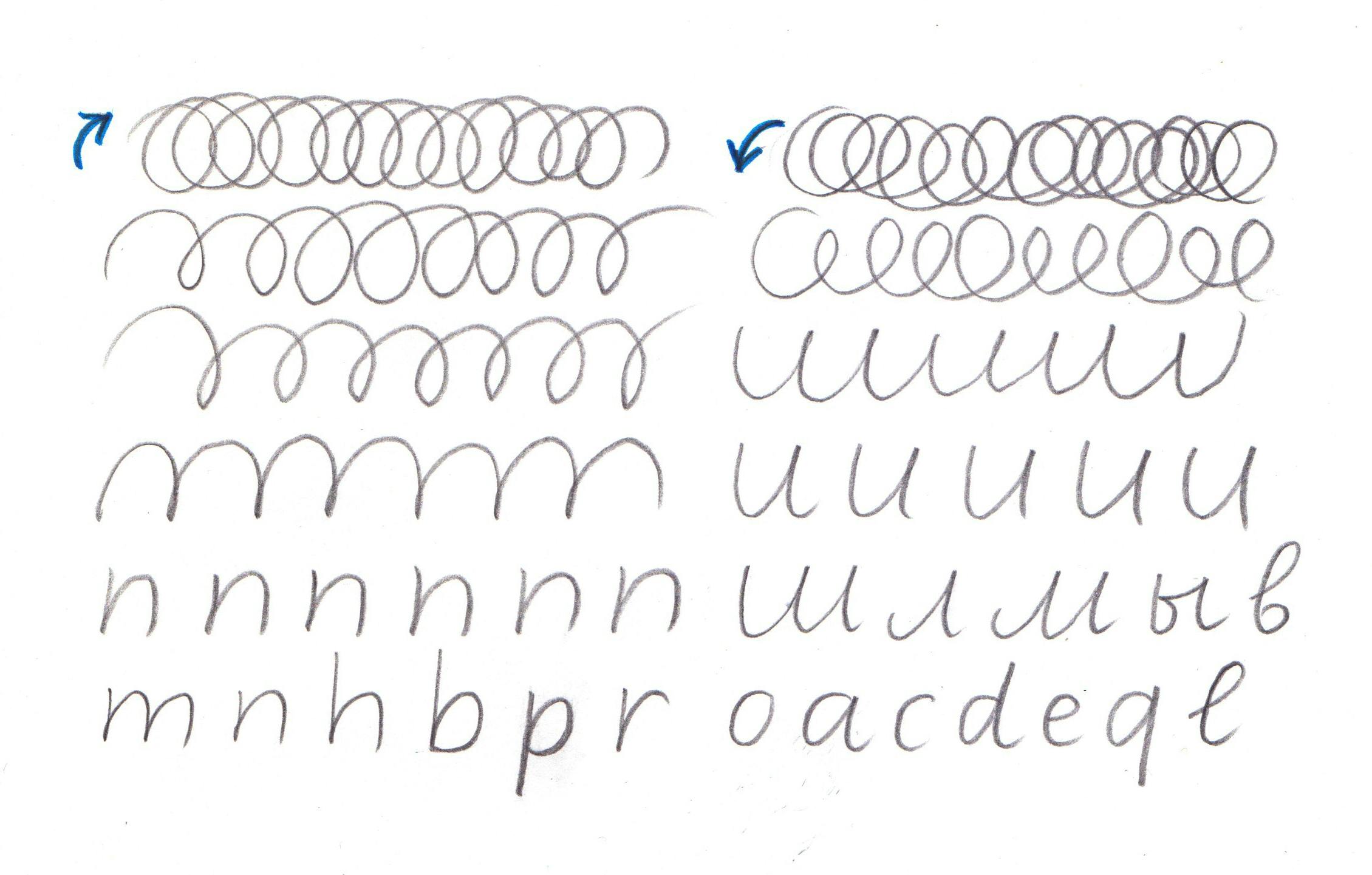
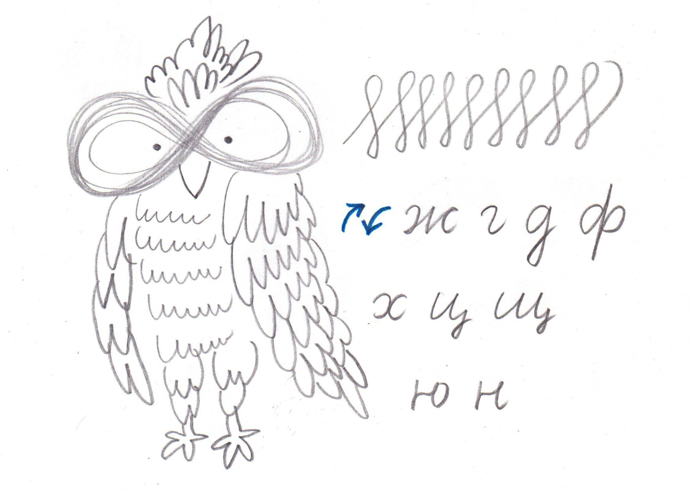
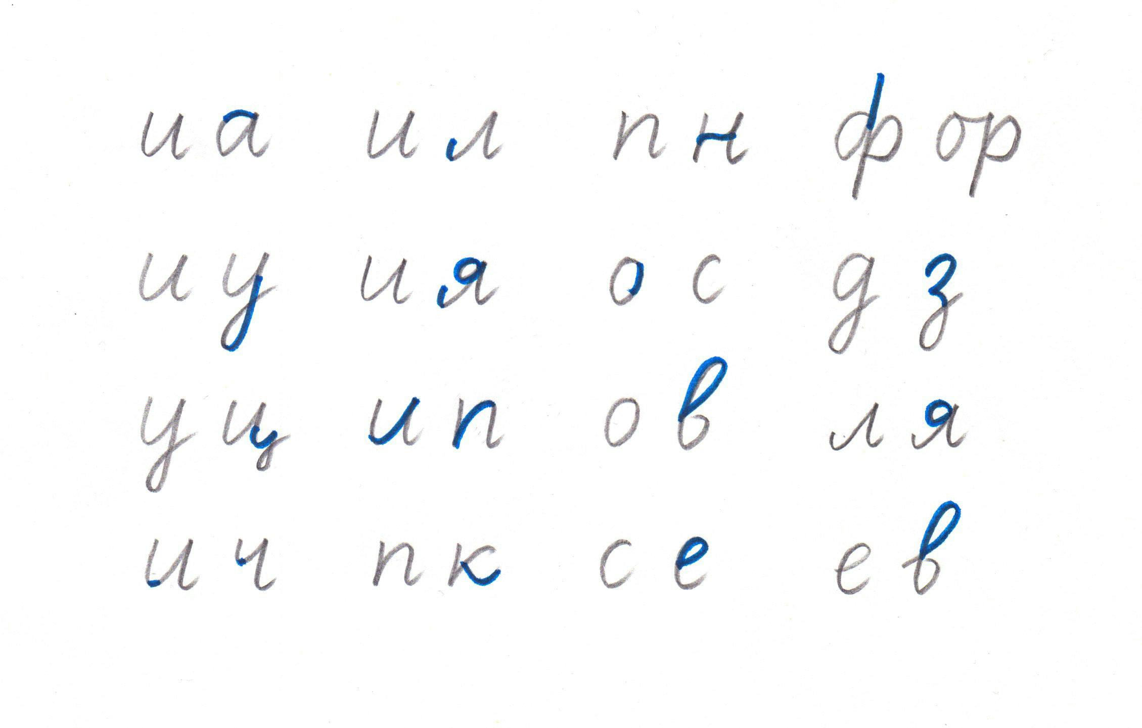
However, a new contemporary approach is now strongly emerging under the combined efforts of type designer Irina Smirnova and calligrapher Julia Baranova. Here is how they explain its potential implementation in primary schools:
’The construction and movement come from italic, but slant, width, roundness can be different and personal, as we can see in adult writing. In some cases it’s better to keep close to a commonly accepted school model to lessen confusion for a child; if this is not the case, italic is the best guide. We start learning cursive writing from basic counterclockwise and clockwise circle movements. At first, they resemble caterpillars, then gradually transform into aqueduct arches, and later into clockwise u-arches and counterclockwise n-arches. When writing basic letters becomes easy, we can practise pairs of letters that tend to become alike or even identical when writing fast. When we explain these differences to a child, they can quickly begin to read adult handwriting that is far removed from the examples in copybooks. Another challenge is connecting the letters. Computer-drawn examples are more a hindrance than help, because they show only one or two kinds of connection. A connection is just a trajectory between two points; it can be done in many different ways and vary between different pairs. Exploring variations works well as a trick to get a result without imposing limitations, instead going to the extremes and discussing what happens. For example if letters don’t align, or have different height and jump, we can ask a child to ‘hide’ a word by scattering letters all over the page. And then we offer the chance to do the opposite – to make a word easily readable by aligning letters. This game was played with simple capitals, before learning cursive. Another option to explore the extremes is going from the biggest to the smallest possible size within a page or using the whole room and making movements in the air. Movements in the air when the whole body is involved are joyful and effortless. A shift of attention from model to movement is the key. We try to avoid giving examples to copy. Instead we practise movements and work together towards making them flow easily. When studying a model, one is concerned mostly with form. While writing an essay or taking notes, one thinks about content and writing flows automatically with the easiest and most familiar movements.’
Greek handwriting
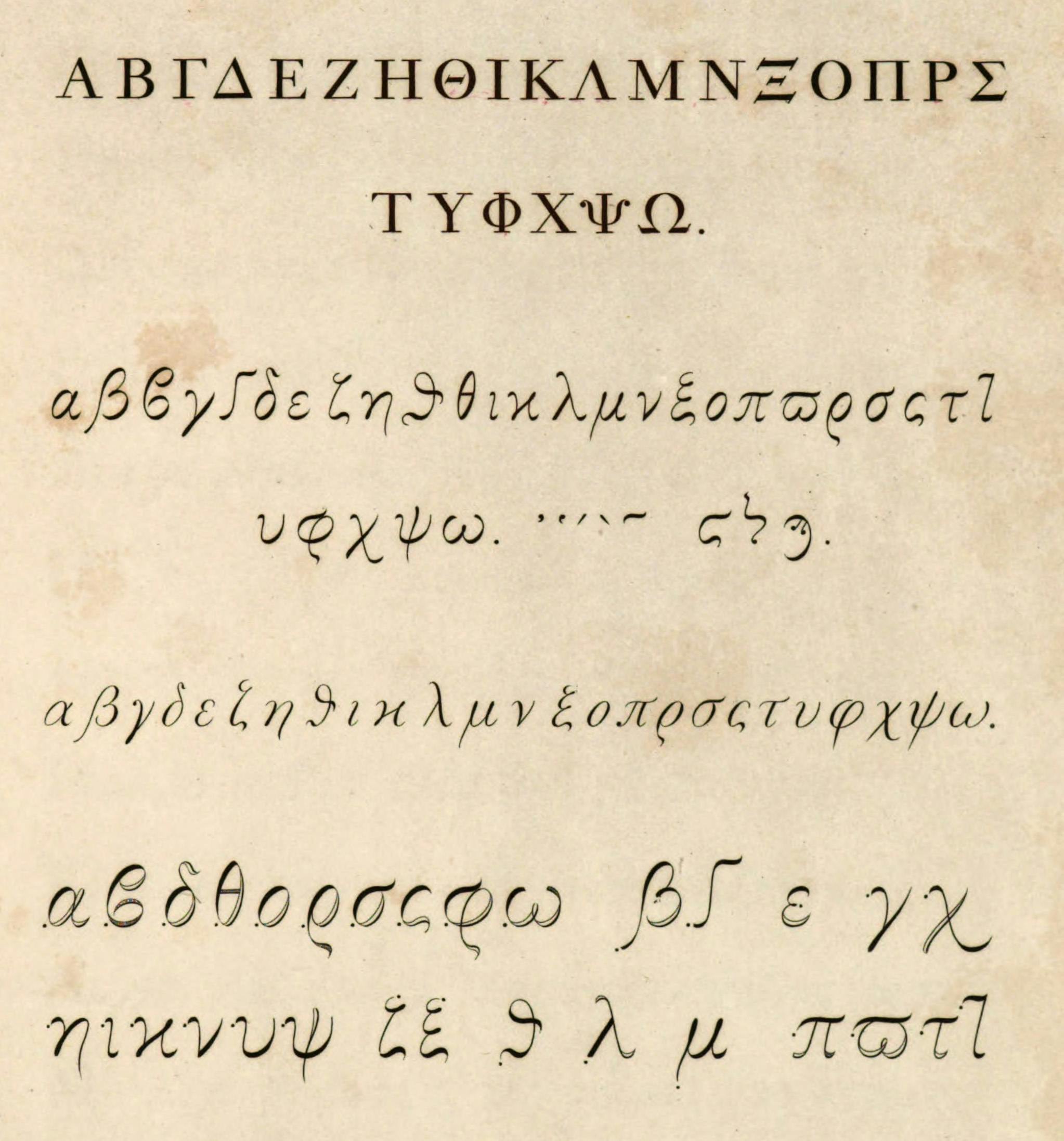
Greek script can evoke two significant and successive aesthetic directions: firstly, the capital alphabet carved in stone, which slowly developed in the wake of Athenian democracy. It spread throughout the Mediterranean basin and reached maturity around the 5th century BCE, and then slowly transformed into uncial writing and migrated to parchment and vellum around the 4th century CE.
The second direction is the minuscule cursive hand that appeared around the 10th century and stabilised during the Renaissance era, mainly thanks to the studies of Hellenists in Italy and France, where it found its culmination around the middle of the 16th century. It was during this period that the Cretan scribe Angelo Vergecio copied a large number of Ancient Greek classics and built up a corpus of beautiful handwritten books for the Kingdom of France Library. Some of these manuscripts were to serve as a reference for the ‘Grecs du Roi’, a series of outstanding typefaces cut by Claude Garamont for the Royal printing office in the 1540s.
One might think that this complex cursive style paved the way for a lasting tradition; at least, that is what happened in the typefounding and printing trades before further changes occurred in the 18th century with the rise of Philhellenism in Europe. It should be remembered that at that time, Greece was still under the rule of the Ottoman Empire. The growing interest of Western scholars, archaeologists and art historians played an essential part in the rediscovery of Greek culture. A new wave of academic publications has stimulated the emergence of different cursive interpretations of the script, as can be seen for example in John Hodgkin’s seminal study, Calligraphia graeca et Poecilographia graeca.
In the meantime, this rejuvenated love for Greek civilisation had manifested itself in the editions of several European publishers, notably the Didots in France. Firmin Didot designed a new series of Greek types at the turn of the 19th century, along with his soon-to-be ubiquitous Latin ‘modern’ typefaces. They were introduced in the books of his brother Pierre and also used later for his own imprint.
His eldest son Ambroise Firmin-Didot took up the torch with great zeal as a Hellenic student and a punchcutter. He travelled to Greece and the Middle East in 1816–17 and became one of the most fervent defenders of the Greek cause when the War of Independence began in 1821. This war, with the support of Russia, Great Britain and France, eventually led to the victory of the revolutionaries and the recognition of an independent Greek state in 1830.
The Didots’ involvement during this period took many forms, including the donation of printing presses and Greek types at various times and places, and the establishment of a state printing house in Athens in 1833. They also trained, in Paris, several Greek craftsmen in punchcutting, typefounding and printing, who then returned to their country to set up new workshops.
These combined initiatives favoured the implantation in modern Greece of an upright typographic pattern with a tempered cursiveness. One can also witness in this new style the lack of connections between letters and the loss of the numerous ligatures and alternative forms that were still in use during the 18th century.
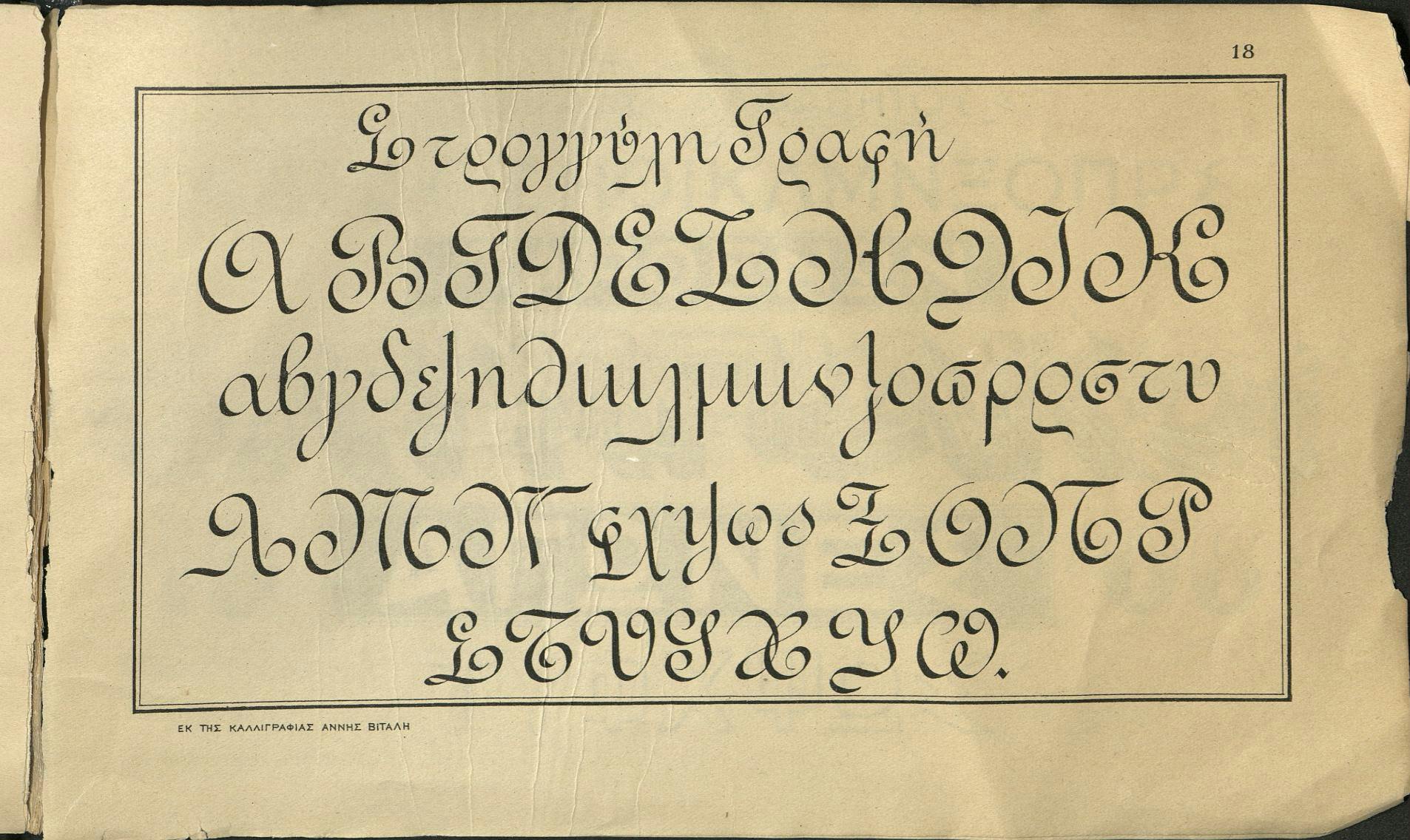
Western influence continued throughout the decades and new hybrid calligraphic models were developed, as shown earlier for Cyrillic. There are several Greek versions of a Ronde and an English Roundhand styles. These transpositions turn out to be rather unusual and artificial, and it is difficult to measure their proven impact. It is also not known whether there was any attempt to endorse hygienic vertical writing as in other European countries and in the United States.
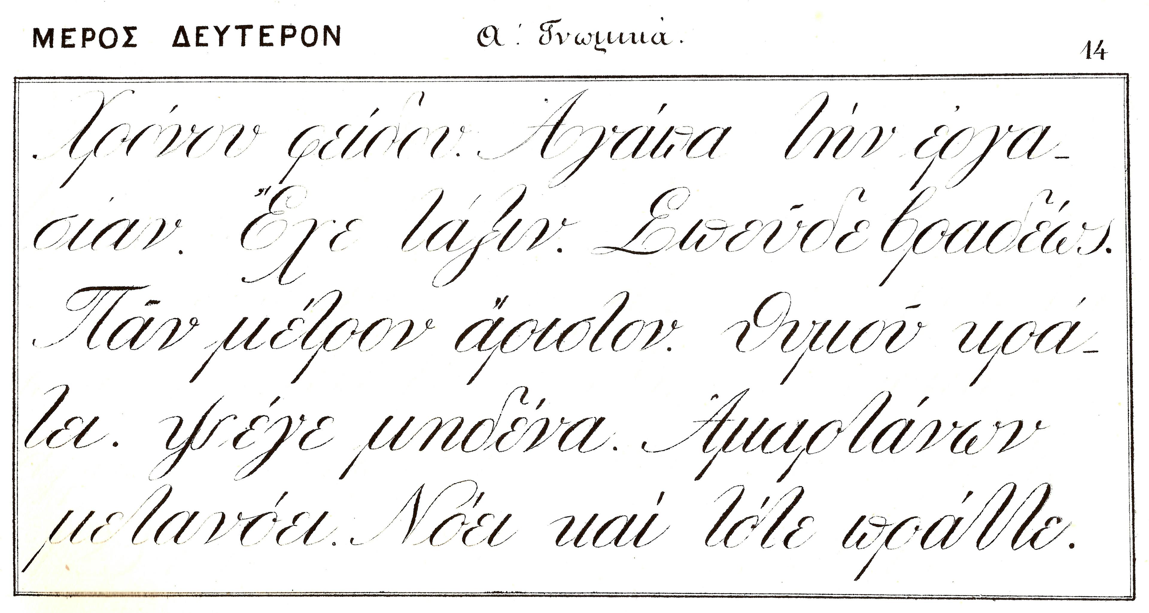
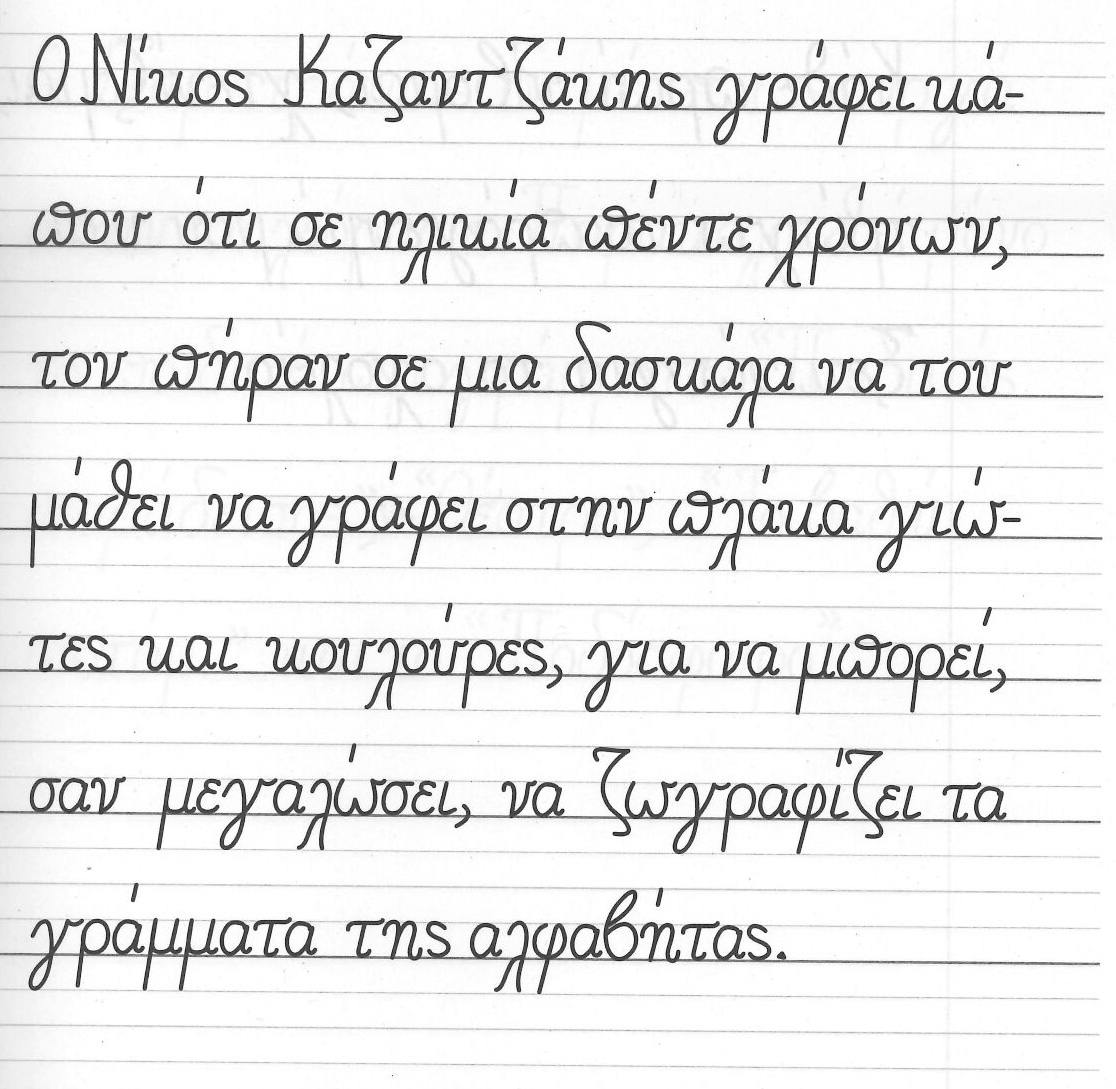
Some textbooks published in the early 20th century simultaneously used the ‘Didot’ pattern and the English Roundhand style. Towards the end of the 1910s, a new upright monolinear model appeared, which can be considered the Greek equivalent of print script. This approach seems to have taken root throughout the whole century, as many primary school textbooks attest; it generalised a conventional and enduring pattern. However, recent models currently in use in Greek primary schools display more cursive, slightly sloped letterforms, on the verge of being partly connected. Could this new tendency be interpreted as a decisive sign of change?
Conclusion
In 1974, a somewhat controversial and thought-provoking Wim Crouwel wrote:
’When talking about “education in letterforms”, we cannot separate this activity from other activities in the field of creative education. In my view, education means helping a human being to find a personal form of expression through letterforms. It does not mean learning how to copy existing types. If today we find ourselves in a situation with education in letterforms, it only means that we have discovered how nonsensical it is to follow any of the numerous “how-to-do-it” systems. We are no longer sure which method or which direction is best. It is as if the environment has become polluted with type, with written shapes, and with printed letterforms. No clear line can be perceived.’ 1
Can this statement be applied to our global world, almost 50 years later? As we know, the widespread use of digital devices (computers, smartphones) has transformed our reading and writing habits in a completely new way. On the one hand, a significant part of humanity, which can afford to buy and use these devices, has unknowingly learned to write ‘with prefabricated letters’, to quote a famous phrase from Gerrit Noordzij. How has this anthropological shift modified, or even degraded, our own writing practice?
On the other hand, beyond the models that are taught, sometimes for a century, beyond their quality and their perfectibility, and despite the increasing difficulties that the world of education is going through – difficulties that can be very different even devastating, depending on the country and the social policies – the possibilities of finding ‘a personal form of expression’ in handwriting remain endless.
Each of us carries the remnants of this learning: a stroke, a loop, the shape of a letter, a ligature that comes from a model practised during those primary school years. Certain habits, even within a sporadic practice, remain solidly anchored. This ability, even this virtuosity to make the multiple states of thought and speech instantly visible, is a lifetime journey. What paper trail will we have left at the end of it?