Models from Americas and Western Europe
This third part explores the movement of certain models from North America to South America and then to Western Europe, as well as their often lasting entrenchment.
Vertical writing bounces back
Despite its short existence in North America, vertical writing made greater inroads throughout the 20th century on other continents. It travelled and took root, along with other cursive styles, to South America and most notably Brazil.
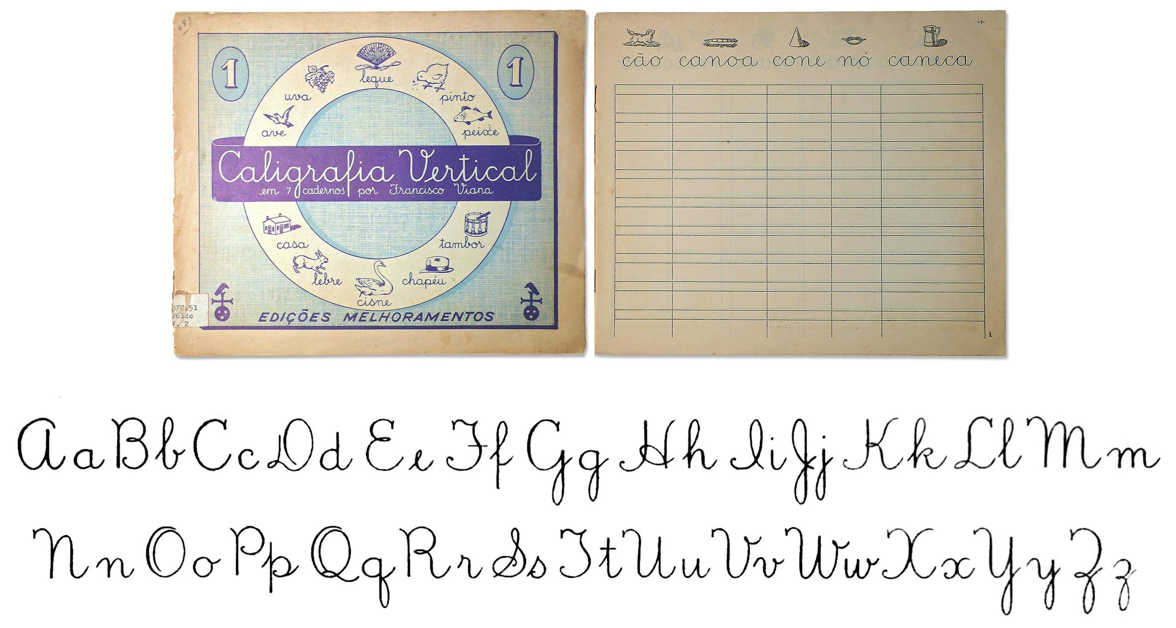
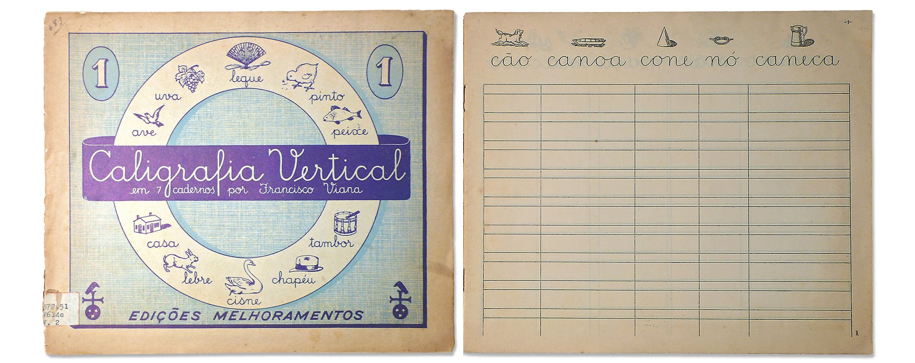
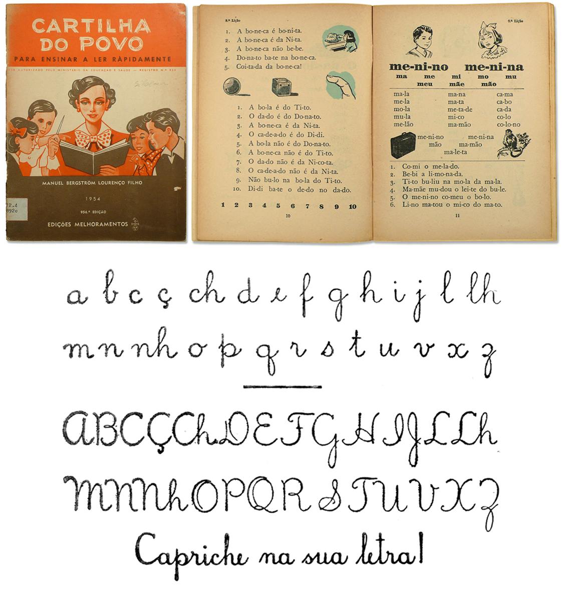
Its presence in primary schools in some Brazilian states can be seen as early as the 1900s. Caligrafia Vertical, a series of seven copybooks created by Francisco Viana, was first published in 1909 and constantly reissued until 1989, selling 110 million copies, according to its publisher Melhoramentos, based in São Paulo. Viana’s model is perfectly in line with those disseminated 15 years earlier in the USA. Melhoramentos brought another popular textbook to the market in 1928, Cartilha do Povo, by Manuel Bergström and Lourenço Filho, which evidenced a similar model.
Several other copybooks and textbooks have continued to be reprinted until recently, ensuring the implementation and persistence of vertical cursive writing in Brazil. This phenomenon was described and discussed by Sandro Fetter in his doctoral dissertation, defended in 2019.1 His research provides a fairly substantial historical overview of the subject, as well as of the teaching of handwriting in the Western world.
In addition, it led to the design of a typeface family named Letra Escolar Brasileira, built upon a comprehensive study of vertical writing and intended to serve as an updated reference in Brazilian primary schools. Fetter carefully developed a gradual transition in four phases from an unconnected, italic-inspired model to a fully continuous looped cursive.
A growing interest in vertical writing also became apparent in Europe, especially around the middle of the century. In France, new official primary school curricula decreed the compulsory use of English Roundhand in 1923, alongside the ever-present Ronde, and in 1938, additional curricula permitted the optional use of print script. The cohabitation of these models is evident in some copybooks: one can notice the English Roundhand next to its ‘rectified’ version and print script on the same page.
A survey of a wide selection of children's workbooks shows that the preference for and skills in vertical writing quickly increased after the Second World War.2 The introduction of an upright English Roundhand was probably the first step towards the development of a vertical monolinear cursive model.
It is also in this context of steady change that new scientific and psychological studies on the pedagogy of writing began to proliferate. These were to have an influence from the late 1950s onwards, such as the in-depth and experimental study carried out by the Swiss psychologist Vinh Bang, Évolution de l’écriture de l’enfant à l’adulte.
This book, based on the author’s thesis on the development of writing in Geneva schoolchildren, proposed a didactic approach to teaching handwriting that took into account the child’s cognitive development. Bang also endeavoured to build a scale for measuring such a development, which could compensate for the lack of psychological foundation of the existing, traditional scales. A section entitled ‘Essai de didactique’ presents a progression of learning from a print script model to a slanted continuous looped cursive. Bang explains this method as follows:
’The first point to make is that the written alphabet and the printed [typographic] alphabet each serve a different purpose. The printed alphabet ensures perfection in legibility (easy reading) and in aesthetics (layout, proportion of letters, etc., that flatter the eye). To make it easier for children to start learning to write, it is therefore necessary to adopt an alphabet that is as close as possible to the alphabet used for reading: print script. The written alphabet serves another purpose: its primary function is to record. In practice, to “draw” a printed alphabet, one has to be a specialist or lose a lot of time. Print script writing is a deliberate transformation of the printed alphabet, adapted to the movements of the hand to make it easier to trace the letters. The history of the alphabet has shown an evolution of handwriting towards a cursive movement. One may wonder whether the evolution of children’s writing does not follow the same law. […] We have seen that even when children learn print script, they quickly change the flow of their writing to better suit the cursive movement.’ 3
Among the main methods and copybooks that appeared in the 1960s, André Casteilla’s Pédagogie de l’écriture cursive moderne gave a renewed definition of cursive writing:
’It is a script in which each letter is drawn at once and all the letters are linked together within a word. Cursive handwriting that fully serves its purpose should allow an entire word to be written at once, without lifting the pen, the only limit to the length of the stroke being that of the hand.’ 4
Marguerite Auzias, another educator involved in defining new handwriting methods, was also a pragmatic supporter of this style:
’Firstly, children using [print] script tend to isolate words poorly, losing their unity; this is detrimental to children with spelling difficulties or who are likely to have them. Moreover, it is a slower kind of writing than cursive at all ages […] it is gradually being abandoned in France and even in some Decrolian schools where it was widely used between 1920 and 1950. Finally, script writing is “cut” and consequently breaks up and hinders the movement of the hand, whereas cursive writing “stimulates” and educates a certain flexibility of execution in the continuity of the line. We have often been able to verify that the great majority of 5–6 year olds are quite capable of reproducing well-structured and regular letters from the outset, and it is necessary to offer them well-formed and simple models, with a consistent technique. […]
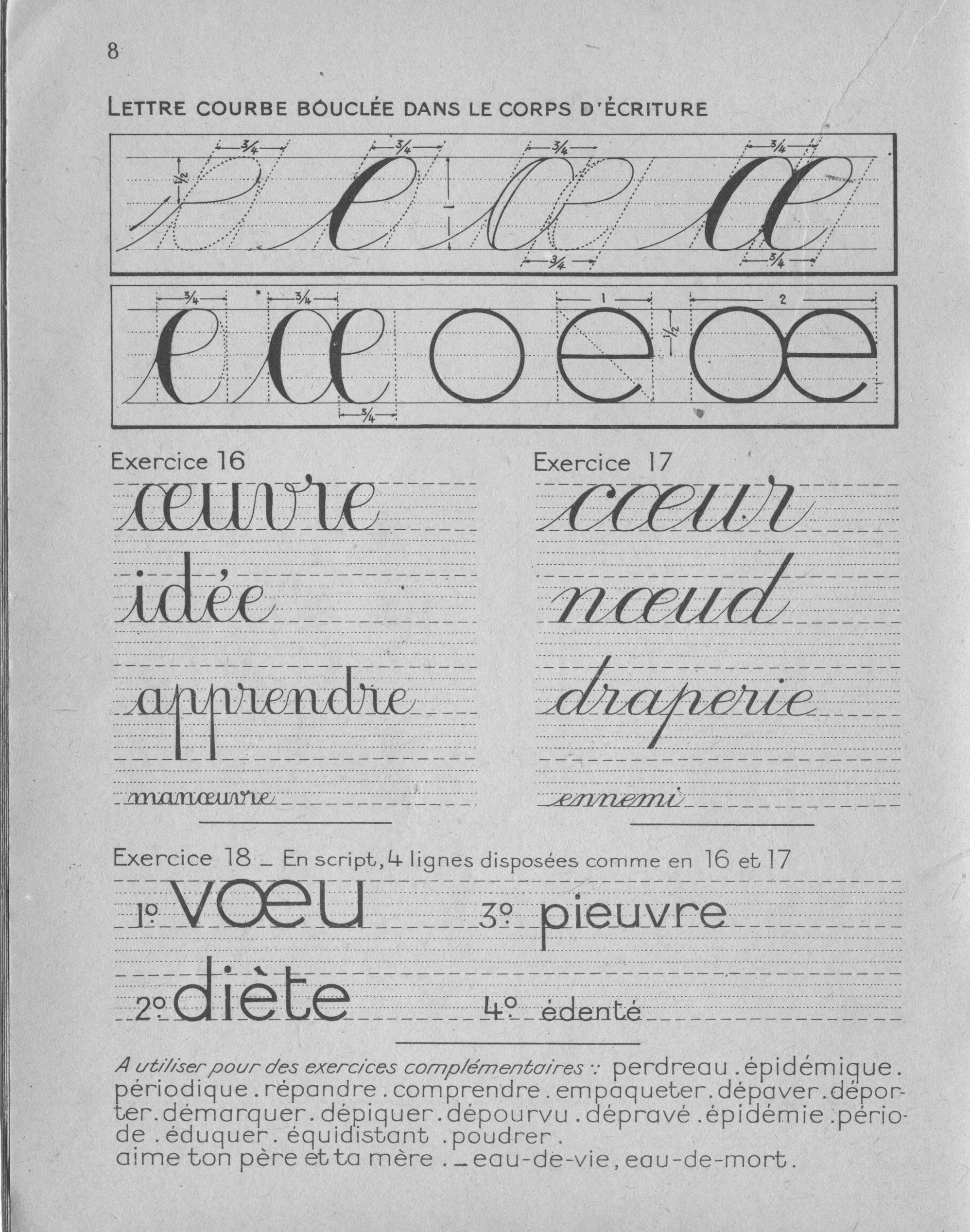
One of the great criticisms of cursive writing has been its complexity. However, this complexity can be greatly reduced: it is more elegant and more “modern” to remove all the frills that complicate English Roundhand. One therefore avoids making the loops which, in this calligraphic style, sprinkled the letters r, o, b, s, f, v. One also avoids the useless slashes in front of the letters a, d, g, q, c, o.’ 5
It should also be remembered that this consensus on vertical writing went hand in hand with the popularisation of a new tool: the ballpoint pen. It began to be marketed in the early 1950s, thanks in particular to the efforts of the BIC company, with a great deal of joyful advertising. However, it took a few more years for the BIC Crystal to be well received in classrooms, where pointed pens and inkwells were still prevalent despite the marginal and tolerated use of fountain pens. Casteilla enthusiastically made no bones of his preference:
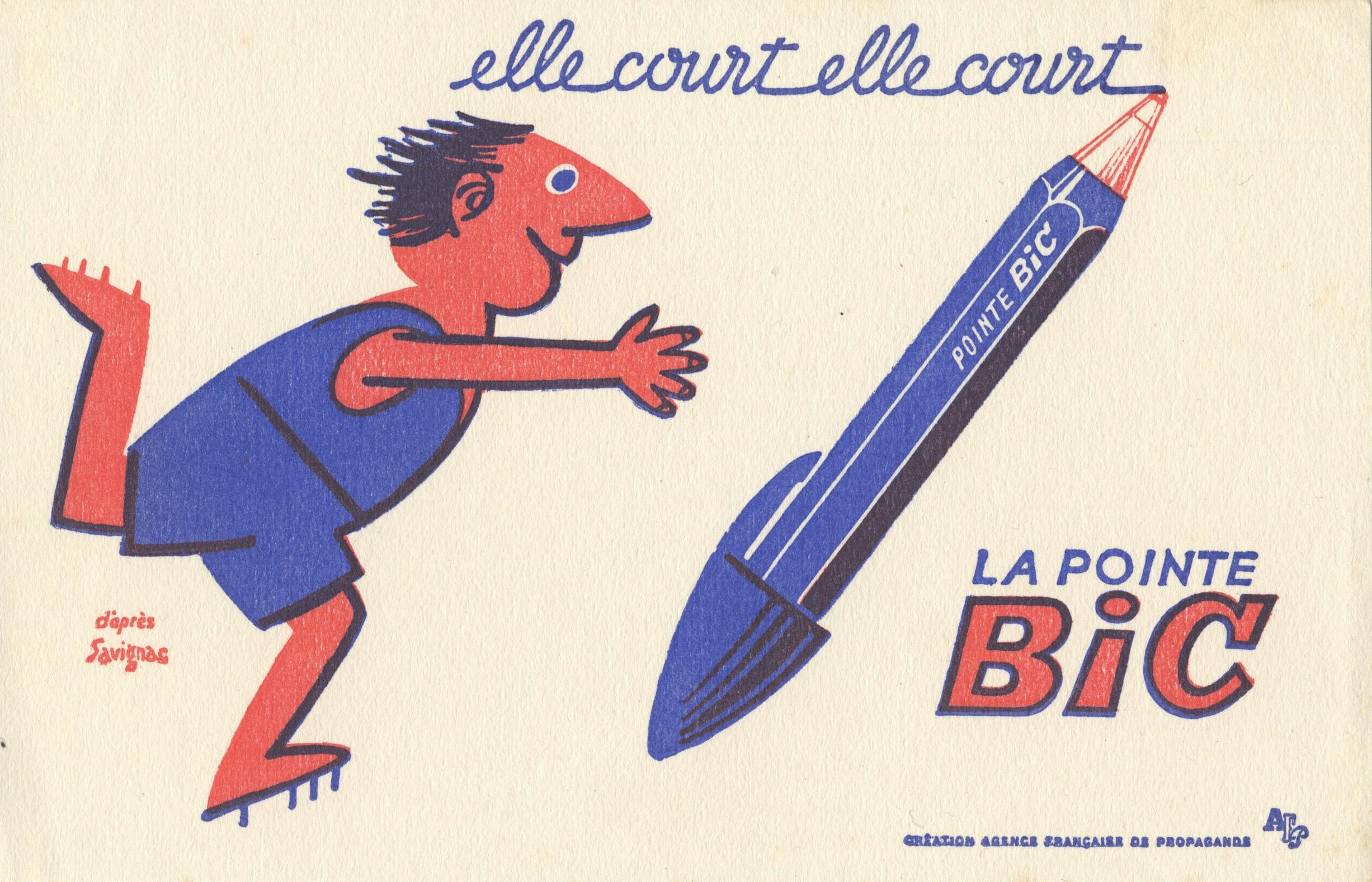
’Even more practical, the ballpoint pen has replaced the fountain pen. It is of excellent quality, can be used on a wide range of materials and has the incomparable advantage of being very cheap. This is why it has quickly become commonplace. The inkwell, in which stagnant and discoloured ink used to dry up, is no longer to be found in homes: the ballpoint pen has replaced it. Cheapness is not the only reason for the immense success of the ballpoint pen; with it one carries with him the possibility of tracing several thousand metres of writing; the ink in its reservoir takes a very long time to dry out; it does not discolour; it no longer spills unexpectedly onto tablecloths, clothes or paper. Finally, it has also done away with the nib, which used to be rusty if you didn’t have the opportunity to use it often. The ballpoint pen is much more convenient: it rolls effortlessly and does not splatter the writing page in unexpected patches; no one is clumsy with it. Everyone now has a ballpoint pen, and they are found everywhere except at school.’ 6
The year after this passionate plea, on 3 September 1965, the Ministry of Education issued a circular authorising the introduction of ballpoint pens in primary schools. Another circular, published on 4 December 1972, endorsed their use as a preference:
’The ballpoint pen and the felt tip will be the preferred instruments. Instructions from 1965 already pointed out the advantages of the former in learning cursive handwriting “which does not at any time require differentiated pressure from the hand. The strokes are of uniform width and are drawn with a continuous movement”. From now on, it is better to avoid the difficulties of the pointed pen.’
This circular also specified the hierarchy of writing models to be employed:
’The teaching of “script” writing in primary schools will remain optional. Script, which imitates print, makes reading easier; the design of its letters is simple; it alleviates the many difficulties for beginners in connecting letters. On the other hand, it imposes an additional stage, which it may be paradoxical to subject to those children who have already learnt continuous writing at nursery school. Moreover, it has the disadvantages of choppy writing: the intervals between letters, which must be smaller than the intervals between words, are difficult. Therefore, while using script for titles or labels, teachers may find it useful to skip this stage. […] Finally, it should be remembered that both upright and slanted writing models have long been permitted.’7
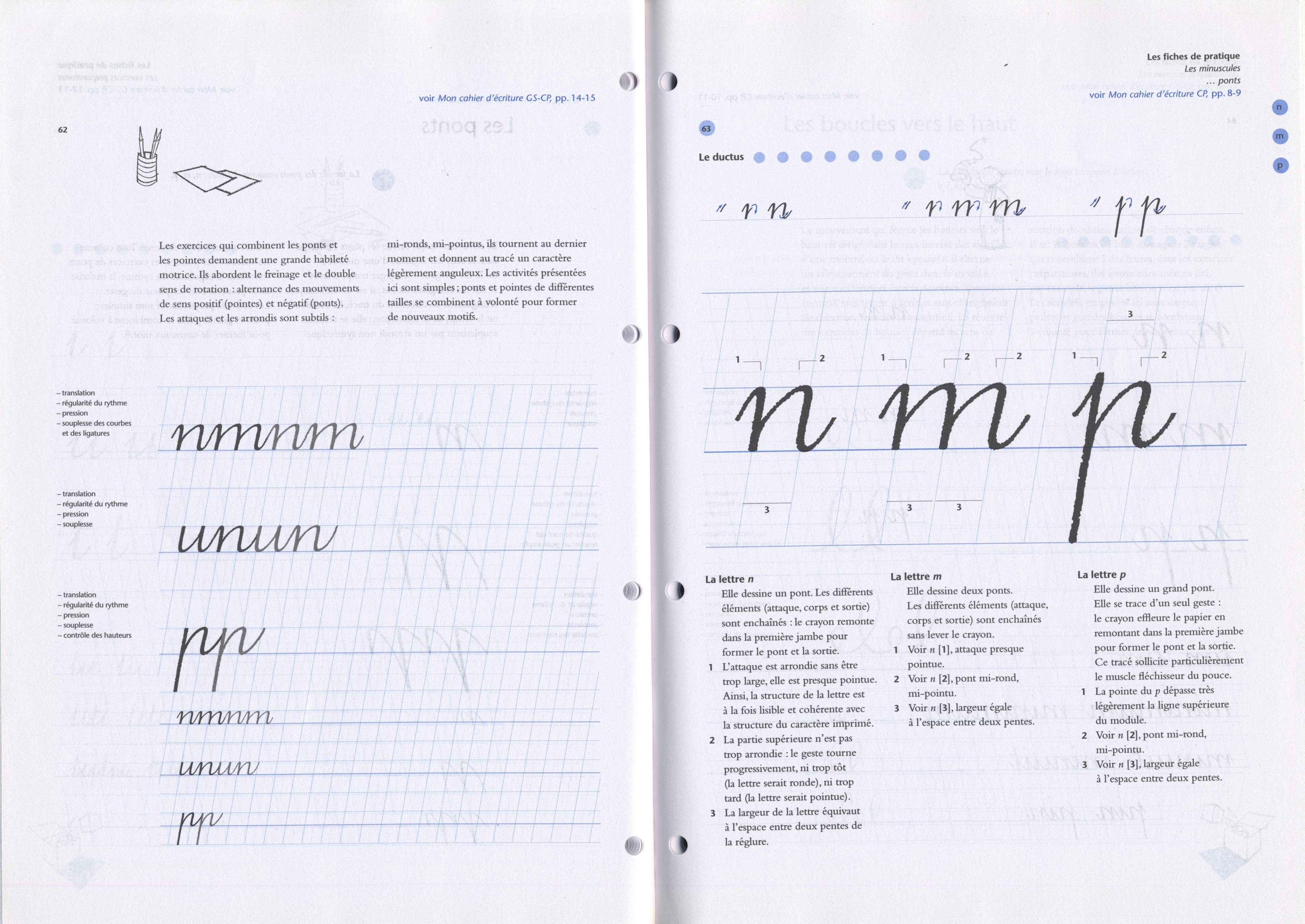
The models resulting from this new trend emancipated themselves from the historical heritage, but often suffered from defective proportions and exaggerated length of the ascending and descending loops.
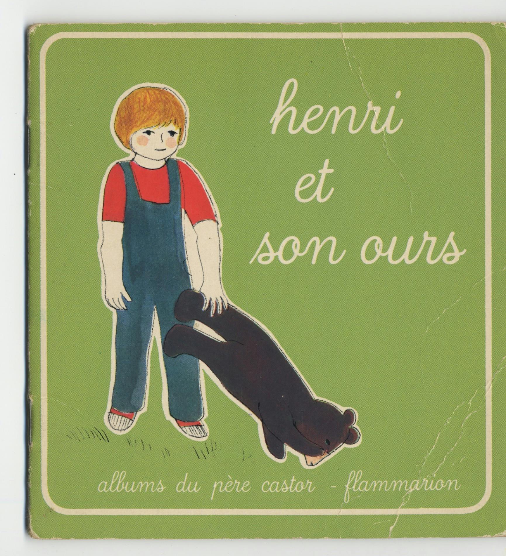
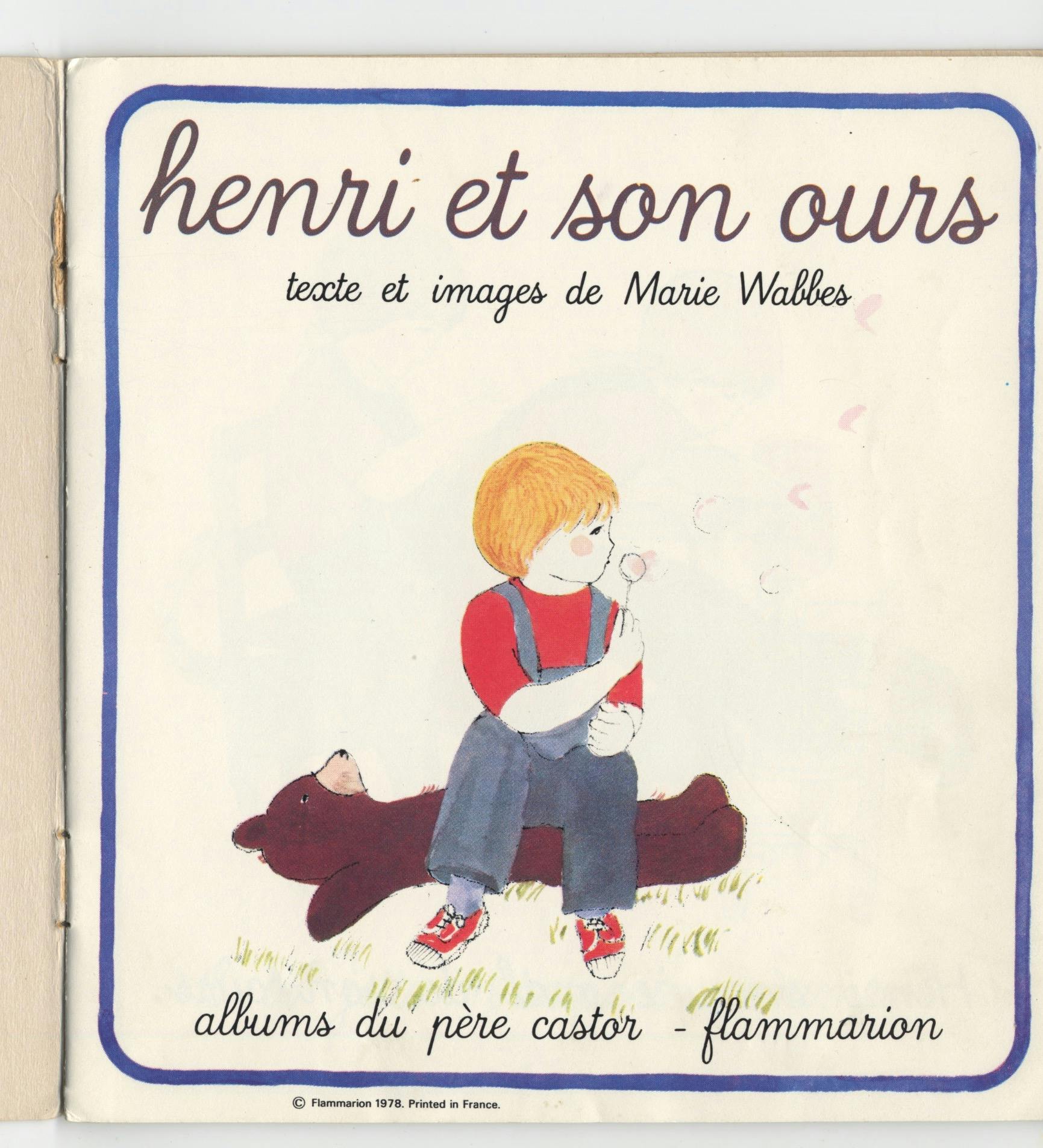
However, continuous cursive writing has become a permanent feature of everyday life, extending beyond the world of education to the world of toys and children’s books. A fine example of this cultural impregnation is Père Castor, a slightly sloped typeface designed by José Mendoza y Almeida between 1976 and 1978. It was commissioned by the Flammarion publishing house and mostly used for a series of small books. In addition, this typeface was designed for possible educational use, an outcome which has not been realised.8
The making of new (official) cursive models
In the early 1990s, an unusual project, partly following in the footsteps of Mendoza, began under special circumstances. Its development deserves to be told, along with the contribution of one of its main protagonists, Laurence Bedoin.9
This initiative started at the École Estienne, in Paris, as part of the typography course now known as the ‘DSAA Design Typographique’, which was still experimental at the time. This course was launched in September 1992, thanks to the collaboration of the school’s management and teachers with Franck Jalleau, type designer at the Imprimerie Nationale, and Michel Derre, calligrapher and graphic designer.
Laurence Bedoin (née Collard) and Héloïse Tissot, two students in the second year commencing in 1993, decided to undertake a joint degree project under Jalleau’s supervision. Their teacher had recently been involved in a mixed collaboration with an educational publisher that had resulted in the design of a typeface for school textbooks. His skills had not been sufficiently appreciated, it seems, to enable him to improve or replace the old-fashioned vertical cursive model.
Bedoin and Tissot first gathered extensive documentation on the subject by scouring libraries and bookshops and by consulting several people involved in the teaching and study of writing. Jean Hébrard, General Inspector of the Ministry of Education, advised them and even participated in their graduation jury in June 1995. Their main objective in completing this project, according to Bedoin, was not only to create a new version of the continuous loop cursive, but above all to provide reliable and up-to-date tools for teachers.
This project could easily have ended there. Yet, against all odds, their model was chosen in 1998 by the educational publisher Nathan for a series of three textbooks and a teaching guide. They must be ranked among the greatest successes of the genre, given the pedagogical and graphic qualities of their design.
The following year, thanks to Hébrard’s influence, the Ministry of Education launched a competition to select a new handwriting model for primary schools. The jury, chaired by type designer Jean François Porchez, selected the Bedoin-Tissot project – but also another one, submitted by calligrapher Marion Andrews. Her model was designed in a style inspired by italic handwriting, a style until then quite absent in France. The results were announced publicly in January 2002.10
The next two years were spent preparing and harmonising the two models, now named Écriture A and Écriture B, for the Directorate General of School Education with the help of Porchez. However, this process could not be completed, particularly as the digital implementations of the fonts had been neglected. Despite this interruption, a conference was organised in 2005 to discuss the project and to exchange views on the French pedagogy of writing.11
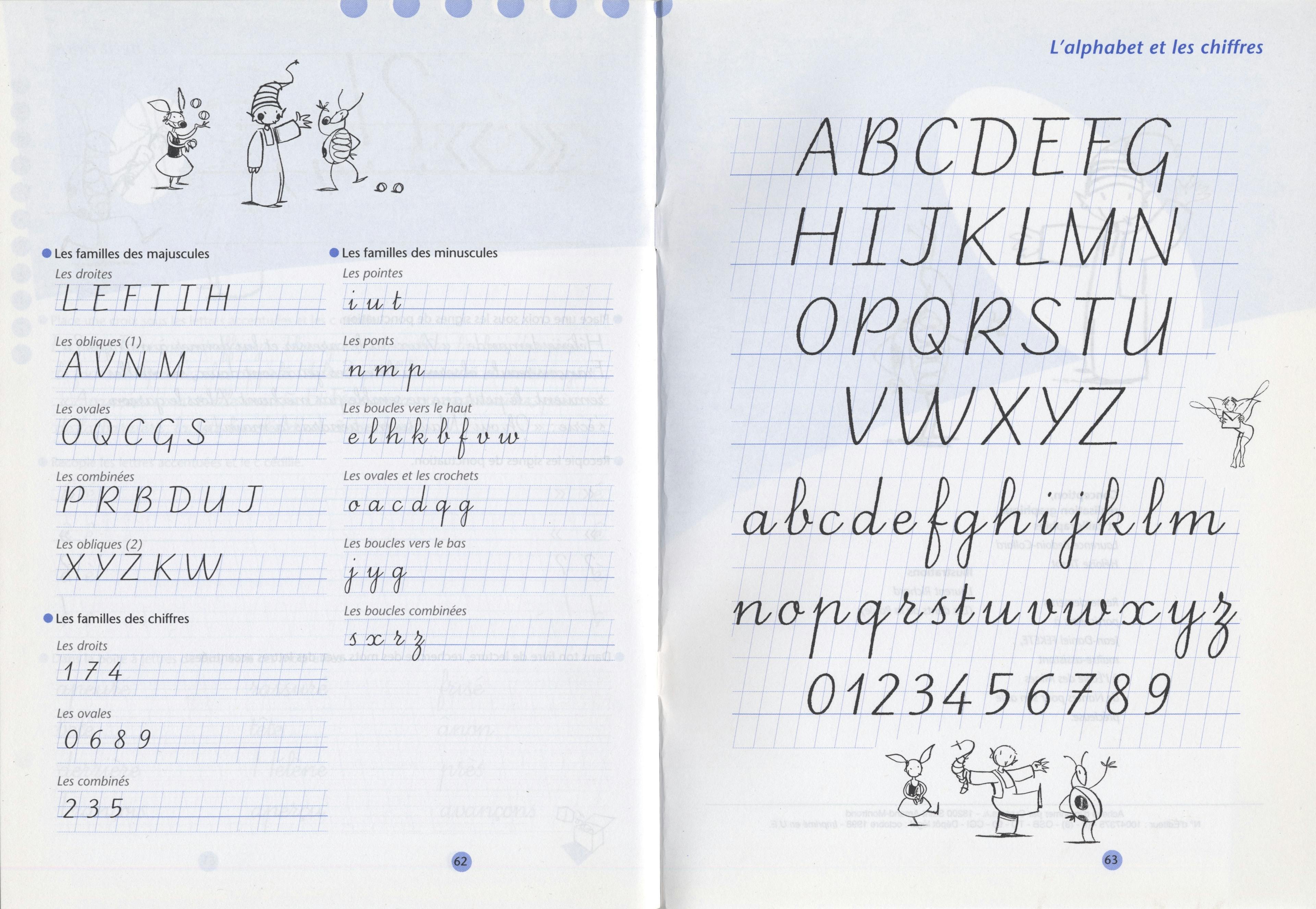
It was only with a new political change in 2012 that the project was revived and finally finished. Bedoin started both projects afresh with Andrews’ contribution, and type designer Malou Verlomme digitised the final versions of both designs, comprising upright and slanted versions. The Ministry of Education has been offering both font families for download online,12 together with an accompanying educational document, since 2013.13 A survey of their actual impact on the teaching of writing over the past ten years has yet to be conducted.
These two models are probably among the best ever designed for such use. Bedoin’s conclusion on this 20-year experience, from first idea to completion, is quite straightforward: whatever the quality of the model taught, the first thing to do is train the teachers as well as possible so that they in turn can teach their pupils to write in the best possible conditions. They could also benefit from a complementary approach by specialists in psychomotor development. The task ahead remains Herculean.
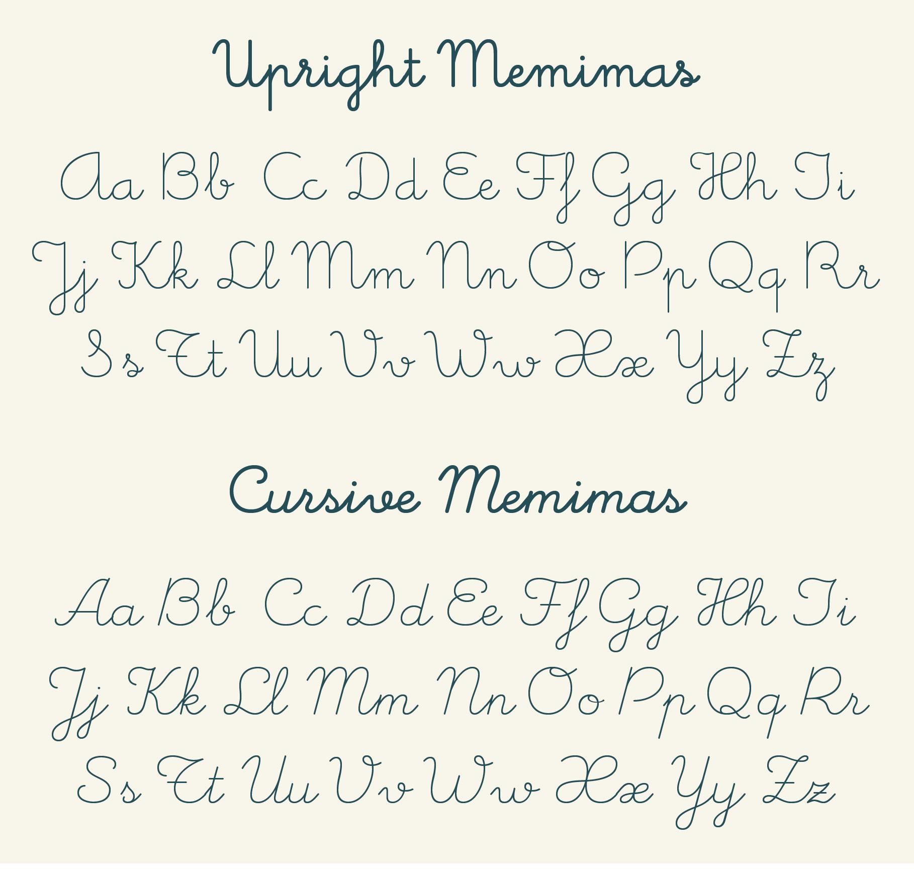
The predominance of the vertical model remains strong in France and in the Western Mediterranean countries. It is possible to find at least a dozen digital variations of this design in Spain,14 the best being Memimas Pro by José Manuel Urós, available in several weights, as well as a slanted version. There are also several examples in Portugal and Italy, where the spread of this model, possibly from France, may date back to the 1960s, or more recently.15