
Articles
24 results
November Tamil: Designing with purpose
Essays by Aadarsh RajanNovember, October and November Stencil Tamil are a family of low-contrast, monolinear Tamil typefaces. Following a rigorous overhaul of the original, they have now been redesigned for better reading and unambiguous communication in text and display sizes.
Conceptual Type?
Essays by Peter BiľakIn November 2010 Peter Biľak was invited to give a talk at a one-day conference ‘Conceptual Type – Type led by ideas’ in Copenhagen about the underlying ideas behind typefaces. This lecture questions the possibility of conceptual type and compares type to other disciplines.
Designing Fonts for Two Billion people
by Peter BiľakTypotheque tackled the unprecedented task of designing a comprehensive set of fonts for South Asia.Taking Credit: Film title sequences, 1955-1965 / 10 Bibliography
Essays by Emily KingThe bibliography for Emily King’s dissertation for the V&A/RCA M.A. Course in the History of Design. The dissertation focuses on the relationship between graphic design and film in the middle of the past century.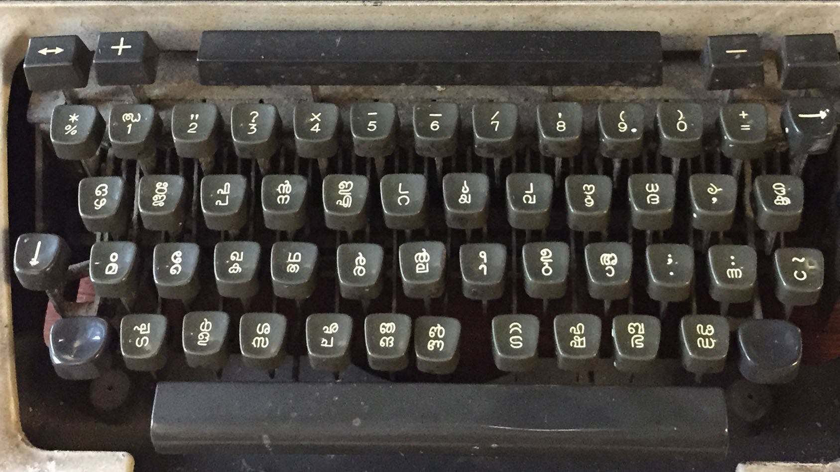
Malayalam: Scripting Tradition and Modernity
by Karthik MalliThe article explores the rich tradition of Malayalam script and its evolution in the face of modern technologies. It delves into the challenges and innovations in adapting the script to digital platforms while preserving its cultural heritage.
Syllabics typographic guidelines and local typographic preferences
Essays by Kevin KingThis essay provides guidelines to fine Syllabics typography through identifying its general and inherent concepts, as well as detailing the nuances found in local preferences within individual communities.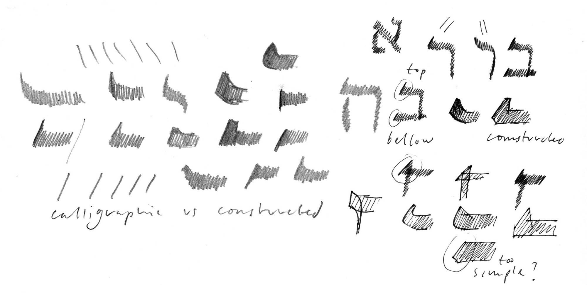
Designing Hebrew Type
Essays by Peter BiľakAn article on the process of designing typefaces for the language other than your own — challenges of looking at unfamiliar patterns, letters, and their cultural significances.
Typeface design beyond a single script
Essays by Peter BiľakCreating a new language version of a typeface is akin to a translation, whereby purpose, intention and respect are as important as proportion and design.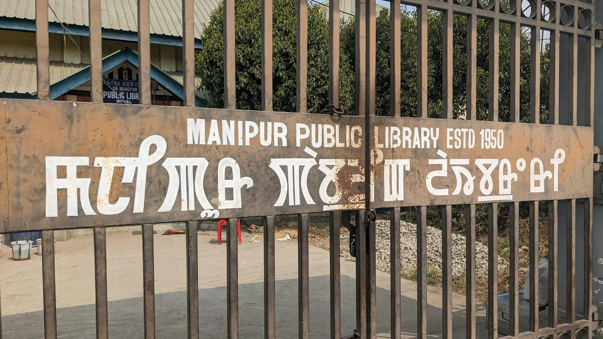
Tracing Meitei Mayek & Ol Chiki Letters: A Comparative Study
by Karthik MalliThis essay explores socio-linguistic landscape of northeast of India and adoption of two minority writing scripts, Meitei Mayek and Ol Chiki, enjoying significant growth in popularity in recent years, establishing distinct identity of their users.Jack
Reviews by Stuart BaileyA critical review and description of an open-structured live multimedia performance series which took place in the Netherlands in 1999.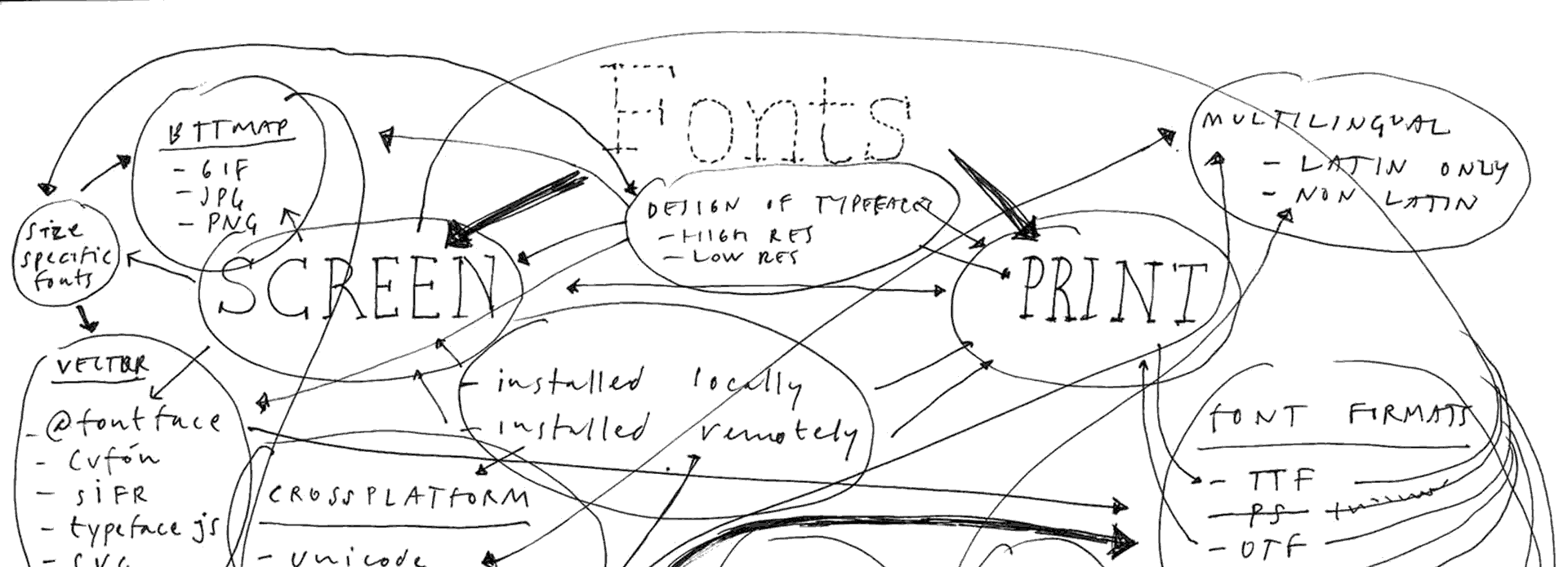
Brief History of Webfonts
Essays by Peter BiľakIn less than three decades, web typography has caught up to and even surpassed print typography. A brief look into how we got to where we are today.Graphic Design Magazines: Das Plakat
Essays by Steven HellerThe point-form story of a German dentist named Hans Josef Sachs and the magazine Das Plakat he founded on his love for posters. Responsible for the promulgation of early German advertising art abroad, his vast collection was confiscated by Goebbels for the Nazis’ collections and Sachs narrowly escaped the Holocaust. Steven Heller looks at the rise and fall of this significant early design periodical.
Calcula
Typeface stories by Shiva NallaperumalCalcula is an experimental display typeface inspired by the idea of exploring the grey area between typeface design and lettering.New Faces (Bibliography)
Essays by Emily KingThe bibliography of Emily King’s doctoral thesis which focuses on typeface design in the United States, England and the Netherlands between 1987 and 1997.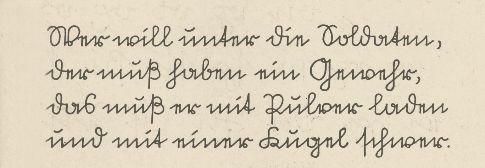 Modern handwriting: IntroductionPart 5
Cursive handwriting in Central Europe
by Sébastien MorlighemThis fourth part reveals other traditions of cursive writing in Central and Northern Europe, much different from Western Europe models previously discussed.Eric Gill got it wrong; a re-evaluation of Gill Sans
Typeface stories by Ben ArcherThis article is intended for an audience of contemporary designers and students who are at least one step removed from mid-century British typographic culture; it is a critique of the Gill Sans typeface and the idiosyncrasies of its creation from a contemporary perspective. The central argument is that an earlier typeface by Eric Gill’s mentor, Edward Johnston, is a superior piece of type design. Modern handwriting: IntroductionPart 3
Models from Americas and Western Europe
by Sébastien MorlighemThis third part explores the movement of certain models from North America to South America and then to Western Europe, as well as their often lasting entrenchment.
On developing a secondary style for the Canadian Syllabics
Essays by Kevin KingThis essay explores the journey to developing a suitable secondary style for such a script, the Canadian Syllabics, in a way that expands its typographic palette and offers more tools for expressing the language in its visual form.Old Guns
Essays by Steven HellerIn 1999, Print magazine talked to 20 American design heroes and had them look at work from their halcyon days. Designers from Art Chantry to Massimo Vignelli discuss a piece of early work as a foil for Print’s ‘Designers Under Thirty’ section.Taking Credit: Film title sequences, 1955-1965 / 7: Sex and Typography: From Russia With Love, 1963
Essays by Emily KingPart seven of ten of Emily King's dissertation for the V&A/RCA M.A. Course in the History of Design. The dissertation focuses on the relationship between graphic design and film in the middle of the past century. Bond titling sequences and the invasion of British design...